- Published on
The Ultimate Guide To Help You Make A Motivation Card With Tailwind CSS
- What is Tailwind CSS?
- The description of Motivation Card ui component
- Why use Tailwind CSS to create a Motivation Card ui component?
- The preview of Motivation Card ui component
- The source code of Motivation Card ui component
- How to create a Motivation Card with Tailwind CSS?
- Conclusion
What is Tailwind CSS?
Tailwind CSS is a utility-first CSS framework that allows developers to create custom designs quickly and efficiently. It provides a set of pre-defined CSS classes that can be used to style HTML elements. Tailwind CSS is highly customizable and can be used to create any design style.
The description of Motivation Card ui component
A motivation card is a UI component that displays motivational quotes or messages. It is commonly used in applications that focus on personal growth and development. The motivation card typically includes a background image, a quote or message, and a call-to-action button.
Why use Tailwind CSS to create a Motivation Card ui component?
Tailwind CSS provides a set of pre-defined CSS classes that can be used to create a motivation card quickly and efficiently. It allows developers to create custom designs without having to write custom CSS. Tailwind CSS also provides responsive design classes that make it easy to create designs that work on different screen sizes.
The preview of Motivation Card ui component
To create a motivation card with Tailwind CSS, we will use a combination of CSS classes to style the HTML elements. The result will be a beautiful and responsive motivation card that can be used in any application.
Free download of the Motivation Card's source code
The source code of Motivation Card ui component
The source code for the motivation card is straightforward and easy to understand. We will use HTML and Tailwind CSS classes to create the card. The HTML structure of the card is as follows:
<div class="bg-white rounded-lg overflow-hidden shadow-lg">
  <img class="w-full" src="https://source.unsplash.com/random/800x600" alt="Sunset in the mountains">
  <div class="px-6 py-4">
    <div class="font-bold text-xl mb-2">Motivational Quote</div>
    <p class="text-gray-700 text-base">
      "Insert motivational quote here"
    </p>
  </div>
  <div class="px-6 pt-4 pb-2">
    <button class="bg-blue-500 hover:bg-blue-700 text-white font-bold py-2 px-4 rounded">
      Call to Action
    </button>
  </div>
</div>
<div class="min-h-screen min-w-screen bg-gray-100 flex items-center justify-center">
<div>
<div class="flex flex-col max-w-md bg-white px-8 py-6 rounded-xl space-y-5 items-center">
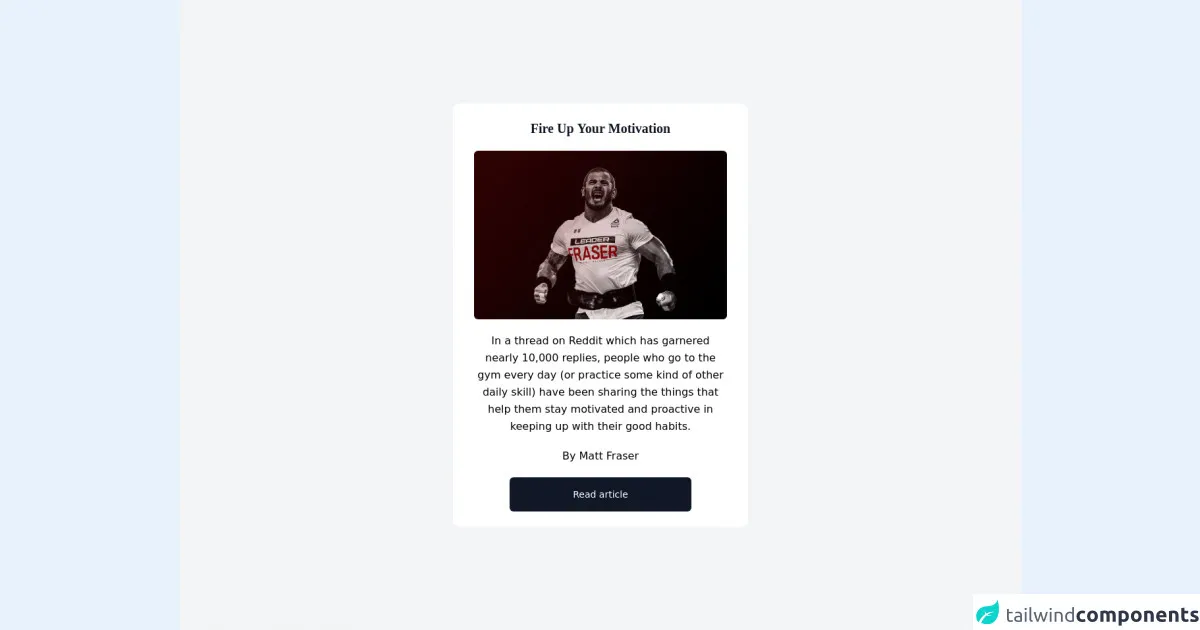
<h3 class="font-serif font-bold text-gray-900 text-xl">Fire Up Your Motivation</h3>
<img class="w-full rounded-md" src="https://coffeeordie.com/wp-content/uploads/2019/03/FraserCOVER2.jpg" alt="motivation" />
<p class="text-center leading-relaxed">In a thread on Reddit which has garnered nearly 10,000 replies, people who go to the gym every day (or practice some kind of other daily skill) have been sharing the things that help them stay motivated and proactive in keeping up with their good habits.</p>
<span class="text-center">By Matt Fraser</span>
<button class="px-24 py-4 bg-gray-900 rounded-md text-white text-sm focus:border-transparent">Read article</button>
</div>
</div>
</div>
How to create a Motivation Card with Tailwind CSS?
To create a motivation card with Tailwind CSS, follow these steps:
- Create a new HTML file and add the HTML structure for the motivation card.
- Add the Tailwind CSS CDN to your HTML file.
- Add the necessary Tailwind CSS classes to style the card.
- Customize the card by changing the background image, quote, and call-to-action button text.
Here is an example of the Tailwind CSS classes that can be used to create a motivation card:
<div class="bg-white rounded-lg overflow-hidden shadow-lg">
  <img class="w-full" src="https://source.unsplash.com/random/800x600" alt="Sunset in the mountains">
  <div class="px-6 py-4">
    <div class="font-bold text-xl mb-2">Motivational Quote</div>
    <p class="text-gray-700 text-base">
      "Insert motivational quote here"
    </p>
  </div>
  <div class="px-6 pt-4 pb-2">
    <button class="bg-blue-500 hover:bg-blue-700 text-white font-bold py-2 px-4 rounded">
      Call to Action
    </button>
  </div>
</div>
In this example, we use the following Tailwind CSS classes:
bg-white- sets the background color of the card to whiterounded-lg- rounds the corners of the cardoverflow-hidden- hides any content that overflows the cardshadow-lg- adds a shadow effect to the cardw-full- sets the width of the image to 100%px-6- adds padding to the left and right of the card contentpy-4- adds padding to the top and bottom of the card contentfont-bold- sets the font weight to boldtext-xl- sets the font size to extra largemb-2- adds margin to the bottom of the elementtext-gray-700- sets the text color to graytext-base- sets the font size to basebg-blue-500- sets the background color of the button to bluehover:bg-blue-700- changes the background color of the button on hovertext-white- sets the text color of the button to whitefont-bold- sets the font weight of the button to boldpy-2- adds padding to the top and bottom of the buttonpx-4- adds padding to the left and right of the buttonrounded- rounds the corners of the button
By customizing the values of these classes, you can create a unique motivation card that fits your application's design.
Conclusion
In this article, we learned how to create a motivation card with Tailwind CSS. We discussed the benefits of using Tailwind CSS and provided a preview and source code for the motivation card. We also provided step-by-step instructions on how to create a motivation card with Tailwind CSS. By following these instructions, you can create a beautiful and responsive motivation card for your application.