- Published on
6 Critical Skills To Make A Modal With Vue With Tailwind CSS Remarkably Well
- What is Tailwind CSS?
- The description of modal with Vue UI component
- Why use Tailwind CSS to create a modal with Vue UI component?
- The preview of modal with Vue UI component
- The source code of modal with Vue UI component
- How to create a modal with Vue with Tailwind CSS?
- Conclusion
As a FrontEnd technology blogger, you may have heard of Tailwind CSS, a utility-first CSS framework that helps developers create responsive and scalable user interfaces. In this article, we will explore how to use Tailwind CSS to create a modal with Vue, a popular JavaScript framework for building user interfaces. We will cover the critical skills required to make a modal with Vue and Tailwind CSS remarkably well.
What is Tailwind CSS?
Tailwind CSS is a utility-first CSS framework that provides a set of pre-defined CSS classes to help developers create responsive and scalable user interfaces. It allows developers to write less custom CSS and focus more on creating the user interface. Tailwind CSS is highly configurable, and developers can customize the framework to meet their specific needs.
The description of modal with Vue UI component
A modal is a UI component that displays content in a pop-up window, typically used to display additional information or to prompt the user for input. In Vue, a modal can be created using a combination of Vue components and CSS styles. The Vue component handles the logic of displaying and hiding the modal, while the CSS styles define the appearance of the modal.
Why use Tailwind CSS to create a modal with Vue UI component?
Tailwind CSS provides a set of pre-defined CSS classes that can be used to create a modal with ease. Using Tailwind CSS, developers can create a modal without writing custom CSS, which saves time and effort. Additionally, Tailwind CSS is highly configurable, and developers can customize the framework to meet their specific needs.
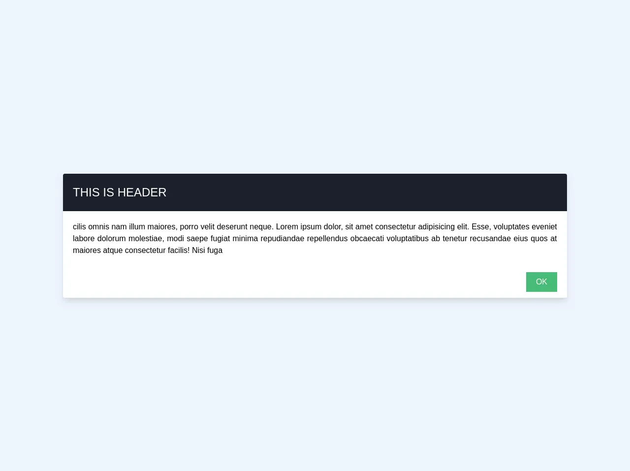
The preview of modal with Vue UI component
To create a modal with Vue and Tailwind CSS, we will use the following Vue component:
<template>
  <div class="modal">
    <div class="modal-overlay"></div>
    <div class="modal-container">
      <div class="modal-header">
        <h3 class="modal-title">{{ title }}</h3>
        <button class="modal-close" @click="$emit('close')">
          <i class="fa fa-times"></i>
        </button>
      </div>
      <div class="modal-body">
        <slot></slot>
      </div>
    </div>
  </div>
</template>
Free download of the modal with vue's source code
The source code of modal with Vue UI component
To create a modal with Vue and Tailwind CSS, we will use the following CSS styles:
.modal {
  position: fixed;
  top: 0;
  left: 0;
  right: 0;
  bottom: 0;
  display: flex;
  justify-content: center;
  align-items: center;
}

.modal-overlay {
  position: absolute;
  top: 0;
  left: 0;
  right: 0;
  bottom: 0;
  background-color: rgba(0, 0, 0, 0.5);
}

.modal-container {
  position: relative;
  background-color: #fff;
  border-radius: 4px;
  box-shadow: 0 0 10px rgba(0, 0, 0, 0.5);
  max-width: 90%;
  max-height: 90%;
  overflow: auto;
}

.modal-header {
  display: flex;
  justify-content: space-between;
  align-items: center;
  padding: 1rem;
  border-bottom: 1px solid #ccc;
}

.modal-title {
  margin: 0;
  font-size: 1.25rem;
}

.modal-close {
  border: none;
  background-color: transparent;
  font-size: 1.5rem;
  cursor: pointer;
}

.modal-close:hover {
  color: #000;
}

.modal-body {
  padding: 1rem;
}
<!DOCTYPE html>
<html lang="en">
<head>
    <meta charset="UTF-8">
    <meta name="viewport" content="width=device-width, initial-scale=1.0">
    <meta http-equiv="X-UA-Compatible" content="ie=edge">

<!--   tailwind cdn -->
    <link href="https://unpkg.com/tailwindcss@^1.0/dist/tailwind.min.css" rel="stylesheet">
    <title>vue modal</title>
</head>
  <style>

  .modal-body{
    max-height: 500px;
  }
  .bg-gray-800-opacity{
    background-color: #2D374850;
  }
  @media screen and (max-width: 768px){
    .modal-body {
        max-height: 400px;
    }
  }

  /* animation for vue transition tag */

  .fade-up-down-enter-active {
    transition: all 0.3s ease;
  }
  .fade-up-down-leave-active {
    transition: all 0.3s ease;
  }
  .fade-up-down-enter {
    transform: translateY(10%);
    opacity: 0;
  }
  .fade-up-down-leave-to {
    transform: translateY(10%);
    opacity: 0;
  }

  .fade-enter-active{
      -webkit-transition: opacity 2s;
      transition: opacity .3s;

  }
  .fade-leave-active {
      transition: opacity .3s;
  }

  .fade-enter,
  .fade-leave-to{
      opacity: 0;
  }


  </style>
<body class="bg-gray-900 relative">
    <div id="app" class="h-full w-full flex items-center justify-center">
    <transition name="fade">

      <div v-show="show_modal" class="fixed inset-0 z-30">

<!--       background -->
        <div v-show="show_modal" @click="showModal()" class="bg-filter bg-white opacity-25 fixed inset-0 w-full h-full z-20">
        </div>
<!--          -->
        <main class="flex flex-col items-center justify-center h-full w-full">
            <transition name="fade-up-down">
                <div v-show="show_modal" class="modal-wrapper inline-block flex items-center z-30">
                    <div class="modal max-w-md mx-auto xl:max-w-5xl lg:max-w-5xl md:max-w-2xl bg-white max-h-screen shadow-lg flex-row rounded relative">

                        <div class="modal-header p-5 bg-gray-900 text-gray-900 rounded-t">
                            <h5 class="text-white text-2xl uppercase">this is header</h5>
                        </div>
                        <div class="modal-body p-5 w-full h-full overflow-y-auto ">
                            <p class="text-justify">
                               cilis omnis nam illum maiores, porro velit deserunt neque.
                                Lorem ipsum dolor, sit amet consectetur adipisicing elit. Esse, voluptates eveniet labore dolorum molestiae, modi saepe fugiat minima repudiandae repellendus obcaecati voluptatibus ab tenetur recusandae eius quos at maiores atque consectetur facilis! Nisi fuga
                            </p>
                        </div>
                        <div class="modal-footer py-3 px-5 border0-t text-right">
                            <button class="bg-green-500 px-5 py-2 text-white" @click="showModal()">OK</button>
                        </div>
                    </div>
                </div>
            </transition>


        </main>
      </div>
    </transition>
    <div>
      <span class="text-gray-300 font-bold">lorem text</span><br>
        <button class="bg-green-500 text-white px-6 py-3 rounded" @click="showModal()">
            show modal
        </button>
    </div>
    </div>
</body>
<!-- Veujs cdn -->
<script crossorigin src="https://cdn.jsdelivr.net/npm/[email protected]/dist/vue.js"></script>
  <script>

   new Vue({
        el:'#app',
        data(){
          return{
            show_modal: true,
          }
        },
        methods:{
          showModal(){
            if(this.show_modal){
              //stop screen scrolling
              document.getElementsByTagName("html")[0].classList.remove('overflow-y-hidden');
              this.show_modal = false;
            }else{
              document.getElementsByTagName("html")[0].classList.add('overflow-y-hidden');
              this.show_modal = true;
            }
          }
        }
      })

  </script>

</html>
How to create a modal with Vue with Tailwind CSS?
To create a modal with Vue and Tailwind CSS, follow these steps:
- Create a Vue component for the modal, as shown above.
- Add the CSS styles for the modal, as shown above.
- Use the modal component in your Vue application, passing the title and content as props.
Here is an example of using the modal component in a Vue application:
<template>
  <div>
    <button @click="showModal = true">Show Modal</button>
    <modal :title="'My Modal'" :show="showModal" @close="showModal = false">
      <p>This is the content of my modal.</p>
    </modal>
  </div>
</template>

<script>
import Modal from './Modal.vue'

export default {
  components: {
    Modal
  },
  data() {
    return {
      showModal: false
    }
  }
}
</script>
In this example, we have created a button that shows the modal when clicked. We pass the title and content of the modal as props to the modal component. The @close event is emitted when the user clicks the close button, which sets the showModal data property to false, hiding the modal.
Conclusion
Creating a modal with Vue and Tailwind CSS is a straightforward process that requires some critical skills. In this article, we have covered the critical skills required to make a modal with Vue and Tailwind CSS remarkably well. We have also provided a preview and source code for creating a modal with Vue and Tailwind CSS. With these skills, you can create beautiful and responsive modals that enhance the user experience of your Vue application.