- Published on
How to Make A Modal With Tailwind CSS?
- What is Tailwind CSS?
- The description of Modal ui component
- Why use Tailwind CSS to create a Modal ui component?
- The preview of Modal ui component
- The source code of Modal ui component
- How to create a Modal with Tailwind CSS?
- Conclusion
What is Tailwind CSS?
Tailwind CSS is a utility-first CSS framework that provides a set of pre-defined classes to speed up the development process. It allows developers to easily create responsive and customizable UI components without having to write any CSS from scratch.
The description of Modal ui component
A modal is a UI component that is used to display content on top of the current page. It is commonly used for displaying messages, forms, and other types of content that require user interaction. Modals are usually triggered by clicking a button or a link and they can be closed by clicking outside the modal or by pressing the escape key.
Why use Tailwind CSS to create a Modal ui component?
Tailwind CSS provides a set of pre-defined classes that can be used to create a modal UI component quickly and easily. These classes can be customized to match the design of your website or application, and they are responsive by default, which means that your modal will look great on any device.
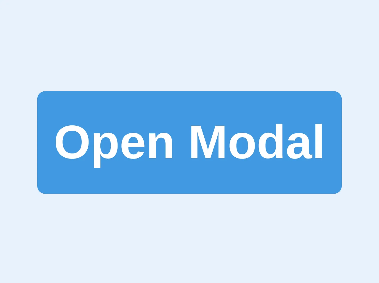
The preview of Modal ui component
To create a modal UI component with Tailwind CSS, you can use the following classes:
fixed: This class is used to position the modal at a fixed position on the screen.inset-0: This class is used to set the top, right, bottom, and left properties to 0, which makes the modal cover the entire screen.bg-gray-900: This class is used to set the background color of the modal to gray.opacity-50: This class is used to set the opacity of the modal to 50%, which makes the content behind the modal partially visible.z-50: This class is used to set the z-index of the modal to 50, which ensures that it appears on top of other elements on the page.
Free download of the Modal's source code
The source code of Modal ui component
To create a modal UI component with Tailwind CSS, you can use the following HTML and CSS code:
<div class="fixed inset-0 bg-gray-900 opacity-50 z-50"></div>

<div class="fixed inset-0 flex items-center justify-center z-50">
  <div class="bg-white rounded-lg p-6">
    <h2 class="text-lg font-medium mb-4">Modal Title</h2>
    <p class="mb-4">Modal Content</p>
    <button class="bg-blue-500 text-white px-4 py-2 rounded hover:bg-blue-600">Close</button>
  </div>
</div>
/* No custom CSS required */
<style>
		.animated {
			-webkit-animation-duration: 1s;
			animation-duration: 1s;
			-webkit-animation-fill-mode: both;
			animation-fill-mode: both;
		}

		.animated.faster {
			-webkit-animation-duration: 500ms;
			animation-duration: 500ms;
		}

		.fadeIn {
			-webkit-animation-name: fadeIn;
			animation-name: fadeIn;
		}

		.fadeOut {
			-webkit-animation-name: fadeOut;
			animation-name: fadeOut;
		}

		@keyframes fadeIn {
			from {
				opacity: 0;
			}

			to {
				opacity: 1;
			}
		}

		@keyframes fadeOut {
			from {
				opacity: 1;
			}

			to {
				opacity: 0;
			}
		}
	</style>

	<div>
		<button onclick="openModal()" class='bg-blue-500 text-white p-2 rounded text-2xl font-bold'>Open Modal</button>
	</div>

	<div class="main-modal fixed w-full h-100 inset-0 z-50 overflow-hidden flex justify-center items-center animated fadeIn faster"
		style="background: rgba(0,0,0,.7);">
		<div
			class="border border-teal-500 shadow-lg modal-container bg-white w-11/12 md:max-w-md mx-auto rounded shadow-lg z-50 overflow-y-auto">
			<div class="modal-content py-4 text-left px-6">
				<!--Title-->
				<div class="flex justify-between items-center pb-3">
					<p class="text-2xl font-bold">Header</p>
					<div class="modal-close cursor-pointer z-50">
						<svg class="fill-current text-black" xmlns="http://www.w3.org/2000/svg" width="18" height="18"
							viewBox="0 0 18 18">
							<path
								d="M14.53 4.53l-1.06-1.06L9 7.94 4.53 3.47 3.47 4.53 7.94 9l-4.47 4.47 1.06 1.06L9 10.06l4.47 4.47 1.06-1.06L10.06 9z">
							</path>
						</svg>
					</div>
				</div>
				<!--Body-->
				<div class="my-5">
					<p>Inliberali Persius Multi iustitia pronuntiaret expeteretur sanos didicisset laus angusti ferrentur arbitrium arbitramur huic desiderent.?</p>
				</div>
				<!--Footer-->
				<div class="flex justify-end pt-2">
					<button
						class="focus:outline-none modal-close px-4 bg-gray-400 p-3 rounded-lg text-black hover:bg-gray-300">Cancel</button>
					<button
						class="focus:outline-none px-4 bg-teal-500 p-3 ml-3 rounded-lg text-white hover:bg-teal-400">Confirm</button>
				</div>
			</div>
		</div>
	</div>

	<script>
		const modal = document.querySelector('.main-modal');
		const closeButton = document.querySelectorAll('.modal-close');

		const modalClose = () => {
			modal.classList.remove('fadeIn');
			modal.classList.add('fadeOut');
			setTimeout(() => {
				modal.style.display = 'none';
			}, 500);
		}

		const openModal = () => {
			modal.classList.remove('fadeOut');
			modal.classList.add('fadeIn');
			modal.style.display = 'flex';
		}

		for (let i = 0; i < closeButton.length; i++) {

			const elements = closeButton[i];

			elements.onclick = (e) => modalClose();

			modal.style.display = 'none';

			window.onclick = function (event) {
				if (event.target == modal) modalClose();
			}
		}
	</script>
How to create a Modal with Tailwind CSS?
To create a modal UI component with Tailwind CSS, follow these steps:
- Create a button or a link that will trigger the modal.
- Add an event listener to the button or link that will show the modal when clicked.
- Add the HTML and CSS code for the modal to your page.
- Customize the modal by adding your own classes or modifying the existing ones.
Here is an example of how to create a modal UI component with Tailwind CSS:
<button id="open-modal" class="bg-blue-500 text-white px-4 py-2 rounded hover:bg-blue-600">Open Modal</button>

<div id="modal" class="fixed inset-0 bg-gray-900 opacity-50 z-50 hidden"></div>

<div class="fixed inset-0 flex items-center justify-center z-50 hidden">
  <div class="bg-white rounded-lg p-6">
    <h2 class="text-lg font-medium mb-4">Modal Title</h2>
    <p class="mb-4">Modal Content</p>
    <button id="close-modal" class="bg-blue-500 text-white px-4 py-2 rounded hover:bg-blue-600">Close</button>
  </div>
</div>

<script>
  const openModalButton = document.getElementById('open-modal');
  const closeModalButton = document.getElementById('close-modal');
  const modal = document.getElementById('modal');

  openModalButton.addEventListener('click', () => {
    modal.classList.remove('hidden');
  });

  closeModalButton.addEventListener('click', () => {
    modal.classList.add('hidden');
  });
</script>
In this example, we have added a button with an ID of open-modal that will trigger the modal when clicked. We have also added an event listener to the button that will remove the hidden class from the modal, which will make it visible on the screen.
We have also added a button with an ID of close-modal that will close the modal when clicked. We have added an event listener to this button that will add the hidden class back to the modal, which will hide it from the screen.
Conclusion
Creating a modal UI component with Tailwind CSS is easy and can be done quickly using pre-defined classes. By following the steps outlined in this article, you can create a modal that looks great on any device and can be customized to match the design of your website or application.