- Published on
How To Create A Mini Column Sidebar With Tailwind CSS In 5 Easy Steps
- What is Tailwind CSS?
- The description of Mini column sidebar ui component
- Why use Tailwind CSS to create a Mini column sidebar ui component?
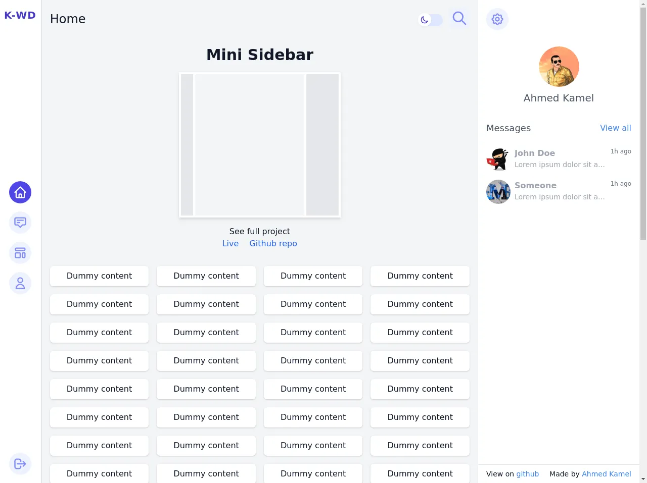
- The preview of Mini column sidebar ui component.
- The source code of Mini column sidebar ui component.
- How to create a Mini column sidebar with Tailwind CSS?
- Conclusion
What is Tailwind CSS?
Tailwind CSS is a utility-first CSS framework that provides a set of pre-defined classes to help developers quickly create modern and responsive user interfaces. It is designed to be highly customizable, allowing developers to easily create unique designs without having to write custom CSS.
The description of Mini column sidebar ui component
A mini column sidebar is a user interface component that is commonly used in web applications to display navigation links or other important information. It is typically a narrow column that is positioned to the left or right of the main content area.
Why use Tailwind CSS to create a Mini column sidebar ui component?
Tailwind CSS provides a set of pre-defined classes that can be used to quickly create a mini column sidebar without having to write custom CSS. This can save developers a significant amount of time and effort, allowing them to focus on other aspects of their application.
The preview of Mini column sidebar ui component.
To create a mini column sidebar using Tailwind CSS, we will start by defining a container element for the sidebar. This element will have a fixed width and will be positioned to the left or right of the main content area. We will then add a list of links or other content to the sidebar, using Tailwind CSS classes to style the elements as needed.
Free download of the Mini column sidebar's source code
The source code of Mini column sidebar ui component.
To create a mini column sidebar using Tailwind CSS, we can use the following HTML and CSS code:
<style>
/* This example part of kwd-dashboard see https://kamona-wd.github.io/kwd-dashboard/ */
/* So here we will write some classes to simulate dark mode and some of tailwind css config in our project */
:root {
--light: #edf2f9;
--dark: #152e4d;
--darker: #12263f;
}
.dark .dark\:text-light {
color: var(--light);
}
.dark .dark\:bg-dark {
background-color: var(--dark);
}
.dark .dark\:bg-darker {
background-color: var(--darker);
}
.dark .dark\:text-gray-300 {
color: #d1d5db;
}
.dark .dark\:text-indigo-700 {
c olor: #4338ca;
}
.dark .dark\:text-indigo-500 {
color: #6366f1;
}
.dark .dark\:text-indigo-100 {
color: #e0e7ff;
}
.dark .dark\:hover\:text-light:hover {
color: var(--light);
}
.dark .dark\:border-indigo-800 {
border-color: #3730a3;
}
.dark .dark\:border-indigo-700 {
border-color: #4338ca;
}
.dark .dark\:bg-indigo-600 {
background-color: #4f46e5;
}
.dark .dark\:hover\:bg-indigo-600:hover {
background-color: #4f46e5;
}
.dark .dark\:border-indigo-500 {
border-color: #6366f1;
}
.dark .group:hover .dark\:group-hover\:text-indigo-400 {
color: #818cf8;
}
.hover\:overflow-y-auto:hover {
overflow-y: auto;
}
</style>
<div
x-data="setup()"
x-init="$refs.loading.classList.add('hidden')"
:class="{ 'dark': isDark}"
@resize.window="watchScreen()"
>
<div class="flex h-screen antialiased text-gray-900 bg-gray-100 dark:bg-dark dark:text-light">
<!-- Loading screen -->
<div
x-ref="loading"
class="fixed inset-0 z-50 flex items-center justify-center text-2xl font-semibold text-white bg-indigo-800"
>
Loading.....
</div>
<!-- Sidebar first column -->
<!-- Backdrop -->
<div
x-show="isSidebarOpen"
@click="isSidebarOpen = false"
class="fixed inset-0 z-10 bg-indigo-800 md:hidden"
style="opacity: 0.5"
aria-hidden="true"
></div>
<aside
x-show="isSidebarOpen"
x-transition:enter="transition-all transform duration-300 ease-in-out"
x-transition:enter-start="-translate-x-full opacity-0"
x-transition:enter-end="translate-x-0 opacity-100"
x-transition:leave="transition-all transform duration-300 ease-in-out"
x-transition:leave-start="translate-x-0 opacity-100"
x-transition:leave-end="-translate-x-full opacity-0"
x-ref="sidebar"
@keydown.escape="window.innerWidth <= 768 ? isSidebarOpen = false : ''"
tabindex="-1"
class="fixed inset-y-0 z-10 flex flex-shrink-0 bg-white border-r md:static dark:border-indigo-800 dark:bg-darker focus:outline-none"
>
<!-- Mini column -->
<nav class="flex flex-col flex-shrink-0 h-full px-2 py-4 border-r dark:border-indigo-800">
<!-- Brand -->
<div class="flex-shrink-0">
<a
href="https://kamona-wd.github.io/kwd-dashboard/"
class="inline-block text-xl font-bold tracking-wider text-indigo-700 uppercase dark:text-light"
>
K-WD
</a>
</div>
<div class="flex flex-col items-center justify-center flex-1 space-y-4">
<!-- Home link -->
<!-- Active classes "bg-indigo-600 text-white" -->
<!-- inActive classes "bg-indigo-50 text-indigo-400" -->
<a
href="#"
class="p-2 text-white transition-colors duration-200 bg-indigo-600 rounded-full hover:text-indigo-600 hover:bg-indigo-100 dark:hover:text-light dark:hover:bg-indigo-700 dark:bg-dark focus:outline-none focus:bg-indigo-100 dark:focus:bg-indigo-700 focus:ring-indigo-800"
>
<span class="sr-only">Home</span>
<svg
class="w-7 h-7"
xmlns="http://www.w3.org/2000/svg"
fill="none"
viewBox="0 0 24 24"
stroke="currentColor"
>
<path
stroke-linecap="round"
stroke-linejoin="round"
stroke-width="2"
d="M3 12l2-2m0 0l7-7 7 7M5 10v10a1 1 0 001 1h3m10-11l2 2m-2-2v10a1 1 0 01-1 1h-3m-6 0a1 1 0 001-1v-4a1 1 0 011-1h2a1 1 0 011 1v4a1 1 0 001 1m-6 0h6"
/>
</svg>
</a>
<!-- Message link -->
<!-- Active classes "bg-indigo-600 text-white" -->
<!-- inActive classes "bg-indigo-50 text-indigo-400" -->
<a
href="#"
class="p-2 text-indigo-400 transition-colors duration-200 rounded-full bg-indigo-50 hover:text-indigo-600 hover:bg-indigo-100 dark:hover:text-light dark:hover:bg-indigo-700 dark:bg-dark focus:outline-none focus:bg-indigo-100 dark:focus:bg-indigo-700 focus:ring-indigo-800"
>
<span class="sr-only">Messages</span>
<svg
class="w-7 h-7"
xmlns="http://www.w3.org/2000/svg"
fill="none"
viewBox="0 0 24 24"
stroke="currentColor"
>
<path
stroke-linecap="round"
stroke-linejoin="round"
stroke-width="2"
d="M7 8h10M7 12h4m1 8l-4-4H5a2 2 0 01-2-2V6a2 2 0 012-2h14a2 2 0 012 2v8a2 2 0 01-2 2h-3l-4 4z"
/>
</svg>
</a>
<!-- Another link -->
<!-- Active classes "bg-indigo-600 text-white" -->
<!-- inActive classes "bg-indigo-50 text-indigo-400" -->
<a
href="#"
class="p-2 text-indigo-400 transition-colors duration-200 rounded-full bg-indigo-50 hover:text-indigo-600 hover:bg-indigo-100 dark:hover:text-light dark:hover:bg-indigo-700 dark:bg-dark focus:outline-none focus:bg-indigo-100 dark:focus:bg-indigo-700 focus:ring-indigo-800"
>
<span class="sr-only">Another Link</span>
<svg
class="w-7 h-7"
xmlns="http://www.w3.org/2000/svg"
fill="none"
viewBox="0 0 24 24"
stroke="currentColor"
>
<path
stroke-linecap="round"
stroke-linejoin="round"
stroke-width="2"
d="M4 5a1 1 0 011-1h14a1 1 0 011 1v2a1 1 0 01-1 1H5a1 1 0 01-1-1V5zM4 13a1 1 0 011-1h6a1 1 0 011 1v6a1 1 0 01-1 1H5a1 1 0 01-1-1v-6zM16 13a1 1 0 011-1h2a1 1 0 011 1v6a1 1 0 01-1 1h-2a1 1 0 01-1-1v-6z"
/>
</svg>
</a>
<!-- Users link -->
<!-- Active classes "bg-indigo-600 text-white" -->
<!-- inActive classes "bg-indigo-50 text-indigo-400" -->
<a
href="#"
class="p-2 text-indigo-400 transition-colors duration-200 rounded-full bg-indigo-50 hover:text-indigo-600 hover:bg-indigo-100 dark:hover:text-light dark:hover:bg-indigo-700 dark:bg-dark focus:outline-none focus:bg-indigo-100 dark:focus:bg-indigo-700 focus:ring-indigo-800"
>
<span class="sr-only">Users</span>
<svg
class="w-7 h-7"
xmlns="http://www.w3.org/2000/svg"
fill="none"
viewBox="0 0 24 24"
stroke="currentColor"
>
<path
stroke-linecap="round"
stroke-linejoin="round"
stroke-width="2"
d="M16 7a4 4 0 11-8 0 4 4 0 018 0zM12 14a7 7 0 00-7 7h14a7 7 0 00-7-7z"
/>
</svg>
</a>
</div>
<!-- Sidebar footer -->
<!-- prevent default just to prevent form submission in this demo -->
<form @submit="$event.preventDefault()" action="#" class="flex items-center justify-center flex-shrink-0">
<!-- Logout button -->
<button
class="p-2 text-indigo-400 transition-colors duration-200 rounded-full bg-indigo-50 hover:text-indigo-600 hover:bg-indigo-100 dark:hover:text-light dark:hover:bg-indigo-700 dark:bg-dark focus:outline-none focus:bg-indigo-100 dark:focus:bg-indigo-700 focus:ring-indigo-800"
>
<span class="sr-only">Logout</span>
<svg
class="w-7 h-7"
xmlns="http://www.w3.org/2000/svg"
fill="none"
viewBox="0 0 24 24"
stroke="currentColor"
>
<path
stroke-linecap="round"
stroke-linejoin="round"
stroke-width="2"
d="M17 16l4-4m0 0l-4-4m4 4H7m6 4v1a3 3 0 01-3 3H6a3 3 0 01-3-3V7a3 3 0 013-3h4a3 3 0 013 3v1"
/>
</svg>
</button>
</form>
</nav>
</aside>
<div class="flex flex-1 h-screen overflow-y-scroll">
<!-- Main content -->
<main class="flex-1">
<header class="flex items-center justify-between p-4">
<div class="flex items-center space-x-4 md:space-x-0">
<!-- Sidebar button -->
<button
@click="isSidebarOpen = true; $nextTick(() => { $refs.sidebar.focus() })"
class="p-1 text-indigo-400 transition-colors duration-200 rounded-md bg-indigo-50 md:hidden hover:text-indigo-600 hover:bg-indigo-100 dark:hover:text-light dark:hover:bg-indigo-700 dark:bg-dark focus:outline-none focus:ring"
>
<span class="sr-only">Open main manu</span>
<span aria-hidden="true">
<svg
x-show="!isSidebarOpen"
class="w-8 h-8"
xmlns="http://www.w3.org/2000/svg"
fill="none"
viewBox="0 0 24 24"
stroke="currentColor"
>
<path
stroke-linecap="round"
stroke-linejoin="round"
stroke-width="2"
d="M4 6h16M4 12h16M4 18h16"
/>
</svg>
<svg
x-show="isSidebarOpen"
class="w-8 h-8"
xmlns="http://www.w3.org/2000/svg"
fill="none"
viewBox="0 0 24 24"
stroke="currentColor"
>
<path stroke-linecap="round" stroke-linejoin="round" stroke-width="2" d="M6 18L18 6M6 6l12 12" />
</svg>
</span>
</button>
<h1 class="text-2xl font-medium">Home</h1>
</div>
<div class="space-x-2">
<!-- Toggle dark theme button -->
<button aria-hidden="true" class="relative focus:outline-none" x-cloak @click="toggleTheme">
<div class="w-12 h-6 transition bg-indigo-100 rounded-full outline-none dark:bg-indigo-400"></div>
<div
class="absolute top-0 left-0 inline-flex items-center justify-center w-6 h-6 transition-all duration-150 transform scale-110 rounded-full shadow-sm"
:class="{ 'translate-x-0 -translate-y-px bg-white text-indigo-700': !isDark, 'translate-x-6 text-indigo-100 bg-indigo-800': isDark }"
>
<svg
x-show="!isDark"
class="w-4 h-4"
xmlns="http://www.w3.org/2000/svg"
fill="none"
viewBox="0 0 24 24"
stroke="currentColor"
>
<path
stroke-linecap="round"
stroke-linejoin="round"
stroke-width="2"
d="M20.354 15.354A9 9 0 018.646 3.646 9.003 9.003 0 0012 21a9.003 9.003 0 008.354-5.646z"
/>
</svg>
<svg
x-show="isDark"
class="w-4 h-4"
xmlns="http://www.w3.org/2000/svg"
fill="none"
viewBox="0 0 24 24"
stroke="currentColor"
>
<path
stroke-linecap="round"
stroke-linejoin="round"
stroke-width="2"
d="M11.049 2.927c.3-.921 1.603-.921 1.902 0l1.519 4.674a1 1 0 00.95.69h4.915c.969 0 1.371 1.24.588 1.81l-3.976 2.888a1 1 0 00-.363 1.118l1.518 4.674c.3.922-.755 1.688-1.538 1.118l-3.976-2.888a1 1 0 00-1.176 0l-3.976 2.888c-.783.57-1.838-.197-1.538-1.118l1.518-4.674a1 1 0 00-.363-1.118l-3.976-2.888c-.784-.57-.38-1.81.588-1.81h4.914a1 1 0 00.951-.69l1.519-4.674z"
/>
</svg>
</div>
</button>
<!-- Search panel button -->
<button
@click="openSearchPanel"
class="p-1 text-indigo-400 transition-colors duration-200 rounded-md bg-indigo-50 hover:text-indigo-600 hover:bg-indigo-100 dark:hover:text-light dark:hover:bg-indigo-700 dark:bg-dark focus:outline-none focus:ring"
>
<span class="sr-only">Open search panel</span>
<span aria-hidden="true">
<svg
class="w-8 h-8"
xmlns="http://www.w3.org/2000/svg"
fill="none"
viewBox="0 0 24 24"
stroke="currentColor"
>
<path
stroke-linecap="round"
stroke-linejoin="round"
stroke-width="2"
d="M21 21l-6-6m2-5a7 7 0 11-14 0 7 7 0 0114 0z"
/>
</svg>
</span>
</button>
<!-- User panel button -->
<button
@click="openUserPanel"
class="p-1 text-indigo-400 transition-colors duration-200 rounded-md bg-indigo-50 xl:hidden hover:text-indigo-600 hover:bg-indigo-100 dark:hover:text-light dark:hover:bg-indigo-700 dark:bg-dark focus:outline-none focus:ring"
>
<span class="sr-only">Open user panel</span>
<span aria-hidden="true">
<svg
class="w-8 h-8"
xmlns="http://www.w3.org/2000/svg"
fill="none"
viewBox="0 0 24 24"
stroke="currentColor"
>
<path
stroke-linecap="round"
stroke-linejoin="round"
stroke-width="2"
d="M12 5v.01M12 12v.01M12 19v.01M12 6a1 1 0 110-2 1 1 0 010 2zm0 7a1 1 0 110-2 1 1 0 010 2zm0 7a1 1 0 110-2 1 1 0 010 2z"
/>
</svg>
</span>
</button>
</div>
</header>
<section class="flex flex-col items-center justify-center p-4 space-y-4">
<h3 class="text-2xl font-semibold text-center md:text-3xl">Mini Sidebar</h3>
<div class="flex p-1 space-x-1 bg-white shadow-md w-80 h-72 dark:bg-darker">
<div class="w-6 h-full bg-gray-200 dark:bg-dark"></div>
<div class="flex-1 h-full bg-gray-100 dark:bg-dark"></div>
<div class="w-16 h-full bg-gray-200 dark:bg-dark"></div>
</div>
<div>
<p class="text-center">See full project</p>
<a
href="https://kamona-wd.github.io/kwd-dashboard/"
target="_blank"
class="text-base text-blue-600 hover:underline"
>
Live
</a>
<a
href="https://github.com/Kamona-WD/kwd-dashboard"
target="_blank"
class="ml-4 text-base text-blue-600 hover:underline"
>
Github repo
</a>
</div>
</section>
<div class="grid grid-cols-1 gap-4 p-4 md:grid-cols-2 xl:grid-cols-4 2xl:grid-cols-6">
<template x-for="i in 100" x-key="i">
<div class="p-2 text-center bg-white rounded-md shadow dark:bg-darker">Dummy content</div>
</template>
</div>
</main>
<!-- User panel -->
<section
x-show="isUserPanelOpen"
x-transition:enter="transition duration-300 ease-in-out transform"
x-transition:enter-start="translate-x-full"
x-transition:enter-end="translate-x-0"
x-transition:leave="transition duration-300 ease-in-out transform"
x-transition:leave-start="translate-x-0"
x-transition:leave-end="translate-x-full"
@keydown.escape="window.innerWidth <= 1024 ? isUserPanelOpen = false : ''"
tabindex="-1"
x-ref="userPanel"
class="fixed inset-y-0 top-0 right-0 z-10 flex-shrink-0 bg-white xl:z-0 xl:sticky w-80 dark:bg-darker dark:text-light xl:border-l dark:border-indigo-800 focus:outline-none"
>
<h2 class="sr-only">User panel</h2>
<!-- Close button -->
<div class="absolute left-0 p-2 transform -translate-x-full xl:hidden">
<button
@click="isUserPanelOpen = false"
class="p-2 rounded-md text-dark dark:text-light focus:outline-none focus:ring"
>
<svg
class="w-5 h-5"
xmlns="http://www.w3.org/2000/svg"
fill="none"
viewBox="0 0 24 24"
stroke="currentColor"
>
<path stroke-linecap="round" stroke-linejoin="round" stroke-width="2" d="M6 18L18 6M6 6l12 12" />
</svg>
</button>
</div>
<div class="flex flex-col h-screen">
<!-- Panel header -->
<div class="flex-shrink-0 p-4">
<!-- Settings button -->
<button
@click="openSettingsPanel"
class="p-2 text-indigo-400 transition-colors duration-200 rounded-full bg-indigo-50 hover:text-indigo-600 hover:bg-indigo-100 dark:hover:text-light dark:hover:bg-indigo-700 dark:bg-dark focus:outline-none focus:bg-indigo-100 dark:focus:bg-indigo-700 focus:ring-indigo-800"
>
<span class="sr-only">Open settings panel</span>
<svg
class="w-7 h-7"
xmlns="http://www.w3.org/2000/svg"
fill="none"
viewBox="0 0 24 24"
stroke="currentColor"
aria-hidden="true"
>
<path
stroke-linecap="round"
stroke-linejoin="round"
stroke-width="2"
d="M10.325 4.317c.426-1.756 2.924-1.756 3.35 0a1.724 1.724 0 002.573 1.066c1.543-.94 3.31.826 2.37 2.37a1.724 1.724 0 001.065 2.572c1.756.426 1.756 2.924 0 3.35a1.724 1.724 0 00-1.066 2.573c.94 1.543-.826 3.31-2.37 2.37a1.724 1.724 0 00-2.572 1.065c-.426 1.756-2.924 1.756-3.35 0a1.724 1.724 0 00-2.573-1.066c-1.543.94-3.31-.826-2.37-2.37a1.724 1.724 0 00-1.065-2.572c-1.756-.426-1.756-2.924 0-3.35a1.724 1.724 0 001.066-2.573c-.94-1.543.826-3.31 2.37-2.37.996.608 2.296.07 2.572-1.065z"
/>
<path
stroke-linecap="round"
stroke-linejoin="round"
stroke-width="2"
d="M15 12a3 3 0 11-6 0 3 3 0 016 0z"
/>
</svg>
</button>
</div>
<!-- Panel content -->
<div class="flex-1 p-4 space-y-8 overflow-y-hidden hover:overflow-y-auto">
<!-- content -->
<div class="flex flex-col items-center space-y-2">
<!-- User avatar -->
<img
class="w-20 h-20 rounded-full dark:opacity-70"
src="https://avatars.githubusercontent.com/u/57622665?s=460&u=8f581f4c4acd4c18c33a87b3e6476112325e8b38&v=4"
alt="Ahmed Kamel"
/>
<h2 class="text-xl font-medium text-gray-600 dark:text-light">Ahmed Kamel</h2>
</div>
<div class="space-y-6">
<div class="flex items-center justify-between">
<h3 class="text-lg font-normal text-gray-600 dark:text-light">Messages</h3>
<a href="#" class="text-blue-500 hover:underline">View all</a>
</div>
<div class="space-y-4">
<a href="#" class="flex items-start space-x-2 group">
<img
class="flex-shrink-0 object-cover w-12 h-12 rounded-full"
src="https://scontent-hbe1-1.xx.fbcdn.net/v/t1.0-9/82125466_110587420467089_5876443407655632896_n.jpg?_nc_cat=102&ccb=3&_nc_sid=09cbfe&_nc_ohc=GrzMqB3w0WMAX_PK3hf&_nc_ht=scontent-hbe1-1.xx&oh=a51c1ffff60c83e73c3ef0c9c70afafa&oe=6056CFF5"
alt="John Doe"
/>
<div class="overflow-hidden">
<h4
class="font-semibold text-gray-400 transition-colors dark:text-indigo-700 group-hover:text-gray-900 dark:group-hover:text-indigo-400"
>
John Doe
</h4>
<p class="text-sm text-gray-400 truncate">
Lorem ipsum dolor sit amet consectetur adipisicing elit. Quis voluptas eaque nesciunt
doloremque ullam
</p>
</div>
<span class="text-xs text-gray-500 whitespace-nowrap dark:text-indigo-500">1h ago</span>
</a>
<a href="#" class="flex items-start space-x-2 group">
<img
class="flex-shrink-0 object-cover w-12 h-12 rounded-full"
src="https://pbs.twimg.com/profile_banners/1320412502195306496/1603647296/1500x500"
alt="John Doe"
/>
<div class="overflow-hidden">
<h4
class="font-semibold text-gray-400 transition-colors dark:text-indigo-700 group-hover:text-gray-900 dark:group-hover:text-indigo-400"
>
Someone
</h4>
<p class="text-sm text-gray-400 truncate">
Lorem ipsum dolor sit amet consectetur adipisicing elit. Quis voluptas eaque nesciunt
doloremque ullam
</p>
</div>
<span class="text-xs text-gray-500 whitespace-nowrap dark:text-indigo-500">1h ago</span>
</a>
</div>
</div>
</div>
<!-- Panel footer -->
<footer class="flex items-center justify-between flex-shrink-0 px-4 py-2 border-t dark:border-indigo-800">
<div class="text-sm">
View on
<a
href="https://github.com/Kamona-WD/kwd-dashboard"
target="_blank"
class="text-blue-500 hover:underline"
>
github
</a>
</div>
<div class="text-sm">
Made by
<a href="https://github.com/Kamona-WD" target="_blank" class="text-blue-500 hover:underline">
Ahmed Kamel
</a>
</div>
</footer>
</div>
</section>
</div>
<!-- Panels -->
<!-- Settings Panel -->
<!-- Backdrop -->
<div
x-transition:enter="transition duration-300 ease-in-out"
x-transition:enter-start="opacity-0"
x-transition:enter-end="opacity-100"
x-transition:leave="transition duration-300 ease-in-out"
x-transition:leave-start="opacity-100"
x-transition:leave-end="opacity-0"
x-show="isSettingsPanelOpen"
@click="isSettingsPanelOpen = false"
class="fixed inset-0 z-10 bg-indigo-800"
style="opacity: 0.5"
aria-hidden="true"
></div>
<!-- Panel -->
<section
x-transition:enter="transition duration-300 ease-in-out transform sm:duration-500"
x-transition:enter-start="translate-x-full"
x-transition:enter-end="translate-x-0"
x-transition:leave="transition duration-300 ease-in-out transform sm:duration-500"
x-transition:leave-start="translate-x-0"
x-transition:leave-end="translate-x-full"
x-ref="settingsPanel"
tabindex="-1"
x-show="isSettingsPanelOpen"
@keydown.escape="isSettingsPanelOpen = false"
class="fixed inset-y-0 right-0 z-20 w-full max-w-xs bg-white shadow-xl dark:bg-darker dark:text-light sm:max-w-md focus:outline-none"
aria-labelledby="settinsPanelLabel"
>
<div class="absolute left-0 p-2 transform -translate-x-full">
<!-- Close button -->
<button
@click="isSettingsPanelOpen = false"
class="p-2 text-white rounded-md focus:outline-none focus:ring"
>
<svg
class="w-5 h-5"
xmlns="http://www.w3.org/2000/svg"
fill="none"
viewBox="0 0 24 24"
stroke="currentColor"
>
<path stroke-linecap="round" stroke-linejoin="round" stroke-width="2" d="M6 18L18 6M6 6l12 12" />
</svg>
</button>
</div>
<!-- Panel content -->
<div class="flex flex-col h-screen">
<!-- Panel header -->
<div
class="flex flex-col items-center justify-center flex-shrink-0 px-4 py-8 space-y-4 border-b dark:border-indigo-700"
>
<span aria-hidden="true" class="text-gray-500 dark:text-indigo-600">
<svg
class="w-8 h-8"
xmlns="http://www.w3.org/2000/svg"
fill="none"
viewBox="0 0 24 24"
stroke="currentColor"
>
<path
stroke-linecap="round"
stroke-linejoin="round"
stroke-width="2"
d="M12 6V4m0 2a2 2 0 100 4m0-4a2 2 0 110 4m-6 8a2 2 0 100-4m0 4a2 2 0 110-4m0 4v2m0-6V4m6 6v10m6-2a2 2 0 100-4m0 4a2 2 0 110-4m0 4v2m0-6V4"
/>
</svg>
</span>
<h2 id="settinsPanelLabel" class="text-xl font-medium text-gray-500 dark:text-light">Settings</h2>
</div>
<!-- Content -->
<div class="flex-1 overflow-hidden hover:overflow-y-auto">
<!-- Theme -->
<div class="p-4 space-y-4 md:p-8">
<h6 class="text-lg font-medium text-gray-400 dark:text-light">Mode</h6>
<div class="flex items-center space-x-8">
<!-- Light button -->
<button
@click="setLightTheme"
class="flex items-center justify-center px-4 py-2 space-x-4 transition-colors border rounded-md hover:text-gray-900 hover:border-gray-900 dark:border-indigo-600 dark:hover:text-indigo-100 dark:hover:border-indigo-500 focus:outline-none focus:ring focus:ring-indigo-400 dark:focus:ring-indigo-700"
:class="{ 'border-gray-900 text-gray-900 dark:border-indigo-500 dark:text-indigo-100': !isDark, 'text-gray-500 dark:text-indigo-500': isDark }"
>
<span>
<svg
class="w-6 h-6"
xmlns="http://www.w3.org/2000/svg"
fill="none"
viewBox="0 0 24 24"
stroke="currentColor"
>
<path
stroke-linecap="round"
stroke-linejoin="round"
stroke-width="2"
d="M11.049 2.927c.3-.921 1.603-.921 1.902 0l1.519 4.674a1 1 0 00.95.69h4.915c.969 0 1.371 1.24.588 1.81l-3.976 2.888a1 1 0 00-.363 1.118l1.518 4.674c.3.922-.755 1.688-1.538 1.118l-3.976-2.888a1 1 0 00-1.176 0l-3.976 2.888c-.783.57-1.838-.197-1.538-1.118l1.518-4.674a1 1 0 00-.363-1.118l-3.976-2.888c-.784-.57-.38-1.81.588-1.81h4.914a1 1 0 00.951-.69l1.519-4.674z"
/>
</svg>
</span>
<span>Light</span>
</button>
<!-- Dark button -->
<button
@click="setDarkTheme"
class="flex items-center justify-center px-4 py-2 space-x-4 transition-colors border rounded-md hover:text-gray-900 hover:border-gray-900 dark:border-indigo-600 dark:hover:text-indigo-100 dark:hover:border-indigo-500 focus:outline-none focus:ring focus:ring-indigo-400 dark:focus:ring-indigo-700"
:class="{ 'border-gray-900 text-gray-900 dark:border-indigo-500 dark:text-indigo-100': isDark, 'text-gray-500 dark:text-indigo-500': !isDark }"
>
<span>
<svg
class="w-6 h-6"
xmlns="http://www.w3.org/2000/svg"
fill="none"
viewBox="0 0 24 24"
stroke="currentColor"
>
<path
stroke-linecap="round"
stroke-linejoin="round"
stroke-width="2"
d="M20.354 15.354A9 9 0 018.646 3.646 9.003 9.003 0 0012 21a9.003 9.003 0 008.354-5.646z"
/>
</svg>
</span>
<span>Dark</span>
</button>
</div>
</div>
<!-- -->
<div class="p-4 space-y-4 md:p-8">
<!-- -->
</div>
</div>
</div>
</section>
<!-- Search panel -->
<!-- Backdrop -->
<div
x-transition:enter="transition duration-300 ease-in-out"
x-transition:enter-start="opacity-0"
x-transition:enter-end="opacity-100"
x-transition:leave="transition duration-300 ease-in-out"
x-transition:leave-start="opacity-100"
x-transition:leave-end="opacity-0"
x-show="isSearchPanelOpen"
@click="isSearchPanelOpen = false"
class="fixed inset-0 z-10 bg-indigo-800"
style="opacity: 0.5"
aria-hidden="ture"
></div>
<!-- Panel -->
<section
x-transition:enter="transition duration-300 ease-in-out transform sm:duration-500"
x-transition:enter-start="-translate-x-full"
x-transition:enter-end="translate-x-0"
x-transition:leave="transition duration-300 ease-in-out transform sm:duration-500"
x-transition:leave-start="translate-x-0"
x-transition:leave-end="-translate-x-full"
x-show="isSearchPanelOpen"
@keydown.escape="isSearchPanelOpen = false"
class="fixed inset-y-0 z-20 w-full max-w-xs bg-white shadow-xl dark:bg-darker dark:text-light sm:max-w-md focus:outline-none"
>
<div class="absolute right-0 p-2 transform translate-x-full">
<!-- Close button -->
<button @click="isSearchPanelOpen = false" class="p-2 text-white rounded-md focus:outline-none focus:ring">
<svg
class="w-5 h-5"
xmlns="http://www.w3.org/2000/svg"
fill="none"
viewBox="0 0 24 24"
stroke="currentColor"
>
<path stroke-linecap="round" stroke-linejoin="round" stroke-width="2" d="M6 18L18 6M6 6l12 12" />
</svg>
</button>
</div>
<h2 class="sr-only">Search panel</h2>
<!-- Panel content -->
<div class="flex flex-col h-screen">
<!-- Panel header (Search input) -->
<div
class="relative flex-shrink-0 px-4 py-8 text-gray-400 border-b dark:border-indigo-800 dark:focus-within:text-light focus-within:text-gray-700"
>
<span class="absolute inset-y-0 inline-flex items-center px-4">
<svg
class="w-5 h-5"
xmlns="http://www.w3.org/2000/svg"
fill="none"
viewBox="0 0 24 24"
stroke="currentColor"
>
<path
stroke-linecap="round"
stroke-linejoin="round"
stroke-width="2"
d="M21 21l-6-6m2-5a7 7 0 11-14 0 7 7 0 0114 0z"
/>
</svg>
</span>
<input
x-ref="searchInput"
type="text"
class="w-full py-2 pl-10 pr-4 border rounded-full dark:bg-dark dark:border-transparent dark:text-light focus:outline-none focus:ring"
placeholder="Search..."
/>
</div>
<!-- Panel content (Search result) -->
<div class="flex-1 px-4 pb-4 space-y-4 overflow-y-hidden h hover:overflow-y-auto">
<h3 class="py-2 text-sm font-semibold text-gray-600 dark:text-light">History</h3>
<p class="px=4">Search resault</p>
<!-- -->
<!-- Search content -->
<!-- -->
</div>
</div>
</section>
</div>
</div>
<script src="https://cdn.jsdelivr.net/gh/alpine-collective/[email protected]/dist/component.min.js"></script>
<script src="https://cdn.jsdelivr.net/gh/alpinejs/[email protected]/dist/alpine.min.js" defer></script>
<script>
const setup = () => {
const getTheme = () => {
if (window.localStorage.getItem('dark')) {
return JSON.parse(window.localStorage.getItem('dark'))
}
return !!window.matchMedia && window.matchMedia('(prefers-color-scheme: dark)').matches
}
const setTheme = (value) => {
window.localStorage.setItem('dark', value)
}
return {
loading: true,
isDark: getTheme(),
toggleTheme() {
this.isDark = !this.isDark
setTheme(this.isDark)
},
setLightTheme() {
this.isDark = false
setTheme(this.isDark)
},
setDarkTheme() {
this.isDark = true
setTheme(this.isDark)
},
watchScreen() {
if (window.innerWidth <= 768) {
this.isSidebarOpen = false
this.isUserPanelOpen = false
} else if (window.innerWidth >= 768 && window.innerWidth < 1280) {
this.isSidebarOpen = true
this.isUserPanelOpen = false
} else if (window.innerWidth >= 1280) {
this.isSidebarOpen = true
this.isUserPanelOpen = true
}
},
isSidebarOpen: window.innerWidth >= 768 ? true : false,
toggleSidbarMenu() {
this.isSidebarOpen = !this.isSidebarOpen
},
isUserPanelOpen: window.innerWidth >= 1280 ? true : false,
openUserPanel() {
this.isUserPanelOpen = true
this.$nextTick(() => {
this.$refs.userPanel.focus()
})
},
isSettingsPanelOpen: false,
openSettingsPanel() {
this.isSettingsPanelOpen = true
this.$nextTick(() => {
this.$refs.settingsPanel.focus()
})
},
isNotificationsPanelOpen: false,
openNotificationsPanel() {
this.isNotificationsPanelOpen = true
this.$nextTick(() => {
this.$refs.notificationsPanel.focus()
})
},
isSearchPanelOpen: false,
openSearchPanel() {
this.isSearchPanelOpen = true
this.$nextTick(() => {
this.$refs.searchInput.focus()
})
},
}
}
</script>
How to create a Mini column sidebar with Tailwind CSS?
Step 1: Create the HTML structure for the sidebar
To create the HTML structure for the mini column sidebar, we will start by defining a container element for the sidebar. This element will have a fixed width and will be positioned to the left or right of the main content area. We will also add a list of links or other content to the sidebar.
<div class="flex">
  <div class="w-1/4 bg-gray-100 h-screen">
    <ul class="list-reset">
      <li class="py-2 px-4 bg-gray-200 border-r-4 border-gray-400">
        <a href="#" class="text-gray-700 font-bold">Dashboard</a>
      </li>
      <li class="py-2 px-4">
        <a href="#" class="text-gray-700 font-bold">Projects</a>
      </li>
      <li class="py-2 px-4">
        <a href="#" class="text-gray-700 font-bold">Team</a>
      </li>
      <li class="py-2 px-4">
        <a href="#" class="text-gray-700 font-bold">Settings</a>
      </li>
    </ul>
  </div>
  <div class="w-3/4 bg-gray-200 h-screen">
    <p class="p-4">Main content goes here.</p>
  </div>
</div>
In this example, we have used the flex class to create a flexbox layout for the main content area and the sidebar. We have also used the w-1/4 class to set the width of the sidebar to 25% of the available space, and the bg-gray-100 class to set the background color of the sidebar to light gray.
Step 2: Style the sidebar
To style the sidebar, we will use Tailwind CSS classes to add padding, borders, and other visual elements.
<div class="flex">
  <div class="w-1/4 bg-gray-100 h-screen">
    <ul class="list-reset">
      <li class="py-2 px-4 bg-gray-200 border-r-4 border-gray-400">
        <a href="#" class="text-gray-700 font-bold">Dashboard</a>
      </li>
      <li class="py-2 px-4">
        <a href="#" class="text-gray-700 font-bold">Projects</a>
      </li>
      <li class="py-2 px-4">
        <a href="#" class="text-gray-700 font-bold">Team</a>
      </li>
      <li class="py-2 px-4">
        <a href="#" class="text-gray-700 font-bold">Settings</a>
      </li>
    </ul>
  </div>
  <div class="w-3/4 bg-gray-200 h-screen">
    <p class="p-4">Main content goes here.</p>
  </div>
</div>
In this example, we have used the py-2 class to add vertical padding to the list items, and the px-4 class to add horizontal padding. We have also used the bg-gray-200 class to set the background color of the list items to light gray, and the border-r-4 and border-gray-400 classes to add a border to the right side of the first list item.
Step 3: Position the sidebar
To position the sidebar to the left or right of the main content area, we will use the flex class to create a flexbox layout.
<div class="flex">
  <div class="w-1/4 bg-gray-100 h-screen">
    <ul class="list-reset">
      <li class="py-2 px-4 bg-gray-200 border-r-4 border-gray-400">
        <a href="#" class="text-gray-700 font-bold">Dashboard</a>
      </li>
      <li class="py-2 px-4">
        <a href="#" class="text-gray-700 font-bold">Projects</a>
      </li>
      <li class="py-2 px-4">
        <a href="#" class="text-gray-700 font-bold">Team</a>
      </li>
      <li class="py-2 px-4">
        <a href="#" class="text-gray-700 font-bold">Settings</a>
      </li>
    </ul>
  </div>
  <div class="w-3/4 bg-gray-200 h-screen">
    <p class="p-4">Main content goes here.</p>
  </div>
</div>
In this example, we have used the flex class to create a flexbox layout for the main content area and the sidebar. We have also used the w-1/4 class to set the width of the sidebar to 25% of the available space.
Step 4: Add responsiveness
To make the mini column sidebar responsive, we can use Tailwind CSS classes to adjust the layout based on the screen size.
<div class="flex flex-col md:flex-row">
  <div class="w-full md:w-1/4 bg-gray-100 h-screen">
    <ul class="list-reset">
      <li class="py-2 px-4 bg-gray-200 border-r-4 border-gray-400">
        <a href="#" class="text-gray-700 font-bold">Dashboard</a>
      </li>
      <li class="py-2 px-4">
        <a href="#" class="text-gray-700 font-bold">Projects</a>
      </li>
      <li class="py-2 px-4">
        <a href="#" class="text-gray-700 font-bold">Team</a>
      </li>
      <li class="py-2 px-4">
        <a href="#" class="text-gray-700 font-bold">Settings</a>
      </li>
    </ul>
  </div>
  <div class="w-full md:w-3/4 bg-gray-200 h-screen">
    <p class="p-4">Main content goes here.</p>
  </div>
</div>
In this example, we have used the flex-col and md:flex-row classes to create a column layout for small screens and a row layout for medium screens and above. We have also used the w-full and md:w-1/4 classes to set the width of the sidebar to 100% on small screens and 25% on medium screens and above.
Step 5: Customize the design
To customize the design of the mini column sidebar, we can use Tailwind CSS classes to adjust the colors, fonts, and other visual elements.
<div class="flex flex-col md:flex-row">
  <div class="w-full md:w-1/4 bg-gray-800 text-gray-100 h-screen">
    <ul class="list-reset">
      <li class="py-2 px-4 bg-gray-900 border-r-4 border-gray-500">
        <a href="#" class="text-gray-100 font-bold">Dashboard</a>
      </li>
      <li class="py-2 px-4">
        <a href="#" class="text-gray-100 font-bold">Projects</a>
      </li>
      <li class="py-2 px-4">
        <a href="#" class="text-gray-100 font-bold">Team</a>
      </li>
      <li class="py-2 px-4">
        <a href="#" class="text-gray-100 font-bold">Settings</a>
      </li>
    </ul>
  </div>
  <div class="w-full md:w-3/4 bg-gray-100 h-screen">
    <p class="p-4">Main content goes here.</p>
  </div>
</div>
In this example, we have used the bg-gray-800 and text-gray-100 classes to set the background color and text color of the sidebar to dark gray and white, respectively. We have also used the bg-gray-900 and border-gray-500 classes to add a darker border to the first list item.
Conclusion
In this article, we have learned how to create a mini column sidebar using Tailwind CSS in 5 easy steps. By using pre-defined classes and a flexible layout system, we can quickly create a modern and responsive user interface component without having to write custom CSS. With Tailwind CSS, it is easy to customize the design and create unique user interfaces that are both functional and visually appealing.