- Published on
Here Are 6 Ways To Make A Medium - Home Timeline With Tailwind CSS
- What is Tailwind CSS?
- The description of Medium - Home Timeline UI component
- Why use Tailwind CSS to create a Medium - Home Timeline UI component?
- The preview of Medium - Home Timeline UI component
- The source code of Medium - Home Timeline UI component
- How to create a Medium - Home Timeline with Tailwind CSS?
- 1. Define the HTML structure of the timeline
- 2. Style the timeline elements
- 3. Add the scrollable behavior
- 4. Add hover effects
- 5. Add click behavior
- 6. Customize the design
- Conclusion
As a FrontEnd technology blogger, you may have heard of Tailwind CSS. It is a utility-first CSS framework that helps developers create responsive and customizable user interfaces quickly. In this article, we will explore how to create a Medium - Home Timeline UI component with Tailwind CSS.
What is Tailwind CSS?
Tailwind CSS is a CSS framework that provides a set of pre-defined CSS classes that can be used to style HTML elements. It is designed to be highly customizable and allows developers to create unique designs without writing custom CSS code. With Tailwind CSS, developers can create responsive and mobile-first designs quickly.
The description of Medium - Home Timeline UI component
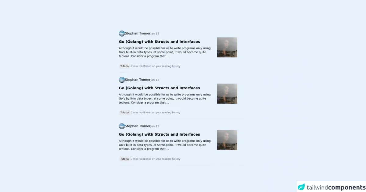
The Medium - Home Timeline UI component is a user interface element that displays a list of articles in a timeline format. Each article is displayed as a card with a thumbnail image, title, author, and date. The timeline is scrollable, and users can click on an article to view the full content.
Why use Tailwind CSS to create a Medium - Home Timeline UI component?
Tailwind CSS is an excellent choice for creating a Medium - Home Timeline UI component because it provides a set of pre-defined CSS classes that can be used to style the different elements of the timeline. Additionally, Tailwind CSS is highly customizable, making it easy to create unique designs that match the look and feel of your website.
The preview of Medium - Home Timeline UI component
To create a Medium - Home Timeline UI component with Tailwind CSS, we will use a combination of HTML and CSS code. The HTML code will define the structure of the timeline, while the CSS code will style the different elements of the timeline.
Free download of the Medium - Home Timeline's source code
The source code of Medium - Home Timeline UI component
To create a Medium - Home Timeline UI component with Tailwind CSS, we will use a combination of HTML and CSS code. The HTML code will define the structure of the timeline, while the CSS code will style the different elements of the timeline.
<div class="h-screen flex flex-col items-center justify-center">

    <card class="w-1/2 flex flex-col mt-5">

      <header class="flex flex-row gap-3 items-center">
        <img src="https://picsum.photos/30/30" class="rounded-full" />
          <div> Stephan Tromer </div>
          <div class="text-sm text-gray-500"> Jan 13 </div>
      </header>

      <content class="grid grid-cols-4 gap-3">

        <div class="col-span-3 flex flex-col">
          <subject class="font-bold text-lg pt-3">
            Go (Golang) with Structs and Interfaces
          </subject>

          <description class="font-light text-sm pt-2">
            Although it would be possible for us to write programs only using Go’s built-in data types, at some point, it would become quite tedious. Consider a program that....
          </description>
        </div>

        <div class="flex items-center">
          <img src="https://picsum.photos/100/100" />
        </div>

      </content>

      <footer class="flex flex-row pt-7 gap-3 items-center">

        <button class="hover:bg-gray-300 delay-100 duration-100 bg-gray-200 rounded-full py-1 px-2 text-xs">
          Tutorial
        </button>

        <div class="text-gray-500 text-xs">
          7 min read
        </div>

        <div class="text-gray-500 text-xs">
          Based on your reading history
        </div>

      </footer>

      <hr class="mt-5">

    </card>

</div>
How to create a Medium - Home Timeline with Tailwind CSS?
Here are six ways to create a Medium - Home Timeline UI component with Tailwind CSS:
1. Define the HTML structure of the timeline
The first step in creating a Medium - Home Timeline UI component is to define the HTML structure of the timeline. We will use a combination of HTML and Tailwind CSS classes to create the timeline structure.
<div class="flex flex-col space-y-4">
  <div class="flex items-center space-x-4">
    <div class="flex-shrink-0">
      <img class="h-10 w-10 rounded-full" src="https://via.placeholder.com/150" alt="">
    </div>
    <div class="flex-grow">
      <div class="text-sm font-medium text-gray-900">John Doe</div>
      <div class="text-sm text-gray-500">Jan 1, 2022</div>
    </div>
  </div>
  <div class="flex">
    <div class="flex-shrink-0">
      <img class="h-16 w-16" src="https://via.placeholder.com/300x200" alt="">
    </div>
    <div class="ml-4">
      <div class="text-lg font-medium text-gray-900">Article Title</div>
      <div class="text-sm text-gray-500">Lorem ipsum dolor sit amet, consectetur adipiscing elit, sed do eiusmod tempor incididunt ut labore et dolore magna aliqua.</div>
    </div>
  </div>
</div>
2. Style the timeline elements
Once we have defined the HTML structure of the timeline, we can start styling the different elements of the timeline. We will use a combination of Tailwind CSS classes to style the different elements of the timeline.
/* Style the author name */
.text-gray-900 {
  color: #1a202c;
}

/* Style the article title */
.text-lg {
  font-size: 1.125rem;
  line-height: 1.75rem;
}

/* Style the article description */
.text-sm {
  font-size: 0.875rem;
  line-height: 1.25rem;
}

/* Style the thumbnail image */
.h-16 {
  height: 4rem;
}

.w-16 {
  width: 4rem;
}

/* Style the author image */
.h-10 {
  height: 2.5rem;
}

.w-10 {
  width: 2.5rem;
}

.rounded-full {
  border-radius: 9999px;
}
3. Add the scrollable behavior
To make the timeline scrollable, we will use the overflow-y property and set it to scroll. We will also set the max-height property to limit the height of the timeline.
/* Style the timeline container */
.timeline {
  max-height: 600px;
  overflow-y: scroll;
}
4. Add hover effects
To add hover effects to the timeline elements, we will use the hover pseudo-class and add a background color to the timeline element.
/* Add hover effect to the timeline element */
.timeline-element:hover {
  background-color: #f7fafc;
}
5. Add click behavior
To add click behavior to the timeline elements, we will use the cursor property and set it to pointer. We will also add an onclick event to the timeline element.
/* Add click behavior to the timeline element */
.timeline-element {
  cursor: pointer;
}

.timeline-element:hover {
  background-color: #f7fafc;
}
6. Customize the design
Finally, we can customize the design of the timeline by changing the colors, fonts, and other design elements. We can use Tailwind CSS to customize the design of the timeline easily.
/* Customize the design of the timeline */
.timeline {
  max-height: 600px;
  overflow-y: scroll;
  background-color: #f7fafc;
}

.timeline-element:hover {
  background-color: #edf2f7;
}

.text-gray-900 {
  color: #2d3748;
}

.text-lg {
  font-size: 1.25rem;
  line-height: 1.75rem;
}

.text-sm {
  font-size: 0.875rem;
  line-height: 1.25rem;
}

.h-16 {
  height: 4rem;
}

.w-16 {
  width: 4rem;
}

.h-10 {
  height: 2.5rem;
}

.w-10 {
  width: 2.5rem;
}

.rounded-full {
  border-radius: 9999px;
}
Conclusion
In this article, we explored how to create a Medium - Home Timeline UI component with Tailwind CSS. We learned how to define the HTML structure of the timeline, style the different elements of the timeline, add scrollable and hover effects, and customize the design of the timeline. With Tailwind CSS, creating a Medium - Home Timeline UI component is easy and straightforward.