- Published on
6 Steps To Build A Medium - Recommended Topics With Tailwind CSS Like A Pro In Under An Hour
- What is Tailwind CSS?
- The description of Medium - Recommended Topics UI component
- Why use Tailwind CSS to create a Medium - Recommended Topics UI component?
- The preview of Medium - Recommended Topics UI component
- The source code of Medium - Recommended Topics UI component
- How to create a Medium - Recommended Topics with Tailwind CSS?
- Step 1: Set up your project
- Step 2: Create the HTML structure
- Step 3: Style the HTML elements
- Step 4: Add custom styles
- Step 5: Add interactivity
- Step 6: Test your component
- Conclusion
If you're looking to create a Medium - Recommended Topics UI component, Tailwind CSS is a great tool to use. In this article, we'll go over what Tailwind CSS is, why it's a good choice for creating this component, and the steps you can take to create it yourself.
What is Tailwind CSS?
Tailwind CSS is a utility-first CSS framework that allows you to quickly and easily create custom designs without writing custom CSS. It provides a set of pre-defined classes that you can use to style your HTML elements. This means that you don't have to write CSS from scratch, which can save you a lot of time and effort.
The description of Medium - Recommended Topics UI component
The Medium - Recommended Topics UI component is a list of topics that are related to the current article. It's usually displayed at the bottom of the article and provides readers with additional content that they might be interested in. The component typically consists of a list of links with a title and a short description.
Why use Tailwind CSS to create a Medium - Recommended Topics UI component?
Tailwind CSS is a great choice for creating a Medium - Recommended Topics UI component because it allows you to quickly and easily style your HTML elements using pre-defined classes. This means that you don't have to spend a lot of time writing custom CSS, which can save you a lot of time and effort. Additionally, Tailwind CSS provides a wide range of utility classes that you can use to style your elements, which gives you a lot of flexibility when it comes to design.
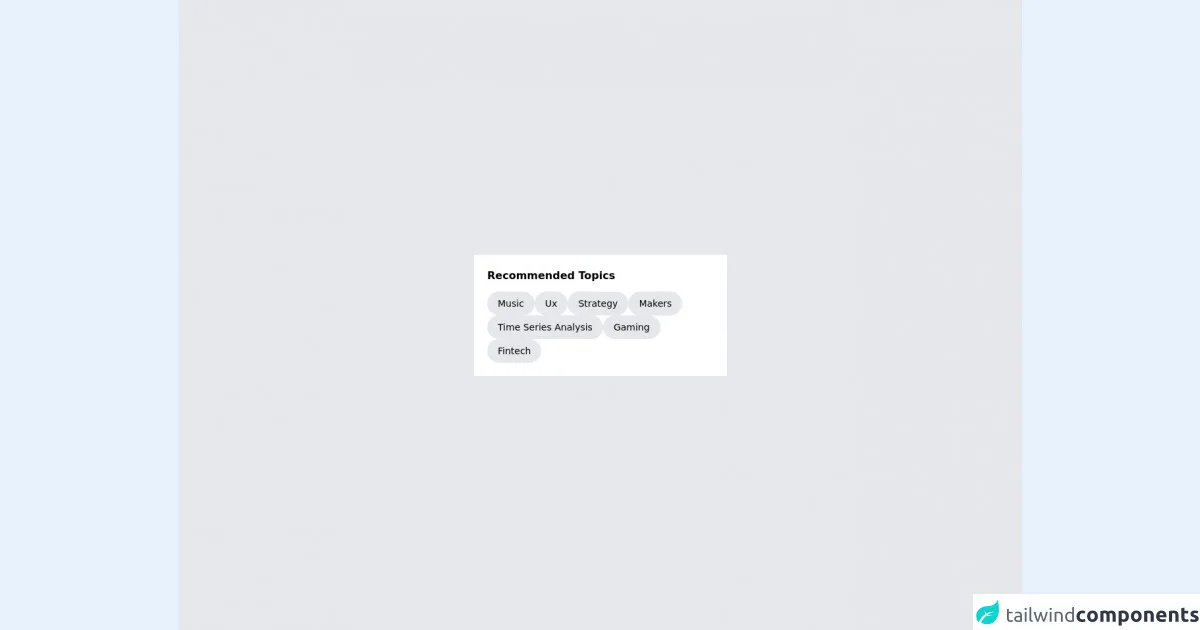
The preview of Medium - Recommended Topics UI component
To give you an idea of what the Medium - Recommended Topics UI component looks like, here's a preview:
Free download of the Medium - Recommended Topics's source code
The source code of Medium - Recommended Topics UI component
If you're interested in seeing the source code for the Medium - Recommended Topics UI component, here it is:
<div class="bg-gray-200 h-screen flex items-center justify-center">

  <div class="bg-white w-96 p-5">

    <div class="font-semibold">
      Recommended Topics
    </div>

    <div class="mt-3 flex flex-wrap gap-3">

      <button class="bg-gray-200 hover:bg-gray-300 duration-300 rounded-full px-4 py-2 font-light text-sm">
        Music
      </button>

      <button class="bg-gray-200 hover:bg-gray-300 duration-300 rounded-full px-4 py-2 font-light text-sm">
        Ux
      </button>

      <button class="bg-gray-200 hover:bg-gray-300 duration-300 rounded-full px-4 py-2 font-light text-sm">
        Strategy
      </button>

      <button class="bg-gray-200 hover:bg-gray-300 duration-300 rounded-full px-4 py-2 font-light text-sm">
        Makers
      </button>

      <button class="bg-gray-200 hover:bg-gray-300 duration-300 rounded-full px-4 py-2 font-light text-sm">
        Time Series Analysis
      </button>

      <button class="bg-gray-200 hover:bg-gray-300 duration-300 rounded-full px-4 py-2 font-light text-sm">
        Gaming
      </button>

      <button class="bg-gray-200 hover:bg-gray-300 duration-300 rounded-full px-4 py-2 font-light text-sm">
        Fintech
      </button>

    </div>

  </div>

</div>
How to create a Medium - Recommended Topics with Tailwind CSS?
Now that you know what Tailwind CSS is and why it's a good choice for creating a Medium - Recommended Topics UI component, let's go over the steps you can take to create it yourself.
Step 1: Set up your project
The first step is to set up your project. You can do this by creating a new HTML file and linking to the Tailwind CSS stylesheet. Here's an example of what your HTML file might look like:
<!DOCTYPE html>
<html>
  <head>
    <title>Medium - Recommended Topics</title>
    <link rel="stylesheet" href="https://cdn.jsdelivr.net/npm/[email protected]/dist/tailwind.min.css">
  </head>
  <body>
    <!-- Your HTML code goes here -->
  </body>
</html>
Step 2: Create the HTML structure
The next step is to create the HTML structure for the Medium - Recommended Topics UI component. Here's an example of what your HTML code might look like:
<div class="bg-gray-100 py-4">
  <div class="container mx-auto px-4">
    <h2 class="text-lg font-semibold mb-4">Recommended Topics</h2>
    <ul class="grid grid-cols-2 md:grid-cols-4 gap-4">
      <li>
        <a href="#" class="block text-gray-700 hover:text-gray-900 font-medium">Technology</a>
        <p class="text-sm text-gray-600">Stay up-to-date with the latest tech news and trends.</p>
      </li>
      <li>
        <a href="#" class="block text-gray-700 hover:text-gray-900 font-medium">Business</a>
        <p class="text-sm text-gray-600">Get insights into the world of business and finance.</p>
      </li>
      <li>
        <a href="#" class="block text-gray-700 hover:text-gray-900 font-medium">Politics</a>
        <p class="text-sm text-gray-600">Stay informed about the latest political developments.</p>
      </li>
      <li>
        <a href="#" class="block text-gray-700 hover:text-gray-900 font-medium">Culture</a>
        <p class="text-sm text-gray-600">Explore the world of art, music, and literature.</p>
      </li>
    </ul>
  </div>
</div>
Step 3: Style the HTML elements
The next step is to style the HTML elements using Tailwind CSS classes. Here's an example of what your CSS code might look like:
/* Style the container */
.container {
  max-width: 1200px;
}

/* Style the heading */
h2 {
  color: #333;
}

/* Style the list */
ul {
  list-style: none;
}

/* Style the list items */
li {
  background-color: #fff;
  border: 1px solid #ddd;
  border-radius: 4px;
  padding: 1rem;
}

/* Style the links */
a {
  color: #333;
}

a:hover {
  color: #000;
}

/* Style the descriptions */
p {
  margin-top: 0.5rem;
}
Step 4: Add custom styles
If you want to add custom styles to your Medium - Recommended Topics UI component, you can do so using Tailwind CSS classes. Here's an example of how you might add custom styles to the list items:
<li class="shadow-md rounded-md p-4">
  <a href="#" class="block text-gray-700 hover:text-gray-900 font-medium">Technology</a>
  <p class="text-sm text-gray-600">Stay up-to-date with the latest tech news and trends.</p>
</li>
Step 5: Add interactivity
If you want to add interactivity to your Medium - Recommended Topics UI component, you can do so using JavaScript. Here's an example of how you might add a hover effect to the list items:
<li class="shadow-md rounded-md p-4 hover:bg-gray-50">
  <a href="#" class="block text-gray-700 hover:text-gray-900 font-medium">Technology</a>
  <p class="text-sm text-gray-600">Stay up-to-date with the latest tech news and trends.</p>
</li>
Step 6: Test your component
The final step is to test your Medium - Recommended Topics UI component to make sure it works as expected. You can do this by opening your HTML file in a web browser and checking that the component looks and behaves as you intended.
Conclusion
In this article, we've gone over what Tailwind CSS is, why it's a good choice for creating a Medium - Recommended Topics UI component, and the steps you can take to create it yourself. By following these steps, you can quickly and easily create a custom Medium - Recommended Topics UI component that looks great and provides readers with additional content that they might be interested in.