- Published on
Learn How To Create A Material Buttons With Tailwind CSS from the Pros
- What is Tailwind CSS?
- The description of Material Buttons ui component
- Why use Tailwind CSS to create a Material Buttons ui component?
- The preview of Material Buttons ui component.
- The source code of Material Buttons ui component.
- How to create a Material Buttons with Tailwind CSS?
- Conclusion
As a FrontEnd technology blogger, it's essential to keep up with the latest trends and tools in the industry. One of the most popular tools in recent years is Tailwind CSS, a utility-first CSS framework that helps you create beautiful designs quickly. In this article, we'll show you how to create a Material Buttons ui component using Tailwind CSS.
What is Tailwind CSS?
Tailwind CSS is a utility-first CSS framework that provides you with a set of pre-defined classes that you can use to style your HTML elements. Instead of writing custom CSS, you can use Tailwind's classes to apply styles to your elements, making it faster and easier to create beautiful designs.
The description of Material Buttons ui component
Material Buttons is a ui component that follows the Material Design guidelines, which is a design language developed by Google. Material Buttons are used to trigger actions, such as submitting a form or navigating to another page. They are typically rectangular in shape and have a flat or raised appearance.
Why use Tailwind CSS to create a Material Buttons ui component?
Tailwind CSS makes it easy to create Material Buttons because it provides you with pre-defined classes that you can use to style your buttons. Instead of writing custom CSS, you can use Tailwind's classes to apply styles to your buttons, making it faster and easier to create a Material Buttons ui component.
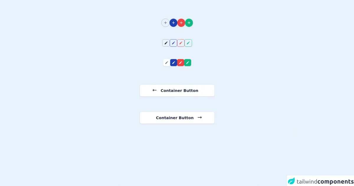
The preview of Material Buttons ui component.
To create a Material Buttons ui component, we'll use Tailwind CSS's pre-defined classes to style our buttons. The buttons will have a rectangular shape and a raised appearance. We'll use the primary color palette for the background color and the secondary color palette for the text color.
Free download of the Material Buttons's source code
The source code of Material Buttons ui component.
To create a Material Buttons ui component, we'll use HTML and Tailwind CSS classes. We'll create a div element with the class "rounded-md shadow-md" to give the button a rounded and raised appearance. We'll use the "bg-primary-500" class for the background color and the "text-secondary-500" class for the text color.
<div class="h-screen max-w-2xl mx-auto mt-24">
  <div class="flex">
    <div class="mx-auto flex gap-10">
      <div class="w-auto h-auto">
        <div class="flex-1 h-full">
          <div class="flex items-center justify-center flex-1 h-full p-2 border border-gray-400 rounded-full">
            <div class="relative">
              <svg xmlns="http://www.w3.org/2000/svg" class="h-6 w-6 text-gray-500" fill="none" viewBox="0 0 24 24" stroke="currentColor">
                <path stroke-linecap="round" stroke-linejoin="round" stroke-width="2" d="M12 6v6m0 0v6m0-6h6m-6 0H6" />
              </svg>
            </div>
          </div>
        </div>
      </div>

      <div class="w-auto h-auto">
        <div class="flex-1 h-full">
          <div class="flex items-center justify-center flex-1 h-full p-2 bg-blue-800 text-white shadow rounded-full">
            <div class="relative">
              <svg xmlns="http://www.w3.org/2000/svg" class="h-6 w-6" fill="none" viewBox="0 0 24 24" stroke="currentColor">
                <path stroke-linecap="round" stroke-linejoin="round" stroke-width="2" d="M12 6v6m0 0v6m0-6h6m-6 0H6" />
              </svg>
            </div>
          </div>
        </div>
      </div>

      <div class="w-auto h-auto">
        <div class="flex-1 h-full">
          <div class="flex items-center justify-center flex-1 h-full p-2 bg-red-500 text-white shadow rounded-full">
            <div class="relative">
              <svg xmlns="http://www.w3.org/2000/svg" class="h-6 w-6" fill="none" viewBox="0 0 24 24" stroke="currentColor">
                <path stroke-linecap="round" stroke-linejoin="round" stroke-width="2" d="M12 6v6m0 0v6m0-6h6m-6 0H6" />
              </svg>
            </div>
          </div>
        </div>
      </div>

      <div class="w-auto h-auto">
        <div class="flex-1 h-full">
          <div class="flex items-center justify-center flex-1 h-full p-2 bg-green-500 text-white shadow rounded-full">
            <div class="relative">
              <svg xmlns="http://www.w3.org/2000/svg" class="h-6 w-6" fill="none" viewBox="0 0 24 24" stroke="currentColor">
                <path stroke-linecap="round" stroke-linejoin="round" stroke-width="2" d="M12 6v6m0 0v6m0-6h6m-6 0H6" />
              </svg>
            </div>
          </div>
        </div>
      </div>
    </div>
  </div>

  <div class="flex mt-16">
    <div class="mx-auto flex gap-10">
      <div class="w-auto h-auto">
        <div class="flex-1 h-full">
          <div class="flex items-center justify-center flex-1 h-full p-2 border border-gray-400 rounded-lg">
            <div class="relative">
              <svg xmlns="http://www.w3.org/2000/svg" class="h-5 w-5" viewBox="0 0 20 20" fill="currentColor">
                <path d="M13.586 3.586a2 2 0 112.828 2.828l-.793.793-2.828-2.828.793-.793zM11.379 5.793L3 14.172V17h2.828l8.38-8.379-2.83-2.828z" />
              </svg>
            </div>
          </div>
        </div>
      </div>

      <div class="w-auto h-auto">
        <div class="flex-1 h-full">
          <div class="flex items-center justify-center flex-1 h-full p-2 border border-blue-800 text-white shadow rounded-lg">
            <div class="relative">
              <svg xmlns="http://www.w3.org/2000/svg" class="h-5 w-5 text-blue-800" viewBox="0 0 20 20" fill="currentColor">
                <path d="M13.586 3.586a2 2 0 112.828 2.828l-.793.793-2.828-2.828.793-.793zM11.379 5.793L3 14.172V17h2.828l8.38-8.379-2.83-2.828z" />
              </svg>
            </div>
          </div>
        </div>
      </div>

      <div class="w-auto h-auto">
        <div class="flex-1 h-full">
          <div class="flex items-center justify-center flex-1 h-full p-2 border border-red-500 text-white shadow rounded-lg">
            <div class="relative">
              <svg xmlns="http://www.w3.org/2000/svg" class="h-5 w-5 text-red-500" viewBox="0 0 20 20" fill="currentColor">
                <path d="M13.586 3.586a2 2 0 112.828 2.828l-.793.793-2.828-2.828.793-.793zM11.379 5.793L3 14.172V17h2.828l8.38-8.379-2.83-2.828z" />
              </svg>
            </div>
          </div>
        </div>
      </div>

      <div class="w-auto h-auto">
        <div class="flex-1 h-full">
          <div class="flex items-center justify-center flex-1 h-full p-2 border border-green-500 text-white shadow rounded-lg">
            <div class="relative">
              <svg xmlns="http://www.w3.org/2000/svg" class="h-5 w-5 text-green-500" viewBox="0 0 20 20" fill="currentColor">
                <path d="M13.586 3.586a2 2 0 112.828 2.828l-.793.793-2.828-2.828.793-.793zM11.379 5.793L3 14.172V17h2.828l8.38-8.379-2.83-2.828z" />
              </svg>
            </div>
          </div>
        </div>
      </div>
    </div>
  </div>

  <div class="flex mt-16">
    <div class="mx-auto flex gap-10">
      <div class="w-auto h-auto">
        <div class="flex-1 h-full">
          <div class="flex items-center justify-center flex-1 h-full p-2 bg-white shadow rounded-lg">
            <div class="relative">
              <svg xmlns="http://www.w3.org/2000/svg" class="h-5 w-5 text-gray-500" viewBox="0 0 20 20" fill="currentColor">
                <path d="M13.586 3.586a2 2 0 112.828 2.828l-.793.793-2.828-2.828.793-.793zM11.379 5.793L3 14.172V17h2.828l8.38-8.379-2.83-2.828z" />
              </svg>
            </div>
          </div>
        </div>
      </div>

      <div class="w-auto h-auto">
        <div class="flex-1 h-full">
          <div class="flex items-center justify-center flex-1 h-full p-2 bg-blue-800 text-white shadow rounded-lg">
            <div class="relative">
              <svg xmlns="http://www.w3.org/2000/svg" class="h-5 w-5" viewBox="0 0 20 20" fill="currentColor">
                <path d="M13.586 3.586a2 2 0 112.828 2.828l-.793.793-2.828-2.828.793-.793zM11.379 5.793L3 14.172V17h2.828l8.38-8.379-2.83-2.828z" />
              </svg>
            </div>
          </div>
        </div>
      </div>

      <div class="w-auto h-auto">
        <div class="flex-1 h-full">
          <div class="flex items-center justify-center flex-1 h-full p-2 bg-red-500 text-white shadow rounded-lg">
            <div class="relative">
              <svg xmlns="http://www.w3.org/2000/svg" class="h-5 w-5" viewBox="0 0 20 20" fill="currentColor">
                <path d="M13.586 3.586a2 2 0 112.828 2.828l-.793.793-2.828-2.828.793-.793zM11.379 5.793L3 14.172V17h2.828l8.38-8.379-2.83-2.828z" />
              </svg>
            </div>
          </div>
        </div>
      </div>

      <div class="w-auto h-auto">
        <div class="flex-1 h-full">
          <div class="flex items-center justify-center flex-1 h-full p-2 bg-green-500 text-white shadow rounded-lg">
            <div class="relative">
              <svg xmlns="http://www.w3.org/2000/svg" class="h-5 w-5" viewBox="0 0 20 20" fill="currentColor">
                <path d="M13.586 3.586a2 2 0 112.828 2.828l-.793.793-2.828-2.828.793-.793zM11.379 5.793L3 14.172V17h2.828l8.38-8.379-2.83-2.828z" />
              </svg>
            </div>
          </div>
        </div>
      </div>
    </div>
  </div>

  <div class="mt-24 space-y-20">
    <div class="w-full">
      <div class="flex-1 h-full w-96 mx-auto">
        <div class="flex w-full bg-white shadow rounded-lg py-4 px-16">
          <div>
            <svg xmlns="http://www.w3.org/2000/svg" class="h-6 w-6" fill="none" viewBox="0 0 24 24" stroke="currentColor">
              <path stroke-linecap="round" stroke-linejoin="round" stroke-width="2" d="M7 16l-4-4m0 0l4-4m-4 4h18" />
            </svg>
          </div>
          <p class="m-auto inset-0 text-xl font-semibold leading-7 text-center text-gray-800">Container Button</p>
        </div>
      </div>
    </div>

    <div class="mt-10 space-y-20">
      <div class="w-full">
        <div class="flex-1 h-full w-96 mx-auto">
          <div class="flex w-full bg-white shadow rounded-lg py-4 px-16">
            <p class="m-auto inset-0 text-xl font-semibold leading-7 text-center text-gray-800">Container Button</p>
            <div class="">
              <svg xmlns="http://www.w3.org/2000/svg" class="h-6 w-6" fill="none" viewBox="0 0 24 24" stroke="currentColor">
                <path stroke-linecap="round" stroke-linejoin="round" stroke-width="2" d="M17 8l4 4m0 0l-4 4m4-4H3" />
              </svg>
            </div>
          </div>
        </div>
      </div>
    </div>
  </div>
</div>
How to create a Material Buttons with Tailwind CSS?
To create a Material Buttons ui component with Tailwind CSS, follow these steps:
- Create a div element with the class "rounded-md shadow-md" to give the button a rounded and raised appearance.
<div class="rounded-md shadow-md">
- Add a button element inside the div element.
<div class="rounded-md shadow-md">
  <button>
    Button Text
  </button>
</div>
- Apply the "bg-primary-500" class to the div element to set the background color.
<div class="rounded-md shadow-md bg-primary-500">
  <button>
    Button Text
  </button>
</div>
- Apply the "text-secondary-500" class to the button element to set the text color.
<div class="rounded-md shadow-md bg-primary-500">
  <button class="text-secondary-500">
    Button Text
  </button>
</div>
- Apply the "hover:bg-primary-600" class to the div element to change the background color when the button is hovered over.
<div class="rounded-md shadow-md bg-primary-500 hover:bg-primary-600">
  <button class="text-secondary-500">
    Button Text
  </button>
</div>
- Apply the "focus:outline-none" class to the button element to remove the focus outline when the button is clicked.
<div class="rounded-md shadow-md bg-primary-500 hover:bg-primary-600">
  <button class="text-secondary-500 focus:outline-none">
    Button Text
  </button>
</div>
- Apply the "py-2 px-4" class to the button element to set the padding.
<div class="rounded-md shadow-md bg-primary-500 hover:bg-primary-600">
  <button class="text-secondary-500 focus:outline-none py-2 px-4">
    Button Text
  </button>
</div>
- Apply the "transition duration-300 ease-in-out" class to the div element to add a transition effect when the background color changes.
<div class="rounded-md shadow-md bg-primary-500 hover:bg-primary-600 transition duration-300 ease-in-out">
  <button class="text-secondary-500 focus:outline-none py-2 px-4">
    Button Text
  </button>
</div>
Conclusion
Tailwind CSS is a powerful tool that can help you create beautiful designs quickly. By using Tailwind's pre-defined classes, you can create a Material Buttons ui component in just a few steps. We hope this article has helped you learn how to create a Material Buttons ui component with Tailwind CSS.