- Published on
3 Things You Must Know To Create A Login Form By Tailwindcss With Tailwind CSS
- What is Tailwind CSS?
- The description of Login form by Tailwindcss ui component
- Why use Tailwind CSS to create a Login form by Tailwindcss ui component?
- The preview of Login form by Tailwindcss ui component.
- The source code of Login form by Tailwindcss ui component.
- How to create a Login form by Tailwindcss with Tailwind CSS?
- Conclusion
As a FrontEnd technology blogger, you must be aware of the importance of creating an effective login form. A login form is a crucial element of any website or application that requires user authentication. In this article, we will discuss how to create a login form by Tailwind CSS, a popular utility-first CSS framework.
What is Tailwind CSS?
Tailwind CSS is a CSS framework that provides a set of pre-designed CSS classes to build custom user interfaces. It is a utility-first framework, which means that it provides low-level utility classes that can be combined to create custom designs. Tailwind CSS is gaining popularity among developers due to its flexibility and ease of use.
The description of Login form by Tailwindcss ui component
Tailwind CSS provides a set of pre-designed UI components that can be used to create custom user interfaces. One of these components is the Login form, which is a pre-designed form that can be customized to meet your specific needs.
The Login form by Tailwindcss UI component includes the following elements:
- Email input field
- Password input field
- Remember me checkbox
- Login button
Why use Tailwind CSS to create a Login form by Tailwindcss ui component?
Tailwind CSS provides a set of pre-designed UI components that can be customized to meet your specific needs. Using Tailwind CSS to create a Login form can save you time and effort, as you do not have to design the form from scratch. Additionally, Tailwind CSS provides a set of utility classes that can be used to customize the form's appearance and behavior.
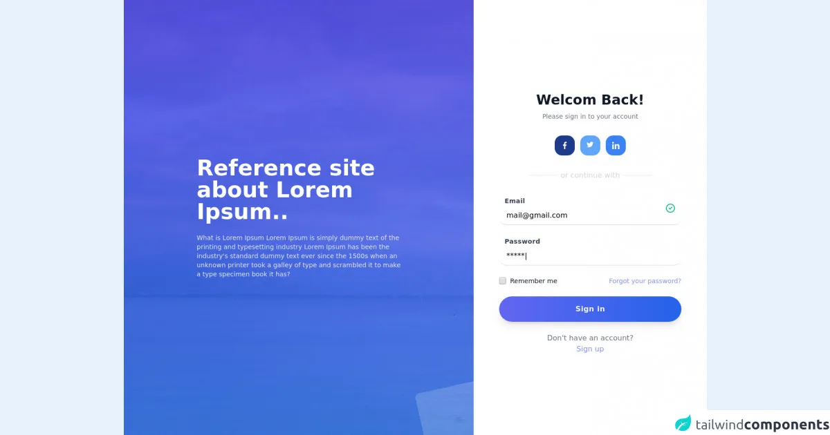
The preview of Login form by Tailwindcss ui component.
To create a Login form by Tailwind CSS, you can use the pre-designed UI component provided by Tailwind CSS. The Login form by Tailwindcss UI component includes the following elements:
- Email input field
- Password input field
- Remember me checkbox
- Login button
Free download of the Login form by Tailwindcss's source code
The source code of Login form by Tailwindcss ui component.
To create a Login form by Tailwind CSS, you can use the pre-designed UI component provided by Tailwind CSS. The Login form by Tailwindcss UI component includes the following elements:
- Email input field
- Password input field
- Remember me checkbox
- Login button
<style>
/*remove custom style*/
  .circles{
    position: absolute;
    top: 0;
    left: 0;
    width: 100%;
    height: 100%;
    overflow: hidden;
}
  .circles li{
    position: absolute;
    display: block;
    list-style: none;
    width: 20px;
    height: 20px;
    background: rgba(255, 255, 255, 0.2);
    animation: animate 25s linear infinite;
    bottom: -150px;
}
.circles li:nth-child(1){
    left: 25%;
    width: 80px;
    height: 80px;
    animation-delay: 0s;
}


.circles li:nth-child(2){
    left: 10%;
    width: 20px;
    height: 20px;
    animation-delay: 2s;
    animation-duration: 12s;
}

.circles li:nth-child(3){
    left: 70%;
    width: 20px;
    height: 20px;
    animation-delay: 4s;
}

.circles li:nth-child(4){
    left: 40%;
    width: 60px;
    height: 60px;
    animation-delay: 0s;
    animation-duration: 18s;
}

.circles li:nth-child(5){
    left: 65%;
    width: 20px;
    height: 20px;
    animation-delay: 0s;
}

.circles li:nth-child(6){
    left: 75%;
    width: 110px;
    height: 110px;
    animation-delay: 3s;
}

.circles li:nth-child(7){
    left: 35%;
    width: 150px;
    height: 150px;
    animation-delay: 7s;
}

.circles li:nth-child(8){
    left: 50%;
    width: 25px;
    height: 25px;
    animation-delay: 15s;
    animation-duration: 45s;
}

.circles li:nth-child(9){
    left: 20%;
    width: 15px;
    height: 15px;
    animation-delay: 2s;
    animation-duration: 35s;
}

.circles li:nth-child(10){
    left: 85%;
    width: 150px;
    height: 150px;
    animation-delay: 0s;
    animation-duration: 11s;
}
  @keyframes animate {

    0%{
        transform: translateY(0) rotate(0deg);
        opacity: 1;
        border-radius: 0;
    }

    100%{
        transform: translateY(-1000px) rotate(720deg);
        opacity: 0;
        border-radius: 50%;
    }

}
</style>
<div class="relative min-h-screen flex ">
    <div class="flex flex-col sm:flex-row items-center md:items-start sm:justify-center md:justify-start flex-auto min-w-0 bg-white">
      <div class="sm:w-1/2 xl:w-3/5 h-full hidden md:flex flex-auto items-center justify-center p-10 overflow-hidden bg-purple-900 text-white bg-no-repeat bg-cover relative"
        style="background-image: url(https://images.unsplash.com/photo-1579451861283-a2239070aaa9?ixid=MnwxMjA3fDB8MHxwaG90by1wYWdlfHx8fGVufDB8fHx8&ixlib=rb-1.2.1&auto=format&fit=crop&w=1950&q=80);">
        <div class="absolute bg-gradient-to-b from-indigo-600 to-blue-500 opacity-75 inset-0 z-0"></div>
        <div class="w-full  max-w-md z-10">
          <div class="sm:text-4xl xl:text-5xl font-bold leading-tight mb-6">Reference site about Lorem Ipsum..</div>
          <div class="sm:text-sm xl:text-md text-gray-200 font-normal"> What is Lorem Ipsum Lorem Ipsum is simply dummy
            text of the printing and typesetting industry Lorem Ipsum has been the industry's standard dummy text ever
            since the 1500s when an unknown printer took a galley of type and scrambled it to make a type specimen book it
            has?</div>
        </div>
        <!---remove custom style-->
       <ul class="circles">
      <li></li>
      <li></li>
      <li></li>
      <li></li>
      <li></li>
      <li></li>
      <li></li>
      <li></li>
      <li></li>
      <li></li>
   </ul>
      </div>
      <div class="md:flex md:items-center md:justify-center w-full sm:w-auto md:h-full w-2/5 xl:w-2/5 p-8  md:p-10 lg:p-14 sm:rounded-lg md:rounded-none bg-white">
        <div class="max-w-md w-full space-y-8">
          <div class="text-center">
            <h2 class="mt-6 text-3xl font-bold text-gray-900">
              Welcom Back!
            </h2>
            <p class="mt-2 text-sm text-gray-500">Please sign in to your account</p>
          </div>
          <div class="flex flex-row justify-center items-center space-x-3">
            <a href="https://www.behance.net/ajeeshmon" target="_blank"
              class="w-11 h-11 items-center justify-center inline-flex rounded-2xl font-bold text-lg   bg-blue-900 hover:shadow-lg cursor-pointer transition ease-in duration-300"><img
                class="w-4 h-4"
                src="data:image/svg+xml;base64,PHN2ZyB4bWxucz0iaHR0cDovL3d3dy53My5vcmcvMjAwMC9zdmciIHZlcnNpb249IjEuMSIgeG1sbnM6eGxpbms9Imh0dHA6Ly93d3cudzMub3JnLzE5OTkveGxpbmsiIHhtbG5zOnN2Z2pzPSJodHRwOi8vc3ZnanMuY29tL3N2Z2pzIiB3aWR0aD0iNTEyIiBoZWlnaHQ9IjUxMiIgeD0iMCIgeT0iMCIgdmlld0JveD0iMCAwIDI0IDI0IiBzdHlsZT0iZW5hYmxlLWJhY2tncm91bmQ6bmV3IDAgMCA1MTIgNTEyIiB4bWw6c3BhY2U9InByZXNlcnZlIiBjbGFzcz0iIj48Zz48cGF0aCB4bWxucz0iaHR0cDovL3d3dy53My5vcmcvMjAwMC9zdmciIGQ9Im0xNS45OTcgMy45ODVoMi4xOTF2LTMuODE2Yy0uMzc4LS4wNTItMS42NzgtLjE2OS0zLjE5Mi0uMTY5LTMuMTU5IDAtNS4zMjMgMS45ODctNS4zMjMgNS42Mzl2My4zNjFoLTMuNDg2djQuMjY2aDMuNDg2djEwLjczNGg0LjI3NHYtMTAuNzMzaDMuMzQ1bC41MzEtNC4yNjZoLTMuODc3di0yLjkzOWMuMDAxLTEuMjMzLjMzMy0yLjA3NyAyLjA1MS0yLjA3N3oiIGZpbGw9IiNmZmZmZmYiIGRhdGEtb3JpZ2luYWw9IiMwMDAwMDAiIHN0eWxlPSIiIGNsYXNzPSIiPjwvcGF0aD48L2c+PC9zdmc+"></span>
            <a href="https://twitter.com/ajeemon?lang=en" target="_blank"
              class="w-11 h-11 items-center justify-center inline-flex rounded-2xl font-bold text-lg  text-white bg-blue-400 hover:shadow-lg cursor-pointer transition ease-in duration-300"><img
                class="w-4 h-4"
                src="data:image/svg+xml;base64,PHN2ZyB4bWxucz0iaHR0cDovL3d3dy53My5vcmcvMjAwMC9zdmciIHZlcnNpb249IjEuMSIgeG1sbnM6eGxpbms9Imh0dHA6Ly93d3cudzMub3JnLzE5OTkveGxpbmsiIHhtbG5zOnN2Z2pzPSJodHRwOi8vc3ZnanMuY29tL3N2Z2pzIiB3aWR0aD0iNTEyIiBoZWlnaHQ9IjUxMiIgeD0iMCIgeT0iMCIgdmlld0JveD0iMCAwIDY4MS4zMzQ2NCA2ODEiIHN0eWxlPSJlbmFibGUtYmFja2dyb3VuZDpuZXcgMCAwIDUxMiA1MTIiIHhtbDpzcGFjZT0icHJlc2VydmUiPjxnPjxwYXRoIHhtbG5zPSJodHRwOi8vd3d3LnczLm9yZy8yMDAwL3N2ZyIgZD0ibTIwMC45NjQ4NDQgNTE1LjI5Mjk2OWMyNDEuMDUwNzgxIDAgMzcyLjg3MTA5NC0xOTkuNzAzMTI1IDM3Mi44NzEwOTQtMzcyLjg3MTA5NCAwLTUuNjcxODc1LS4xMTcxODgtMTEuMzIwMzEzLS4zNzEwOTQtMTYuOTM3NSAyNS41ODU5MzctMTguNSA0Ny44MjQyMTgtNDEuNTg1OTM3IDY1LjM3MTA5NC02Ny44NjMyODEtMjMuNDgwNDY5IDEwLjQ0MTQwNi00OC43NTM5MDcgMTcuNDYwOTM3LTc1LjI1NzgxMyAyMC42MzY3MTggMjcuMDU0Njg3LTE2LjIzMDQ2OCA0Ny44MjgxMjUtNDEuODk0NTMxIDU3LjYyNS03Mi40ODgyODEtMjUuMzIwMzEzIDE1LjAxMTcxOS01My4zNjMyODEgMjUuOTE3OTY5LTgzLjIxNDg0NCAzMS44MDg1OTQtMjMuOTE0MDYyLTI1LjQ3MjY1Ni01Ny45NjQ4NDMtNDEuNDAyMzQ0LTk1LjY2NDA2Mi00MS40MDIzNDQtNzIuMzY3MTg4IDAtMTMxLjA1ODU5NCA1OC42ODc1LTEzMS4wNTg1OTQgMTMxLjAzMTI1IDAgMTAuMjg5MDYzIDEuMTUyMzQ0IDIwLjI4OTA2MyAzLjM5ODQzNyAyOS44ODI4MTMtMTA4LjkxNzk2OC01LjQ4MDQ2OS0yMDUuNTAzOTA2LTU3LjYyNS0yNzAuMTMyODEyLTEzNi45MjE4NzUtMTEuMjUgMTkuMzYzMjgxLTE3Ljc0MjE4OCA0MS44NjMyODEtMTcuNzQyMTg4IDY1Ljg3MTA5MyAwIDQ1LjQ2MDkzOCAyMy4xMzY3MTkgODUuNjA1NDY5IDU4LjMxNjQwNyAxMDkuMDgyMDMyLTIxLjUtLjY2MDE1Ni00MS42OTUzMTMtNi41NjI1LTU5LjM1MTU2My0xNi4zODY3MTktLjAxOTUzMS41NTA3ODEtLjAxOTUzMSAxLjA4NTkzNy0uMDE5NTMxIDEuNjcxODc1IDAgNjMuNDY4NzUgNDUuMTcxODc1IDExNi40NjA5MzggMTA1LjE0NDUzMSAxMjguNDY4NzUtMTEuMDE1NjI1IDIuOTk2MDk0LTIyLjYwNTQ2OCA0LjYwOTM3NS0zNC41NTg1OTQgNC42MDkzNzUtOC40Mjk2ODcgMC0xNi42NDg0MzctLjgyODEyNS0yNC42MzI4MTItMi4zNjMyODEgMTYuNjgzNTk0IDUyLjA3MDMxMiA2NS4wNjY0MDYgODkuOTYwOTM3IDEyMi40MjU3ODEgOTEuMDIzNDM3LTQ0Ljg1NTQ2OSAzNS4xNTYyNS0xMDEuMzU5Mzc1IDU2LjA5NzY1Ny0xNjIuNzY5NTMxIDU2LjA5NzY1Ny0xMC41NjI1IDAtMjEuMDAzOTA2LS42MDU0NjktMzEuMjYxNzE4OC0xLjgxNjQwNyA1Ny45OTk5OTk4IDM3LjE3NTc4MSAxMjYuODcxMDkzOCA1OC44NzEwOTQgMjAwLjg4NjcxODggNTguODcxMDk0IiBmaWxsPSIjZmZmZmZmIiBkYXRhLW9yaWdpbmFsPSIjMDAwMDAwIiBzdHlsZT0iIj48L3BhdGg+PC9nPjwvc3ZnPg=="></span>
            <a href="https://in.linkedin.com/in/ajeeshmon" target="_blank"
              class="w-11 h-11 items-center justify-center inline-flex rounded-2xl font-bold text-lg  text-white bg-blue-500 hover:shadow-lg cursor-pointer transition ease-in duration-300"><img
                src="data:image/svg+xml;base64,PHN2ZyB4bWxucz0iaHR0cDovL3d3dy53My5vcmcvMjAwMC9zdmciIHZlcnNpb249IjEuMSIgeG1sbnM6eGxpbms9Imh0dHA6Ly93d3cudzMub3JnLzE5OTkveGxpbmsiIHhtbG5zOnN2Z2pzPSJodHRwOi8vc3ZnanMuY29tL3N2Z2pzIiB3aWR0aD0iNTEyIiBoZWlnaHQ9IjUxMiIgeD0iMCIgeT0iMCIgdmlld0JveD0iMCAwIDI0IDI0IiBzdHlsZT0iZW5hYmxlLWJhY2tncm91bmQ6bmV3IDAgMCA1MTIgNTEyIiB4bWw6c3BhY2U9InByZXNlcnZlIj48Zz48cGF0aCB4bWxucz0iaHR0cDovL3d3dy53My5vcmcvMjAwMC9zdmciIGQ9Im0yMy45OTQgMjR2LS4wMDFoLjAwNnYtOC44MDJjMC00LjMwNi0uOTI3LTcuNjIzLTUuOTYxLTcuNjIzLTIuNDIgMC00LjA0NCAxLjMyOC00LjcwNyAyLjU4N2gtLjA3di0yLjE4NWgtNC43NzN2MTYuMDIzaDQuOTd2LTcuOTM0YzAtMi4wODkuMzk2LTQuMTA5IDIuOTgzLTQuMTA5IDIuNTQ5IDAgMi41ODcgMi4zODQgMi41ODcgNC4yNDN2Ny44MDF6IiBmaWxsPSIjZmZmZmZmIiBkYXRhLW9yaWdpbmFsPSIjMDAwMDAwIiBzdHlsZT0iIj48L3BhdGg+PHBhdGggeG1sbnM9Imh0dHA6Ly93d3cudzMub3JnLzIwMDAvc3ZnIiBkPSJtLjM5NiA3Ljk3N2g0Ljk3NnYxNi4wMjNoLTQuOTc2eiIgZmlsbD0iI2ZmZmZmZiIgZGF0YS1vcmlnaW5hbD0iIzAwMDAwMCIgc3R5bGU9IiI+PC9wYXRoPjxwYXRoIHhtbG5zPSJodHRwOi8vd3d3LnczLm9yZy8yMDAwL3N2ZyIgZD0ibTIuODgyIDBjLTEuNTkxIDAtMi44ODIgMS4yOTEtMi44ODIgMi44ODJzMS4yOTEgMi45MDkgMi44ODIgMi45MDkgMi44ODItMS4zMTggMi44ODItMi45MDljLS4wMDEtMS41OTEtMS4yOTItMi44ODItMi44ODItMi44ODJ6IiBmaWxsPSIjZmZmZmZmIiBkYXRhLW9yaWdpbmFsPSIjMDAwMDAwIiBzdHlsZT0iIj48L3BhdGg+PC9nPjwvc3ZnPg=="
                class="w-4 h-4"></a>
          </div>
          <div class="flex items-center justify-center space-x-2">
            <span class="h-px w-16 bg-gray-200"></span>
            <span class="text-gray-300 font-normal">or continue with</span>
            <span class="h-px w-16 bg-gray-200"></span>
          </div>
          <form class="mt-8 space-y-6" action="#" method="POST">
            <input type="hidden" name="remember" value="true">
            <div class="relative">
              <div class="absolute right-3 mt-4"><svg xmlns="http://www.w3.org/2000/svg" class="h-6 w-6 text-green-500"
                  fill="none" viewBox="0 0 24 24" stroke="currentColor">
                  <path stroke-linecap="round" stroke-linejoin="round" stroke-width="2"
                    d="M9 12l2 2 4-4m6 2a9 9 0 11-18 0 9 9 0 0118 0z"></path>
                </svg>
              </div>
              <label class="ml-3 text-sm font-bold text-gray-700 tracking-wide">Email</label>
              <input
                class=" w-full text-base px-4 py-2 border-b border-gray-300 focus:outline-none rounded-2xl focus:border-indigo-500"
                type="" placeholder="[email protected]" value="[email protected]">
            </div>
            <div class="mt-8 content-center">
              <label class="ml-3 text-sm font-bold text-gray-700 tracking-wide">
                Password
              </label>
              <input
                class="w-full content-center text-base px-4 py-2 border-b rounded-2xl border-gray-300 focus:outline-none focus:border-indigo-500"
                type="" placeholder="Enter your password" value="*****|">
            </div>
            <div class="flex items-center justify-between">
              <div class="flex items-center">
                <input id="remember_me" name="remember_me" type="checkbox"
                  class="h-4 w-4 bg-blue-500 focus:ring-blue-400 border-gray-300 rounded">
                <label for="remember_me" class="ml-2 block text-sm text-gray-900">
                  Remember me
                </label>
              </div>
              <div class="text-sm">
                <a href="#" class="text-indigo-400 hover:text-blue-500">
                  Forgot your password?
                </a>
              </div>
            </div>
            <div>
              <button type="submit"
                class="w-full flex justify-center bg-gradient-to-r from-indigo-500 to-blue-600  hover:bg-gradient-to-l hover:from-blue-500 hover:to-indigo-600 text-gray-100 p-4  rounded-full tracking-wide font-semibold  shadow-lg cursor-pointer transition ease-in duration-500">
                Sign in
              </button>
            </div>
            <p class="flex flex-col items-center justify-center mt-10 text-center text-md text-gray-500">
              <span>Don't have an account?</span>
              <a href="#"
                class="text-indigo-400 hover:text-blue-500 no-underline hover:underline cursor-pointer transition ease-in duration-300">Sign
                up</a>
            </p>
          </form>
        </div>
      </div>
    </div>
  </div>
How to create a Login form by Tailwindcss with Tailwind CSS?
To create a Login form by Tailwind CSS, you can follow the steps below:
Install Tailwind CSS: You can install Tailwind CSS using npm or yarn.
Create a new HTML file: Create a new HTML file and add the necessary HTML tags.
Add Tailwind CSS classes: Add Tailwind CSS classes to the HTML elements to create the Login form. You can use the pre-designed UI component provided by Tailwind CSS or customize the form to meet your specific needs.
Add JavaScript: Add JavaScript code to handle form validation and submission.
Style the form: Use Tailwind CSS utility classes to style the form's appearance and behavior.
Conclusion
Creating a Login form is an essential task for any website or application that requires user authentication. Using Tailwind CSS to create a Login form can save you time and effort, as you do not have to design the form from scratch. Additionally, Tailwind CSS provides a set of utility classes that can be used to customize the form's appearance and behavior. By following the steps outlined in this article, you can create a Login form by Tailwindcss with Tailwind CSS.