- Published on
6 Critical Skills To Build A Login Form Mobile With Tailwind CSS Remarkably Well
- What is Tailwind CSS?
- The description of Login form Mobile UI component
- Why use Tailwind CSS to create a Login form Mobile UI component?
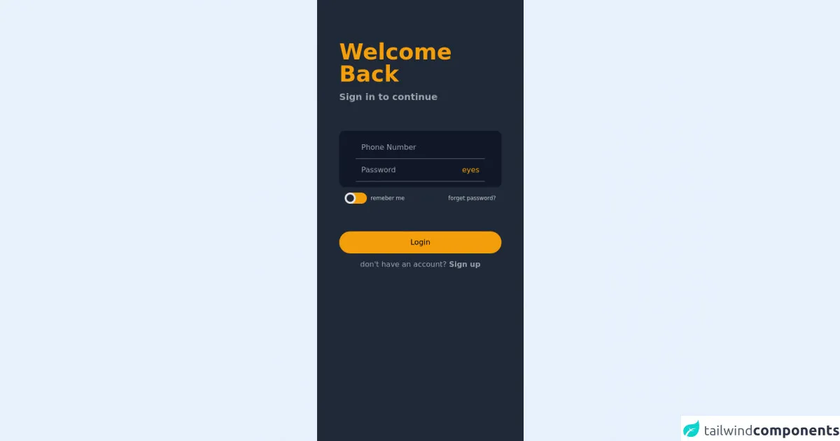
- The preview of Login form Mobile UI component.
- The source code of Login form Mobile UI component.
- How to create a Login form Mobile with Tailwind CSS?
- Step 1: Set up your project
- Step 2: Create the HTML structure
- Step 3: Add Tailwind CSS classes
- Step 4: Add JavaScript functionality
- Conclusion
As a FrontEnd technology blogger, you must have heard of Tailwind CSS, a utility-first CSS framework that allows you to create custom designs without writing any CSS. In this article, we will discuss how to use Tailwind CSS to build a Login form Mobile UI component. We will cover the following topics:
- What is Tailwind CSS?
- The description of Login form Mobile UI component
- Why use Tailwind CSS to create a Login form Mobile UI component?
- The preview of Login form Mobile UI component.
- The source code of Login form Mobile UI component.
- How to create a Login form Mobile with Tailwind CSS?
- Conclusion.
What is Tailwind CSS?
Tailwind CSS is a utility-first CSS framework that provides a set of pre-defined classes to style your HTML elements. It allows you to create custom designs without writing any CSS. Tailwind CSS is different from other CSS frameworks like Bootstrap and Foundation because it does not come with pre-built UI components. Instead, it provides a set of low-level utility classes that you can use to create your own custom designs.
The description of Login form Mobile UI component
A Login form Mobile UI component is a user interface component that allows users to log in to a mobile application. It typically consists of two input fields for the user's email and password, a "forgot password" link, and a "login" button. The Login form Mobile UI component is an essential part of any mobile application that requires user authentication.
Why use Tailwind CSS to create a Login form Mobile UI component?
Tailwind CSS provides a set of pre-defined classes that you can use to style your HTML elements. It allows you to create custom designs without writing any CSS. Using Tailwind CSS to create a Login form Mobile UI component has several benefits:
Consistent design: Tailwind CSS provides a set of pre-defined classes that ensure consistency in design across your application.
Customization: Tailwind CSS allows you to customize your design by adding or modifying classes.
Responsive design: Tailwind CSS provides responsive design classes that allow you to create a mobile-first design.
Faster development: Tailwind CSS provides a set of pre-defined classes that allow you to create a Login form Mobile UI component quickly.
Easy maintenance: Tailwind CSS provides a set of pre-defined classes that make it easy to maintain your code.
The preview of Login form Mobile UI component.
Free download of the Login form Mobile's source code
The source code of Login form Mobile UI component.
<!-- This is an example component -->
<!--
  Welcome to Tailwind Play, the official Tailwind CSS playground!

  Everything here works just like it does when you're running Tailwind locally
  with a real build pipeline. You can customize your config file, use features
  like `@apply`, or even add third-party plugins.

  Feel free to play with this example if you're just learning, or trash it and
  start from scratch if you know enough to be dangerous. Have fun!
-->
<div class="h-screen w-full">
  <div class="bg-gray-800 h-screen mx-auto max-w-md">
    <div class="p-12">
      <p class="text-5xl pt-10 text-yellow-500 font-bold">
        Welcome <br />
        Back
      </p>
      <p class="text-xl py-3 text-gray-400 font-semibold">Sign in to continue</p>
    </div>
    <div class="mx-12 p-3 rounded-xl shadow-sm bg-gray-900">
      <div class="p-3 mx-6 border-b border-gray-500">
        <input placeholder="Phone Number" class="bg-transparent text-yellow-500 w-full focus:outline-none focus:rang" type="tel" />
      </div>

      <div class="p-3 mx-6 flex border-b border-gray-500">
        <input placeholder="Password" class="bg-transparent text-yellow-500 focus:outline-none focus:rang w-full" type="password" />
        <div class="w-auto text-yellow-500">eyes</div>
      </div>
    </div>
    <div class="mx-12 p-3 justify-between flex">
      <div class="flex">
        <div class="relative inline-block w-12 mr-2 align-middle select-none transition duration-200 ease-in">
          <input type="checkbox" name="toggle" id="toggle" class="toggle-checkbox absolute block w-6 h-6 rounded-full bg-gray-800 border-4 appearance-none cursor-pointer" />
          <label for="toggle" class="toggle-label block overflow-hidden h-6 rounded-full bg-yellow-500 cursor-pointer"></label>
        </div>
        <label for="toggle" class="text-xs text-gray-300 mt-1">remeber me</label>
      </div>
      <div class="bg mt-1 text-xs text-gray-300">
        <a href="">forget password?</a>
      </div>
    </div>
    <div class="w-full p-12">
      <button class=" bg-yellow-500 p-3 rounded-3xl w-full h-full hover:bg-yellow-600"> Login</button>
      <p class="mx-auto text-center mt-3 text-gray-400">don't have an account?  <a href="" class="text-md font-semibold">Sign up</a> </p>
    </div>
  </div>
</div>

<style>
    .toggle-checkbox:checked {
  @apply: right-0 border-green-400;
  right: 0;
  border-color: rgb(241, 131, 4);
}
.toggle-checkbox:checked + .toggle-label {
  @apply: bg-green-400;
  background-color: rgb(241, 131, 4);
}
</style>
How to create a Login form Mobile with Tailwind CSS?
To create a Login form Mobile with Tailwind CSS, you need to follow these steps:
Step 1: Set up your project
To use Tailwind CSS, you need to install it in your project. You can install Tailwind CSS using npm or yarn. Once you have installed Tailwind CSS, you need to create a new HTML file and link the Tailwind CSS stylesheet.
Step 2: Create the HTML structure
To create the Login form Mobile UI component, you need to create an HTML structure that consists of two input fields for the user's email and password, a "forgot password" link, and a "login" button.
Step 3: Add Tailwind CSS classes
To style the Login form Mobile UI component, you need to add Tailwind CSS classes to your HTML elements. You can use the pre-defined classes provided by Tailwind CSS or create your own custom classes.
Step 4: Add JavaScript functionality
To add functionality to the Login form Mobile UI component, you need to add JavaScript code that handles user input and authentication.
Conclusion
In this article, we discussed how to use Tailwind CSS to build a Login form Mobile UI component. We covered the benefits of using Tailwind CSS, the HTML structure of the Login form Mobile UI component, and the steps to create a Login form Mobile UI component with Tailwind CSS. By following these steps, you can create a Login form Mobile UI component that is responsive, customizable, and easy to maintain.