- Published on
Here Are 6 Ways To Make A Login Form With Tailwind CSS
- What is Tailwind CSS?
- The description of Login Form UI component
- Why use Tailwind CSS to create a Login Form UI component?
- The preview of Login Form UI component
- The source code of Login Form UI component
- How to create a Login Form with Tailwind CSS?
- 1. Basic Login Form
- 2. Rounded Login Form
- 3. Colored Login Form
- 4. Gradient Login Form
- 5. Shadow Login Form
- 6. Icon Login Form
- Conclusion
In this article, we will explore how to create a Login Form UI component using Tailwind CSS. We will cover what Tailwind CSS is, why it is useful for creating UI components, and six different ways to create a Login Form using Tailwind CSS.
What is Tailwind CSS?
Tailwind CSS is a utility-first CSS framework that allows you to quickly build custom user interfaces. It provides a set of pre-defined CSS classes that you can use to style your HTML elements. Tailwind CSS is highly customizable, which means you can easily tweak the styles to match your design requirements.
The description of Login Form UI component
A Login Form is a UI component that allows users to enter their login credentials, such as their username and password, to access a protected area of a website or application. A typical Login Form consists of two input fields, one for the username and one for the password, and a submit button.
Why use Tailwind CSS to create a Login Form UI component?
Tailwind CSS is an excellent choice for creating UI components like Login Forms because it provides a set of pre-defined CSS classes that you can use to style your HTML elements. This means you don't have to write custom CSS code from scratch, which can save you a lot of time and effort. Additionally, Tailwind CSS is highly customizable, which means you can easily tweak the styles to match your design requirements.
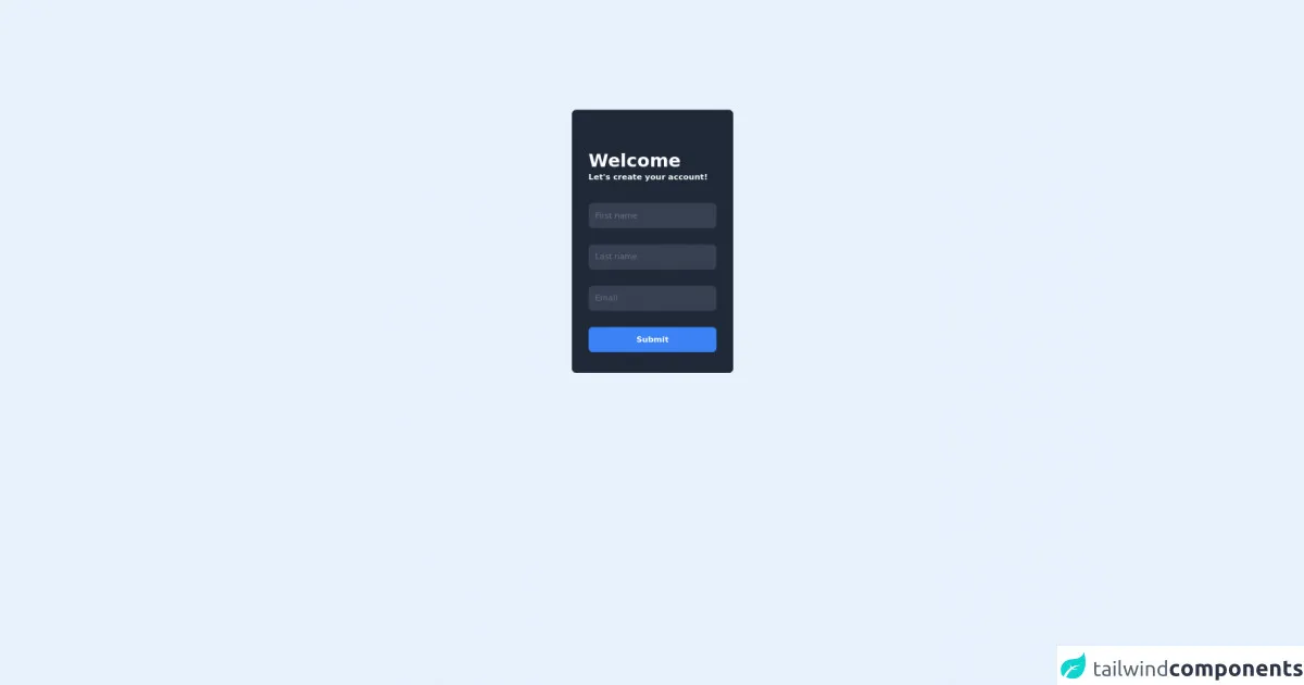
The preview of Login Form UI component
Before we dive into the code, let's take a look at what the Login Form UI component will look like.
Free download of the Login Form's source code
The source code of Login Form UI component
Here is the HTML and CSS code for the Login Form UI component.
<div class="flex items-center justify-center h-screen">
  <div class="bg-gray-800 flex flex-col w-80 border border-gray-900 rounded-lg px-8 py-10">
  <div class="text-white mt-10">
    <h1 class="font-bold text-4xl">Welcome</h1>
    <p class="font-semibold">Let's create your account!</p>
  </div>
  <form class="flex flex-col space-y-8 mt-10">
    <input type="text" placeholder="First name" class="border rounded-lg py-3 px-3 bg-gray-700 border-gray-700 placeholder-gray-500">
    <input type="text" placeholder="Last name" class="border rounded-lg py-3 px-3 bg-gray-700 border-gray-700 placeholder-gray-500">
    <input type="text" placeholder="Email" class="border rounded-lg py-3 px-3 bg-gray-700 border-gray-700 placeholder-gray-500">
    <button class="border border-blue-500 bg-blue-500 text-white rounded-lg py-3 font-semibold">Submit</button>
  </form>
</div>
</div>
How to create a Login Form with Tailwind CSS?
Now that we have covered the basics, let's explore six different ways to create a Login Form using Tailwind CSS.
1. Basic Login Form
The first way to create a Login Form is to use the basic HTML input elements and Tailwind CSS classes to style them. Here is the code:
<form>
  <div class="mb-4">
    <label class="block text-gray-700 text-sm font-bold mb-2" for="username">
      Username
    </label>
    <input class="shadow appearance-none border rounded w-full py-2 px-3 text-gray-700 leading-tight focus:outline-none focus:shadow-outline" id="username" type="text" placeholder="Username">
  </div>
  <div class="mb-6">
    <label class="block text-gray-700 text-sm font-bold mb-2" for="password">
      Password
    </label>
    <input class="shadow appearance-none border rounded w-full py-2 px-3 text-gray-700 leading-tight focus:outline-none focus:shadow-outline" id="password" type="password" placeholder="******************">
  </div>
  <div class="flex items-center justify-between">
    <button class="bg-blue-500 hover:bg-blue-700 text-white font-bold py-2 px-4 rounded focus:outline-none focus:shadow-outline" type="button">
      Sign In
    </button>
  </div>
</form>
2. Rounded Login Form
The second way to create a Login Form is to use the rounded Tailwind CSS classes to give the input fields and submit button a rounded appearance. Here is the code:
<form>
  <div class="mb-4">
    <label class="block text-gray-700 text-sm font-bold mb-2" for="username">
      Username
    </label>
    <input class="shadow appearance-none border rounded-full w-full py-2 px-3 text-gray-700 leading-tight focus:outline-none focus:shadow-outline" id="username" type="text" placeholder="Username">
  </div>
  <div class="mb-6">
    <label class="block text-gray-700 text-sm font-bold mb-2" for="password">
      Password
    </label>
    <input class="shadow appearance-none border rounded-full w-full py-2 px-3 text-gray-700 leading-tight focus:outline-none focus:shadow-outline" id="password" type="password" placeholder="******************">
  </div>
  <div class="flex items-center justify-between">
    <button class="bg-blue-500 hover:bg-blue-700 text-white font-bold py-2 px-4 rounded-full focus:outline-none focus:shadow-outline" type="button">
      Sign In
    </button>
  </div>
</form>
3. Colored Login Form
The third way to create a Login Form is to use the Tailwind CSS color classes to give the input fields and submit button a colored appearance. Here is the code:
<form>
  <div class="mb-4">
    <label class="block text-gray-700 text-sm font-bold mb-2" for="username">
      Username
    </label>
    <input class="shadow appearance-none border rounded-full w-full py-2 px-3 text-gray-700 leading-tight focus:outline-none focus:shadow-outline bg-blue-100" id="username" type="text" placeholder="Username">
  </div>
  <div class="mb-6">
    <label class="block text-gray-700 text-sm font-bold mb-2" for="password">
      Password
    </label>
    <input class="shadow appearance-none border rounded-full w-full py-2 px-3 text-gray-700 leading-tight focus:outline-none focus:shadow-outline bg-blue-100" id="password" type="password" placeholder="******************">
  </div>
  <div class="flex items-center justify-between">
    <button class="bg-blue-500 hover:bg-blue-700 text-white font-bold py-2 px-4 rounded-full focus:outline-none focus:shadow-outline" type="button">
      Sign In
    </button>
  </div>
</form>
4. Gradient Login Form
The fourth way to create a Login Form is to use the Tailwind CSS gradient classes to give the input fields and submit button a gradient appearance. Here is the code:
<form>
  <div class="mb-4">
    <label class="block text-gray-700 text-sm font-bold mb-2" for="username">
      Username
    </label>
    <input class="shadow appearance-none border rounded-full w-full py-2 px-3 text-gray-700 leading-tight focus:outline-none focus:shadow-outline bg-gradient-to-r from-purple-400 via-pink-500 to-red-500" id="username" type="text" placeholder="Username">
  </div>
  <div class="mb-6">
    <label class="block text-gray-700 text-sm font-bold mb-2" for="password">
      Password
    </label>
    <input class="shadow appearance-none border rounded-full w-full py-2 px-3 text-gray-700 leading-tight focus:outline-none focus:shadow-outline bg-gradient-to-r from-purple-400 via-pink-500 to-red-500" id="password" type="password" placeholder="******************">
  </div>
  <div class="flex items-center justify-between">
    <button class="bg-gradient-to-r from-purple-400 via-pink-500 to-red-500 hover:from-pink-500 hover:to-red-500 text-white font-bold py-2 px-4 rounded-full focus:outline-none focus:shadow-outline" type="button">
      Sign In
    </button>
  </div>
</form>
5. Shadow Login Form
The fifth way to create a Login Form is to use the Tailwind CSS shadow classes to give the input fields and submit button a shadow appearance. Here is the code:
<form>
  <div class="mb-4">
    <label class="block text-gray-700 text-sm font-bold mb-2" for="username">
      Username
    </label>
    <input class="shadow-lg appearance-none border rounded-full w-full py-2 px-3 text-gray-700 leading-tight focus:outline-none focus:shadow-outline bg-blue-100" id="username" type="text" placeholder="Username">
  </div>
  <div class="mb-6">
    <label class="block text-gray-700 text-sm font-bold mb-2" for="password">
      Password
    </label>
    <input class="shadow-lg appearance-none border rounded-full w-full py-2 px-3 text-gray-700 leading-tight focus:outline-none focus:shadow-outline bg-blue-100" id="password" type="password" placeholder="******************">
  </div>
  <div class="flex items-center justify-between">
    <button class="bg-blue-500 hover:bg-blue-700 text-white font-bold py-2 px-4 rounded-full focus:outline-none focus:shadow-outline shadow-lg" type="button">
      Sign In
    </button>
  </div>
</form>
6. Icon Login Form
The sixth way to create a Login Form is to add icons to the input fields and submit button using Tailwind CSS and Font Awesome. Here is the code:
<form>
  <div class="mb-4">
    <label class="block text-gray-700 text-sm font-bold mb-2" for="username">
      <i class="fas fa-user mr-2"></i>Username
    </label>
    <div class="relative">
      <input class="shadow appearance-none border rounded-full w-full py-2 px-3 text-gray-700 leading-tight focus:outline-none focus:shadow-outline bg-blue-100" id="username" type="text" placeholder="Username">
      <div class="absolute inset-y-0 right-0 flex items-center px-2 pointer-events-none">
        <i class="fas fa-user text-gray-400"></i>
      </div>
    </div>
  </div>
  <div class="mb-6">
    <label class="block text-gray-700 text-sm font-bold mb-2" for="password">
      <i class="fas fa-lock mr-2"></i>Password
    </label>
    <div class="relative">
      <input class="shadow appearance-none border rounded-full w-full py-2 px-3 text-gray-700 leading-tight focus:outline-none focus:shadow-outline bg-blue-100" id="password" type="password" placeholder="******************">
      <div class="absolute inset-y-0 right-0 flex items-center px-2 pointer-events-none">
        <i class="fas fa-lock text-gray-400"></i>
      </div>
    </div>
  </div>
  <div class="flex items-center justify-between">
    <button class="bg-blue-500 hover:bg-blue-700 text-white font-bold py-2 px-4 rounded-full focus:outline-none focus:shadow-outline shadow-lg" type="button">
      <i class="fas fa-sign-in-alt mr-2"></i>Sign In
    </button>
  </div>
</form>
Conclusion
In this article, we explored how to create a Login Form UI component using Tailwind CSS. We covered what Tailwind CSS is, why it is useful for creating UI components, and six different ways to create a Login Form using Tailwind CSS. We hope this article has been helpful in showing you the power and flexibility of Tailwind CSS. Happy coding!