- Published on
How to Build A Login Form With Tailwind CSS?
- What is Tailwind CSS?
- The description of Login form ui component
- Why use Tailwind CSS to create a Login form ui component?
- The preview of Login form ui component
- The source code of Login form ui component
- How to create a Login form with Tailwind CSS?
- Conclusion
What is Tailwind CSS?
Tailwind CSS is a utility-first CSS framework that helps developers quickly build custom user interfaces. It provides a set of pre-defined CSS classes that can be used to style HTML elements. Tailwind CSS is highly customizable, allowing developers to create unique designs without writing custom CSS.
The description of Login form ui component
A login form is a common user interface component that allows users to authenticate themselves on a website or application. A typical login form consists of two input fields for the user's email or username and password, along with a submit button.
Why use Tailwind CSS to create a Login form ui component?
Tailwind CSS makes it easy to create a login form with minimal CSS code. The pre-defined CSS classes provided by Tailwind CSS can be used to style the form elements, making it easy to create a consistent and visually appealing design. Additionally, Tailwind CSS is highly customizable, allowing developers to easily modify the design of the login form to match the branding of their website or application.
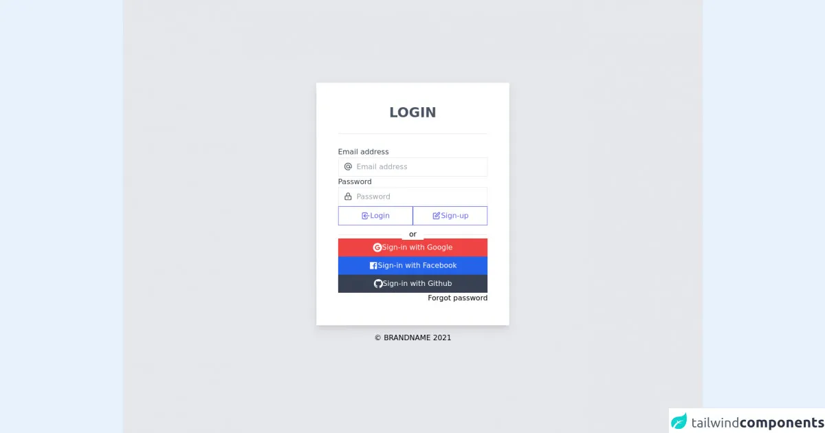
The preview of Login form ui component
To create a login form with Tailwind CSS, we will use the following HTML code:
<form class="bg-white shadow-md rounded px-8 pt-6 pb-8 mb-4">
  <div class="mb-4">
    <label class="block text-gray-700 text-sm font-bold mb-2" for="username">
      Username
    </label>
    <input class="shadow appearance-none border rounded w-full py-2 px-3 text-gray-700 leading-tight focus:outline-none focus:shadow-outline" id="username" type="text" placeholder="Username">
  </div>
  <div class="mb-6">
    <label class="block text-gray-700 text-sm font-bold mb-2" for="password">
      Password
    </label>
    <input class="shadow appearance-none border rounded w-full py-2 px-3 text-gray-700 mb-3 leading-tight focus:outline-none focus:shadow-outline" id="password" type="password" placeholder="********">
  </div>
  <div class="flex items-center justify-between">
    <button class="bg-blue-500 hover:bg-blue-700 text-white font-bold py-2 px-4 rounded focus:outline-none focus:shadow-outline" type="button">
      Sign In
    </button>
    <a class="inline-block align-baseline font-bold text-sm text-blue-500 hover:text-blue-800" href="#">
      Forgot Password?
    </a>
  </div>
</form>
Free download of the Login form's source code
The source code of Login form ui component
To create the login form, we used Tailwind CSS classes to style the form elements. The bg-white, shadow-md, and rounded classes were used to style the form container. The px-8, pt-6, and pb-8 classes were used to add padding to the form container. The mb-4 and mb-6 classes were used to add margin to the form elements.
The block, text-gray-700, text-sm, and font-bold classes were used to style the form labels. The appearance-none, border, rounded, w-full, py-2, px-3, text-gray-700, leading-tight, focus:outline-none, and focus:shadow-outline classes were used to style the form input fields.
The flex, items-center, and justify-between classes were used to style the form submit button and forgot password link. The bg-blue-500, hover:bg-blue-700, text-white, font-bold, py-2, px-4, rounded, focus:outline-none, and focus:shadow-outline classes were used to style the submit button. The inline-block, align-baseline, font-bold, text-sm, text-blue-500, and hover:text-blue-800 classes were used to style the forgot password link.
<!-- Simple login form -->

<div class="bg-white sm:bg-gray-200 min-h-screen w-screen flex flex-col justify-center items-center">
      <div class="bg-white shadow-none sm:shadow-lg px-8 sm:px-12 w-full xs:w-full sm:w-8/12 md:w-7/12 lg:w-7/12 xl:w-2/6 h-screen sm:h-auto py-8">
        <div class="text-center w-full font-bold text-3xl text-gray-600 p-4">
          LOGIN
        </div>
        <div
            class="w-full bg-gray-200 my-3" style="height: 1px"
        ></div>
        <form>
          <div class="flex flex-col gap-4 px-0 py-4">
            <div>
              <label class="text-gray-700">Email address</label>
              <!-- <AtSymbolIcon class="font-medium text-2xl text-gray-600 absolute p-2.5 px-3 w-11" /> -->
              <svg xmlns="http://www.w3.org/2000/svg" class="font-medium text-2xl text-gray-600 absolute p-2.5 px-3 w-11" fill="none" viewBox="0 0 24 24" stroke="currentColor">
                <path stroke-linecap="round" stroke-linejoin="round" stroke-width="2" d="M16 12a4 4 0 10-8 0 4 4 0 008 0zm0 0v1.5a2.5 2.5 0 005 0V12a9 9 0 10-9 9m4.5-1.206a8.959 8.959 0 01-4.5 1.207" />
            </svg>
              <input
                class="py-2 pl-10 border border-gray-200 w-full"
                placeholder="Email address"
                type="email"
              />
            </div>
            <div>
              <label class="text-gray-700">Password</label>
              <!-- <LockClosedIcon class="font-medium text-2xl text-gray-600 absolute p-2.5 px-3 w-11" /> -->
              <svg xmlns="http://www.w3.org/2000/svg" class="font-medium text-2xl text-gray-600 absolute p-2.5 px-3 w-11" fill="none" viewBox="0 0 24 24" stroke="currentColor">
                <path stroke-linecap="round" stroke-linejoin="round" stroke-width="2" d="M12 15v2m-6 4h12a2 2 0 002-2v-6a2 2 0 00-2-2H6a2 2 0 00-2 2v6a2 2 0 002 2zm10-10V7a4 4 0 00-8 0v4h8z" />
            </svg>
              <input
                class="py-2 pl-10 border border-gray-200 w-full"
                placeholder="Password"
                type="password"
              />
            </div>
            <div class="w-full flex flex-row gap-2">
              <button
                class="border border-indigo-500 hover:bg-indigo-500 hover:text-white duration-100 ease-in-out w-6/12 text-indigo-500 p-0 flex flex-row justify-center items-center gap-1"
                type="submit"
              >
                <svg xmlns="http://www.w3.org/2000/svg" class="h-5 w-5" fill="none" viewBox="0 0 24 24" stroke="currentColor">
                    <path stroke-linecap="round" stroke-linejoin="round" stroke-width="2" d="M11 16l-4-4m0 0l4-4m-4 4h14m-5 4v1a3 3 0 01-3 3H6a3 3 0 01-3-3V7a3 3 0 013-3h7a3 3 0 013 3v1" />
                </svg> Login
              </button>
                <button class="border border-indigo-500 hover:bg-indigo-500 hover:text-white duration-100 ease-in-out w-6/12 text-indigo-500 p-2 flex flex-row justify-center items-center gap-1">
                  <svg xmlns="http://www.w3.org/2000/svg" class="w-5" fill="none" viewBox="0 0 24 24" stroke="currentColor">
                    <path stroke-linecap="round" stroke-linejoin="round" stroke-width="2" d="M11 5H6a2 2 0 00-2 2v11a2 2 0 002 2h11a2 2 0 002-2v-5m-1.414-9.414a2 2 0 112.828 2.828L11.828 15H9v-2.828l8.586-8.586z" />
                </svg> Sign-up
                </button>
            </div>
            <div class="my-2 flex flex-row justify-center">
              <span class="absolute bg-white px-4">or</span>
              <div
                class="w-full bg-gray-200 mt-3" style="height: 1px"
              ></div>
            </div>
            <div class="w-full flex flex-col gap-2">
              <button class="bg-red-500 text-white w-full p-2 flex flex-row justify-center gap-2 items-center hover:bg-red-600 duration-100 ease-in-out">
                  <svg xmlns="http://www.w3.org/2000/svg" xmlns:xlink="http://www.w3.org/1999/xlink" aria-hidden="true" role="img" class="w-5" preserveAspectRatio="xMidYMid meet" viewBox="0 0 24 24"><g fill="none"><path fill-rule="evenodd" clip-rule="evenodd" d="M12 0C5.372 0 0 5.373 0 12s5.372 12 12 12c6.627 0 12-5.373 12-12S18.627 0 12 0zm.14 19.018c-3.868 0-7-3.14-7-7.018c0-3.878 3.132-7.018 7-7.018c1.89 0 3.47.697 4.682 1.829l-1.974 1.978v-.004c-.735-.702-1.667-1.062-2.708-1.062c-2.31 0-4.187 1.956-4.187 4.273c0 2.315 1.877 4.277 4.187 4.277c2.096 0 3.522-1.202 3.816-2.852H12.14v-2.737h6.585c.088.47.135.96.135 1.474c0 4.01-2.677 6.86-6.72 6.86z" fill="currentColor"/></g></svg>
                Sign-in with Google
              </button>
              <button class="bg-blue-600 text-white w-full p-2 flex flex-row justify-center gap-2 items-center hover:bg-blue-700 duration-100 ease-in-out">
                      <svg xmlns="http://www.w3.org/2000/svg" xmlns:xlink="http://www.w3.org/1999/xlink" aria-hidden="true" role="img" class="w-5" preserveAspectRatio="xMidYMid meet" viewBox="0 0 1024 1024"><path d="M880 112H144c-17.7 0-32 14.3-32 32v736c0 17.7 14.3 32 32 32h736c17.7 0 32-14.3 32-32V144c0-17.7-14.3-32-32-32zm-92.4 233.5h-63.9c-50.1 0-59.8 23.8-59.8 58.8v77.1h119.6l-15.6 120.7h-104V912H539.2V602.2H434.9V481.4h104.3v-89c0-103.3 63.1-159.6 155.3-159.6c44.2 0 82.1 3.3 93.2 4.8v107.9z" fill="currentColor"/></svg>
                  Sign-in with Facebook
              </button>
              <button class="bg-gray-700 text-white w-full p-2 flex flex-row justify-center gap-2 items-center hover:bg-gray-800 duration-100 ease-in-out">
                      <svg xmlns="http://www.w3.org/2000/svg" xmlns:xlink="http://www.w3.org/1999/xlink" aria-hidden="true" role="img" class="w-5" preserveAspectRatio="xMidYMid meet" viewBox="0 0 24 24"><g fill="none"><path fill-rule="evenodd" clip-rule="evenodd" d="M12 0C5.37 0 0 5.37 0 12c0 5.31 3.435 9.795 8.205 11.385c.6.105.825-.255.825-.57c0-.285-.015-1.23-.015-2.235c-3.015.555-3.795-.735-4.035-1.41c-.135-.345-.72-1.41-1.23-1.695c-.42-.225-1.02-.78-.015-.795c.945-.015 1.62.87 1.845 1.23c1.08 1.815 2.805 1.305 3.495.99c.105-.78.42-1.305.765-1.605c-2.67-.3-5.46-1.335-5.46-5.925c0-1.305.465-2.385 1.23-3.225c-.12-.3-.54-1.53.12-3.18c0 0 1.005-.315 3.3 1.23c.96-.27 1.98-.405 3-.405s2.04.135 3 .405c2.295-1.56 3.3-1.23 3.3-1.23c.66 1.65.24 2.88.12 3.18c.765.84 1.23 1.905 1.23 3.225c0 4.605-2.805 5.625-5.475 5.925c.435.375.81 1.095.81 2.22c0 1.605-.015 2.895-.015 3.3c0 .315.225.69.825.57A12.02 12.02 0 0 0 24 12c0-6.63-5.37-12-12-12z" fill="currentColor"/></g></svg>
                       Sign-in with Github
              </button>
            </div>
            <div class="w-full flex flex-row justify-end">
              <a href="#">Forgot password</a>
            </div>
          </div>
        </form>
      </div>
      <div class="p-4">© BRANDNAME 2021</div>
    </div>
How to create a Login form with Tailwind CSS?
To create a login form with Tailwind CSS, follow these steps:
- Create a new HTML file and add the following code:
<form class="bg-white shadow-md rounded px-8 pt-6 pb-8 mb-4">
  <div class="mb-4">
    <label class="block text-gray-700 text-sm font-bold mb-2" for="username">
      Username
    </label>
    <input class="shadow appearance-none border rounded w-full py-2 px-3 text-gray-700 leading-tight focus:outline-none focus:shadow-outline" id="username" type="text" placeholder="Username">
  </div>
  <div class="mb-6">
    <label class="block text-gray-700 text-sm font-bold mb-2" for="password">
      Password
    </label>
    <input class="shadow appearance-none border rounded w-full py-2 px-3 text-gray-700 mb-3 leading-tight focus:outline-none focus:shadow-outline" id="password" type="password" placeholder="********">
  </div>
  <div class="flex items-center justify-between">
    <button class="bg-blue-500 hover:bg-blue-700 text-white font-bold py-2 px-4 rounded focus:outline-none focus:shadow-outline" type="button">
      Sign In
    </button>
    <a class="inline-block align-baseline font-bold text-sm text-blue-500 hover:text-blue-800" href="#">
      Forgot Password?
    </a>
  </div>
</form>
- Add the Tailwind CSS CDN to your HTML file:
<link href="https://cdn.jsdelivr.net/npm/[email protected]/dist/tailwind.min.css" rel="stylesheet">
- Open the HTML file in your web browser to see the login form.
Conclusion
In this article, we learned how to create a login form with Tailwind CSS. Tailwind CSS provides a set of pre-defined CSS classes that can be used to style HTML elements, making it easy to create custom user interfaces. By using Tailwind CSS, developers can create visually appealing and consistent designs without writing custom CSS.