- Published on
What You Need To Create A Login Form With Tailwind CSS
- What is Tailwind CSS?
- The description of Login Form ui component
- Why use Tailwind CSS to create a Login Form ui component?
- The preview of Login Form ui component.
- The source code of Login Form ui component.
- How to create a Login Form with Tailwind CSS?
- Conclusion
In today's digital age, login forms are an essential part of any website or application. They provide a secure way for users to access their accounts and ensure that only authorized users can access sensitive information. In this article, we will explore how to create a login form using Tailwind CSS.
What is Tailwind CSS?
Tailwind CSS is a utility-first CSS framework that allows developers to quickly create responsive and customizable user interfaces. It provides a set of pre-defined classes that can be used to style HTML elements without writing any CSS code. Tailwind CSS is gaining popularity among developers due to its simplicity and flexibility.
The description of Login Form ui component
A login form is a user interface component that allows users to enter their login credentials, such as username and password, to access a website or application. It typically consists of two input fields for username and password, a submit button, and a link to reset the password or create a new account.
Why use Tailwind CSS to create a Login Form ui component?
Tailwind CSS can help developers create a login form quickly and easily. It provides a set of pre-defined classes that can be used to style the form elements, such as input fields, buttons, and links. Developers can customize the form's appearance by modifying the classes or creating new ones.
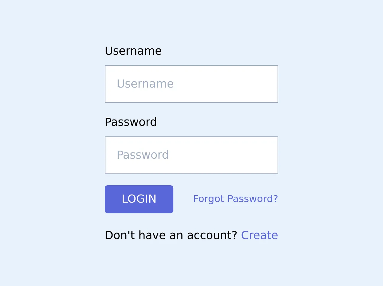
The preview of Login Form ui component.
To create a login form using Tailwind CSS, we will use the following HTML code:
<form class="bg-white shadow-md rounded px-8 pt-6 pb-8 mb-4">
  <div class="mb-4">
    <label class="block text-gray-700 font-bold mb-2" for="username">
      Username
    </label>
    <input
      class="shadow appearance-none border rounded w-full py-2 px-3 text-gray-700 leading-tight focus:outline-none focus:shadow-outline"
      id="username"
      type="text"
      placeholder="Enter your username"
    />
  </div>
  <div class="mb-6">
    <label class="block text-gray-700 font-bold mb-2" for="password">
      Password
    </label>
    <input
      class="shadow appearance-none border rounded w-full py-2 px-3 text-gray-700 leading-tight focus:outline-none focus:shadow-outline"
      id="password"
      type="password"
      placeholder="Enter your password"
    />
  </div>
  <div class="flex items-center justify-between">
    <button
      class="bg-blue-500 hover:bg-blue-700 text-white font-bold py-2 px-4 rounded focus:outline-none focus:shadow-outline"
      type="button"
    >
      Sign In
    </button>
    <a
      class="inline-block align-baseline font-bold text-sm text-blue-500 hover:text-blue-800"
      href="#"
    >
      Forgot Password?
    </a>
  </div>
</form>
Free download of the Login Form's source code
The source code of Login Form ui component.
To create the login form using Tailwind CSS, we will use the following classes:
bg-white: sets the background color of the form to white.shadow-md: adds a shadow effect to the form.rounded: rounds the corners of the form.px-8: adds padding to the left and right sides of the form.pt-6: adds padding to the top of the form.pb-8: adds padding to the bottom of the form.mb-4: adds margin to the bottom of the form.mb-6: adds margin to the bottom of the password input field.block: displays the label and input field as block elements.text-gray-700: sets the color of the label and input field text to gray.font-bold: sets the font weight of the label to bold.appearance-none: removes the default styling of the input field.border: adds a border to the input field.w-full: sets the width of the input field to 100%.py-2: adds padding to the top and bottom of the input field.px-3: adds padding to the left and right sides of the input field.leading-tight: sets the line height of the input field text to be tight.focus:outline-none: removes the outline when the input field is focused.focus:shadow-outline: adds a shadow effect when the input field is focused.flex: displays the button and link as flex elements.items-center: centers the button and link vertically.justify-between: evenly spaces the button and link horizontally.bg-blue-500: sets the background color of the button to blue.hover:bg-blue-700: sets the background color of the button to a darker shade of blue when hovered over.text-white: sets the color of the button text to white.font-bold: sets the font weight of the button text to bold.py-2: adds padding to the top and bottom of the button.px-4: adds padding to the left and right sides of the button.rounded: rounds the corners of the button.inline-block: displays the link as an inline-block element.align-baseline: aligns the link with the baseline of the text.text-sm: sets the font size of the link text to small.text-blue-500: sets the color of the link text to blue.hover:text-blue-800: sets the color of the link text to a darker shade of blue when hovered over.
<form>
  <div class="mb-4">
    <label class="block text-md font-light mb-2" for="username">Username</label>
    <input class="w-full bg-drabya-gray border-gray-500 appearance-none border p-4 font-light leading-tight focus:outline-none focus:shadow-outline" type="text" name="username" id="" placeholder="Username">
  </div>
  <div class="mb-4">
    <label class="block text-md font-light mb-2" for="password">Password</label>
    <input class="w-full bg-drabya-gray border-gray-500 appearance-none border p-4 font-light leading-tight focus:outline-none focus:shadow-outline" type="password" name="password" id="" placeholder="Password">
  </div>

  <div class="flex items-center justify-between mb-5">
    <button class="bg-indigo-600 hover:bg-blue-700 text-white font-light py-2 px-6 rounded focus:outline-none focus:shadow-outline" type="button">
      LOGIN
    </button>
    <a class="inline-block align-baseline font-light text-sm text-indigo-600 hover:text-indigo-500" href="#">
      Forgot Password?
    </a>
  </div>
  <p class="text-center text-md font-light">Don't have an account? <a class="font-light text-md text-indigo-600">Create</a></p>
</form>
How to create a Login Form with Tailwind CSS?
To create a login form using Tailwind CSS, follow these steps:
- Create a new HTML file and add the above HTML code to it.
- Add the Tailwind CSS stylesheet to the HTML file by adding the following code to the head section of the HTML file:
<link href="https://cdn.jsdelivr.net/npm/[email protected]/dist/tailwind.min.css" rel="stylesheet">
- Save the HTML file and open it in a web browser to see the login form.
Conclusion
In this article, we have explored how to create a login form using Tailwind CSS. Tailwind CSS provides a set of pre-defined classes that can be used to style the form elements, making it easy for developers to create a customized login form quickly. With Tailwind CSS, developers can focus on creating a great user experience without worrying about the underlying CSS code.