- Published on
Surprisingly Effective Ways To Build A Card With Sidebar With Tailwind CSS
- What is Tailwind CSS?
- The description of Card with sidebar ui component
- Why use Tailwind CSS to create a Card with sidebar ui component?
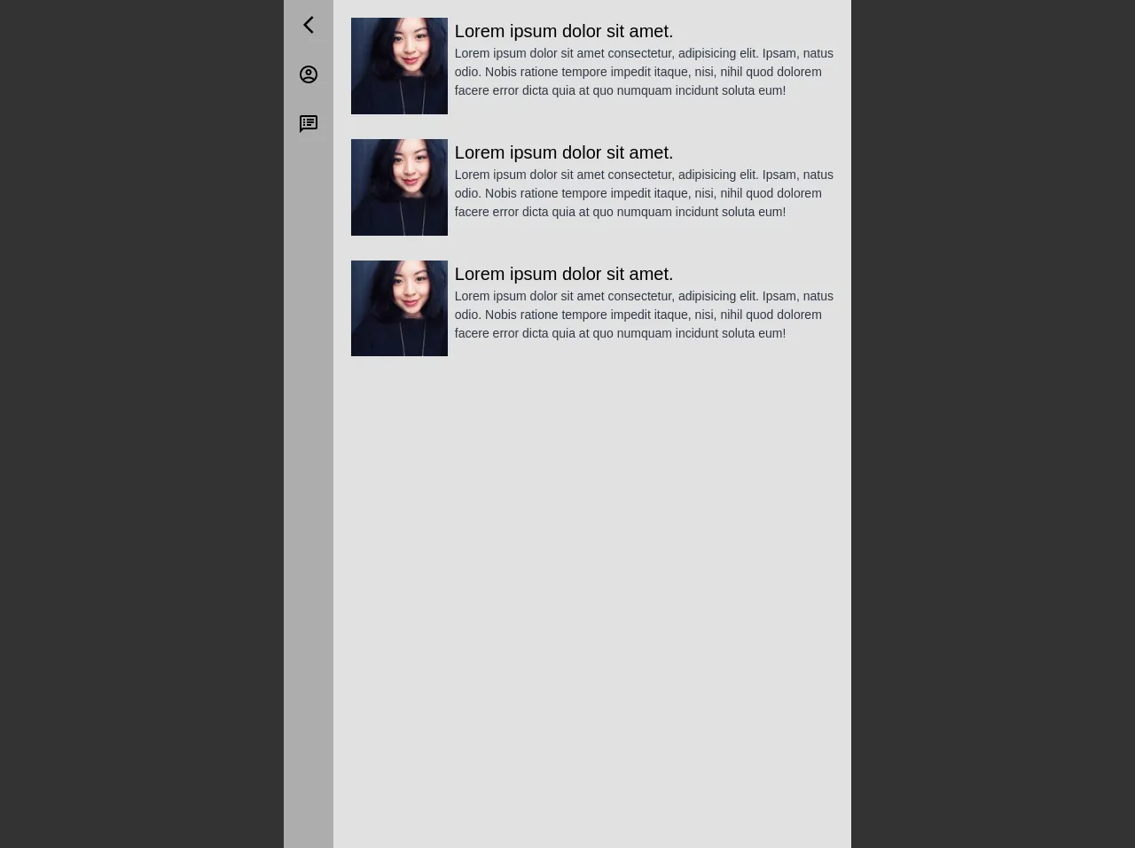
- The preview of Card with sidebar ui component.
- The source code of Card with sidebar ui component.
- How to create a Card with sidebar with Tailwind CSS?
- Conclusion.
What is Tailwind CSS?
Tailwind CSS is a utility-first CSS framework that provides a set of pre-defined classes to style your HTML elements. It allows you to create complex layouts and designs with minimal effort, making it a popular choice among developers.
The description of Card with sidebar ui component
A card with sidebar is a common UI component used in web design. It consists of a main content area and a sidebar that contains additional information or navigation links. This component is often used to display product information, blog posts, or user profiles.
Why use Tailwind CSS to create a Card with sidebar ui component?
Tailwind CSS provides a set of pre-defined classes that make it easy to create a card with sidebar UI component. These classes can be used to style the main content area, sidebar, and other elements of the component. Additionally, Tailwind CSS allows you to customize the styles of each component without having to write custom CSS.
The preview of Card with sidebar ui component.
To create a card with sidebar UI component with Tailwind CSS, we will use the following classes:
bg-white: sets the background color of the component to white.rounded-lg: adds rounded corners to the component.shadow-md: adds a shadow to the component.flex: sets the display property of the component to flex.flex-row: sets the direction of the flex container to row.w-full: sets the width of the component to 100%.md:w-3/4: sets the width of the component to 75% on medium screens and above.p-4: adds padding to the component.md:p-8: adds more padding to the component on medium screens and above.md:pl-0: removes the left padding of the component on medium screens and above.md:border-l: adds a border to the left side of the component on medium screens and above.md:border-gray-300: sets the color of the border to gray on medium screens and above.md:ml-0: removes the left margin of the component on medium screens and above.flex-col: sets the direction of the flex container to column.md:flex-row: sets the direction of the flex container to row on medium screens and above.md:justify-between: aligns the items in the flex container to the start and end on medium screens and above.md:w-1/4: sets the width of the sidebar to 25% on medium screens and above.md:pl-8: adds left padding to the sidebar on medium screens and above.md:pr-4: adds right padding to the sidebar on medium screens and above.md:py-8: adds top and bottom padding to the sidebar on medium screens and above.text-gray-700: sets the text color of the component to gray.font-bold: sets the font weight of the component to bold.text-lg: sets the font size of the component to large.
Free download of the Card with sidebar's source code
The source code of Card with sidebar ui component.
Here is the source code for the card with sidebar UI component:
<div class="bg-white rounded-lg shadow-md flex flex-row w-full md:w-3/4 p-4 md:p-8 md:pl-0 md:border-l md:border-gray-300 md:ml-0">
  <div class="flex flex-col md:flex-row md:justify-between md:w-1/4 md:pl-8 md:pr-4 md:py-8">
    <img src="https://via.placeholder.com/150" alt="Placeholder Image" class="w-full md:w-auto">
    <div class="text-gray-700 font-bold text-lg mt-4 md:mt-0">Sidebar Content</div>
  </div>
  <div class="flex flex-col w-full md:flex-row md:w-3/4 p-4">
    <div class="text-gray-700 font-bold text-lg">Main Content</div>
    <p>Lorem ipsum dolor sit amet, consectetur adipiscing elit. Sed sodales, velit eu vehicula lacinia, ipsum sapien posuere nunc, euismod mattis lectus elit eu velit. Sed vel mauris in neque pharetra venenatis. Donec eget ante eget enim faucibus aliquet. Nulla facilisi. Sed euismod, nunc nec venenatis bibendum, nisl dui tincidunt mauris, in vestibulum velit turpis vel elit. Vestibulum ante ipsum primis in faucibus orci luctus et ultrices posuere cubilia curae; Sed euismod, nunc nec venenatis bibendum, nisl dui tincidunt mauris, in vestibulum velit turpis vel elit. Vestibulum ante ipsum primis in faucibus orci luctus et ultrices posuere cubilia curae;</p>
  </div>
</div>
<!-- Delete this div -->
<div style="background-color:#333; position:absolute; width: 100%; height: 100%; z-index: -1;"></div>

<style>
  .bg-sidebar {
  	background-color: rgba(255, 255, 255, 0.6);
  }

  .btn-sidebar:hover {
    background-color: rgba(255, 255, 255, 0.25);
  }

  .bg-content {
    background-color: rgba(255, 255, 255, 0.85);
  }
</style>
<div class="flex w-2/4">
        <div class="flex bg-sidebar">
            <ul class="flex list-none h-full flex-col">
                <li class="p-4 btn-sidebar cursor-pointer"><svg xmlns="http://www.w3.org/2000/svg" width="24" height="24" viewBox="0 0 24 24"><path opacity=".87" fill="none" d="M0 0h24v24H0V0z"/><path d="M17.51 3.87L15.73 2.1 5.84 12l9.9 9.9 1.77-1.77L9.38 12l8.13-8.13z"/></svg></li>
                <li class="p-4 btn-sidebar cursor-pointer"><svg xmlns="http://www.w3.org/2000/svg" width="24" height="24" viewBox="0 0 24 24"><path fill="none" d="M0 0h24v24H0V0z"/><path d="M12 2C6.48 2 2 6.48 2 12s4.48 10 10 10 10-4.48 10-10S17.52 2 12 2zM7.07 18.28c.43-.9 3.05-1.78 4.93-1.78s4.51.88 4.93 1.78C15.57 19.36 13.86 20 12 20s-3.57-.64-4.93-1.72zm11.29-1.45c-1.43-1.74-4.9-2.33-6.36-2.33s-4.93.59-6.36 2.33C4.62 15.49 4 13.82 4 12c0-4.41 3.59-8 8-8s8 3.59 8 8c0 1.82-.62 3.49-1.64 4.83zM12 6c-1.94 0-3.5 1.56-3.5 3.5S10.06 13 12 13s3.5-1.56 3.5-3.5S13.94 6 12 6zm0 5c-.83 0-1.5-.67-1.5-1.5S11.17 8 12 8s1.5.67 1.5 1.5S12.83 11 12 11z"/></svg></li>
                <li class="p-4 btn-sidebar cursor-pointer"><svg xmlns="http://www.w3.org/2000/svg" width="24" height="24" viewBox="0 0 24 24"><path fill="none" d="M0 0h24v24H0V0z"/><path d="M20 2H4c-1.1 0-1.99.9-1.99 2L2 22l4-4h14c1.1 0 2-.9 2-2V4c0-1.1-.9-2-2-2zm0 14H5.17l-.59.59-.58.58V4h16v12zM6 12h2v2H6zm0-3h2v2H6zm0-3h2v2H6zm4 6h5v2h-5zm0-3h8v2h-8zm0-3h8v2h-8z"/></svg></li>
            </ul>
        </div>
        <div class="w-full flex flex-col bg-content">
            <div class="flex p-5 pb-2">
                <img class="w-1/5 h-full inline-block" src="https://randomuser.me/api/portraits/women/17.jpg">
                <div class="w-4/4 ml-2 inline-block">
                    <div class="text-black text-xl">Lorem ipsum dolor sit amet.</div>
                    <div class="text-gray-800 text-sm">Lorem ipsum dolor sit amet consectetur, adipisicing elit. Ipsam, natus odio. Nobis ratione tempore impedit itaque, nisi, nihil quod dolorem facere error dicta quia at quo numquam incidunt soluta eum!</div>
                </div>
            </div>
            <div class="flex p-5 pb-2 mb-3">
                <img class="w-1/5 h-full inline-block" src="https://randomuser.me/api/portraits/women/17.jpg">
                <div class="w-4/4 ml-2 inline-block">
                    <div class="text-black text-xl">Lorem ipsum dolor sit amet.</div>
                    <div class="text-gray-800 text-sm">Lorem ipsum dolor sit amet consectetur, adipisicing elit. Ipsam, natus odio. Nobis ratione tempore impedit itaque, nisi, nihil quod dolorem facere error dicta quia at quo numquam incidunt soluta eum!</div>
                </div>
            </div>
        </div>
    </div>
How to create a Card with sidebar with Tailwind CSS?
- Start by creating a new HTML file and linking to the Tailwind CSS stylesheet:
<!DOCTYPE html>
<html lang="en">
<head>
  <meta charset="UTF-8">
  <title>Card with Sidebar</title>
  <link rel="stylesheet" href="https://cdn.jsdelivr.net/npm/[email protected]/dist/tailwind.min.css">
</head>
<body>
  <!-- Your content here -->
</body>
</html>
- Add the HTML markup for the card with sidebar component:
<div class="bg-white rounded-lg shadow-md flex flex-row w-full md:w-3/4 p-4 md:p-8 md:pl-0 md:border-l md:border-gray-300 md:ml-0">
  <div class="flex flex-col md:flex-row md:justify-between md:w-1/4 md:pl-8 md:pr-4 md:py-8">
    <img src="https://via.placeholder.com/150" alt="Placeholder Image" class="w-full md:w-auto">
    <div class="text-gray-700 font-bold text-lg mt-4 md:mt-0">Sidebar Content</div>
  </div>
  <div class="flex flex-col w-full md:flex-row md:w-3/4 p-4">
    <div class="text-gray-700 font-bold text-lg">Main Content</div>
    <p>Lorem ipsum dolor sit amet, consectetur adipiscing elit. Sed sodales, velit eu vehicula lacinia, ipsum sapien posuere nunc, euismod mattis lectus elit eu velit. Sed vel mauris in neque pharetra venenatis. Donec eget ante eget enim faucibus aliquet. Nulla facilisi. Sed euismod, nunc nec venenatis bibendum, nisl dui tincidunt mauris, in vestibulum velit turpis vel elit. Vestibulum ante ipsum primis in faucibus orci luctus et ultrices posuere cubilia curae; Sed euismod, nunc nec venenatis bibendum, nisl dui tincidunt mauris, in vestibulum velit turpis vel elit. Vestibulum ante ipsum primis in faucibus orci luctus et ultrices posuere cubilia curae;</p>
  </div>
</div>
- Customize the styles of the card with sidebar component by adding or modifying the Tailwind CSS classes.
Conclusion.
In conclusion, Tailwind CSS provides an easy and efficient way to create a card with sidebar UI component. By using pre-defined classes, you can quickly create a complex layout without having to write custom CSS. With its flexibility and customization options, Tailwind CSS is a great choice for any web developer looking to create beautiful and responsive designs.