- Published on
How To Make A List With Tailwind CSS In 5 Easy Steps
- What is Tailwind CSS?
- The description of List ui component
- Why use Tailwind CSS to create a List ui component?
- The preview of List ui component.
- The source code of List ui component.
- How to create a List with Tailwind CSS?
- Step 1: Create an unordered list
- Step 2: Add list items
- Step 3: Style the list
- Step 4: Customize the list
- Step 5: Preview and test the list
- Conclusion
What is Tailwind CSS?
Tailwind CSS is a utility-first CSS framework that allows you to quickly build custom user interfaces. It provides a set of pre-defined CSS classes that you can use to style your HTML elements without having to write any CSS code.
The description of List ui component
A list is a common user interface component that displays a set of items in a vertical or horizontal sequence. Lists can be used to display a variety of content, including navigation links, product features, and blog posts.
Why use Tailwind CSS to create a List ui component?
Tailwind CSS makes it easy to create a list UI component with minimal CSS code. By using pre-defined CSS classes, you can quickly style your list items and customize the look and feel of your list.
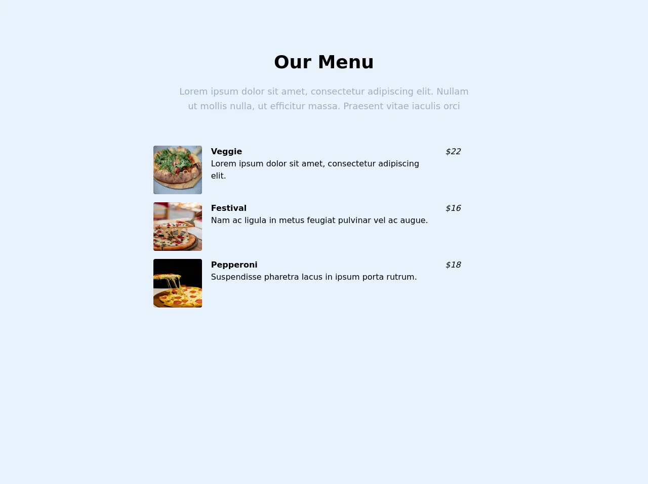
The preview of List ui component.
To create a list UI component with Tailwind CSS, you can use the ul and li HTML elements. Here's an example of what a simple list might look like:
<ul class="list-disc">
  <li>Item 1</li>
  <li>Item 2</li>
  <li>Item 3</li>
</ul>
Free download of the List's source code
The source code of List ui component.
To create a list UI component with Tailwind CSS, you can use a combination of pre-defined CSS classes and custom styles. Here's an example of what the source code for a simple list might look like:
<ul class="list-disc">
  <li class="mb-2">Item 1</li>
  <li class="mb-2">Item 2</li>
  <li class="mb-2">Item 3</li>
</ul>
<!-- This is an example component -->
<div id="menu" class="container mx-auto px-4 lg:pt-24 lg:pb-64">
      <div class="flex flex-wrap text-center justify-center">
        <div class="w-full lg:w-6/12 px-4">
          <h2 class="text-4xl font-semibold text-black">Our Menu</h2>
          <p class="text-lg leading-relaxed mt-4 mb-4 text-gray-500">
            Lorem ipsum dolor sit amet, consectetur adipiscing elit. Nullam ut mollis nulla, ut efficitur massa. Praesent vitae iaculis orci
          </p>
        </div>
      </div>
      <div class="flex flex-wrap mt-12 justify-center">
      <div class="grid grid-cols-1 sm:grid-cols-6 md:grid-cols-6 lg:grid-cols-6 xl:grid-cols-6 gap-4">
        <div class="col-span-2 sm:col-span-1 xl:col-span-1">
          <img
            alt="..."
            src="https://source.unsplash.com/gUBJ9vSlky0"
            class="h-24 w-24 rounded  mx-auto"
          />
        </div>
        <div class="col-span-2 sm:col-span-4 xl:col-span-4">
          <h3 class="font-semibold text-black">Veggie</h3>
          <p>
          Lorem ipsum dolor sit amet, consectetur adipiscing elit.
          </p>
        </div>
        <div class="col-span-2 sm:col-span-1 xl:col-span-1 italic ">$22</div>

        <div class="col-span-2 sm:col-span-1 xl:col-span-1">
          <img
            alt="..."
            src="https://source.unsplash.com/UxRhrU8fPHQ"
            class="h-24 w-24 rounded  mx-auto"
          />
        </div>
        <div class="col-span-2 sm:col-span-4 xl:col-span-4">
          <h3 class="font-semibold text-black">Festival</h3>
          <p>
          Nam ac ligula in metus feugiat pulvinar vel ac augue.
          </p>
        </div>
        <div class="col-span-2 sm:col-span-1 xl:col-span-1 italic ">$16</div>

        <div class="col-span-2 sm:col-span-1 xl:col-span-1">
          <img
            alt="..."
            src="https://source.unsplash.com/uU0Anw-8Vsg"
            class="h-24 w-24 rounded  mx-auto"
          />
        </div>
        <div class="col-span-2 sm:col-span-4 xl:col-span-4">
          <h3 class="font-semibold text-black">Pepperoni</h3>
          <p>
           Suspendisse pharetra lacus in ipsum porta rutrum.
          </p>
        </div>
        <div class="col-span-2 sm:col-span-1 xl:col-span-1 italic ">$18</div>
      </div>
      </div>
    </div>
In this example, we're using the list-disc class to style the unordered list as a bulleted list. We're also using the mb-2 class to add a margin-bottom of 0.5rem to each list item.
How to create a List with Tailwind CSS?
Here are the 5 easy steps to create a list with Tailwind CSS:
Step 1: Create an unordered list
The first step is to create an unordered list using the ul HTML element. This element will contain all of the list items.
<ul>
  <!-- List items will go here -->
</ul>
Step 2: Add list items
Next, add list items to the unordered list using the li HTML element. Each list item should be wrapped in an li element.
<ul>
  <li>List Item 1</li>
  <li>List Item 2</li>
  <li>List Item 3</li>
</ul>
Step 3: Style the list
To style the list, you can use pre-defined Tailwind CSS classes. For example, you can use the list-disc class to display the list items as bullets.
<ul class="list-disc">
  <li>List Item 1</li>
  <li>List Item 2</li>
  <li>List Item 3</li>
</ul>
Step 4: Customize the list
You can customize the list further by adding your own custom CSS classes. For example, you can add a margin-bottom to each list item using the mb-2 class.
<ul class="list-disc">
  <li class="mb-2">List Item 1</li>
  <li class="mb-2">List Item 2</li>
  <li class="mb-2">List Item 3</li>
</ul>
Step 5: Preview and test the list
Finally, preview and test your list to make sure it looks and functions as expected. You can make further adjustments to the list by adding or modifying CSS classes.
Conclusion
Creating a list UI component with Tailwind CSS is a quick and easy process that can save you time and effort. By using pre-defined CSS classes and custom styles, you can create a list that looks great and functions well. With these 5 easy steps, you can create a list in no time and focus on other aspects of your project.