- Published on
6 Incredibly Easy Ways To Make A LIst Order Product With Tailwind CSS Better While Spending Less
- What is Tailwind CSS?
- The description of List Order Product UI component
- Why use Tailwind CSS to create a List Order Product UI component?
- The preview of List Order Product UI component
- The source code of List Order Product UI component
- How to create a List Order Product with Tailwind CSS?
- Conclusion
As a FrontEnd technology blogger, you might have heard about Tailwind CSS. It is a utility-first CSS framework that helps you create beautiful designs with minimal effort. In this article, we will discuss how to create a List Order Product UI component with Tailwind CSS and make it better while spending less.
What is Tailwind CSS?
Tailwind CSS is a utility-first CSS framework that provides you with a set of pre-defined classes to style your HTML elements. It is designed to help you create beautiful designs with minimal effort by providing you with a set of pre-defined classes that you can use to style your HTML elements.
The description of List Order Product UI component
A List Order Product UI component is a simple component that displays a list of products with their respective order numbers. It is a common UI component used in e-commerce websites to display the order details of a customer.
Why use Tailwind CSS to create a List Order Product UI component?
Tailwind CSS provides you with a set of pre-defined classes that you can use to style your HTML elements. This makes it easier for you to create beautiful designs without having to write custom CSS. Additionally, Tailwind CSS is highly customizable, which means you can easily customize the styles of your UI components to match your brand's look and feel.
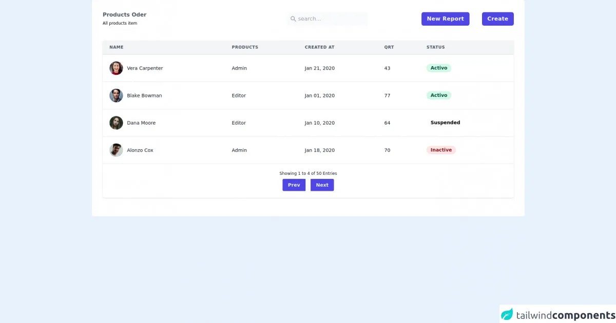
The preview of List Order Product UI component
To create a List Order Product UI component with Tailwind CSS, you can use the following HTML structure:
<div class="flex flex-col">
  <div class="flex flex-row items-center justify-between bg-gray-100 p-4">
    <div class="font-bold">Product Name</div>
    <div class="font-bold">Order Number</div>
  </div>
  <div class="flex flex-row items-center justify-between p-4">
    <div>Product 1</div>
    <<div>Order #12345</div>
  </div>
  <div class="flex flex-row items-center justify-between bg-gray-100 p-4">
    <div>Product 2</div>
    <div>Order #12346</div>
  </div>
  <div class="flex flex-row items-center justify-between p-4">
    <div>Product 3</div>
    <div>Order #12347</div>
  </div>
</div>
Free download of the LIst Order Product's source code
The source code of List Order Product UI component
To create the List Order Product UI component, you can use the following HTML structure:
<div class="flex flex-col">
  <div class="flex flex-row items-center justify-between bg-gray-100 p-4">
    <div class="font-bold">Product Name</div>
    <div class="font-bold">Order Number</div>
  </div>
  <div class="flex flex-row items-center justify-between p-4">
    <div>Product 1</div>
    <div>Order #12345</div>
  </div>
  <div class="flex flex-row items-center justify-between bg-gray-100 p-4">
    <div>Product 2</div>
    <div>Order #12346</div>
  </div>
  <div class="flex flex-row items-center justify-between p-4">
    <div>Product 3</div>
    <div>Order #12347</div>
  </div>
</div>
<div class="bg-white p-8 rounded-md w-full">
<div class=" flex items-center justify-between pb-6">
<div>
<h2 class="text-gray-600 font-semibold">Products Oder</h2>
<span class="text-xs">All products item</span>
</div>
<div class="flex items-center justify-between">
<div class="flex bg-gray-50 items-center p-2 rounded-md">
<svg xmlns="http://www.w3.org/2000/svg" class="h-5 w-5 text-gray-400" viewBox="0 0 20 20"
fill="currentColor">
<path fill-rule="evenodd"
d="M8 4a4 4 0 100 8 4 4 0 000-8zM2 8a6 6 0 1110.89 3.476l4.817 4.817a1 1 0 01-1.414 1.414l-4.816-4.816A6 6 0 012 8z"
clip-rule="evenodd" />
</svg>
<input class="bg-gray-50 outline-none ml-1 block " type="text" name="" id="" placeholder="search...">
</div>
<div class="lg:ml-40 ml-10 space-x-8">
<button class="bg-indigo-600 px-4 py-2 rounded-md text-white font-semibold tracking-wide cursor-pointer">New Report</button>
<button class="bg-indigo-600 px-4 py-2 rounded-md text-white font-semibold tracking-wide cursor-pointer">Create</button>
</div>
</div>
</div>
<div>
<div class="-mx-4 sm:-mx-8 px-4 sm:px-8 py-4 overflow-x-auto">
<div class="inline-block min-w-full shadow rounded-lg overflow-hidden">
<table class="min-w-full leading-normal">
<thead>
<tr>
<th
class="px-5 py-3 border-b-2 border-gray-200 bg-gray-100 text-left text-xs font-semibold text-gray-600 uppercase tracking-wider">
Name
</th>
<th
class="px-5 py-3 border-b-2 border-gray-200 bg-gray-100 text-left text-xs font-semibold text-gray-600 uppercase tracking-wider">
products
</th>
<th
class="px-5 py-3 border-b-2 border-gray-200 bg-gray-100 text-left text-xs font-semibold text-gray-600 uppercase tracking-wider">
Created at
</th>
<th
class="px-5 py-3 border-b-2 border-gray-200 bg-gray-100 text-left text-xs font-semibold text-gray-600 uppercase tracking-wider">
QRT
</th>
<th
class="px-5 py-3 border-b-2 border-gray-200 bg-gray-100 text-left text-xs font-semibold text-gray-600 uppercase tracking-wider">
Status
</th>
</tr>
</thead>
<tbody>
<tr>
<td class="px-5 py-5 border-b border-gray-200 bg-white text-sm">
<div class="flex items-center">
<div class="flex-shrink-0 w-10 h-10">
<img class="w-full h-full rounded-full"
src="https://images.unsplash.com/photo-1494790108377-be9c29b29330?ixlib=rb-1.2.1&ixid=eyJhcHBfaWQiOjEyMDd9&auto=format&fit=facearea&facepad=2.2&w=160&h=160&q=80"
alt="" />
</div>
<div class="ml-3">
<p class="text-gray-900 whitespace-no-wrap">
Vera Carpenter
</p>
</div>
</div>
</td>
<td class="px-5 py-5 border-b border-gray-200 bg-white text-sm">
<p class="text-gray-900 whitespace-no-wrap">Admin</p>
</td>
<td class="px-5 py-5 border-b border-gray-200 bg-white text-sm">
<p class="text-gray-900 whitespace-no-wrap">
Jan 21, 2020
</p>
</td>
<td class="px-5 py-5 border-b border-gray-200 bg-white text-sm">
<p class="text-gray-900 whitespace-no-wrap">
43
</p>
</td>
<td class="px-5 py-5 border-b border-gray-200 bg-white text-sm">
<span
class="relative inline-block px-3 py-1 font-semibold text-green-900 leading-tight">
<span aria-hidden
class="absolute inset-0 bg-green-200 opacity-50 rounded-full"></span>
<span class="relative">Activo</span>
</span>
</td>
</tr>
<tr>
<td class="px-5 py-5 border-b border-gray-200 bg-white text-sm">
<div class="flex items-center">
<div class="flex-shrink-0 w-10 h-10">
<img class="w-full h-full rounded-full"
src="https://images.unsplash.com/photo-1500648767791-00dcc994a43e?ixlib=rb-1.2.1&ixid=eyJhcHBfaWQiOjEyMDd9&auto=format&fit=facearea&facepad=2.2&w=160&h=160&q=80"
alt="" />
</div>
<div class="ml-3">
<p class="text-gray-900 whitespace-no-wrap">
Blake Bowman
</p>
</div>
</div>
</td>
<td class="px-5 py-5 border-b border-gray-200 bg-white text-sm">
<p class="text-gray-900 whitespace-no-wrap">Editor</p>
</td>
<td class="px-5 py-5 border-b border-gray-200 bg-white text-sm">
<p class="text-gray-900 whitespace-no-wrap">
Jan 01, 2020
</p>
<td class="px-5 py-5 border-b border-gray-200 bg-white text-sm">
<p class="text-gray-900 whitespace-no-wrap">
77
</p>
</td>
<td class="px-5 py-5 border-b border-gray-200 bg-white text-sm">
<span
class="relative inline-block px-3 py-1 font-semibold text-green-900 leading-tight">
<span aria-hidden
class="absolute inset-0 bg-green-200 opacity-50 rounded-full"></span>
<span class="relative">Activo</span>
</span>
</td>
</tr>
<tr>
<td class="px-5 py-5 border-b border-gray-200 bg-white text-sm">
<div class="flex items-center">
<div class="flex-shrink-0 w-10 h-10">
<img class="w-full h-full rounded-full"
src="https://images.unsplash.com/photo-1540845511934-7721dd7adec3?ixlib=rb-1.2.1&ixid=eyJhcHBfaWQiOjEyMDd9&auto=format&fit=facearea&facepad=2.2&w=160&h=160&q=80"
alt="" />
</div>
<div class="ml-3">
<p class="text-gray-900 whitespace-no-wrap">
Dana Moore
</p>
</div>
</div>
</td>
<td class="px-5 py-5 border-b border-gray-200 bg-white text-sm">
<p class="text-gray-900 whitespace-no-wrap">Editor</p>
</td>
<td class="px-5 py-5 border-b border-gray-200 bg-white text-sm">
<p class="text-gray-900 whitespace-no-wrap">
Jan 10, 2020
</p>
<td class="px-5 py-5 border-b border-gray-200 bg-white text-sm">
<p class="text-gray-900 whitespace-no-wrap">
64
</p>
</td>
<td class="px-5 py-5 border-b border-gray-200 bg-white text-sm">
<span
class="relative inline-block px-3 py-1 font-semibold text-orange-900 leading-tight">
<span aria-hidden
class="absolute inset-0 bg-orange-200 opacity-50 rounded-full"></span>
<span class="relative">Suspended</span>
</span>
</td>
</tr>
<tr>
<td class="px-5 py-5 bg-white text-sm">
<div class="flex items-center">
<div class="flex-shrink-0 w-10 h-10">
<img class="w-full h-full rounded-full"
src="https://images.unsplash.com/photo-1522609925277-66fea332c575?ixlib=rb-1.2.1&ixid=eyJhcHBfaWQiOjEyMDd9&auto=format&fit=facearea&facepad=2.2&h=160&w=160&q=80"
alt="" />
</div>
<div class="ml-3">
<p class="text-gray-900 whitespace-no-wrap">
Alonzo Cox
</p>
</div>
</div>
</td>
<td class="px-5 py-5 bg-white text-sm">
<p class="text-gray-900 whitespace-no-wrap">Admin</p>
</td>
<td class="px-5 py-5 bg-white text-sm">
<p class="text-gray-900 whitespace-no-wrap">Jan 18, 2020</p>
</td>
<td class="px-5 py-5 bg-white text-sm">
<p class="text-gray-900 whitespace-no-wrap">70</p>
</td>
<td class="px-5 py-5 bg-white text-sm">
<span
class="relative inline-block px-3 py-1 font-semibold text-red-900 leading-tight">
<span aria-hidden
class="absolute inset-0 bg-red-200 opacity-50 rounded-full"></span>
<span class="relative">Inactive</span>
</span>
</td>
</tr>
</tbody>
</table>
<div
class="px-5 py-5 bg-white border-t flex flex-col xs:flex-row items-center xs:justify-between ">
<span class="text-xs xs:text-sm text-gray-900">
Showing 1 to 4 of 50 Entries
</span>
<div class="inline-flex mt-2 xs:mt-0">
<button
class="text-sm text-indigo-50 transition duration-150 hover:bg-indigo-500 bg-indigo-600 font-semibold py-2 px-4 rounded-l">
Prev
</button>
<button
class="text-sm text-indigo-50 transition duration-150 hover:bg-indigo-500 bg-indigo-600 font-semibold py-2 px-4 rounded-r">
Next
</button>
</div>
</div>
</div>
</div>
</div>
</div>
How to create a List Order Product with Tailwind CSS?
- Use the
flexandflex-colclasses to create a flex container that displays the list of products in a column. - Use the
flex-rowclass to create a flex container that displays the product name and order number in a row. - Use the
items-centerandjustify-betweenclasses to align the product name and order number in the center and space them evenly. - Use the
bg-gray-100class to add a gray background color to every other row to create a zebra-striped effect. - Use the
p-4class to add padding to the rows to increase the spacing between them. - Use the
font-boldclass to make the product name and order number bold.
Conclusion
In this article, we discussed how to create a List Order Product UI component with Tailwind CSS. We also discussed how Tailwind CSS can help you create beautiful designs with minimal effort and how it can be customized to match your brand's look and feel. By following the six easy steps outlined in this article, you can create a List Order Product UI component that looks great and is easy to maintain.