- Published on
Learn How To Create A List Of Cards With Tailwind CSS Like an Expert
- What is Tailwind CSS?
- The description of List of cards ui component
- Why use Tailwind CSS to create a List of cards ui component?
- The preview of List of cards ui component
- The source code of List of cards ui component
- How to create a List of cards with Tailwind CSS?
- Conclusion
What is Tailwind CSS?
Tailwind CSS is a utility-first CSS framework that helps developers build custom designs quickly. It provides a set of pre-defined CSS classes that can be used to style HTML elements. Tailwind CSS is highly customizable and can be configured to generate only the styles that are actually used in the project, resulting in smaller file sizes and faster load times.
The description of List of cards ui component
A list of cards is a common UI component used to display a collection of items, such as products, blog posts, or user profiles. Each item is represented by a card that contains a title, an image, and a description. The cards are usually arranged in a grid layout, with each row containing a fixed number of cards.
Why use Tailwind CSS to create a List of cards ui component?
Tailwind CSS provides a set of pre-defined classes that can be used to create a list of cards quickly and easily. The classes can be combined and customized to achieve the desired look and feel. Using Tailwind CSS also ensures that the code is consistent and maintainable.
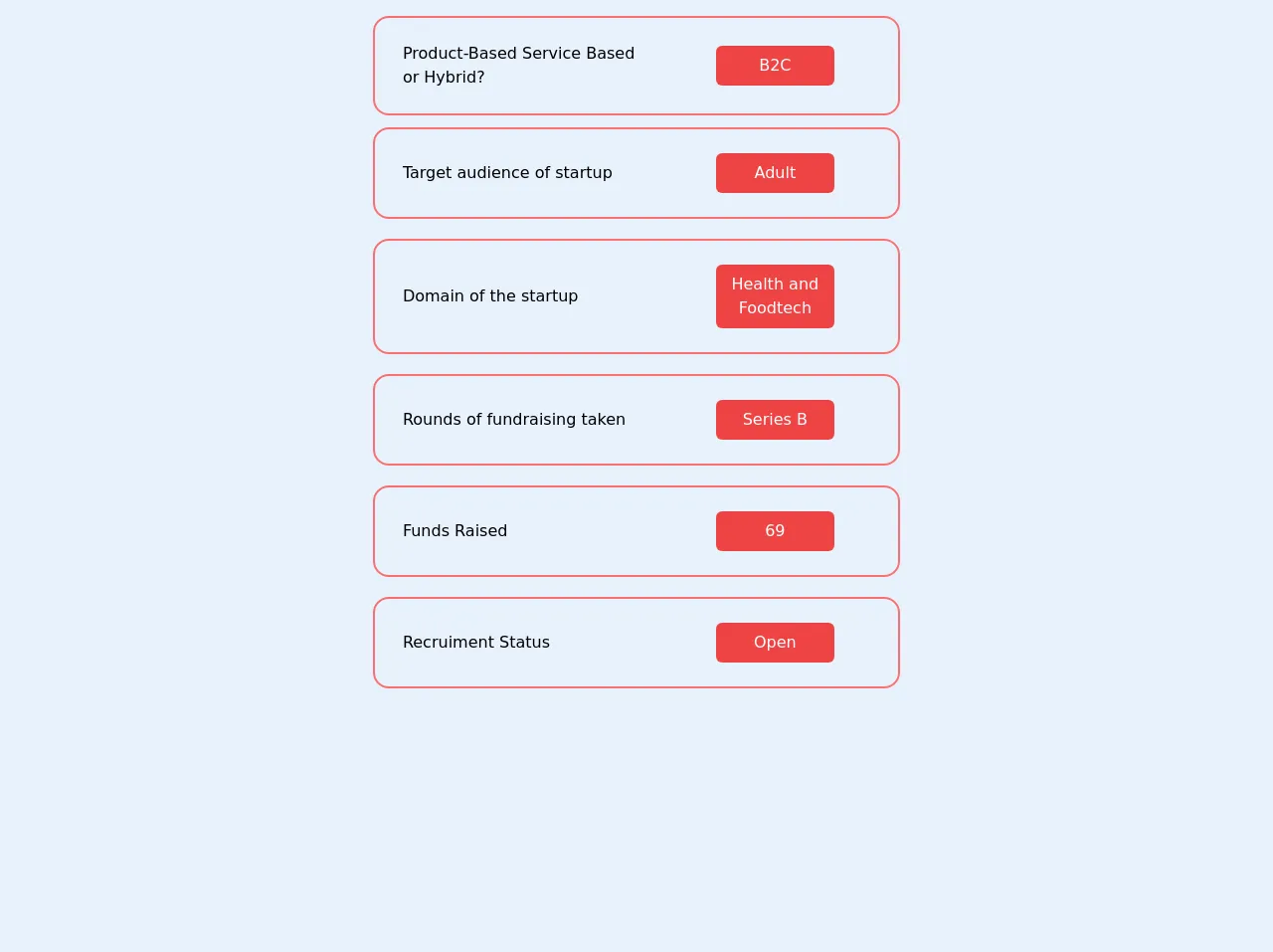
The preview of List of cards ui component
To create a list of cards with Tailwind CSS, we will use the following classes:
bg-white: sets the background color of the card to white.rounded-lg: rounds the corners of the card.shadow-md: adds a subtle shadow to the card.w-full: sets the width of the card to 100%.max-w-sm: sets the maximum width of the card to 20rem.mx-auto: centers the card horizontally.overflow-hidden: hides any content that overflows the card.my-4: adds a margin of 1rem to the top and bottom of the card.
Free download of the List of cards's source code
The source code of List of cards ui component
To create a list of cards with Tailwind CSS, we will use the following HTML code:
<div class="flex flex-wrap -mx-4">
  <div class="w-full md:w-1/2 lg:w-1/3 px-4">
    <div class="bg-white rounded-lg shadow-md w-full max-w-sm mx-auto overflow-hidden my-4">
      <img src="https://via.placeholder.com/640x360" alt="Placeholder" class="w-full">
      <div class="p-4">
        <h2 class="text-lg font-medium text-gray-900">Card Title</h2>
        <p class="mt-2 text-gray-600">Card Description</p>
      </div>
    </div>
  </div>
  <!-- Repeat the above code for each card -->
</div>
The above code creates a grid of cards using the flex and flex-wrap classes. Each card is contained within a div element with the w-full md:w-1/2 lg:w-1/3 px-4 classes, which sets the width of the card based on the screen size. The px-4 class adds a margin of 1rem to the left and right of the card.
Inside each card, we have an img element that displays the image and a div element that contains the title and description. The p-4 class adds a padding of 1rem to the top, bottom, left, and right of the div element.
<div
								class="container mb-2 flex mx-auto w-full items-center justify-center"
							>
								<ul class="flex flex-col p-4">
									<li class="border-gray-400 flex flex-row">
										<div
											class="select-none flex flex-1 items-center p-4 transition duration-500 ease-in-out transform hover:-translate-y-2 rounded-2xl border-2 p-6 hover:shadow-2xl border-red-400"
										>
											<div class="flex-1 pl-1 mr-16">
												<div class="font-medium">
													Product-Based Service Based or Hybrid?
												</div>
											</div>
											<div
												class="w-1/4 text-wrap text-center flex text-white text-bold flex-col rounded-md bg-red-500 justify-center items-center mr-10 p-2"
											>
												B2C
											</div>
										</div>
									</li>
									<li class="border-gray-400 flex flex-row mb-2">
										<div
											class="select-none rounded-md flex flex-1 items-center p-4 transition duration-500 ease-in-out transform hover:-translate-y-2 rounded-2xl border-2 p-6 mt-3 border-red-400 hover:shadow-2xl"
										>
											<div class="flex-1 pl-1 mr-16">
												<div class="font-medium">
													Target audience of startup
												</div>
											</div>
											<div
												class="w-1/4 text-wrap text-center text-white text-bold flex flex-col rounded-md bg-red-500 justify-center items-center mr-10 p-2"
											>
												Adult
											</div>
										</div>
									</li>
									<li class="border-gray-400 flex flex-row mb-2">
										<div
											class="select-none rounded-md flex flex-1 items-center p-4 transition duration-500 ease-in-out transform hover:-translate-y-2 rounded-2xl border-2 p-6 mt-3 border-red-400 hover:shadow-2xl"
										>
											<div class="flex-1 pl-1 mr-16">
												<div class="font-medium">Domain of the startup</div>
											</div>
											<div
												class="flex w-1/4 text-wrap text-center flex-col text-white text-bold rounded-md bg-red-500 justify-center items-center mr-10 p-2"
											>
												Health and Foodtech
											</div>
										</div>
									</li>
									<li class="border-gray-400 flex flex-row mb-2">
										<div
											class="select-none rounded-md flex flex-1 items-center p-4 transition duration-500 ease-in-out transform hover:-translate-y-2 rounded-2xl border-2 p-6 mt-3 border-red-400 hover:shadow-2xl"
										>
											<div class="flex-1 pl-1 mr-16">
												<div class="font-medium">
													Rounds of fundraising taken
												</div>
											</div>
											<div
												class="w-1/4 text-wrap text-center flex flex-col text-white text-bold rounded-md bg-red-500 justify-center items-center mr-10 p-2"
											>
												Series B
											</div>
										</div>
									</li>
									<li class="border-gray-400 flex flex-row mb-2">
										<div
											class="select-none rounded-md flex flex-1 items-center p-4 transition duration-500 ease-in-out transform hover:-translate-y-2 rounded-2xl border-2 p-6 mt-3 border-red-400 hover:shadow-2xl"
										>
											<div class="flex-1 pl-1 mr-16">
												<div class="font-medium">Funds Raised</div>
											</div>
											<div
												class="w-1/4 text-wrap text-center flex flex-col text-white text-bold rounded-md bg-red-500 justify-center items-center mr-10 p-2"
											>
												69
											</div>
										</div>
									</li>
									<li class="border-gray-400 flex flex-row mb-2">
										<div
											class="select-none rounded-md flex flex-1 items-center p-4 transition duration-500 ease-in-out transform hover:-translate-y-2 rounded-2xl border-2 p-6 mt-3 border-red-400 hover:shadow-2xl"
										>
											<div class="flex-1 pl-1 mr-16">
												<div class="font-medium">Recruiment Status</div>
											</div>
											<div
												class="w-1/4 text-wrap text-center flex flex-col text-white text-bold rounded-md bg-red-500 justify-center items-center mr-10 p-2"
											>
												Open
											</div>
										</div>
									</li>
								</ul>
							</div>
How to create a List of cards with Tailwind CSS?
To create a list of cards with Tailwind CSS, follow these steps:
- Create a container element for the cards using the
flexandflex-wrapclasses.
<div class="flex flex-wrap -mx-4">
  <!-- Cards go here -->
</div>
- Create a
divelement for each card and set its width using thew-full md:w-1/2 lg:w-1/3 px-4classes.
<div class="w-full md:w-1/2 lg:w-1/3 px-4">
  <!-- Card content goes here -->
</div>
- Inside each card
div, create animgelement to display the image and adivelement to contain the title and description.
<div class="w-full md:w-1/2 lg:w-1/3 px-4">
  <div class="bg-white rounded-lg shadow-md w-full max-w-sm mx-auto overflow-hidden my-4">
    <img src="https://via.placeholder.com/640x360" alt="Placeholder" class="w-full">
    <div class="p-4">
      <h2 class="text-lg font-medium text-gray-900">Card Title</h2>
      <p class="mt-2 text-gray-600">Card Description</p>
    </div>
  </div>
</div>
- Customize the classes to achieve the desired look and feel.
Conclusion
In this article, we learned how to create a list of cards with Tailwind CSS. We saw how Tailwind CSS provides a set of pre-defined classes that can be used to style HTML elements quickly and easily. We also saw how to customize the classes to achieve the desired look and feel. With this knowledge, you can create beautiful and responsive UI components with ease.