- Published on
6 Steps To Build A Linkedin Login Page With Tailwind CSS Like A Pro In Under An Hour
- What is Tailwind CSS?
- The description of Linkedin Login Page UI component
- Why use Tailwind CSS to create a Linkedin Login Page UI component?
- The preview of Linkedin Login Page UI component
- The source code of Linkedin Login Page UI component
- How to create a Linkedin Login Page with Tailwind CSS?
- Step 1: Set up your development environment
- Step 2: Create the HTML structure
- Step 3: Add the form elements
- Step 4: Add Tailwind CSS classes
- Step 5: Customize the styles
- Step 6: Preview and test your page
- Conclusion
If you're a FrontEnd developer, you probably know how important it is to have a well-designed and user-friendly login page. In this article, we'll show you how to create a Linkedin Login Page UI component using Tailwind CSS in just a few steps.
What is Tailwind CSS?
Tailwind CSS is a utility-first CSS framework that allows you to design and customize your website's UI components quickly and easily. It provides a set of pre-defined classes that you can use to style your HTML elements without having to write any CSS code.
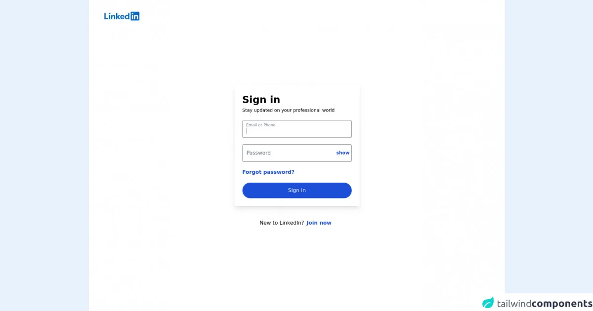
The description of Linkedin Login Page UI component
The Linkedin Login Page UI component is a simple and elegant login page that allows users to log in to their Linkedin account. It consists of a form with two input fields for email and password, a "Remember me" checkbox, and a "Sign in" button.
Why use Tailwind CSS to create a Linkedin Login Page UI component?
Tailwind CSS is an excellent choice for creating UI components like the Linkedin Login Page because it provides a set of pre-defined classes that you can use to style your HTML elements quickly and easily. It also allows you to customize your styles using configuration files, which makes it easy to maintain consistency across your website.
The preview of Linkedin Login Page UI component
To create the Linkedin Login Page UI component, we'll use Tailwind CSS to style the HTML elements. The final result will look like this:
Free download of the Linkedin Login Page's source code
The source code of Linkedin Login Page UI component
To create the Linkedin Login Page UI component, we'll use HTML and Tailwind CSS. Here's the source code:
<!DOCTYPE html>
<html lang="en" class="border-l">
<head>
    <meta charset="UTF-8">
    <link href="https://unpkg.com/tailwindcss@^2/dist/tailwind.min.css" rel="stylesheet">
    <title>Login</title>
    <style>
        * {
            margin:0;
            padding:0;
        }
        .input {
            transition: border 0.2s ease-in-out;
            min-width: 280px
        }
        .input:focus+.label,
        .input:active+.label,
        .input.filled+.label {
            font-size: .75rem;
            transition: all 0.2s ease-out;
            top: -0.3rem;
            color: #6b7280;
        }
        .label {
            transition: all 0.2s ease-out;
            top: 0.4rem;
            left: 0;
        }
    </style>
</head>
<body>
<header>
    <a aria-label="Linkedin" class="z-10 mt-9 absolute md:ml-12 ml-9" href="/">
        <svg class="w-32" viewBox="0 0 100 21" preserveAspectRatio="xMinYMin meet" focusable="false">
            <g stroke="none" stroke-width="1" fill="none" fill-rule="evenodd">
                <path d="M19.479,0 L1.583,0 C0.727,0 0,0.677 0,1.511 L0,19.488 C0,20.323 0.477,21 1.333,21 L19.229,21 C20.086,21 21,20.323 21,19.488 L21,1.511 C21,0.677 20.336,0 19.479,0" class="bug-text-color" transform="translate(63.000000, 0.000000)"></path>
                <path d="M82.479,0 L64.583,0 C63.727,0 63,0.677 63,1.511 L63,19.488 C63,20.323 63.477,21 64.333,21 L82.229,21 C83.086,21 84,20.323 84,19.488 L84,1.511 C84,0.677 83.336,0 82.479,0 Z M71,8 L73.827,8 L73.827,9.441 L73.858,9.441 C74.289,8.664 75.562,7.875 77.136,7.875 C80.157,7.875 81,9.479 81,12.45 L81,18 L78,18 L78,12.997 C78,11.667 77.469,10.5 76.227,10.5 C74.719,10.5 74,11.521 74,13.197 L74,18 L71,18 L71,8 Z M66,18 L69,18 L69,8 L66,8 L66,18 Z M69.375,4.5 C69.375,5.536 68.536,6.375 67.5,6.375 C66.464,6.375 65.625,5.536 65.625,4.5 C65.625,3.464 66.464,2.625 67.5,2.625 C68.536,2.625 69.375,3.464 69.375,4.5 Z" class="background" fill="#0a66c2"></path>
            </g>
            <g>
                <path d="M60,18 L57.2,18 L57.2,16.809 L57.17,16.809 C56.547,17.531 55.465,18.125 53.631,18.125 C51.131,18.125 48.978,16.244 48.978,13.011 C48.978,9.931 51.1,7.875 53.725,7.875 C55.35,7.875 56.359,8.453 56.97,9.191 L57,9.191 L57,3 L60,3 L60,18 Z M54.479,10.125 C52.764,10.125 51.8,11.348 51.8,12.974 C51.8,14.601 52.764,15.875 54.479,15.875 C56.196,15.875 57.2,14.634 57.2,12.974 C57.2,11.268 56.196,10.125 54.479,10.125 L54.479,10.125 Z" fill="#0a66c2"></path>
                <path d="M47.6611,16.3889 C46.9531,17.3059 45.4951,18.1249 43.1411,18.1249 C40.0001,18.1249 38.0001,16.0459 38.0001,12.7779 C38.0001,9.8749 39.8121,7.8749 43.2291,7.8749 C46.1801,7.8749 48.0001,9.8129 48.0001,13.2219 C48.0001,13.5629 47.9451,13.8999 47.9451,13.8999 L40.8311,13.8999 L40.8481,14.2089 C41.0451,15.0709 41.6961,16.1249 43.1901,16.1249 C44.4941,16.1249 45.3881,15.4239 45.7921,14.8749 L47.6611,16.3889 Z M45.1131,11.9999 C45.1331,10.9449 44.3591,9.8749 43.1391,9.8749 C41.6871,9.8749 40.9121,11.0089 40.8311,11.9999 L45.1131,11.9999 Z" fill="#0a66c2"></path>
                <polygon fill="#0a66c2" points="38 8 34.5 8 31 12 31 3 28 3 28 18 31 18 31 13 34.699 18 38.241 18 34 12.533"></polygon>
                <path d="M16,8 L18.827,8 L18.827,9.441 L18.858,9.441 C19.289,8.664 20.562,7.875 22.136,7.875 C25.157,7.875 26,9.792 26,12.45 L26,18 L23,18 L23,12.997 C23,11.525 22.469,10.5 21.227,10.5 C19.719,10.5 19,11.694 19,13.197 L19,18 L16,18 L16,8 Z" fill="#0a66c2"></path>
                <path d="M11,18 L14,18 L14,8 L11,8 L11,18 Z M12.501,6.3 C13.495,6.3 14.3,5.494 14.3,4.5 C14.3,3.506 13.495,2.7 12.501,2.7 C11.508,2.7 10.7,3.506 10.7,4.5 C10.7,5.494 11.508,6.3 12.501,6.3 Z" fill="#0a66c2"></path>
                <polygon fill="#0a66c2" points="3 3 0 3 0 18 9 18 9 15 3 15"></polygon>
            </g>
        </svg>
    </a>
</header>
<div class="h-screen bg-white relative flex flex-col space-y-10 justify-center items-center">
    <div class="bg-white md:shadow-lg shadow-none rounded p-6 w-96" >
        <h1 class="text-3xl font-bold leading-normal" >Sign in</h1>
        <p class="text-sm leading-normal">Stay updated on your professional world</p>
        <form class="space-y-5 mt-5">
            <div class="mb-4 relative">
                <input id="email" class="w-full rounded px-3 border border-gray-500 pt-5 pb-2 focus:outline-none input active:outline-none" type="text" autofocus>
                <label for="email" class="label absolute mb-0 -mt-2 pt-4 pl-3 leading-tighter text-gray-500 text-base mt-2 cursor-text">Email or Phone</label>
            </div>
            <div class="relative flex items-center border border-gray-500 focus:ring focus:border-blue-500 rounded">
                <input id="password" class="w-full rounded px-3 pt-5 outline-none pb-2 focus:outline-none active:outline-none input active:border-blue-500" type="password"/>
                <label for="password" class="label absolute mb-0 -mt-2 pt-4 pl-3 leading-tighter text-gray-500 text-base mt-2 cursor-text">Password</label>
                <a class="text-sm font-bold text-blue-700 hover:bg-blue-100 rounded-full px-2 py-1 mr-1 leading-normal cursor-pointer">show</a>
            </div>
            <div class="-m-2">
                <a class="font-bold text-blue-700 hover:bg-blue-200 hover:underline hover:p-5 p-2 rounded-full" href="#">Forgot password?</a>
            </div>
            <button class="w-full text-center bg-blue-700 hover:bg-blue-900 rounded-full text-white py-3 font-medium">Sign in</button>
        </form>
    </div>
    <p>New to LinkedIn?<a class="text-blue-700 font-bold hover:bg-blue-200 hover:underline hover:p-5 p-2 rounded-full" href="#">Join now</a></p>
</div>
</body>
</html>
How to create a Linkedin Login Page with Tailwind CSS?
Now that we've covered the basics let's dive into the steps to create a Linkedin Login Page with Tailwind CSS.
Step 1: Set up your development environment
Before we start, make sure you have a development environment set up on your computer. You'll need a text editor, a web browser, and a local server. You can use any text editor you like, but we recommend Visual Studio Code.
Step 2: Create the HTML structure
The first step is to create the HTML structure of the Linkedin Login Page. Open your text editor and create a new HTML file. Add the following code to create the basic structure of the page:
<!DOCTYPE html>
<html>
  <head>
    <title>Linkedin Login Page</title>
  </head>
  <body>
    <div class="min-h-screen bg-gray-100 flex flex-col justify-center py-12 sm:px-6 lg:px-8">
      <div class="sm:mx-auto sm:w-full sm:max-w-md">
        <h2 class="mt-6 text-center text-3xl font-extrabold text-gray-900">
          Sign in to your account
        </h2>
        <p class="mt-2 text-center text-sm text-gray-600 max-w">
          Or
          <a href="#" class="font-medium text-indigo-600 hover:text-indigo-500">
            start your free trial
          </a>
        </p>
      </div>
    </div>
  </body>
</html>
This code creates a basic HTML structure with a title and a container div that will hold the login form.
Step 3: Add the form elements
Next, we'll add the form elements to the container div. Add the following code to create the form:
<form class="mt-8 space-y-6" action="#" method="POST">
  <input type="hidden" name="remember" value="true">
  <div class="rounded-md shadow-sm -space-y-px">
    <div>
      <label for="email-address" class="sr-only">Email address</label>
      <input
        id="email-address"
        name="email"
        type="email"
        autocomplete="email"
        required
        class="appearance-none rounded-none relative block w-full px-3 py-2 border border-gray-300 placeholder-gray-500 text-gray-900 rounded-t-md focus:outline-none focus:ring-indigo-500 focus:border-indigo-500 focus:z-10 sm:text-sm"
        placeholder="Email address"
      >
    </div>
    <div>
      <label for="password" class="sr-only">Password</label>
      <input
        id="password"
        name="password"
        type="password"
        autocomplete="current-password"
        required
        class="appearance-none rounded-none relative block w-full px-3 py-2 border border-gray-300 placeholder-gray-500 text-gray-900 rounded-b-md focus:outline-none focus:ring-indigo-500 focus:border-indigo-500 focus:z-10 sm:text-sm"
        placeholder="Password"
      >
    </div>
  </div>

  <div class="flex items-center justify-between">
    <div class="flex items-center">
      <input
        id="remember-me"
        name="remember-me"
        type="checkbox"
        class="h-4 w-4 text-indigo-600 focus:ring-indigo-500 border-gray-300 rounded"
      >
      <label for="remember-me" class="ml-2 block text-sm text-gray-900">
        Remember me
      </label>
    </div>

    <div class="text-sm">
      <a href="#" class="font-medium text-indigo-600 hover:text-indigo-500">
        Forgot your password?
      </a>
    </div>
  </div>

  <div>
    <button
      type="submit"
      class="group relative w-full flex justify-center py-2 px-4 border border-transparent text-sm font-medium rounded-md text-white bg-indigo-600 hover:bg-indigo-700 focus:outline-none focus:ring-2 focus:ring-offset-2 focus:ring-indigo-500"
    >
      <span class="absolute left-0 inset-y-0 flex items-center pl-3">
        <svg
          class="h-5 w-5 text-indigo-500 group-hover:text-indigo-400"
          xmlns="http://www.w3.org/2000/svg"
          viewBox="0 0 20 20"
          fill="currentColor"
          aria-hidden="true"
        >
          <path
            fill-rule="evenodd"
            d="M11.293 5.293a1 1 0 011.414 0l3 3a1 1 0 01-1.414 1.414l-3-3a1 1 0 010-1.414z"
            clip-rule="evenodd"
          ></path>
          <path
            fill-rule="evenodd"
            d="M4 10a1 1 0 011-1h10a1 1 0 110 2H5a1 1 0 01-1-1z"
            clip-rule="evenodd"
          ></path>
          <path
            fill-rule="evenodd"
            d="M10 15a1 1 0 100-2 1 1 0 000 2z"
            clip-rule="evenodd"
          ></path>
        </svg>
      </span>
      Sign in
    </button>
  </div>
</form>
This code creates a form with two input fields for email and password, a "Remember me" checkbox, and a "Sign in" button.
Step 4: Add Tailwind CSS classes
Now that we have the HTML structure and form elements in place, it's time to add Tailwind CSS classes to style them. Add the following classes to the HTML elements:
<!-- Add classes to the container div -->
<div class="min-h-screen bg-gray-100 flex flex-col justify-center py-12 sm:px-6 lg:px-8">

<!-- Add classes to the form -->
<form class="mt-8 space-y-6" action="#" method="POST">

<!-- Add classes to the input fields -->
<input
  id="email-address"
  name="email"
  type="email"
  autocomplete="email"
  required
  class="appearance-none rounded-none relative block w-full px-3 py-2 border border-gray-300 placeholder-gray-500 text-gray-900 rounded-t-md focus:outline-none focus:ring-indigo-500 focus:border-indigo-500 focus:z-10 sm:text-sm"
  placeholder="Email address"
>
<input
  id="password"
  name="password"
  type="password"
  autocomplete="current-password"
  required
  class="appearance-none rounded-none relative block w-full px-3 py-2 border border-gray-300 placeholder-gray-500 text-gray-900 rounded-b-md focus:outline-none focus:ring-indigo-500 focus:border-indigo-500 focus:z-10 sm:text-sm"
  placeholder="Password"
>

<!-- Add classes to the "Remember me" checkbox -->
<input
  id="remember-me"
  name="remember-me"
  type="checkbox"
  class="h-4 w-4 text-indigo-600 focus:ring-indigo-500 border-gray-300 rounded"
>
<label for="remember-me" class="ml-2 block text-sm text-gray-900">
  Remember me
</label>

<!-- Add classes to the "Sign in" button -->
<button
  type="submit"
  class="group relative w-full flex justify-center py-2 px-4 border border-transparent text-sm font-medium rounded-md text-white bg-indigo-600 hover:bg-indigo-700 focus:outline-none focus:ring-2 focus:ring-offset-2 focus:ring-indigo-500"
>
These classes will style the HTML elements and make them look like the Linkedin Login Page.
Step 5: Customize the styles
Tailwind CSS allows you to customize your styles using configuration files. You can modify the default styles or create your own custom styles. To customize the styles of the Linkedin Login Page, create a new file called tailwind.config.js in the root directory of your project and add the following code:
module.exports = {
  theme: {
    extend: {
      colors: {
        'linkedin-blue': '#0077B5',
      },
      fontFamily: {
        sans: ['"Helvetica Neue"', 'Helvetica', 'Arial', 'sans-serif'],
      },
    },
  },
  variants: {},
  plugins: [],
};
This code extends the default Tailwind CSS theme by adding a new color called linkedin-blue and a new font family called sans. You can use these new styles in your HTML code by adding the corresponding classes.
Step 6: Preview and test your page
Finally, you can preview and test your Linkedin Login Page by opening the HTML file in your web browser. Make sure that the form elements are working correctly and that the styles are applied correctly.
Conclusion
In this article, we've shown you how to create a Linkedin Login Page UI component using Tailwind CSS in just a few steps. Tailwind CSS is an excellent choice for creating UI components because it provides a set of pre-defined classes that you can use to style your HTML elements quickly and easily. With Tailwind CSS, you can create beautiful and user-friendly login pages like the Linkedin Login Page in no time.