- Published on
6 Easy Ways To Create A Interactive Tabs With Tailwind CSS
- What is Tailwind CSS?
- The description of Interactive Tabs UI component
- Why use Tailwind CSS to create an Interactive Tabs UI component?
- The preview of Interactive Tabs UI component
- The source code of Interactive Tabs UI component
- How to create an Interactive Tabs with Tailwind CSS?
- Step 1: Create the HTML structure
- Step 2: Add Tailwind CSS classes
- Step 3: Add JavaScript code
- Step 4: Test the Interactive Tabs UI component
- Conclusion
As a FrontEnd technology blogger, I always look for ways to create interactive and engaging user interfaces. One of the most popular UI components that can enhance user experience is the Tabs component. In this article, I will show you how to create an Interactive Tabs UI component with Tailwind CSS.
What is Tailwind CSS?
Tailwind CSS is a utility-first CSS framework that allows you to create custom designs without writing any CSS. It provides a set of pre-defined classes that you can use to style your HTML elements. With Tailwind CSS, you can create responsive and mobile-first designs with ease.
The description of Interactive Tabs UI component
The Tabs UI component is a set of buttons or links that allow users to switch between different sections of content on a webpage. This component is commonly used in websites and applications to organize content and improve user experience.
An Interactive Tabs UI component is a Tabs component that allows users to interact with the content by clicking on the tabs. When a user clicks on a tab, the corresponding content is displayed, and the other content is hidden.
Why use Tailwind CSS to create an Interactive Tabs UI component?
Tailwind CSS provides a set of pre-defined classes that you can use to create an Interactive Tabs UI component quickly. With Tailwind CSS, you don't need to write any CSS code, which saves you time and effort. Additionally, Tailwind CSS is highly customizable, which means you can create a unique design for your Interactive Tabs UI component.
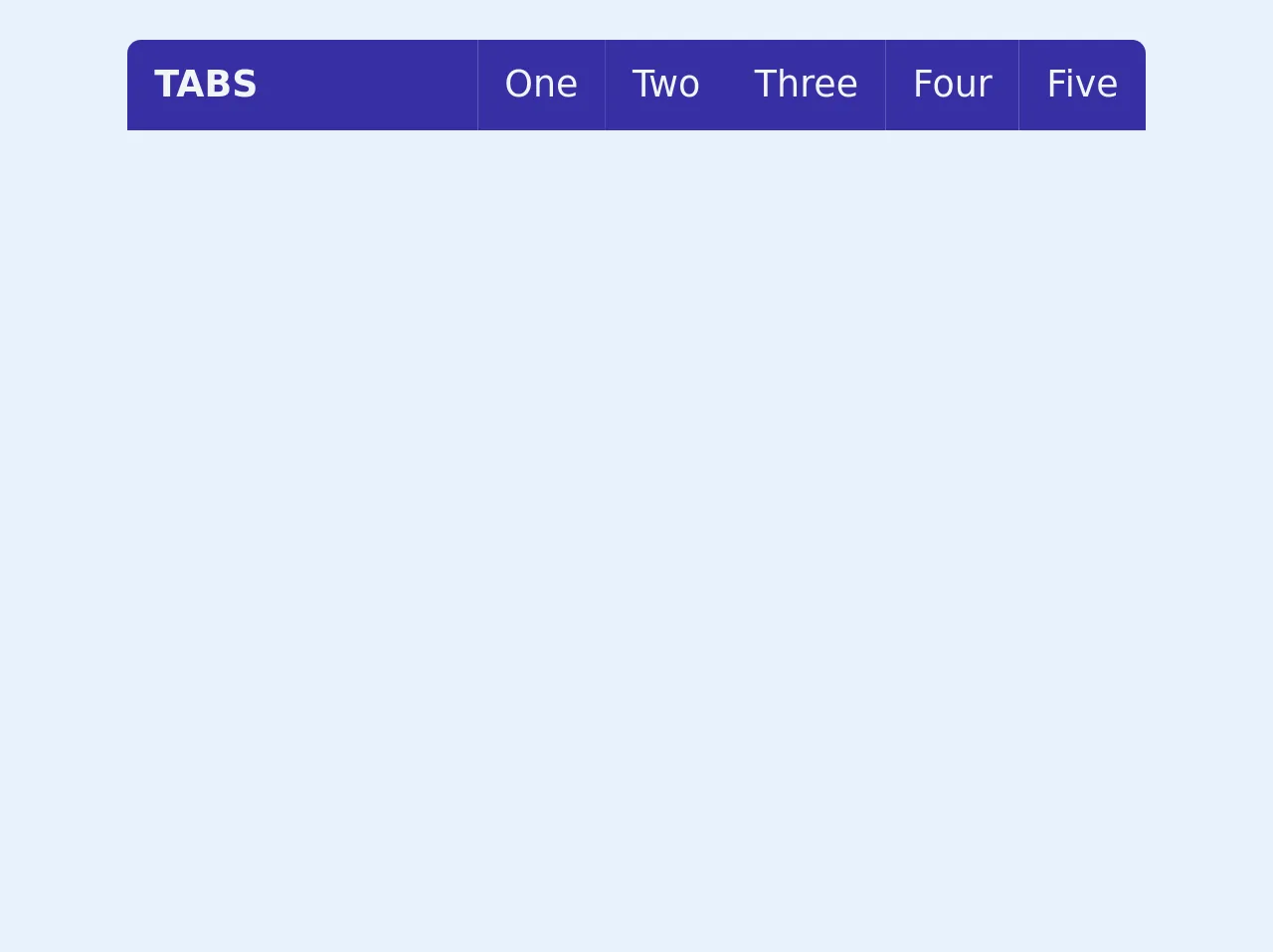
The preview of Interactive Tabs UI component
Creating an Interactive Tabs UI component with Tailwind CSS is easy. You can customize the design by changing the colors, fonts, and sizes of the elements. Here is a preview of what the Interactive Tabs UI component will look like:
Free download of the Interactive Tabs's source code
The source code of Interactive Tabs UI component
To create an Interactive Tabs UI component with Tailwind CSS, you need to write HTML and JavaScript code. The HTML code defines the structure of the component, while the JavaScript code adds interactivity to the component.
Here is the source code for the Interactive Tabs UI component:
<style>

  .body{background-color:white !important;}

  .tab {
    opacity:0;
    visibility:hidden;
    transform:translate(0,50px);
  }

  .active-tab,.active-button{
    transition:transform 0.2s,background 0.2s,color 0.2s;
  }

  .active-tab{
    visibility:visible;
    opacity:1;
    transform:translate(0,0);
    z-index:99;
  }
  .active-button{
    background:white !important;
    color:#3730a3;
  }
</style>
<div class="tabs mx-auto text-indigo-800 m-10" style="max-width:450px;">
  <div class="top flex text-gray-100 rounded-t-md overflow-hidden">
    <div class="header p-2 px-3 bg-indigo-800 w-full font-semibold uppercase">Tabs</div>
    <div class="buttons ml-auto my-auto flex">
      <span tab="1" class="btn bg-indigo-800 cursor-pointer p-2 px-3">One</span>
      <span tab="2" class="btn bg-indigo-800 cursor-pointer p-2 px-3">Two</span>
      <span tab="3" class="btn bg-indigo-800 cursor-pointer p-2 px-3">Three</span>
      <span tab="4" class="btn bg-indigo-800 cursor-pointer p-2 px-3">Four</span>
      <span tab="5" class="btn bg-indigo-800 cursor-pointer p-2 px-3">Five</span>
    </div>
  </div>
  <div class="center text-gray-800 relative">
<!-- tab start -->
   <div class="tab bg-white rounded-b-md w-full border border-t-0 absolute top-0">
      <p class="text-xl p-3 px-5 font-semibold">Wellcome To Tab 1</p>
      <img class="p-5 w-96" src="https://images.pexels.com/photos/635705/pexels-photo-635705.jpeg?auto=compress&cs=tinysrgb&dpr=2&h=650&w=940" alt="">
      <div class="p-3 px-5">
        <div class="long-text">Lorem ipsum dolor sit amet consectetur adipisicing elit. Accusamus expedita rem dolore ut numquam fugiat, accusantium consequatur ratione nesciunt magnam quibusdam necessitatibus dolorum velit. Quia illo autem adipisci cupiditate. Repellendus!</div>
        <br>
        <div tab="2" class="oint text-sm my-4 p-2 px-4 cursor-pointer font-semibold inline-block bg-indigo-800 rounded-sm text-indigo-100">Go Next Tab</div>
      </div>

   </div>
<!--     tab end -->
   <div class="tab bg-white rounded-b-md w-full border border-t-0 absolute top-0">
      <p class="text-xl p-3 px-5 font-semibold">Wellcome To Tab 2</p>
      <div class="p-3 px-5">
        <div class="long-text">Lorem ipsum dolor sit amet consectetur adipisicing elit. Accusamus expedita rem dolore ut numquam fugiat, accusantium consequatur ratione nesciunt magnam quibusdam necessitatibus dolorum velit. Quia illo autem adipisci cupiditate. Repellendus!</div>
        <br>
        <div tab="3" class="oint text-sm my-4 p-2 px-4 cursor-pointer font-semibold inline-block bg-indigo-800 rounded-sm text-indigo-100">Go Next Tab</div>
      </div>

   </div>
<!--     tab end -->
   <div class="tab bg-white rounded-b-md w-full border border-t-0 absolute top-0">
      <p class="text-xl p-3 px-5 font-semibold">Wellcome To Tab 3</p>
      <img class="p-5 w-96" src="https://images.pexels.com/photos/635705/pexels-photo-635705.jpeg?auto=compress&cs=tinysrgb&dpr=2&h=650&w=940" alt="">
      <div class="p-3 px-5">
        <div class="long-text">Lorem ipsum dolor sit amet consectetur adipisicing elit. Accusamus expedita rem dolore ut numquam fugiat, accusantium consequatur ratione nesciunt magnam quibusdam necessitatibus dolorum velit. Quia illo autem adipisci cupiditate. Repellendus!</div>
        <br>
        <div tab="4" class="oint text-sm my-4 p-2 px-4 cursor-pointer font-semibold inline-block bg-indigo-800 rounded-sm text-indigo-100">Go Next Tab</div>
      </div>

   </div>
<!--     tab end -->
   <div class="tab bg-white rounded-b-md w-full border border-t-0 absolute top-0">
      <p class="text-xl p-3 px-5 font-semibold">Wellcome To Tab 4</p>
      <img class="p-5 w-96" src="https://images.pexels.com/photos/635705/pexels-photo-635705.jpeg?auto=compress&cs=tinysrgb&dpr=2&h=650&w=940" alt="">
      <div class="p-3 px-5">
        <div class="long-text">Lorem ipsum dolor sit amet consectetur adipisicing elit. Accusamus expedita rem dolore ut numquam fugiat, accusantium consequatur ratione nesciunt magnam quibusdam necessitatibus dolorum velit. Quia illo autem adipisci cupiditate. Repellendus!</div>
        <br>
        <div tab="5" class="oint text-sm my-4 p-2 px-4 cursor-pointer font-semibold inline-block bg-indigo-800 rounded-sm text-indigo-100">Go Next Tab</div>
      </div>

   </div>
<!--     tab end -->
   <div class="tab bg-white rounded-b-md w-full border border-t-0 absolute top-0">
      <p class="text-xl p-3 px-5 font-semibold">Wellcome To Tab 5</p>
      <img class="p-5 w-96" src="https://images.pexels.com/photos/635705/pexels-photo-635705.jpeg?auto=compress&cs=tinysrgb&dpr=2&h=650&w=940" alt="">
      <div class="p-3 px-5">
        <div class="long-text">Lorem ipsum dolor sit amet consectetur adipisicing elit. Accusamus expedita rem dolore ut numquam fugiat, accusantium consequatur ratione nesciunt magnam quibusdam necessitatibus dolorum velit. Quia illo autem adipisci cupiditate. Repellendus!</div>
      </div>

   </div>
<!--     tab end -->


  </div>
</div>

<script>
const root = document.querySelector(".tabs"),tabs=root.querySelectorAll(".tab"),btns=root.querySelectorAll(".btn");
  root.onclick = function(e){
    var t = e.target,val = t.getAttribute("tab");
    if(val != null){
      tabs.forEach(each=>{each.classList.remove("active-tab");});
      btns.forEach(each=>{each.classList.remove("active-button");});
      tabs[val - 1].classList.add("active-tab");
      btns[val - 1].classList.add("active-button");
    }
  }
</script>
How to create an Interactive Tabs with Tailwind CSS?
Now that you understand what an Interactive Tabs UI component is, and why you should use Tailwind CSS to create it, let's dive into the steps to create an Interactive Tabs UI component.
Step 1: Create the HTML structure
The first step is to create the HTML structure for the Interactive Tabs UI component. The HTML structure consists of a set of tabs and the corresponding content. Here is an example of the HTML structure:
<div class="tabs">
  <div class="tab">
    <button class="tablinks active" onclick="openTab(event, 'tab1')">Tab 1</button>
  </div>
  <div class="tab">
    <button class="tablinks" onclick="openTab(event, 'tab2')">Tab 2</button>
  </div>
  <div class="tab">
    <button class="tablinks" onclick="openTab(event, 'tab3')">Tab 3</button>
  </div>
  <div id="tab1" class="tabcontent active">
    <h3>Tab 1 Content</h3>
    <p>Lorem ipsum dolor sit amet, consectetur adipiscing elit.</p>
  </div>
  <div id="tab2" class="tabcontent">
    <h3>Tab 2 Content</h3>
    <p>Lorem ipsum dolor sit amet, consectetur adipiscing elit.</p>
  </div>
  <div id="tab3" class="tabcontent">
    <h3>Tab 3 Content</h3>
    <p>Lorem ipsum dolor sit amet, consectetur adipiscing elit.</p>
  </div>
</div>
In this example, we have three tabs, and each tab has a button with a unique ID. The content for each tab is placed in a separate div with a unique ID.
Step 2: Add Tailwind CSS classes
The second step is to add Tailwind CSS classes to the HTML structure. We will use the following classes:
flex: to make the tabs and content flex containersjustify-between: to evenly distribute the tabs horizontallyborder-b: to add a bottom border to the tabspx-4: to add padding to the tabscursor-pointer: to change the cursor to a pointer when hovering over the tabshidden: to hide the content initiallyblock: to display the content when a tab is clickedtext-lg: to increase the font size of the tab texttext-gray-600: to change the color of the tab textbg-gray-100: to add a background color to the active tabborder-l: to add a left border to the tabs
Here is an example of the HTML structure with Tailwind CSS classes:
<div class="tabs flex justify-between border-b px-4">
  <div class="tab">
    <button class="tablinks active text-lg text-gray-600 bg-gray-100 border-l border-t border-r rounded-t cursor-pointer" onclick="openTab(event, 'tab1')">Tab 1</button>
  </div>
  <div class="tab">
    <button class="tablinks text-lg text-gray-600 border-t border-r rounded-t cursor-pointer" onclick="openTab(event, 'tab2')">Tab 2</button>
  </div>
  <div class="tab">
    <button class="tablinks text-lg text-gray-600 border-t border-r rounded-t cursor-pointer" onclick="openTab(event, 'tab3')">Tab 3</button>
  </div>
</div>
<div id="tab1" class="tabcontent active block">
  <h3>Tab 1 Content</h3>
  <p>Lorem ipsum dolor sit amet, consectetur adipiscing elit.</p>
</div>
<div id="tab2" class="tabcontent hidden">
  <h3>Tab 2 Content</h3>
  <p>Lorem ipsum dolor sit amet, consectetur adipiscing elit.</p>
</div>
<div id="tab3" class="tabcontent hidden">
  <h3>Tab 3 Content</h3>
  <p>Lorem ipsum dolor sit amet, consectetur adipiscing elit.</p>
</div>
In this example, we have added Tailwind CSS classes to the HTML structure to style the tabs and content.
Step 3: Add JavaScript code
The third step is to add JavaScript code to add interactivity to the Interactive Tabs UI component. We will use the following code:
function openTab(evt, tabName) {
  // Declare all variables
  var i, tabcontent, tablinks;

  // Get all elements with class="tabcontent" and hide them
  tabcontent = document.getElementsByClassName("tabcontent");
  for (i = 0; i < tabcontent.length; i++) {
    tabcontent[i].style.display = "none";
  }

  // Get all elements with class="tablinks" and remove the class "active"
  tablinks = document.getElementsByClassName("tablinks");
  for (i = 0; i < tablinks.length; i++) {
    tablinks[i].className = tablinks[i].className.replace(" active", "");
  }

  // Show the current tab, and add an "active" class to the button that opened the tab
  document.getElementById(tabName).style.display = "block";
  evt.currentTarget.className += " active";
}
In this code, we have defined a function called openTab that takes two parameters: evt and tabName. This function hides all the content and removes the active class from all the tabs. Then it displays the content for the selected tab and adds the active class to the selected tab.
Step 4: Test the Interactive Tabs UI component
The final step is to test the Interactive Tabs UI component. Open the HTML file in a web browser and click on the tabs to see the content change.
Conclusion
In this article, we have learned how to create an Interactive Tabs UI component with Tailwind CSS. We have seen how easy it is to create this component with Tailwind CSS and how it can enhance user experience on a website or application. By following the steps outlined in this article, you can create a unique and interactive Tabs UI component for your next project.