- Published on
Here Are 6 Ways To Build A Horizontal Card With Tailwind CSS
- What is Tailwind CSS?
- The Description of Horizontal Card UI Component
- Why Use Tailwind CSS to Create a Horizontal Card UI Component?
- The Preview of Horizontal Card UI Component
- The Source Code of Horizontal Card UI Component
- How to Create a Horizontal Card with Tailwind CSS?
- Step 1: Create the HTML Markup
- Step 2: Style the HTML Markup with Tailwind CSS
- Step 3: Customize the Horizontal Card
- Conclusion
As a front-end technology blogger, it's important to stay up to date with the latest tools and frameworks. One such framework that has gained a lot of popularity in recent years is Tailwind CSS. Tailwind CSS is a utility-first CSS framework that makes it easy to create beautiful and responsive user interfaces.
In this article, we will explore how to create a horizontal card UI component using Tailwind CSS. We will cover the benefits of using Tailwind CSS, provide a preview of the horizontal card UI component, and provide the source code for you to use in your own projects.
What is Tailwind CSS?
Tailwind CSS is a utility-first CSS framework that provides a set of pre-defined CSS classes that you can use to style your HTML elements. Unlike other CSS frameworks that provide pre-built components, Tailwind CSS provides low-level utility classes that you can use to build your own custom components.
Tailwind CSS is designed to be highly customizable and can be configured to match your design system. It also provides a lot of flexibility when it comes to responsive design, making it easy to create layouts that work on different screen sizes.
The Description of Horizontal Card UI Component
A horizontal card UI component is a common design pattern used in web applications. It consists of a card that is oriented horizontally, with an image on one side and text on the other. This design pattern is often used to display product information or other types of content.
The horizontal card UI component is a great example of how Tailwind CSS can be used to create custom UI components. By using the utility classes provided by Tailwind CSS, we can easily create a horizontal card that is both beautiful and responsive.
Why Use Tailwind CSS to Create a Horizontal Card UI Component?
There are several reasons why you might want to use Tailwind CSS to create a horizontal card UI component:
- Tailwind CSS provides a set of pre-defined utility classes that make it easy to style your HTML elements.
- Tailwind CSS is highly customizable and can be configured to match your design system.
- Tailwind CSS provides a lot of flexibility when it comes to responsive design, making it easy to create layouts that work on different screen sizes.
Overall, using Tailwind CSS to create a horizontal card UI component can save you a lot of time and effort, while also providing a great user experience.
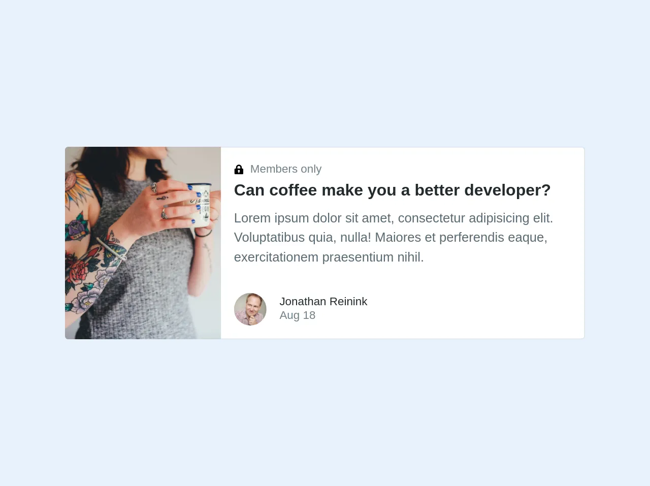
The Preview of Horizontal Card UI Component
To give you an idea of what the horizontal card UI component looks like, here is a preview:
Free download of the Horizontal card's source code
The Source Code of Horizontal Card UI Component
To create the horizontal card UI component, we will be using a combination of HTML and Tailwind CSS classes. Here is the source code:
<div class="max-w-md w-full lg:flex">
  <div class="h-48 lg:h-auto lg:w-48 flex-none bg-cover rounded-t lg:rounded-t-none lg:rounded-l text-center overflow-hidden" style="background-image: url('https://tailwindcss.com/img/card-left.jpg')" title="Woman holding a mug">
  </div>
  <div class="border-r border-b border-l border-grey-light lg:border-l-0 lg:border-t lg:border-grey-light bg-white rounded-b lg:rounded-b-none lg:rounded-r p-4 flex flex-col justify-between leading-normal">
    <div class="mb-8">
      <p class="text-sm text-grey-dark flex items-center">
        <svg class="text-grey w-3 h-3 mr-2" xmlns="http://www.w3.org/2000/svg" viewBox="0 0 20 20">
          <path d="M4 8V6a6 6 0 1 1 12 0v2h1a2 2 0 0 1 2 2v8a2 2 0 0 1-2 2H3a2 2 0 0 1-2-2v-8c0-1.1.9-2 2-2h1zm5 6.73V17h2v-2.27a2 2 0 1 0-2 0zM7 6v2h6V6a3 3 0 0 0-6 0z" />
        </svg>
        Members only
      </p>
      <div class="text-black font-bold text-xl mb-2">Can coffee make you a better developer?</div>
      <p class="text-grey-darker text-base">Lorem ipsum dolor sit amet, consectetur adipisicing elit. Voluptatibus quia, nulla! Maiores et perferendis eaque, exercitationem praesentium nihil.</p>
    </div>
    <div class="flex items-center">
      <img class="w-10 h-10 rounded-full mr-4" src="https://pbs.twimg.com/profile_images/885868801232961537/b1F6H4KC_400x400.jpg" alt="Avatar of Jonathan Reinink">
      <div class="text-sm">
        <p class="text-black leading-none">Jonathan Reinink</p>
        <p class="text-grey-dark">Aug 18</p>
      </div>
    </div>
  </div>
</div>
How to Create a Horizontal Card with Tailwind CSS?
Now that you have seen the preview and source code for the horizontal card UI component, let's walk through how to create it step-by-step.
Step 1: Create the HTML Markup
The first step is to create the HTML markup for the horizontal card. Here is the basic structure:
<div class="flex flex-col lg:flex-row rounded-lg shadow-lg overflow-hidden">
  <div class="w-full lg:w-1/2">
    <img src="https://via.placeholder.com/640x480.png" alt="Placeholder Image" class="w-full h-full object-cover">
  </div>
  <div class="w-full lg:w-1/2 p-6">
    <h2 class="text-2xl font-bold mb-2">Product Name</h2>
    <p class="text-gray-700 mb-4">Lorem ipsum dolor sit amet, consectetur adipiscing elit. Sed euismod, urna euismod eleifend pretium, nisi mauris bibendum mauris, ac malesuada lorem nisl eu elit.</p>
    <a href="#" class="bg-blue-500 hover:bg-blue-700 text-white font-bold py-2 px-4 rounded">Buy Now</a>
  </div>
</div>
In this markup, we are using a combination of flexbox and grid classes to create a responsive layout. The flex class is used to create a flex container, while the lg:flex-row class is used to change the direction of the flex container on larger screens.
Step 2: Style the HTML Markup with Tailwind CSS
Next, we need to style the HTML markup using Tailwind CSS classes. Here is the CSS code:
.rounded-lg {
  border-radius: 0.5rem;
}

.shadow-lg {
  box-shadow: 0 10px 15px -3px rgba(0, 0, 0, 0.1), 0 4px 6px -2px rgba(0, 0, 0, 0.05);
}

.overflow-hidden {
  overflow: hidden;
}

.object-cover {
  object-fit: cover;
}

.text-2xl {
  font-size: 1.5rem;
  line-height: 2rem;
}

.font-bold {
  font-weight: 700;
}

.text-gray-700 {
  color: #4a5568;
}

.bg-blue-500 {
  background-color: #4299e1;
}

.hover\:bg-blue-700:hover {
  background-color: #2c5282;
}

.text-white {
  color: #fff;
}

.py-2 {
  padding-top: 0.5rem;
  padding-bottom: 0.5rem;
}

.px-4 {
  padding-left: 1rem;
  padding-right: 1rem;
}

.rounded {
  border-radius: 0.25rem;
}
In this CSS code, we are using a combination of Tailwind CSS utility classes and custom CSS classes to style the HTML markup. We are also using the hover variant to change the background color of the "Buy Now" button on hover.
Step 3: Customize the Horizontal Card
Finally, we can customize the horizontal card to match our design system. Here are some examples of customizations we can make:
<div class="flex flex-col lg:flex-row rounded-lg shadow-lg overflow-hidden bg-white">
  <div class="w-full lg:w-1/2">
    <img src="https://via.placeholder.com/640x480.png" alt="Placeholder Image" class="w-full h-full object-cover">
  </div>
  <div class="w-full lg:w-1/2 p-6">
    <h2 class="text-2xl font-bold mb-2 text-gray-800">Product Name</h2>
    <p class="text-gray-700 mb-4">Lorem ipsum dolor sit amet, consectetur adipiscing elit. Sed euismod, urna euismod eleifend pretium, nisi mauris bibendum mauris, ac malesuada lorem nisl eu elit.</p>
    <a href="#" class="bg-blue-500 hover:bg-blue-700 text-white font-bold py-2 px-4 rounded">Buy Now</a>
  </div>
</div>
In this example, we have changed the background color of the horizontal card to white, changed the text color of the product name to gray, and added a custom class to the "Buy Now" button to change the border radius.
Conclusion
In this article, we have explored how to create a horizontal card UI component using Tailwind CSS. We have covered the benefits of using Tailwind CSS, provided a preview of the horizontal card UI component, and provided the source code for you to use in your own projects.
By using Tailwind CSS, we can easily create beautiful and responsive UI components that match our design system. With its flexibility and customization options, Tailwind CSS is a great choice for front-end developers looking to create custom UI components quickly and efficiently.