- Published on
3 Things You Must Know To Create A Horizontal Form With Tailwind CSS
- What is Tailwind CSS?
- The description of Horizontal form ui component
- Why use Tailwind CSS to create a Horizontal form ui component?
- The preview of Horizontal form ui component
- The source code of Horizontal form ui component
- How to create a Horizontal form with Tailwind CSS?
- Step 1: Create the HTML markup
- Step 2: Style the form fields
- Step 3: Customize the form layout
- Conclusion
What is Tailwind CSS?
Tailwind CSS is a utility-first CSS framework that helps you quickly build custom user interfaces. It provides a set of pre-defined CSS classes that you can use to style your HTML elements. With Tailwind CSS, you can easily create responsive designs, customize your styles, and improve your development workflow.
The description of Horizontal form ui component
A horizontal form is a user interface component that displays form fields in a horizontal layout. This layout is useful when you have a limited amount of vertical space and want to display multiple form fields in a single row. A horizontal form can improve the user experience by reducing the amount of scrolling required to fill out a form.
Why use Tailwind CSS to create a Horizontal form ui component?
Tailwind CSS provides a set of pre-defined classes that make it easy to create a horizontal form. With Tailwind CSS, you can customize the spacing between form fields, adjust the width of each field, and style the form elements to match your design. Using Tailwind CSS can save you time and improve your development workflow.
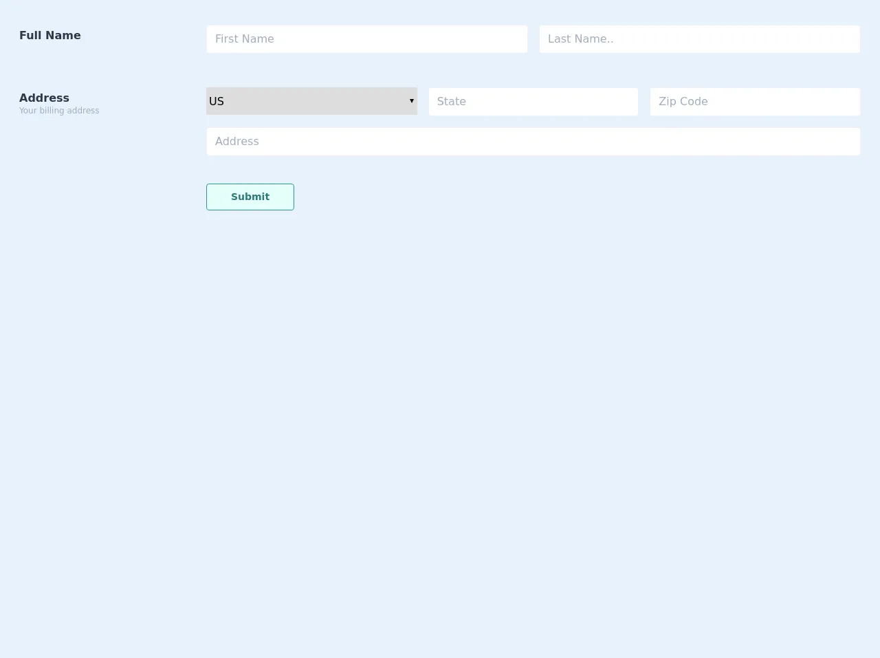
The preview of Horizontal form ui component
To create a horizontal form with Tailwind CSS, you can use the flex and space-x classes to display the form fields in a row. You can also use the w class to adjust the width of each field. Here is a preview of what a horizontal form might look like:
Free download of the Horizontal form's source code
The source code of Horizontal form ui component
To create a horizontal form with Tailwind CSS, you can use the following HTML markup:
<div class="p-5">
    <div class="mt-2">
        <div class="flex flex-col md:flex-row border-b border-gray-200 pb-4 mb-4">
            <div class="w-64 font-bold h-6 mx-2 mt-3 text-gray-800">Full Name</div>
            <div class="flex-1 flex flex-col md:flex-row">
                <div class="w-full flex-1 mx-2">
                    <div class="my-2 p-1 bg-white flex border border-gray-200 rounded">
                        <input placeholder="First Name" class="p-1 px-2 appearance-none outline-none w-full text-gray-800 "> </div>
                </div>
                <div class="w-full flex-1 mx-2">
                    <div class="my-2 p-1 bg-white flex border border-gray-200 rounded">
                        <input placeholder="Last Name.." class="p-1 px-2 appearance-none outline-none w-full text-gray-800 "> </div>
                </div>
            </div>
        </div>
        <div class="flex flex-col md:flex-row pb-4 mb-4">
            <div class="w-64 font-bold h-6 mx-2 mt-3 text-gray-800">Address
                <div class="text-xs font-normal leading-none text-gray-500">Your billing address</div>
            </div>
            <div class="flex-1">
                <div class="flex flex-col md:flex-row">
                    <select class="mx-2 flex-1 h-10 mt-2 form-select w-full">
                        <option value="US">US</option>
                        <option value="Italy">Italy</option>
                        <option value="Spain">Spain</option>
                        <option value="China">China</option>
                    </select>
                    <div class="w-full flex-1 mx-2">
                        <div class="my-2 p-1 bg-white flex border border-gray-200 rounded">
                            <input placeholder="State" class="p-1 px-2 appearance-none outline-none w-full text-gray-800 "> </div>
                    </div>
                    <div class="w-full flex-1 mx-2">
                        <div class="my-2 p-1 bg-white flex border border-gray-200 rounded">
                            <input placeholder="Zip Code" class="p-1 px-2 appearance-none outline-none w-full text-gray-800 "> </div>
                    </div>
                </div>
                <div class="m-2">
                    <div class="w-full flex-1">
                        <div class="my-2 p-1 bg-white flex border border-gray-200 rounded">
                        <input placeholder="Address" class="p-1 px-2 appearance-none outline-none w-full text-gray-800 "> </div>
                    </div>
                </div>
            </div>
        </div>
        <div class="flex flex-col md:flex-row">
            <div class="w-64 mx-2 font-bold h-6 mt-3 text-gray-800"></div>
            <div class="flex-1 flex flex-col md:flex-row">
                <button class="text-sm  mx-2 w-32  focus:outline-none flex justify-center px-4 py-2 rounded font-bold cursor-pointer
        hover:bg-teal-700 hover:text-teal-100
        bg-teal-100
        text-teal-700
        border duration-200 ease-in-out
        border-teal-600 transition">Submit</button>
            </div>
        </div>
    </div>
</div>
How to create a Horizontal form with Tailwind CSS?
To create a horizontal form with Tailwind CSS, you can follow these three steps:
Step 1: Create the HTML markup
First, you need to create the HTML markup for your form. You can use the form and fieldset elements to group your form fields together. Here is an example of what your HTML markup might look like:
<form class="max-w-lg mx-auto">
  <fieldset class="flex space-x-4">
    <div class="w-1/2">
      <label for="first-name" class="block text-sm font-medium text-gray-700">First Name</label>
      <input type="text" name="first-name" id="first-name" class="mt-1 focus:ring-indigo-500 focus:border-indigo-500 block w-full shadow-sm sm:text-sm border-gray-300 rounded-md">
    </div>
    <div class="w-1/2">
      <label for="last-name" class="block text-sm font-medium text-gray-700">Last Name</label>
      <input type="text" name="last-name" id="last-name" class="mt-1 focus:ring-indigo-500 focus:border-indigo-500 block w-full shadow-sm sm:text-sm border-gray-300 rounded-md">
    </div>
  </fieldset>
</form>
In this example, we have created a form with two form fields: First Name and Last Name. We have used the flex and space-x-4 classes to display the form fields in a row with a 4-pixel gap between them. We have also used the w-1/2 class to set the width of each field to 50%.
Step 2: Style the form fields
Next, you can use Tailwind CSS to style the form fields. You can use the pre-defined classes to adjust the font size, color, border, and spacing of the form elements. Here is an example of how you might style the form fields:
input[type="text"] {
  font-size: 16px;
  color: #333;
  border: 1px solid #ccc;
  padding: 8px;
  border-radius: 4px;
}

label {
  font-size: 14px;
  color: #666;
  margin-bottom: 4px;
  display: block;
}
In this example, we have set the font size of the input fields to 16 pixels, the color to #333, and the border to 1 pixel solid #ccc. We have also added padding and border-radius to make the fields look more visually appealing. We have set the font size of the labels to 14 pixels, the color to #666, and added some margin and display properties to make them easier to read.
Step 3: Customize the form layout
Finally, you can customize the layout of the form to match your design. You can use the pre-defined classes to adjust the spacing between form fields, change the width of each field, and add additional styling. Here is an example of how you might customize the form layout:
form {
  max-width: 600px;
  margin: 0 auto;
}

fieldset {
  margin: 0;
  padding: 0;
  border: none;
}

.w-1\/2 {
  width: 50%;
}

.space-x-4 > :not(:first-child) {
  margin-left: 1rem;
}
In this example, we have set the maximum width of the form to 600 pixels and centered it on the page. We have removed the margin, padding, and border from the fieldset element to remove any unwanted spacing. We have used the w-1/2 class to set the width of each field to 50%. We have also used the space-x-4 class to add a 4-pixel gap between form fields.
Conclusion
Creating a horizontal form with Tailwind CSS is easy and can improve the user experience of your website or application. By using the pre-defined classes provided by Tailwind CSS, you can quickly create a custom horizontal form that matches your design. Remember to follow the three steps outlined above: create the HTML markup, style the form fields, and customize the form layout. With these tips, you can create a beautiful and functional horizontal form in no time.