- Published on
6 Critical Skills To Create A Glassmorphism Card With Tailwind CSS Remarkably Well
- What is Tailwind CSS?
- The description of Glassmorphism Card UI component
- Why use Tailwind CSS to create a Glassmorphism Card UI component?
- The preview of Glassmorphism Card UI component
- The source code of Glassmorphism Card UI component
- How to create a Glassmorphism Card with Tailwind CSS?
- Step 1: Create the HTML structure
- Step 2: Style the card using Tailwind CSS
- Step 3: Customize the design using Tailwind CSS
- Conclusion
As a FrontEnd technology blogger, it is important to stay up-to-date with the latest trends and techniques in web development. One of the latest trends is Glassmorphism, a design style that creates a frosted glass effect on UI components. In this article, we will explore how to create a Glassmorphism Card UI component using Tailwind CSS.
What is Tailwind CSS?
Tailwind CSS is a utility-first CSS framework that allows developers to quickly create custom designs using pre-defined classes. It is designed to be highly customizable and easy to use, making it a popular choice for developers who want to create unique designs without spending too much time on CSS.
The description of Glassmorphism Card UI component
The Glassmorphism Card UI component is a popular design style that creates a frosted glass effect on a card. It is a modern and sleek design that can be used for a variety of purposes, such as displaying product information, showcasing portfolio items, or presenting team members.
Why use Tailwind CSS to create a Glassmorphism Card UI component?
Tailwind CSS is a great choice for creating a Glassmorphism Card UI component for several reasons:
- It allows you to easily customize the design using pre-defined classes.
- It is highly responsive, making it easy to create a design that looks great on any device.
- It is lightweight, which means it won't slow down your website's load time.
- It is easy to learn, even for developers who are new to CSS.
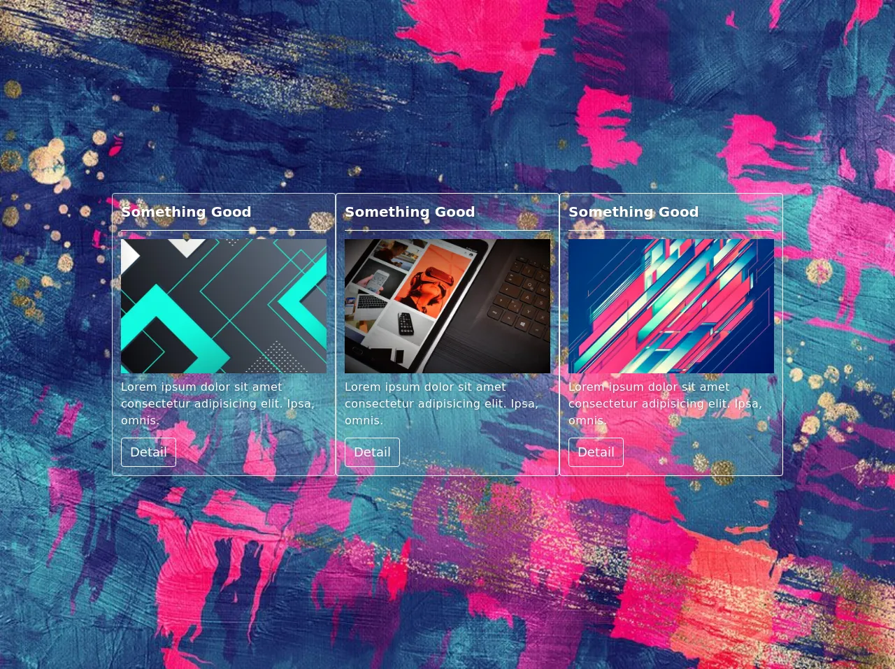
The preview of Glassmorphism Card UI component
To create a Glassmorphism Card UI component, we will use Tailwind CSS to style the card. The card will have a frosted glass effect, with a gradient background and a shadow effect. The card will also include an image, a title, and a description.
Free download of the Glassmorphism Card's source code
The source code of Glassmorphism Card UI component
To create a Glassmorphism Card UI component, we will use HTML and Tailwind CSS. The HTML code will include a div element that will serve as the card container. The Tailwind CSS classes will be used to style the card and create the frosted glass effect.
<style>
    .bg-image {
      background-image: url(https://i.postimg.cc/Pq2fJrXw/bg00.jpg);
      background-size: cover;
      background-position: center;
    }
    .backdrop {
      backdrop-filter: blur(5px);
    }
    .text-shadow {
      text-shadow: 1px 1px 3px rgba(0, 0, 0, 0.3);
    }
  </style>

  <div class="bg-image w-full min-h-screen flex flex-wrap justify-center items-center gap-3 py-5">
    <div class="backdrop w-10/12 md:w-1/4 bg-white bg-opacity-10 rounded p-3 text-white border border-gray-300 shadow-lg">
      <!-- header -->
      <div class="w-full mb-3 pb-3 border-b border-1 border-white">
        <h3 class="text-xl font-semibold text-shadow">Something Good</h3>
      </div>
      <!-- body -->
      <div>
        <img src="https://i.postimg.cc/SxLx0fHV/bg01.jpg" alt="image1" class="w-full h-48 object-cover mb-2">
        <p class="mb-3 tracking-wide text-base text-shadow">
          Lorem ipsum dolor sit amet consectetur adipisicing elit. Ipsa, omnis.
        </p>
        <button class="backdrop bg-white bg-opacity-0 border border-white px-3 py-1.5 rounded focus:outline-none focus:ring-2 focus:ring-white focus:ring-opacity-40 hover:bg-opacity-10 text-lg">
          Detail
        </button>
      </div>
    </div>
    <div class="backdrop w-10/12 md:w-1/4 bg-white bg-opacity-10 rounded p-3 text-white border border-white shadow-lg">
      <!-- header -->
      <div class="w-full mb-3 pb-3 border-b border-1 border-white">
        <h3 class="text-xl font-semibold text-shadow">Something Good</h3>
      </div>
      <!-- body -->
      <div>
        <img src="https://i.postimg.cc/J4khxLqf/bg02.jpg" alt="image2" class="w-full h-48 object-cover mb-2">
        <p class="mb-3 tracking-wide text-base text-shadow">
          Lorem ipsum dolor sit amet consectetur adipisicing elit. Ipsa, omnis.
        </p>
        <button class="backdrop bg-white bg-opacity-0 border border-white px-3 py-1.5 rounded focus:outline-none focus:ring-2 focus:ring-white focus:ring-opacity-40 hover:bg-opacity-10 text-lg">
          Detail
        </button>
      </div>
    </div>
    <div class="backdrop w-10/12 md:w-1/4 bg-white bg-opacity-10 rounded p-3 text-white border border-white shadow-lg">
      <!-- header -->
      <div class="w-full mb-3 pb-3 border-b border-1 border-white">
        <h3 class="text-xl font-semibold text-shadow">Something Good</h3>
      </div>
      <!-- body -->
      <div>
        <img src="https://i.postimg.cc/VNYLzb8w/bg03.jpg" alt="image3" class="w-full h-48 object-cover mb-2">
        <p class="mb-3 tracking-wide text-base text-shadow">
          Lorem ipsum dolor sit amet consectetur adipisicing elit. Ipsa, omnis.
        </p>
        <button class="backdrop bg-white bg-opacity-0 border border-white px-3 py-1.5 rounded focus:outline-none focus:ring-2 focus:ring-white focus:ring-opacity-40 hover:bg-opacity-10 text-lg">
          Detail
        </button>
      </div>
    </div>
  </div>
How to create a Glassmorphism Card with Tailwind CSS?
To create a Glassmorphism Card with Tailwind CSS, you will need to follow these steps:
Step 1: Create the HTML structure
The first step is to create the HTML structure for the card. This will include a div element that will serve as the card container, as well as an image, a title, and a description.
<div class="card">
  <img src="image.png" alt="Card Image" class="card-image">
  <div class="card-content">
    <h2 class="card-title">Card Title</h2>
    <p class="card-description">Card Description</p>
  </div>
</div>
Step 2: Style the card using Tailwind CSS
The next step is to style the card using Tailwind CSS. We will use the bg-gradient-to-r class to create a gradient background, and the shadow-md class to create a shadow effect. We will also use the backdrop-blur and backdrop-opacity classes to create the frosted glass effect.
<div class="card bg-gradient-to-r from-blue-400 to-purple-500 shadow-md backdrop-blur-md backdrop-opacity-75">
  <img src="image.png" alt="Card Image" class="card-image">
  <div class="card-content">
    <h2 class="card-title text-white">Card Title</h2>
    <p class="card-description text-white">Card Description</p>
  </div>
</div>
Step 3: Customize the design using Tailwind CSS
Finally, you can customize the design of the card using Tailwind CSS. You can change the gradient colors, adjust the shadow effect, and change the font size and color of the title and description.
<div class="card bg-gradient-to-r from-purple-500 to-pink-500 shadow-lg backdrop-blur-lg backdrop-opacity-75">
  <img src="image.png" alt="Card Image" class="card-image">
  <div class="card-content">
    <h2 class="card-title text-white text-2xl font-bold">Card Title</h2>
    <p class="card-description text-white text-lg">Card Description</p>
  </div>
</div>
Conclusion
In conclusion, creating a Glassmorphism Card UI component using Tailwind CSS is a great way to add a modern and sleek design to your website. By following the steps outlined in this article, you can create a beautiful card that is both responsive and lightweight. With Tailwind CSS, you can easily customize the design to fit your needs, making it a great choice for developers who want to create unique and stylish designs.