- Published on
Best Ways To Build A Glassmorphism Card With Tailwind CSS
- What is Tailwind CSS?
- The description of Glassmorphism card ui component
- Why use Tailwind CSS to create a Glassmorphism card ui component?
- The preview of Glassmorphism card ui component
- The source code of Glassmorphism card ui component
- How to create a Glassmorphism card with Tailwind CSS?
- Conclusion
What is Tailwind CSS?
Tailwind CSS is a utility-first CSS framework that provides a set of pre-defined CSS classes to help you quickly build custom user interfaces. It is highly customizable and can be used to create any design style, including the popular Glassmorphism UI trend.
The description of Glassmorphism card ui component
Glassmorphism is a design trend that creates a frosted glass effect on user interface elements, giving them a modern and elegant look. A Glassmorphism card is a UI component that uses this effect to create a card-like container with a frosted glass background and a translucent border.
Why use Tailwind CSS to create a Glassmorphism card ui component?
Tailwind CSS makes it easy to create a Glassmorphism card UI component because it provides pre-defined classes for styling elements. This means that you don't have to write custom CSS code from scratch, saving you time and effort.
The preview of Glassmorphism card ui component
To create a Glassmorphism card with Tailwind CSS, you will need to use the following classes:
bg-opacity-25: This class sets the opacity of the background color to 25%.bg-blur: This class adds a blur effect to the background.border-opacity-25: This class sets the opacity of the border color to 25%.border-blur: This class adds a blur effect to the border.rounded-lg: This class rounds the corners of the card.
Free download of the Glassmorphism card's source code
The source code of Glassmorphism card ui component
To create a Glassmorphism card with Tailwind CSS, you can use the following HTML and CSS code:
<div class="bg-white bg-opacity-25 bg-blur border border-white border-opacity-25 border-blur rounded-lg p-6">
  <h2 class="text-2xl font-bold mb-4">Card Title</h2>
  <p class="text-gray-500">Lorem ipsum dolor sit amet, consectetur adipiscing elit. Sed non risus. Suspendisse lectus tortor, dignissim sit amet, adipiscing nec, ultricies sed, dolor. Cras elementum ultrices diam.</p>
</div>
.bg-opacity-25 {
  background-color: rgba(255, 255, 255, 0.25);
}

.bg-blur {
  backdrop-filter: blur(10px);
}

.border-opacity-25 {
  border-color: rgba(255, 255, 255, 0.25);
}

.border-blur {
  box-shadow: 0 0 10px rgba(255, 255, 255, 0.25);
}
<div class="p-4 bg-indigo-100 grid lg:grid-cols-2 gap-3 ">
<h1 class="text-indigo-700 font-bold text-3xl mb-3">
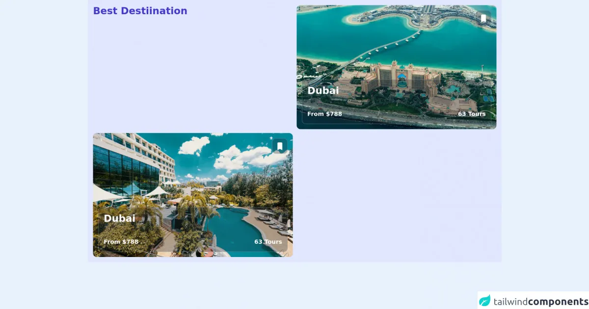
Best Destiination
</h1>
<div class="bg-blue-300 max-h-96 rounded-xl hover:shadow-xl overflow-hidden relative">
<div class="absolute p-4 z-20 h-full w-full justify-between flex flex-col">
<button class="p-2 backdrop-blur-sm bg-gray-800/30 w-12 h-12 justify-center items-center flex self-end rounded-xl border-gray-400/50 border hover:shadow-xl">
<svg xmlns="http://www.w3.org/2000/svg" class="h-8 w-8 text-white" viewBox="0 0 20 20" fill="currentColor">
<path d="M5 4a2 2 0 012-2h6a2 2 0 012 2v14l-5-2.5L5 18V4z" />
</svg>
</button>
<div class="p-4 rounded-xl w-full hover:shadow-xl backdrop-blur-sm bg-gray-800/30 self-end border-gray-400/50 border">
<h1 class="text-white font-bold text-3xl mb-10">
Dubai
</h1>
<div class="flex justify-between">
<h3 class="text-white font-bold text-lg capitalize">
From $788
</h3>
<h3 class="text-white font-bold text-lg capitalize">
63 tours
</h3>
</div>
</div>
</div>
<image class="w-full" src="https://images.unsplash.com/photo-1489516408517-0c0a15662682?ixlib=rb-1.2.1&ixid=MnwxMjA3fDB8MHxwaG90by1wYWdlfHx8fGVufDB8fHx8&auto=format&fit=crop&w=774&q=80" />
</div>
<div class="bg-blue-300 max-h-96 rounded-xl hover:shadow-xl overflow-hidden relative">
<div class="absolute p-4 z-20 h-full w-full justify-between flex flex-col">
<button class="p-2 backdrop-blur-sm bg-gray-800/30 w-12 h-12 justify-center items-center flex self-end rounded-xl border-gray-400/50 border hover:shadow-xl">
<svg xmlns="http://www.w3.org/2000/svg" class="h-8 w-8 text-white" viewBox="0 0 20 20" fill="currentColor">
<path d="M5 4a2 2 0 012-2h6a2 2 0 012 2v14l-5-2.5L5 18V4z" />
</svg>
</button>
<div class="p-4 rounded-xl w-full hover:shadow-xl backdrop-blur-sm bg-gray-800/30 self-end border-gray-400/50 border">
<h1 class="text-white font-bold text-3xl mb-10">
Dubai
</h1>
<div class="flex justify-between">
<h3 class="text-white font-bold text-lg capitalize">
From $788
</h3>
<h3 class="text-white font-bold text-lg capitalize">
63 tours
</h3>
</div>
</div>
</div>
<image class="w-full" src="https://images.unsplash.com/photo-1598605272254-16f0c0ecdfa5?ixlib=rb-1.2.1&ixid=MnwxMjA3fDB8MHxwaG90by1wYWdlfHx8fGVufDB8fHx8&auto=format&fit=crop&w=871&q=80" />
</div>
</div>
How to create a Glassmorphism card with Tailwind CSS?
To create a Glassmorphism card with Tailwind CSS, follow these steps:
- Create a new HTML file and add the following code:
<!DOCTYPE html>
<html lang="en">
<head>
  <meta charset="UTF-8">
  <title>Glassmorphism Card</title>
  <link rel="stylesheet" href="https://cdn.jsdelivr.net/npm/[email protected]/dist/tailwind.min.css">
</head>
<body>
  <div class="bg-white bg-opacity-25 bg-blur border border-white border-opacity-25 border-blur rounded-lg p-6">
    <h2 class="text-2xl font-bold mb-4">Card Title</h2>
    <p class="text-gray-500">Lorem ipsum dolor sit amet, consectetur adipiscing elit. Sed non risus. Suspendisse lectus tortor, dignissim sit amet, adipiscing nec, ultricies sed, dolor. Cras elementum ultrices diam.</p>
  </div>
</body>
</html>
Save the file and open it in your web browser. You should see a Glassmorphism card with a title and some text.
To customize the card, you can modify the classes used in the HTML code. For example, you can change the background color by using the
bg-classes, or change the font size by using thetext-classes.
Conclusion
Tailwind CSS is a powerful tool for creating custom user interfaces, including Glassmorphism cards. By using pre-defined classes, you can quickly and easily create a modern and elegant UI component that will impress your users. Try it out for yourself and see how easy it is to create a Glassmorphism card with Tailwind CSS!