- Published on
Ultimate Guide: Create A Gallery With Tailwind CSS
- What is Tailwind CSS?
- The description of Gallery ui component
- Why use Tailwind CSS to create a Gallery ui component?
- The preview of Gallery ui component
- The source code of Gallery ui component
- How to create a Gallery with Tailwind CSS?
- Step 1: Set up your HTML
- Step 2: Style your gallery
- Step 3: Add interactivity
- Conclusion
As a front-end developer, it's important to stay up-to-date with the latest tools and technologies. One of the most popular CSS frameworks today is Tailwind CSS. In this article, we'll explore how to create a gallery using Tailwind CSS.
What is Tailwind CSS?
Tailwind CSS is a utility-first CSS framework that allows you to quickly build custom designs without writing any CSS. It provides a set of pre-defined classes that you can use to style your HTML elements. Tailwind CSS is highly customizable and can be used to create complex layouts and designs.
The description of Gallery ui component
A gallery is a common UI component that displays a collection of images or videos. It's often used in websites and applications to showcase products, services, or portfolios. A gallery typically includes features such as pagination, zoom, and fullscreen mode.
Why use Tailwind CSS to create a Gallery ui component?
Tailwind CSS is an excellent choice for creating a gallery UI component for several reasons:
- Tailwind CSS provides a set of pre-defined classes that you can use to style your gallery. This saves you time and effort in writing custom CSS.
- Tailwind CSS is highly customizable, which means you can easily modify the styles of your gallery to match your design requirements.
- Tailwind CSS is lightweight and fast, which means your gallery will load quickly and provide a smooth user experience.
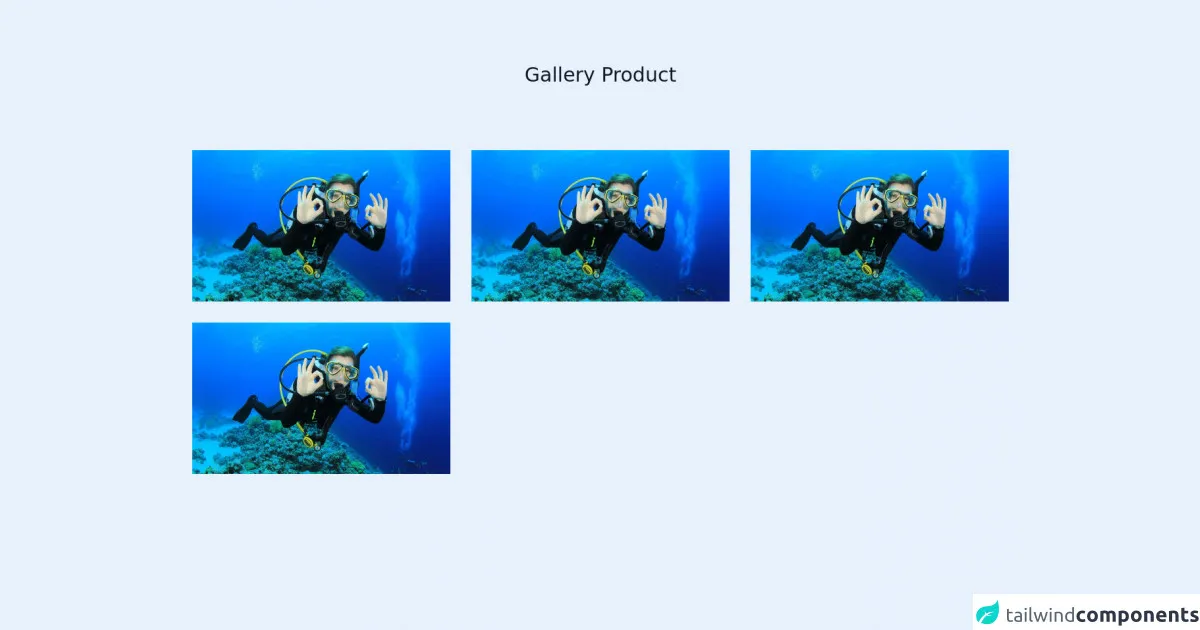
The preview of Gallery ui component
To create a gallery using Tailwind CSS, we'll use a combination of HTML and CSS. Here's a preview of what our gallery will look like:
Free download of the Gallery's source code
The source code of Gallery ui component
Here's the HTML and CSS code we'll use to create our gallery:
<section class="text-gray-600 body-font">
  <div class="container px-5 py-24 mx-auto">
    <div class="flex flex-col text-center w-full mb-20">
      <h1 class="sm:text-3xl text-2xl font-medium title-font mb-4 text-gray-900">Gallery Product</h1>
    </div>
    <div class="flex flex-wrap -m-4">
      <div class="lg:w-1/3 w-1/2 p-4">
        <a href="#">
            <div class="flex relative">
                <img alt="gallery" class="absolute inset-0 w-full h-full object-cover object-center" src="https://imgcdn.rri.co.id/__srct/b763d32e20ec5d473fd182b5c78d0964/969622/img_20210416_190115.jpg?v=1.0.3">
                <div class="px-8 py-10 relative z-10 w-full border-4 border-gray-200 bg-indigo-500 opacity-0 hover:opacity-90">
                    <h2 class="tracking-widest text-sm title-font font-medium text-white mb-1">THE SUBTITLE</h2>
                    <h1 class="title-font text-lg font-bold text-white hover:text-indigo-100 mb-3">Shooting Stars</h1>
                    <p class="leading-relaxed text-white">Photo booth fam kinfolk cold-pressed sriracha leggings jianbing microdosing tousled waistcoat.</p>
                </div>
            </div>
        </a>
      </div>


  </div>
</section>
How to create a Gallery with Tailwind CSS?
Now that we have a preview and source code of our gallery, let's dive into how to create it step-by-step:
Step 1: Set up your HTML
First, we'll set up the HTML structure of our gallery. We'll use a div element with a class of gallery to contain our images. Inside the gallery div, we'll create a div element for each image and add an img element inside it.
<div class="gallery">
  <div>
    <img src="image1.jpg" alt="Image 1">
  </div>
  <div>
    <img src="image2.jpg" alt="Image 2">
  </div>
  <div>
    <img src="image3.jpg" alt="Image 3">
  </div>
  <!-- Add more images as needed -->
</div>
Step 2: Style your gallery
Next, we'll use Tailwind CSS classes to style our gallery. We'll set the display property of the gallery div to grid and specify the number of columns we want using the grid-cols-{number} class. We'll also add some padding to the gallery div to create some space between the images.
<div class="gallery grid grid-cols-3 gap-4">
  <div>
    <img src="image1.jpg" alt="Image 1">
  </div>
  <div>
    <img src="image2.jpg" alt="Image 2">
  </div>
  <div>
    <img src="image3.jpg" alt="Image 3">
  </div>
  <!-- Add more images as needed -->
</div>
Step 3: Add interactivity
Finally, we'll add some interactivity to our gallery. We'll use the hover class to add a zoom effect when the user hovers over an image. We'll also add a click event to each image that opens the image in fullscreen mode.
<div class="gallery grid grid-cols-3 gap-4">
  <div class="relative">
    <img src="image1.jpg" alt="Image 1" class="w-full h-full object-cover">
    <div class="absolute inset-0 bg-black opacity-0 hover:opacity-75 transition-opacity">
      <div class="absolute inset-0 flex items-center justify-center">
        <i class="fas fa-search-plus text-white"></i>
      </div>
    </div>
  </div>
  <div class="relative">
    <img src="image2.jpg" alt="Image 2" class="w-full h-full object-cover">
    <div class="absolute inset-0 bg-black opacity-0 hover:opacity-75 transition-opacity">
      <div class="absolute inset-0 flex items-center justify-center">
        <i class="fas fa-search-plus text-white"></i>
      </div>
    </div>
  </div>
  <div class="relative">
    <img src="image3.jpg" alt="Image 3" class="w-full h-full object-cover">
    <div class="absolute inset-0 bg-black opacity-0 hover:opacity-75 transition-opacity">
      <div class="absolute inset-0 flex items-center justify-center">
        <i class="fas fa-search-plus text-white"></i>
      </div>
    </div>
  </div>
  <!-- Add more images as needed -->
</div>
And that's it! We've created a gallery using Tailwind CSS.
Conclusion
In this article, we've explored how to create a gallery using Tailwind CSS. We've discussed the benefits of using Tailwind CSS for creating UI components and provided a step-by-step guide on how to create a gallery. With Tailwind CSS, you can quickly create custom designs without writing any CSS, making it an excellent choice for front-end developers.