- Published on
Create A Gallery With Tailwind CSS Like A Pro With The Help Of These 6 Tips
- What is Tailwind CSS?
- The description of Gallery UI component
- Why use Tailwind CSS to create a Gallery UI component?
- The preview of Gallery UI component
- The source code of Gallery UI component
- How to create a Gallery with Tailwind CSS?
- Step 1: Set up your development environment
- Step 2: Define the HTML structure
- Step 3: Style the UI components with Tailwind CSS
- Step 4: Add interactivity with JavaScript
- Conclusion
As a FrontEnd technology blogger, you might have heard of Tailwind CSS, a utility-first CSS framework that helps you create beautiful and responsive user interfaces quickly. In this article, we will explore how to create a Gallery UI component with Tailwind CSS like a pro.
What is Tailwind CSS?
Tailwind CSS is a utility-first CSS framework that provides a set of pre-defined CSS classes to help you create beautiful and responsive user interfaces quickly. It is different from other CSS frameworks like Bootstrap or Foundation, which provide pre-designed components with a lot of CSS classes. In contrast, Tailwind CSS provides a set of low-level utility classes that you can combine to create your own custom components.
The description of Gallery UI component
A Gallery UI component is a collection of images or videos that are displayed in a grid layout. It is a common UI component used in many websites and applications to showcase visual content. A Gallery UI component usually includes features like pagination, filtering, and sorting.
Why use Tailwind CSS to create a Gallery UI component?
Tailwind CSS provides a set of utility classes that make it easy to create a custom Gallery UI component. With Tailwind CSS, you can easily create a responsive grid layout, add hover effects, and style pagination and filtering controls. Moreover, Tailwind CSS is highly customizable, which means you can easily change the look and feel of your Gallery UI component to match your brand or design requirements.
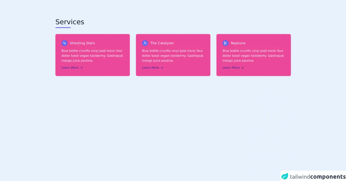
The preview of Gallery UI component
To create a Gallery UI component with Tailwind CSS, we will use a simple example that displays a collection of images in a grid layout. The Gallery UI component will include pagination controls and a search bar to filter images by name or category.
Free download of the Gallery's source code
The source code of Gallery UI component
To create a Gallery UI component with Tailwind CSS, we will use HTML, CSS, and JavaScript. The HTML code will define the structure of the Gallery UI component, the CSS code will style the UI components, and the JavaScript code will add interactivity to the UI components.
<section class="text-gray-600 body-font">
  <div class="container px-5 py-24 mx-auto">
    <div class="flex flex-wrap w-full mb-8">
      <div class="w-full mb-6 lg:mb-0">
        <h1 class="sm:text-4xl text-5xl font-medium title-font mb-2 text-gray-900">Services</h1>
        <div class="h-1 w-20 bg-indigo-500 rounded"></div>
      </div>
    </div>
    <div class="flex flex-wrap -m-4">
      <div class="p-4 lg:w-1/3 w-1/2">
        <div class="flex rounded-lg h-full bg-pink-500 p-8 flex-col">
          <div class="flex items-center mb-3">
            <div class="w-8 h-8 mr-3 inline-flex items-center justify-center rounded-full bg-indigo-500 text-white flex-shrink-0">
              <svg fill="none" stroke="currentColor" stroke-linecap="round" stroke-linejoin="round" stroke-width="2" class="w-5 h-5" viewBox="0 0 24 24">
                <path d="M22 12h-4l-3 9L9 3l-3 9H2"></path>
              </svg>
            </div>
            <h2 class="text-white text-lg title-font font-medium">Shooting Stars</h2>
          </div>
          <div class="flex-grow">
            <p class="leading-relaxed text-base text-white">Blue bottle crucifix vinyl post-ironic four dollar toast vegan taxidermy. Gastropub indxgo juice poutine.</p>
            <a href="" class="mt-3 text-indigo-800 hover:text-gray-900 inline-flex items-center">Learn More
              <svg fill="none" stroke="currentColor" stroke-linecap="round" stroke-linejoin="round" stroke-width="2" class="w-4 h-4 ml-2" viewBox="0 0 24 24">
                <path d="M5 12h14M12 5l7 7-7 7"></path>
              </svg>
            </a>
          </div>
        </div>
      </div>
      <div class="p-4 lg:w-1/3 w-1/2">
        <div class="flex rounded-lg h-full bg-pink-500 p-8 flex-col">
          <div class="flex items-center mb-3">
            <div class="w-8 h-8 mr-3 inline-flex items-center justify-center rounded-full bg-indigo-500 text-white flex-shrink-0">
              <svg fill="none" stroke="currentColor" stroke-linecap="round" stroke-linejoin="round" stroke-width="2" class="w-5 h-5" viewBox="0 0 24 24">
                <path d="M20 21v-2a4 4 0 00-4-4H8a4 4 0 00-4 4v2"></path>
                <circle cx="12" cy="7" r="4"></circle>
              </svg>
            </div>
            <h2 class="text-white text-lg title-font font-medium">The Catalyzer</h2>
          </div>
          <div class="flex-grow">
            <p class="leading-relaxed text-base text-white">Blue bottle crucifix vinyl post-ironic four dollar toast vegan taxidermy. Gastropub indxgo juice poutine.</p>
            <a href="" class="mt-3 text-indigo-800 hover:text-gray-900 inline-flex items-center">Learn More
              <svg fill="none" stroke="currentColor" stroke-linecap="round" stroke-linejoin="round" stroke-width="2" class="w-4 h-4 ml-2" viewBox="0 0 24 24">
                <path d="M5 12h14M12 5l7 7-7 7"></path>
              </svg>
            </a>
          </div>
        </div>
      </div>
      <div class="p-4 lg:w-1/3 w-1/2">
        <div class="flex rounded-lg h-full bg-pink-500 p-8 flex-col">
          <div class="flex items-center mb-3">
            <div class="w-8 h-8 mr-3 inline-flex items-center justify-center rounded-full bg-indigo-500 text-white flex-shrink-0">
              <svg fill="none" stroke="currentColor" stroke-linecap="round" stroke-linejoin="round" stroke-width="2" class="w-5 h-5" viewBox="0 0 24 24">
                <circle cx="6" cy="6" r="3"></circle>
                <circle cx="6" cy="18" r="3"></circle>
                <path d="M20 4L8.12 15.88M14.47 14.48L20 20M8.12 8.12L12 12"></path>
              </svg>
            </div>
            <h2 class="text-white text-lg title-font font-medium">Neptune</h2>
          </div>
          <div class="flex-grow">
            <p class="leading-relaxed text-base text-white">Blue bottle crucifix vinyl post-ironic four dollar toast vegan taxidermy. Gastropub indxgo juice poutine.</p>
            <a href="" class="mt-3 text-indigo-800 hover:text-gray-900 inline-flex items-center">Learn More
              <svg fill="none" stroke="currentColor" stroke-linecap="round" stroke-linejoin="round" stroke-width="2" class="w-4 h-4 ml-2" viewBox="0 0 24 24">
                <path d="M5 12h14M12 5l7 7-7 7"></path>
              </svg>
            </a>
          </div>
        </div>
      </div>
    </div>
  </div>
</section>
How to create a Gallery with Tailwind CSS?
Now that we have a basic understanding of what Tailwind CSS is and why it is useful for creating a Gallery UI component, let's dive into the steps to create a Gallery with Tailwind CSS.
Step 1: Set up your development environment
Before we start, we need to set up our development environment. To create a Gallery UI component with Tailwind CSS, we need a text editor and a web browser. We also need to include the Tailwind CSS library in our project.
Step 2: Define the HTML structure
The first step in creating a Gallery UI component is to define the HTML structure. We will use a simple HTML structure that includes a container, a grid layout, and pagination controls.
Step 3: Style the UI components with Tailwind CSS
The next step is to style the UI components with Tailwind CSS. We will use a combination of utility classes to style the container, grid layout, and pagination controls.
Step 4: Add interactivity with JavaScript
The final step is to add interactivity to the UI components with JavaScript. We will add event listeners to the pagination controls and search bar to filter images by name or category.
Conclusion
In this article, we have explored how to create a Gallery UI component with Tailwind CSS like a pro. We have discussed what Tailwind CSS is, why it is useful for creating a Gallery UI component, and how to create a Gallery UI component with Tailwind CSS. By following these tips, you can create beautiful and responsive Gallery UI components quickly and easily.