- Published on
What You Need To Make A Fun With Buttons With Tailwind CSS
- The description of Fun with buttons ui component
- Why use Tailwind CSS to create a Fun with buttons ui component?
- The preview of Fun with buttons ui component
- The source code of Fun with buttons ui component
- How to create a Fun with buttons with Tailwind CSS?
- Conclusion
Tailwind CSS is a utility-first CSS framework that provides a set of pre-defined CSS classes to help you quickly build custom user interfaces. It is designed to be highly customizable and easy to use, making it a popular choice for front-end developers.
The description of Fun with buttons ui component
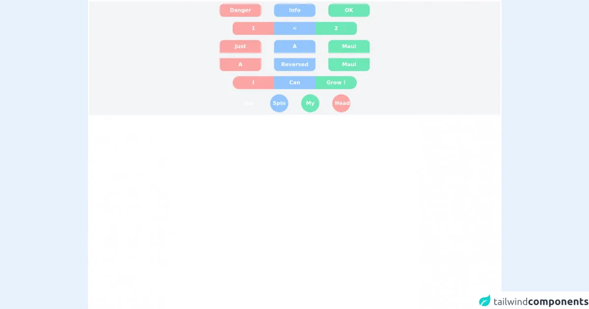
Fun with buttons is a popular UI component that can be used to add some personality and interactivity to your website or application. It typically consists of a set of buttons with different colors, shapes, and animations that respond to user interactions such as hover and click events.
Why use Tailwind CSS to create a Fun with buttons ui component?
Tailwind CSS provides a set of pre-defined classes that can be used to quickly create custom UI components like Fun with buttons. By using Tailwind CSS, you can save time and effort in writing custom CSS code and focus on designing and developing your UI components.
The preview of Fun with buttons ui component
Fun with buttons is a great way to add some fun and interactivity to your website or application. With its colorful buttons and playful animations, it can help to engage your users and make your website or application more memorable.
Free download of the Fun with buttons's source code
The source code of Fun with buttons ui component
If you want to create your own Fun with buttons UI component using Tailwind CSS, you can start by defining the HTML structure and applying the Tailwind CSS classes to style the buttons. Here is an example of the HTML and CSS code for a simple Fun with buttons component:
<!-- I had fun with buttons :) -->
<div class="flex-col min-h-screen h-full w-full bg-white p-1">

  <div class="flex space-x-10 bg-gray-100 p-2 w-full justify-center">
    <button class="min-w-auto w-32 h-10 bg-red-300 p-2 rounded-xl hover:bg-red-500 transition-colors duration-50 hover:animate-pulse ease-out text-white font-semibold">
      Danger
    </button>

    <button class="min-w-auto w-32 h-10 bg-blue-300 p-2 rounded-xl hover:bg-blue-500 transition-colors duration-50 hover:animate-pulse ease-out text-white font-semibold">
      Info
    </button>

    <button class="min-w-auto w-32 h-10 bg-green-300 p-2 rounded-xl hover:bg-green-500 transition-colors duration-50 hover:animate-pulse ease-out text-white font-semibold">
      OK
    </button>
  </div>

  <div class="flex bg-gray-100 p-2 w-full justify-center">
      <button class="min-w-auto w-32 h-10 bg-red-300 p-2 rounded-l-xl hover:bg-red-500 transition-colors duration-50 hover:animate-pulse ease-out text-white font-semibold">
        1
      </button>
      <button class="min-w-auto w-32 h-10 bg-blue-300 p-2 rounded-none hover:bg-blue-500 transition-colors duration-50 hover:animate-pulse ease-out text-white font-semibold">
        <
      </button>
      <button class="min-w-auto w-32 h-10 bg-green-300 p-2 rounded-r-xl hover:bg-green-500 transition-colors duration-50 hover:animate-pulse ease-out text-white font-semibold">
        2
      </button>
  </div>
  <div class="flex bg-gray-100 p-2 w-full justify-center space-x-10">
      <button class="min-w-auto w-32 h-10 bg-red-300 p-2 rounded-t-xl hover:bg-red-500  text-white font-semibold transition-transform hover:-translate-y-2 ease-in-out">
        Just
      </button>
      <button class="min-w-auto w-32 h-10 bg-blue-300 p-2 rounded-t-xl hover:bg-blue-500 text-white font-semibold transition-transform hover:-translate-y-2 ease-in-out">
        A
      </button>
      <button class="min-w-auto w-32 h-10 bg-green-300 p-2 rounded-t-xl hover:bg-green-500 text-white font-semibold transition-transform hover:-translate-y-2 ease-in-out">
        Maul
      </button>
  </div>
  <div class="flex bg-gray-100 p-2 w-full justify-center space-x-10">
    <button class="min-w-auto w-32 h-10 bg-red-300 p-2 rounded-b-xl hover:bg-red-500  text-white font-semibold transition-transform hover:translate-y-2 ease-in-out">
      A
    </button>
    <button class="min-w-auto w-32 h-10 bg-blue-300 p-2 rounded-b-xl hover:bg-blue-500 text-white font-semibold transition-transform hover:translate-y-2 ease-in-out">
      Reversed
    </button>
    <button class="min-w-auto w-32 h-10 bg-green-300 p-2 rounded-b-xl hover:bg-green-500 text-white font-semibold transition-transform hover:translate-y-2 ease-in-out">
      Maul
    </button>
  </div>
  <div class="flex bg-gray-100 p-2 w-full justify-center space-x-0">
    <button class="min-w-auto w-32 h-10 bg-red-300 p-2 rounded-l-full hover:bg-red-500  text-white font-semibold  hover:flex-grow transition-all duration-200 ease-in-out">
      I
    </button>
    <button class="min-w-auto w-32 h-10 bg-blue-300 p-2 rounded-none hover:bg-blue-500 text-white font-semibold  hover:flex-grow transition-all duration-200 ease-in-out">
      Can
    </button>
    <button class="min-w-auto w-32 h-10 bg-green-300 p-2 rounded-r-full hover:bg-green-500 text-white font-semibold hover:flex-grow transition-all duration-200 ease-in-out">
      Grow !
    </button>
  </div>
  <div class="flex bg-gray-100 p-2 w-full justify-center space-x-10">
    <button class="min-w-auto w-14 h-14 bg-orange-300 p-2 rounded-full hover:bg-orange-500 text-white font-semibold transition-rotation duration-300 hover:rotate-45 ease-in-out">
      You
    </button>
    <button class="min-w-auto w-14 h-14 bg-blue-300 p-2 rounded-full hover:bg-blue-500 text-white font-semibold transition-rotation duration-300 hover:rotate-90 ease-in-out">
      Spin
    </button>
    <button class="min-w-auto w-14 h-14 bg-green-300 p-2 rounded-full hover:bg-green-500 text-white font-semibold transition-rotation duration-300 hover:-rotate-90 ease-in-out">
      My
    </button>
    <button class="min-w-auto w-14 h-14 bg-red-300 p-2 rounded-full hover:bg-red-500 text-white font-semibold transition-rotation duration-300 hover:-rotate-45 ease-in-out">
      Head
    </button>
  </div>
<div>
How to create a Fun with buttons with Tailwind CSS?
To create a Fun with buttons UI component using Tailwind CSS, you can follow these steps:
Define the HTML structure for your buttons. This can be done using the
buttonelement and adding any necessary attributes such asclass,id, anddata-*.Apply the Tailwind CSS classes to style your buttons. You can use classes such as
bg-*to set the background color,text-*to set the text color,rounded-*to set the border radius, andhover:*to add hover effects.Add any necessary JavaScript code to handle user interactions such as click and hover events. You can use libraries such as jQuery or vanilla JavaScript to add these interactions.
Test your Fun with buttons component to ensure that it works as expected and meets your design requirements.
Conclusion
In conclusion, Fun with buttons is a popular UI component that can add some personality and interactivity to your website or application. By using Tailwind CSS, you can quickly and easily create your own Fun with buttons component without having to write custom CSS code. With its pre-defined classes and customizable options, Tailwind CSS is a great choice for front-end developers who want to create beautiful and engaging UI components.