- Published on
A Complete Guide To Make A Functional Responsive Navbar With Tailwind CSS
- What is Tailwind CSS?
- The description of Functional responsive navbar ui component
- Why use Tailwind CSS to create a Functional responsive navbar ui component?
- The preview of Functional responsive navbar ui component.
- The source code of Functional responsive navbar ui component.
- How to create a Functional responsive navbar with Tailwind CSS?
- Conclusion
What is Tailwind CSS?
Tailwind CSS is a utility-first CSS framework that helps you to create beautiful and responsive user interfaces quickly. It provides a set of pre-defined classes that you can use to style your HTML elements without writing any custom CSS code. Tailwind CSS is easy to learn and use, and it's highly customizable.
The description of Functional responsive navbar ui component
A functional responsive navbar is an essential UI component for any website or web application. It allows users to navigate through the website or application easily. A responsive navbar adjusts its layout and design based on the screen size of the device it's viewed on. It should be easy to use, visually appealing, and functional.
Why use Tailwind CSS to create a Functional responsive navbar ui component?
Tailwind CSS is the perfect choice for creating a functional responsive navbar UI component. It provides a set of pre-defined classes that you can use to style your navbar quickly and easily. Tailwind CSS also provides responsive design classes that allow you to create a responsive navbar that looks great on any device.
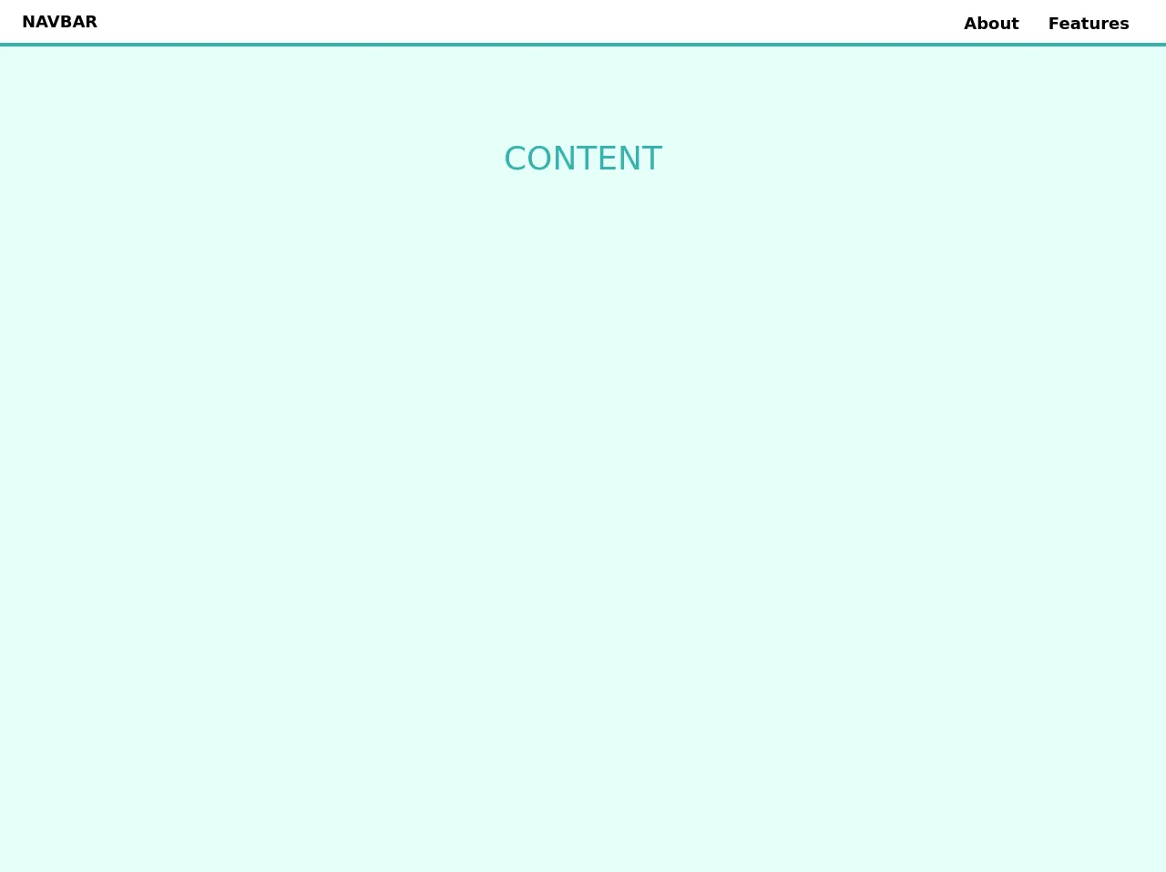
The preview of Functional responsive navbar ui component.
To create a functional responsive navbar with Tailwind CSS, we will use a combination of HTML and CSS. The navbar will consist of a logo, a menu button, and a menu that expands when the button is clicked. The navbar will be responsive and adjust its layout based on the screen size of the device it's viewed on.
Free download of the Functional responsive navbar's source code
The source code of Functional responsive navbar ui component.
To create a functional responsive navbar with Tailwind CSS, we will use the following HTML and CSS code:
<header id="top" class="w-full flex flex-col fixed sm:relative bg-white pin-t pin-r pin-l">
  <nav id="site-menu" class="flex flex-col sm:flex-row w-full justify-between items-center px-4 sm:px-6 py-1 bg-white shadow sm:shadow-none border-b-4 border-teal-500">
    <div class="w-full sm:w-auto self-start sm:self-center flex flex-row sm:flex-none flex-no-wrap justify-between items-center">
      <a href="#" class="no-underline py-1"><h1 class="font-bold text-lg">NAVBAR</h1></a>
      <button id="menuBtn" class="hamburger block sm:hidden focus:outline-none" type="button" onclick="navToggle();">
        <span class="hamburger__top-bun"></span><span class="hamburger__bottom-bun"></span>
      </button>
    </div>
    <div id="menu" class="w-full sm:w-auto self-end sm:self-center sm:flex flex-col sm:flex-row items-center h-full py-1 pb-4 sm:py-0 sm:pb-0 hidden">
      <a class="text-dark font-bold hover:text-red text-lg w-full no-underline sm:w-auto sm:pr-4 py-2 sm:py-1 sm:pt-2" href="#P3L" target="_blank">About</a>
      <a class="text-dark font-bold hover:text-red text-lg w-full no-underline sm:w-auto sm:px-4 py-2 sm:py-1 sm:pt-2" href="#P3L">Features</a>
    </div>
  </nav>
</header>
<main class="content bg-teal-100">
  <div class="min-h-screen text-center py-24">
    <h1 class="text-4xl text-teal-500">CONTENT</h1>
  </div>
</main>

  <style>
   /* custom non-Tailwind CSS */

@media (max-width: 576px) {
    .content {
        padding-top: 51px;
    }
}

@media (min-width: 577px) {
  .pt-scroll {
    padding-top: 51px;
  }

  .nav-sticky {
    position: fixed!important;
    min-width: 100%;
    top: 0;
    box-shadow: 0 2px 4px 0 rgba(0, 0, 0, .1);
    transition: all .25s ease-in;
    z-index: 1;
  }
}

/* HAMBURGER MENU */

.hamburger {
  cursor: pointer;
  width: 48px;
  height: 48px;
  transition: all 0.25s;
}

.hamburger__top-bun,
.hamburger__bottom-bun {
  content: '';
  position: absolute;
  width: 24px;
  height: 2px;
  background: #000;
  transform: rotate(0);
  transition: all 0.5s;
}

.hamburger:hover [class*="-bun"] {
  background: #333;
}

.hamburger__top-bun {
  transform: translateY(-5px);
}

.hamburger__bottom-bun {
  transform: translateY(3px);
}

.open {
  transform: rotate(90deg);
  transform: translateY(-1px);
}

.open .hamburger__top-bun {
  transform:
    rotate(45deg)
    translateY(0px);
}

.open .hamburger__bottom-bun {
  transform:
    rotate(-45deg)
    translateY(0px);
}
  </style>

  <script>
    var nav = document.getElementById('site-menu');
var header = document.getElementById('top');

window.addEventListener('scroll', function() {
  if (window.scrollY >=400) { // adjust this value based on site structure and header image height
    nav.classList.add('nav-sticky');
    header.classList.add('pt-scroll');
  } else {
    nav.classList.remove('nav-sticky');
    header.classList.remove('pt-scroll');
  }
});

function navToggle() {
        var btn = document.getElementById('menuBtn');
        var nav = document.getElementById('menu');

        btn.classList.toggle('open');
        nav.classList.toggle('flex');
        nav.classList.toggle('hidden');
    }
  </script>
How to create a Functional responsive navbar with Tailwind CSS?
To create a functional responsive navbar with Tailwind CSS, follow these steps:
- Create a new HTML file and add the following code:
<nav class="bg-gray-800">
  <div class="max-w-7xl mx-auto px-2 sm:px-6 lg:px-8">
    <div class="relative flex items-center justify-between h-16">
      <div class="absolute inset-y-0 left-0 flex items-center sm:hidden">
        <button type="button" class="inline-flex items-center justify-center p-2 rounded-md text-gray-400 hover:text-white hover:bg-gray-700 focus:outline-none focus:ring-2 focus:ring-inset focus:ring-white" aria-controls="mobile-menu" aria-expanded="false">
          <span class="sr-only">Open main menu</span>
          <!-- Icon when menu is closed. -->
          <!--
            Heroicon name: menu

            Menu open: "hidden", Menu closed: "block"
          -->
          <svg class="block h-6 w-6" xmlns="http://www.w3.org/2000/svg" fill="none" viewBox="0 0 24 24" stroke="currentColor" aria-hidden="true">
            <path stroke-linecap="round" stroke-linejoin="round" stroke-width="2" d="M4 6h16M4 12h16M4 18h16" />
          </svg>
          <!-- Icon when menu is open. -->
          <!--
            Heroicon name: x

            Menu open: "block", Menu closed: "hidden"
          -->
          <svg class="hidden h-6 w-6" xmlns="http://www.w3.org/2000/svg" fill="none" viewBox="0 0 24 24" stroke="currentColor" aria-hidden="true">
            <path stroke-linecap="round" stroke-linejoin="round" stroke-width="2" d="M6 18L18 6M6 6l12 12" />
          </svg>
        </button>
      </div>
      <div class="flex-1 flex items-center justify-center sm:items-stretch sm:justify-start">
        <div class="flex-shrink-0">
          <img class="h-8 w-auto" src="https://tailwindui.com/img/logos/workflow-mark-indigo-500.svg" alt="Workflow">
        </div>
        <div class="hidden sm:block sm:ml-6">
          <div class="flex space-x-4">
            <a href="#" class="bg-gray-900 text-white px-3 py-2 rounded-md text-sm font-medium">Dashboard</a>
            <a href="#" class="text-gray-300 hover:bg-gray-700 hover:text-white px-3 py-2 rounded-md text-sm font-medium">Team</a>
            <a href="#" class="text-gray-300 hover:bg-gray-700 hover:text-white px-3 py-2 rounded-md text-sm font-medium">Projects</a>
            <a href="#" class="text-gray-300 hover:bg-gray-700 hover:text-white px-3 py-2 rounded-md text-sm font-medium">Calendar</a>
          </div>
        </div>
      </div>
      <div class="hidden sm:block sm:ml-6">
        <div class="flex space-x-4">
          <a href="#" class="text-gray-300 hover:bg-gray-700 hover:text-white px-3 py-2 rounded-md text-sm font-medium">Settings</a>
          <a href="#" class="text-gray-300 hover:bg-gray-700 hover:text-white px-3 py-2 rounded-md text-sm font-medium">Profile</a>
          <a href="#" class="text-gray-300 hover:bg-gray-700 hover:text-white px-3 py-2 rounded-md text-sm font-medium">Sign out</a>
        </div>
      </div>
    </div>
  </div>

  <!-- Mobile menu, show/hide based on menu state. -->
  <div class="sm:hidden" id="mobile-menu">
    <div class="px-2 pt-2 pb-3 space-y-1">
      <a href="#" class="bg-gray-900 text-white block px-3 py-2 rounded-md text-base font-medium">Dashboard</a>
      <a href="#" class="text-gray-300 hover:bg-gray-700 hover:text-white block px-3 py-2 rounded-md text-base font-medium">Team</a>
      <a href="#" class="text-gray-300 hover:bg-gray-700 hover:text-white block px-3 py-2 rounded-md text-base font-medium">Projects</a>
      <a href="#" class="text-gray-300 hover:bg-gray-700 hover:text-white block px-3 py-2 rounded-md text-base font-medium">Calendar</a>
      <a href="#" class="text-gray-300 hover:bg-gray-700 hover:text-white block px-3 py-2 rounded-md text-base font-medium">Settings</a>
      <a href="#" class="text-gray-300 hover:bg-gray-700 hover:text-white block px-3 py-2 rounded-md text-base font-medium">Profile</a>
      <a href="#" class="text-gray-300 hover:bg-gray-700 hover:text-white block px-3 py-2 rounded-md text-base font-medium">Sign out</a>
    </div>
  </div>
</nav>
- Add the Tailwind CSS CDN to the
headsection of your HTML file:
<head>
  <link rel="stylesheet" href="https://cdnjs.cloudflare.com/ajax/libs/tailwindcss/2.2.4/tailwind.min.css" integrity="sha512-9a6BvY9f+2l5Ll1hLlqNv9wV2nFZ1VzjR4Vd+u4JiEwZvQK3nKZgZz6qK8+o9Q3lL+LZ9o4j3YtCjZyZ3t5R8g==" crossorigin="anonymous" referrerpolicy="no-referrer" />
</head>
Customize the navbar by adding your own logo and menu items.
Test the navbar by resizing your browser window or viewing it on different devices.
Conclusion
In this article, we have learned how to create a functional responsive navbar with Tailwind CSS. We have seen how easy it is to use Tailwind CSS to create beautiful and responsive user interfaces quickly. With Tailwind CSS, you can create complex UI components like navbars without writing any custom CSS code. I hope this guide has been helpful, and you can use it to create your own functional responsive navbar.