- Published on
6 Critical Skills To Build A Fully CSS Responsive Outlook Clone With Tailwind CSS Remarkably Well
- What is Tailwind CSS?
- The description of Fully CSS responsive Outlook clone UI component
- Why use Tailwind CSS to create a Fully CSS responsive Outlook clone UI component?
- The preview of Fully CSS responsive Outlook clone UI component
- The source code of Fully CSS responsive Outlook clone UI component
- How to create a Fully CSS responsive Outlook clone with Tailwind CSS?
- 1. HTML and CSS
- 2. Tailwind CSS
- 3. Responsive design
- 4. Flexbox
- 5. CSS Grid
- 6. CSS animations
- Conclusion
As a FrontEnd technology blogger, you must be familiar with Tailwind CSS, a utility-first CSS framework that can help you build responsive and customizable UI components quickly. In this article, we will explore how to use Tailwind CSS to create a fully CSS responsive Outlook clone UI component.
What is Tailwind CSS?
Tailwind CSS is a utility-first CSS framework that provides a set of pre-defined CSS classes that you can use to style your HTML elements. It allows you to create responsive and customizable UI components quickly without writing custom CSS code. Tailwind CSS is highly configurable and can be customized to fit your specific needs.
The description of Fully CSS responsive Outlook clone UI component
Outlook is a popular email client that allows users to manage their emails, calendars, and contacts. A fully CSS responsive Outlook clone UI component is a replica of the Outlook interface that is built using only HTML and CSS. The UI component should be responsive and work well on all screen sizes.
Why use Tailwind CSS to create a Fully CSS responsive Outlook clone UI component?
Tailwind CSS provides a set of pre-defined CSS classes that can help you create a fully CSS responsive Outlook clone UI component quickly. It allows you to customize the UI component easily and provides responsive classes that can help you make the UI component work well on all screen sizes.
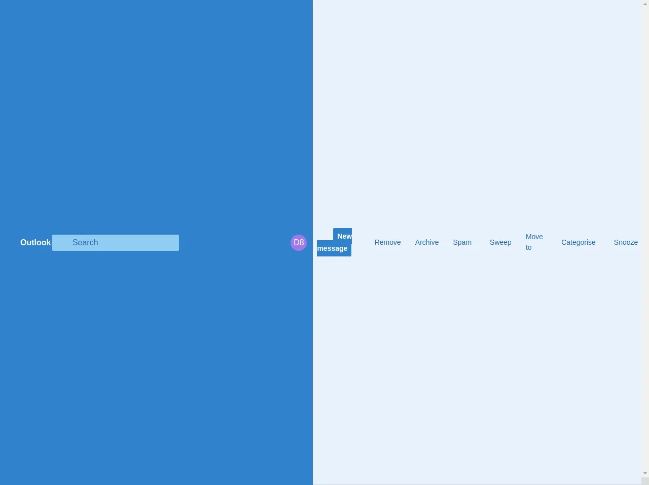
The preview of Fully CSS responsive Outlook clone UI component
Free download of the Fully CSS responsive Outlook clone's source code
The source code of Fully CSS responsive Outlook clone UI component
<style>
*:focus {
  outline: none !important;
}

.w-32px {
  width: 32px;
  height: 32px;
}
</style>
  <div class="flex items-center justify-between lg:justify-start w-full text-white bg-blue-600">
    <div class="flex items-center justify-between lg:w-2/12">
      <div class="flex justify-between items-center">
        <a href="#" class="block lg:hidden no-underline hover:bg-blue-700 p-4">
                    <i class="ms-Icon ms-Icon--GlobalNavButton"></i>
                </a>

        <a href="#" class="block lg:hidden no-underline hover:bg-blue-700 p-4">
                    <i class="ms-Icon ms-Icon--Search"></i>
                </a>

        <a href="#" class="hidden lg:block no-underline hover:bg-blue-700 p-4">
                    <i class="ms-Icon ms-Icon--WaffleOffice365"></i>
                </a>

        <h1 class="hidden lg:block font-semibold px-2">Outlook</h1>
      </div>
    </div>

    <span class="lg:hidden font-semibold">
            Inbox
        </span>

    <div class="flex lg:hidden items-stretch justify-end">
      <a href="#" class="no-underline hover:bg-blue-700 p-4">
                <i class="ms-Icon ms-Icon--SingleColumnEdit"></i>
            </a>
    </div>

    <div class="hidden lg:flex items-center justify-between w-10/12">
      <div class="relative flex flex-grow items-center bg-blue-300 text-blue-700 rounded-sm mr-4">
        <span class="absolute left-0 px-3">
                    <i class="ms-Icon ms-Icon--Search"></i>
                </span>

        <input type="text" class="hidden lg:block no-appearance bg-blue-300 placeholder-blue-700 py-1 ml-10" placeholder="Search">
      </div>

      <div class="hidden lg:flex items-stretch justify-end">
        <a href="#" class="no-underline hover:bg-blue-700 p-4">
                    <i class="ms-Icon ms-Icon--SkypeLogo"></i>
                </a>
        <a href="#" class="no-underline hover:bg-blue-700 p-4">
                    <i class="ms-Icon ms-Icon--Diamond"></i>
                </a>
        <a href="#" class="no-underline hover:bg-blue-700 p-4">
                    <i class="ms-Icon ms-Icon--EventToDoLogo"></i>
                </a>
        <a href="#" class="no-underline hover:bg-blue-700 p-4">
                    <i class="ms-Icon ms-Icon--Settings"></i>
                </a>
        <a href="#" class="no-underline hover:bg-blue-700 p-4">
                    <i class="ms-Icon ms-Icon--Help"></i>
                </a>
        <a href="#" class="no-underline hover:bg-blue-700 p-4">
                    <i class="ms-Icon ms-Icon--Megaphone"></i>
                </a>
        <a href="#" class="flex items-center no-underline hover:bg-blue-700 px-3">
                    <span class="flex items-center justify-center w-32px bg-purple-500 rounded-full">
                        D8
                    </span>
                </a>
      </div>
    </div>
  </div>

  <div class="flex items-center justify-between w-full border-b border-gray-400 p-2">
    <div class="hidden lg:flex items-center w-full">
      <div class="w-2/12">
        <a href="#" class="no-underline hover:bg-gray-100 text-blue-700 p-1 mx-2">
                    <i class="ms-Icon ms-Icon--GlobalNavButton"></i>
                </a>
        <a href="#" class="font-semibold bg-blue-600 text-sm text-white rounded-sm p-2 mx-2">
                    New message
                </a>
      </div>

      <div class="flex flex-nowrap w-10/12 text-sm">
        <a href="#" class="inline-flex items-center no-underline hover:bg-gray-100 text-blue-700 p-1 mr-2">
                    <i class="ms-Icon ms-Icon--Delete mr-1"></i>
                    Remove
                </a>
        <a href="#" class="inline-flex items-center no-underline hover:bg-gray-100 text-blue-700 p-1 mx-2">
                    <i class="ms-Icon ms-Icon--Archive mr-1"></i>
                    Archive
                </a>
        <a href="#" class="inline-flex items-center no-underline hover:bg-gray-100 text-blue-700 p-1 mx-2">
                    <i class="ms-Icon ms-Icon--Blocked mr-1"></i>
                    Spam
                    <i class="ms-Icon ms-Icon--ChevronDownMed text-xs ml-2"></i>
                </a>
        <a href="#" class="inline-flex items-center no-underline hover:bg-gray-100 text-blue-700 p-1 mx-2">
                    <i class="ms-Icon ms-Icon--Broom mr-1"></i>
                    Sweep
                </a>
        <a href="#" class="inline-flex items-center no-underline hover:bg-gray-100 text-blue-700 p-1 mx-2">
                    <i class="ms-Icon ms-Icon--FabricMovetoFolder mr-1"></i>
                    Move to
                    <i class="ms-Icon ms-Icon--ChevronDownMed text-xs ml-2"></i>
                </a>
        <a href="#" class="inline-flex items-center no-underline hover:bg-gray-100 text-blue-700 p-1 mx-2">
                    <i class="ms-Icon ms-Icon--Tag mr-1"></i>
                    Categorise
                    <i class="ms-Icon ms-Icon--ChevronDownMed text-xs ml-2"></i>
                </a>
        <a href="#" class="inline-flex items-center no-underline hover:bg-gray-100 text-blue-700 p-1 mx-2">
                    <i class="ms-Icon ms-Icon--Clock mr-1"></i>
                    Snooze
                    <i class="ms-Icon ms-Icon--ChevronDownMed text-xs ml-2"></i>
                </a>
        <a href="#" class="inline-flex items-center no-underline hover:bg-gray-100 text-blue-700 p-1 mx-2">
                    <i class="ms-Icon ms-Icon--More"></i>
                </a>
      </div>
    </div>

    <div class="flex lg:hidden rounded-full bg-gray-300 text-gray-700 border-2 border-gray-300">
      <div class="text-blue-500 rounded-full bg-white py-1 px-2">
        Focused
      </div>

      <span class="py-1 px-2">
                Other
            </span>
    </div>

    <a href="#" class="flex lg:hidden items-center text-sm text-gray-700">
            <i class="ms-Icon ms-Icon--Filter mr-1"></i>
            Filter
        </a>
  </div>

  <div class="relative overflow-y-scroll h-screen">
    <div class="absolute lg:flex w-screen">
      <div class="block lg:flex lg:w-1/2 hover:bg-gray-200 border-b border-gray-400 py-2 px-4">
        <span class="hidden lg:flex flex-shrink-0 items-center justify-center w-32px bg-blue-500 text-white rounded-full">
                    M
                </span>

        <div class="lg:ml-3">
          <h3 class="text-base truncate">
            Microsoft
          </h3>

          <div class="flex flex-nowrap justify-between items-center">
            <h4 class="truncate text-sm pr-2">
              Lorem ipsum dolor sit amet consectetur adipisicing elit. Eius sunt adipisci similique dolore obcaecati vitae a debitis dolorum quos quod. Eos neque a nisi porro totam ut voluptatem, praesentium recusandae?
            </h4>

            <span class="flex-shrink-0 text-xs text-gray-700 text-right">
                            Sun 29/12
                        </span>
          </div>

          <p class="text-sm text-gray-800 truncate">
            Lorem, ipsum dolor sit amet consectetur adipisicing elit. Ipsam odit deserunt sequi voluptatibus animi tempora placeat facilis dolore exercitationem soluta. Officiis exercitationem voluptatem consequatur sed fugit deserunt optio nihil fuga.
          </p>
        </div>
      </div>

      <!-- <div class="hidden lg:block lg:w-1/2">
                <h1>Test</h1>
            </div> -->
    </div>
  </div>

  <div class="fixed lg:hidden flex bottom-0 w-full">
    <div class="flex items-center justify-between w-full border-t border-gray-200 p-2">
      <div class="px-8">
        <a href="#" class="text-2xl text-blue-600">
                    <i class="ms-Icon ms-Icon--Mail"></i>
                </a>
      </div>
      <div class="px-8">
        <a href="#" class="text-2xl text-gray-700">
                    <i class="ms-Icon ms-Icon--Calendar"></i>
                </a>
      </div>
      <div class="px-8">
        <a href="#" class="text-2xl text-gray-700">
                    <i class="ms-Icon ms-Icon--People"></i>
                </a>
      </div>
    </div>
  </div>
How to create a Fully CSS responsive Outlook clone with Tailwind CSS?
To create a fully CSS responsive Outlook clone UI component with Tailwind CSS, you need to have the following skills:
1. HTML and CSS
You should have a good understanding of HTML and CSS. You should know how to structure your HTML code and apply CSS styles to your HTML elements.
2. Tailwind CSS
You should have a good understanding of Tailwind CSS and its utility classes. You should know how to use Tailwind CSS classes to style your HTML elements.
3. Responsive design
You should have a good understanding of responsive design principles. You should know how to use media queries and responsive classes to make your UI component work well on all screen sizes.
4. Flexbox
You should have a good understanding of Flexbox. Flexbox is a powerful layout tool that can help you create flexible and responsive layouts.
5. CSS Grid
You should have a good understanding of CSS Grid. CSS Grid is another powerful layout tool that can help you create complex and responsive layouts.
6. CSS animations
You should have a good understanding of CSS animations. CSS animations can help you add interactivity and visual effects to your UI component.
Once you have these skills, you can follow the steps below to create a fully CSS responsive Outlook clone UI component with Tailwind CSS:
- Create the HTML structure of the UI component.
- Apply Tailwind CSS classes to style the UI component.
- Use media queries and responsive classes to make the UI component work well on all screen sizes.
- Use Flexbox or CSS Grid to create a responsive layout.
- Use CSS animations to add interactivity and visual effects to the UI component.
Conclusion
In this article, we have explored how to use Tailwind CSS to create a fully CSS responsive Outlook clone UI component. We have discussed the skills you need to have to create this UI component and provided a step-by-step guide on how to create it. With Tailwind CSS, you can create responsive and customizable UI components quickly and easily.