- Published on
A Complete Guide To Make A Free Tailwind CSS Input Group Component With Tailwind CSS
- What is Tailwind CSS?
- The description of Free Tailwind CSS Input Group Component ui component
- Why use Tailwind CSS to create a Free Tailwind CSS Input Group Component ui component?
- The preview of Free Tailwind CSS Input Group Component ui component.
- The source code of Free Tailwind CSS Input Group Component ui component.
- How to create a Free Tailwind CSS Input Group Component with Tailwind CSS?
- Step 1: Create the HTML structure
- Step 2: Style the component with Tailwind CSS classes
- Step 3: Add interactivity to the component
- Conclusion
What is Tailwind CSS?
Tailwind CSS is a utility-first CSS framework that provides a set of pre-defined CSS classes to help developers quickly build custom user interfaces. It is designed to be highly customizable, which means that developers can easily create their own custom styles by modifying the pre-defined classes.
The description of Free Tailwind CSS Input Group Component ui component
A free Tailwind CSS Input Group Component is a user interface (UI) component that allows users to input data into a form. It is a group of input fields that are visually connected and designed to work together. This component is commonly used in web forms, search bars, and other input-heavy UIs.
Why use Tailwind CSS to create a Free Tailwind CSS Input Group Component ui component?
Tailwind CSS is an excellent choice for creating a Free Tailwind CSS Input Group Component UI component because it provides a set of pre-defined CSS classes that can be used to quickly style the component. The utility-first approach of Tailwind CSS also makes it easy to customize the component to fit your specific needs.
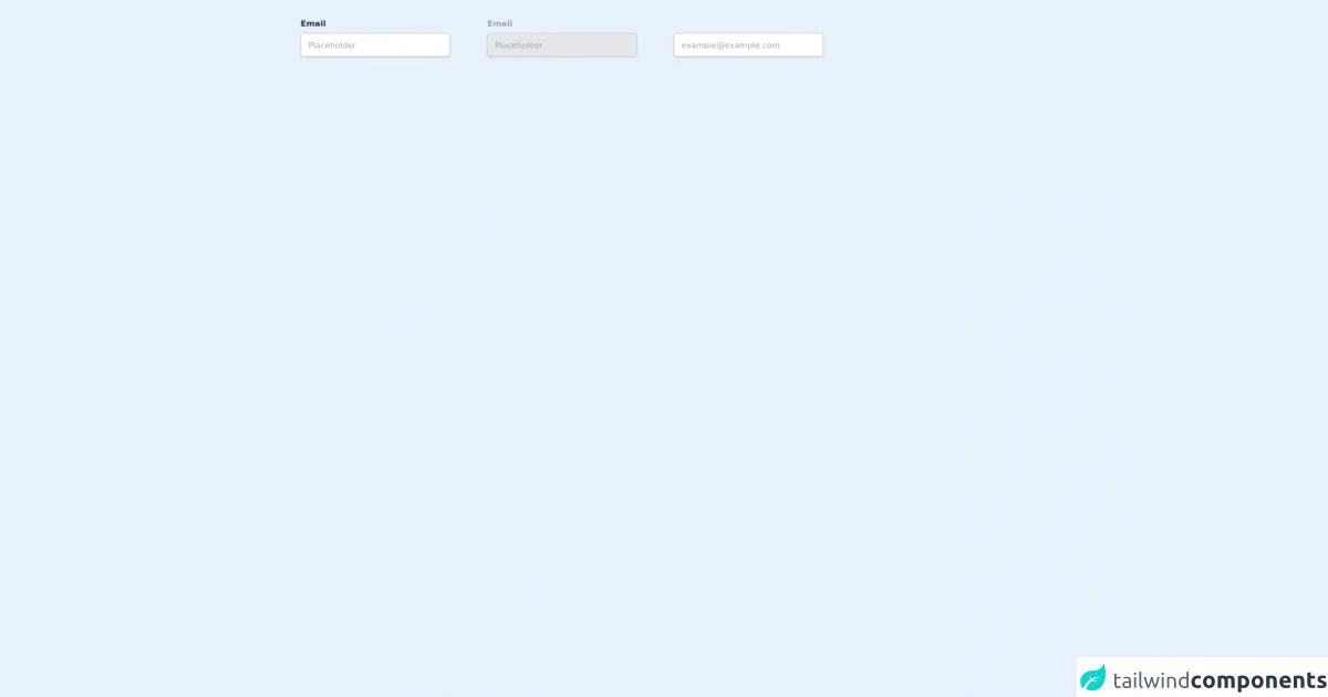
The preview of Free Tailwind CSS Input Group Component ui component.
To create a Free Tailwind CSS Input Group Component, we will use a combination of HTML and Tailwind CSS classes. Here is a preview of what the final component will look like:
Free download of the Free Tailwind CSS Input Group Component's source code
The source code of Free Tailwind CSS Input Group Component ui component.
Here is the source code for creating a Free Tailwind CSS Input Group Component:
<div class="flex lg:flex-row flex-col items-center py-8 px-4">
<!--- more free and premium Tailwind CSS components at https://tailwinduikit.com/ --->

            <!-- Code block starts -->
            <div class="flex flex-col lg:mr-16">
                <label for="email" class="text-gray-800 dark:text-gray-100 text-sm font-bold leading-tight tracking-normal mb-2">Email</label>
                <input id="email" autocomplete="off" class="text-gray-600 dark:text-gray-400 focus:outline-none focus:ring-2 focus:ring-offset-2 focus:ring-indigo-700 dark:focus:border-indigo-700 dark:border-gray-700 dark:bg-gray-800 bg-white font-normal w-64 h-10 flex items-center pl-3 text-sm border-gray-300 rounded border shadow" placeholder="Placeholder" />
            </div>
            <!-- Code block ends -->
            <!-- Code block starts -->
            <div class="flex flex-col lg:mr-16 lg:py-0 py-4">
                <label for="last_email" class="text-gray-400 text-sm font-bold leading-tight tracking-normal mb-2">Email</label>
                <input disabled id="last_email" class="text-gray-600 dark:text-gray-400 focus:outline-none focus:ring-2 focus:ring-offset-2 focus:ring-indigo-700 dark:focus:border-indigo-700 dark:border-gray-700 dark:bg-gray-700 font-normal w-64 h-10 flex items-center pl-3 text-sm border-gray-300 bg-gray-200 rounded border shadow" placeholder="Placeholder" />
            </div>
            <!-- Code block ends -->
            <!-- Code block starts -->
            <div class="flex flex-col lg:py-0 py-4">
                <label for="email1" class="lg:pt-4 text-gray-400 text-sm font-bold leading-tight tracking-normal mb-2"></label>
                <input id="email1" class="text-gray-600 dark:text-gray-400 focus:outline-none focus:ring-2 focus:ring-offset-2 focus:ring-indigo-700 dark:focus:border-indigo-700 dark:border-gray-700 dark:bg-gray-800 bg-white font-normal w-64 h-10 flex items-center pl-3 text-sm border-gray-300 rounded border shadow" placeholder="[email protected]" />
            </div>
            <!-- Code block ends -->
        </div>
How to create a Free Tailwind CSS Input Group Component with Tailwind CSS?
Now that we have a basic understanding of what a Free Tailwind CSS Input Group Component is and why we should use Tailwind CSS to create it, let's dive into the steps for creating the component.
Step 1: Create the HTML structure
The first step is to create the HTML structure for the component. We will use a combination of HTML and Tailwind CSS classes to create the component. Here is the HTML code for the component:
<div class="flex flex-wrap -mx-2">
  <div class="w-full md:w-1/2 px-2 mb-4 md:mb-0">
    <label class="block uppercase tracking-wide text-gray-700 text-xs font-bold mb-2" for="grid-first-name">
      First Name
    </label>
    <input class="appearance-none block w-full bg-gray-200 text-gray-700 border border-gray-200 rounded py-3 px-4 mb-3 leading-tight focus:outline-none focus:bg-white focus:border-gray-500" id="grid-first-name" type="text" placeholder="John">
  </div>
  <div class="w-full md:w-1/2 px-2">
    <label class="block uppercase tracking-wide text-gray-700 text-xs font-bold mb-2" for="grid-last-name">
      Last Name
    </label>
    <input class="appearance-none block w-full bg-gray-200 text-gray-700 border border-gray-200 rounded py-3 px-4 leading-tight focus:outline-none focus:bg-white focus:border-gray-500" id="grid-last-name" type="text" placeholder="Doe">
  </div>
</div>
In this code, we use the flex and flex-wrap classes to create a flex container that wraps its items to the next line when there is not enough space. We also use the w-full and md:w-1/2 classes to make the input fields take up the full width of the container on small screens and half the width on medium screens.
Step 2: Style the component with Tailwind CSS classes
The next step is to style the component using Tailwind CSS classes. We will use a combination of pre-defined and custom classes to achieve the desired look and feel. Here is the CSS code for the component:
/* Input field styling */
.input-field {
  background-color: #f7fafc;
  border-color: #e2e8f0;
  border-radius: 0.25rem;
  padding: 0.75rem 1rem;
}

/* Label styling */
.label {
  color: #a0aec0;
  font-size: 0.875rem;
  font-weight: 600;
  margin-bottom: 0.5rem;
  text-transform: uppercase;
}
In this code, we define custom classes for the input fields and labels. We also use pre-defined Tailwind CSS classes to style the input fields, such as bg-gray-200, border-gray-200, and rounded.
Step 3: Add interactivity to the component
The final step is to add interactivity to the component. We can use JavaScript or jQuery to add functionality to the component, such as validation or auto-complete. Here is an example of how to use jQuery to add auto-complete to the input fields:
$(document).ready(function() {
  var availableTags = [
    "ActionScript",
    "AppleScript",
    "Asp",
    "BASIC",
    "C",
    "C++",
    "Clojure",
    "COBOL",
    "ColdFusion",
    "Erlang",
    "Fortran",
    "Groovy",
    "Haskell",
    "Java",
    "JavaScript",
    "Lisp",
    "Perl",
    "PHP",
    "Python",
    "Ruby",
    "Scala",
    "Scheme"
  ];
  $( "#grid-first-name" ).autocomplete({
    source: availableTags
  });
  $( "#grid-last-name" ).autocomplete({
    source: availableTags
  });
});
In this code, we use the jQuery UI library to add auto-complete functionality to the input fields. We define an array of available tags and use the autocomplete method to enable auto-complete on the input fields.
Conclusion
In this article, we learned how to create a Free Tailwind CSS Input Group Component using HTML and Tailwind CSS classes. We also learned why Tailwind CSS is an excellent choice for creating UI components and how to add interactivity to the component using JavaScript or jQuery. With this knowledge, you can create custom UI components that are both beautiful and functional.