- Published on
Practical Guide: Build A Free Tailwind CSS Order Summaries Component With Tailwind CSS
- What is Tailwind CSS?
- The description of Free Tailwind CSS Order Summaries Component UI component
- Why use Tailwind CSS to create a Free Tailwind CSS Order Summaries Component UI component?
- The preview of Free Tailwind CSS Order Summaries Component UI component
- The source code of Free Tailwind CSS Order Summaries Component UI component
- How to create a Free Tailwind CSS Order Summaries Component with Tailwind CSS?
- Step 1: Set up your project
- Step 2: Create the HTML markup
- Step 3: Style the component using Tailwind CSS
- Conclusion
What is Tailwind CSS?
Tailwind CSS is a utility-first CSS framework that helps you quickly build custom designs without writing any CSS. It provides a set of pre-defined classes that you can use to style your HTML elements. With Tailwind CSS, you can easily create responsive and mobile-first designs.
The description of Free Tailwind CSS Order Summaries Component UI component
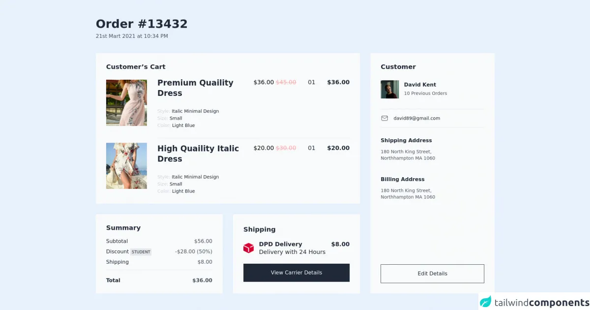
The Free Tailwind CSS Order Summaries Component is a UI component that displays a summary of orders in a table format. It includes information such as order ID, date, customer name, and total amount. This component is designed to be used in e-commerce websites or any other application that requires order summaries.
Why use Tailwind CSS to create a Free Tailwind CSS Order Summaries Component UI component?
Tailwind CSS provides a set of pre-defined classes that you can use to style your HTML elements. This makes it easy to create custom designs without writing any CSS. The Free Tailwind CSS Order Summaries Component is built using Tailwind CSS, which means that you can easily customize the component to match your website's design.
The preview of Free Tailwind CSS Order Summaries Component UI component
Free download of the Free Tailwind CSS Order Summaries Component's source code
The source code of Free Tailwind CSS Order Summaries Component UI component
<div class="py-14 px-4 md:px-6 2xl:px-20 2xl:container 2xl:mx-auto">
  <!--- more free and premium Tailwind CSS components at https://tailwinduikit.com/ --->

  <div class="flex justify-start item-start space-y-2 flex-col">
    <h1 class="text-3xl dark:text-white lg:text-4xl font-semibold leading-7 lg:leading-9 text-gray-800">Order #13432</h1>
    <p class="text-base dark:text-gray-300 font-medium leading-6 text-gray-600">21st Mart 2021 at 10:34 PM</p>
  </div>
  <div class="mt-10 flex flex-col xl:flex-row jusitfy-center items-stretch w-full xl:space-x-8 space-y-4 md:space-y-6 xl:space-y-0">
    <div class="flex flex-col justify-start items-start w-full space-y-4 md:space-y-6 xl:space-y-8">
      <div class="flex flex-col justify-start items-start dark:bg-gray-800 bg-gray-50 px-4 py-4 md:py-6 md:p-6 xl:p-8 w-full">
        <p class="text-lg md:text-xl dark:text-white font-semibold leading-6 xl:leading-5 text-gray-800">Customer’s Cart</p>
        <div class="mt-4 md:mt-6 flex flex-col md:flex-row justify-start items-start md:items-center md:space-x-6 xl:space-x-8 w-full">
          <div class="pb-4 md:pb-8 w-full md:w-40">
            <img class="w-full hidden md:block" src="https://i.ibb.co/84qQR4p/Rectangle-10.png" alt="dress" />
            <img class="w-full md:hidden" src="https://i.ibb.co/L039qbN/Rectangle-10.png" alt="dress" />
          </div>
          <div class="border-b border-gray-200 md:flex-row flex-col flex justify-between items-start w-full pb-8 space-y-4 md:space-y-0">
            <div class="w-full flex flex-col justify-start items-start space-y-8">
              <h3 class="text-xl dark:text-white xl:text-2xl font-semibold leading-6 text-gray-800">Premium Quaility Dress</h3>
              <div class="flex justify-start items-start flex-col space-y-2">
                <p class="text-sm dark:text-white leading-none text-gray-800"><span class="dark:text-gray-400 text-gray-300">Style: </span> Italic Minimal Design</p>
                <p class="text-sm dark:text-white leading-none text-gray-800"><span class="dark:text-gray-400 text-gray-300">Size: </span> Small</p>
                <p class="text-sm dark:text-white leading-none text-gray-800"><span class="dark:text-gray-400 text-gray-300">Color: </span> Light Blue</p>
              </div>
            </div>
            <div class="flex justify-between space-x-8 items-start w-full">
              <p class="text-base dark:text-white xl:text-lg leading-6">$36.00 <span class="text-red-300 line-through"> $45.00</span></p>
              <p class="text-base dark:text-white xl:text-lg leading-6 text-gray-800">01</p>
              <p class="text-base dark:text-white xl:text-lg font-semibold leading-6 text-gray-800">$36.00</p>
            </div>
          </div>
        </div>
        <div class="mt-6 md:mt-0 flex justify-start flex-col md:flex-row items-start md:items-center space-y-4 md:space-x-6 xl:space-x-8 w-full">
          <div class="w-full md:w-40">
            <img class="w-full hidden md:block" src="https://i.ibb.co/s6snNx0/Rectangle-17.png" alt="dress" />
            <img class="w-full md:hidden" src="https://i.ibb.co/BwYWJbJ/Rectangle-10.png" alt="dress" />
          </div>
          <div class="flex justify-between items-start w-full flex-col md:flex-row space-y-4 md:space-y-0">
            <div class="w-full flex flex-col justify-start items-start space-y-8">
              <h3 class="text-xl dark:text-white xl:text-2xl font-semibold leading-6 text-gray-800">High Quaility Italic Dress</h3>
              <div class="flex justify-start items-start flex-col space-y-2">
                <p class="text-sm dark:text-white leading-none text-gray-800"><span class="dark:text-gray-400 text-gray-300">Style: </span> Italic Minimal Design</p>
                <p class="text-sm dark:text-white leading-none text-gray-800"><span class="dark:text-gray-400 text-gray-300">Size: </span> Small</p>
                <p class="text-sm dark:text-white leading-none text-gray-800"><span class="dark:text-gray-400 text-gray-300">Color: </span> Light Blue</p>
              </div>
            </div>
            <div class="flex justify-between space-x-8 items-start w-full">
              <p class="text-base dark:text-white xl:text-lg leading-6">$20.00 <span class="text-red-300 line-through"> $30.00</span></p>
              <p class="text-base dark:text-white xl:text-lg leading-6 text-gray-800">01</p>
              <p class="text-base dark:text-white xl:text-lg font-semibold leading-6 text-gray-800">$20.00</p>
            </div>
          </div>
        </div>
      </div>
      <div class="flex justify-center flex-col md:flex-row flex-col items-stretch w-full space-y-4 md:space-y-0 md:space-x-6 xl:space-x-8">
        <div class="flex flex-col px-4 py-6 md:p-6 xl:p-8 w-full bg-gray-50 dark:bg-gray-800 space-y-6">
          <h3 class="text-xl dark:text-white font-semibold leading-5 text-gray-800">Summary</h3>
          <div class="flex justify-center items-center w-full space-y-4 flex-col border-gray-200 border-b pb-4">
            <div class="flex justify-between w-full">
              <p class="text-base dark:text-white leading-4 text-gray-800">Subtotal</p>
              <p class="text-base dark:text-gray-300 leading-4 text-gray-600">$56.00</p>
            </div>
            <div class="flex justify-between items-center w-full">
              <p class="text-base dark:text-white leading-4 text-gray-800">Discount <span class="bg-gray-200 p-1 text-xs font-medium dark:bg-white dark:text-gray-800 leading-3 text-gray-800">STUDENT</span></p>
              <p class="text-base dark:text-gray-300 leading-4 text-gray-600">-$28.00 (50%)</p>
            </div>
            <div class="flex justify-between items-center w-full">
              <p class="text-base dark:text-white leading-4 text-gray-800">Shipping</p>
              <p class="text-base dark:text-gray-300 leading-4 text-gray-600">$8.00</p>
            </div>
          </div>
          <div class="flex justify-between items-center w-full">
            <p class="text-base dark:text-white font-semibold leading-4 text-gray-800">Total</p>
            <p class="text-base dark:text-gray-300 font-semibold leading-4 text-gray-600">$36.00</p>
          </div>
        </div>
        <div class="flex flex-col justify-center px-4 py-6 md:p-6 xl:p-8 w-full bg-gray-50 dark:bg-gray-800 space-y-6">
          <h3 class="text-xl dark:text-white font-semibold leading-5 text-gray-800">Shipping</h3>
          <div class="flex justify-between items-start w-full">
            <div class="flex justify-center items-center space-x-4">
              <div class="w-8 h-8">
                <img class="w-full h-full" alt="logo" src="https://i.ibb.co/L8KSdNQ/image-3.png" />
              </div>
              <div class="flex flex-col justify-start items-center">
                <p class="text-lg leading-6 dark:text-white font-semibold text-gray-800">DPD Delivery<br /><span class="font-normal">Delivery with 24 Hours</span></p>
              </div>
            </div>
            <p class="text-lg font-semibold leading-6 dark:text-white text-gray-800">$8.00</p>
          </div>
          <div class="w-full flex justify-center items-center">
            <button class="hover:bg-black dark:bg-white dark:text-gray-800 dark:hover:bg-gray-100 focus:outline-none focus:ring-2 focus:ring-offset-2 focus:ring-gray-800 py-5 w-96 md:w-full bg-gray-800 text-base font-medium leading-4 text-white">View Carrier Details</button>
          </div>
        </div>
      </div>
    </div>
    <div class="bg-gray-50 dark:bg-gray-800 w-full xl:w-96 flex justify-between items-center md:items-start px-4 py-6 md:p-6 xl:p-8 flex-col">
      <h3 class="text-xl dark:text-white font-semibold leading-5 text-gray-800">Customer</h3>
      <div class="flex flex-col md:flex-row xl:flex-col justify-start items-stretch h-full w-full md:space-x-6 lg:space-x-8 xl:space-x-0">
        <div class="flex flex-col justify-start items-start flex-shrink-0">
          <div class="flex justify-center w-full md:justify-start items-center space-x-4 py-8 border-b border-gray-200">
            <img src="https://i.ibb.co/5TSg7f6/Rectangle-18.png" alt="avatar" />
            <div class="flex justify-start items-start flex-col space-y-2">
              <p class="text-base dark:text-white font-semibold leading-4 text-left text-gray-800">David Kent</p>
              <p class="text-sm dark:text-gray-300 leading-5 text-gray-600">10 Previous Orders</p>
            </div>
          </div>

          <div class="flex justify-center text-gray-800 dark:text-white md:justify-start items-center space-x-4 py-4 border-b border-gray-200 w-full">
            <svg width="24" height="24" viewBox="0 0 24 24" fill="none" xmlns="http://www.w3.org/2000/svg">
              <path d="M19 5H5C3.89543 5 3 5.89543 3 7V17C3 18.1046 3.89543 19 5 19H19C20.1046 19 21 18.1046 21 17V7C21 5.89543 20.1046 5 19 5Z" stroke="currentColor" stroke-linecap="round" stroke-linejoin="round" />
              <path d="M3 7L12 13L21 7" stroke="currentColor" stroke-linecap="round" stroke-linejoin="round" />
            </svg>
            <p class="cursor-pointer text-sm leading-5 ">[email protected]</p>
          </div>
        </div>
        <div class="flex justify-between xl:h-full items-stretch w-full flex-col mt-6 md:mt-0">
          <div class="flex justify-center md:justify-start xl:flex-col flex-col md:space-x-6 lg:space-x-8 xl:space-x-0 space-y-4 xl:space-y-12 md:space-y-0 md:flex-row items-center md:items-start">
            <div class="flex justify-center md:justify-start items-center md:items-start flex-col space-y-4 xl:mt-8">
              <p class="text-base dark:text-white font-semibold leading-4 text-center md:text-left text-gray-800">Shipping Address</p>
              <p class="w-48 lg:w-full dark:text-gray-300 xl:w-48 text-center md:text-left text-sm leading-5 text-gray-600">180 North King Street, Northhampton MA 1060</p>
            </div>
            <div class="flex justify-center md:justify-start items-center md:items-start flex-col space-y-4">
              <p class="text-base dark:text-white font-semibold leading-4 text-center md:text-left text-gray-800">Billing Address</p>
              <p class="w-48 lg:w-full dark:text-gray-300 xl:w-48 text-center md:text-left text-sm leading-5 text-gray-600">180 North King Street, Northhampton MA 1060</p>
            </div>
          </div>
          <div class="flex w-full justify-center items-center md:justify-start md:items-start">
            <button class="mt-6 md:mt-0 dark:border-white dark:hover:bg-gray-900 dark:bg-transparent dark:text-white py-5 hover:bg-gray-200 focus:outline-none focus:ring-2 focus:ring-offset-2 focus:ring-gray-800 border border-gray-800 font-medium w-96 2xl:w-full text-base font-medium leading-4 text-gray-800">Edit Details</button>
          </div>
        </div>
      </div>
    </div>
  </div>
</div>
How to create a Free Tailwind CSS Order Summaries Component with Tailwind CSS?
To create a Free Tailwind CSS Order Summaries Component, follow these steps:
Step 1: Set up your project
First, create a new HTML file and include the Tailwind CSS CDN in the head section of your HTML file.
<head>
  <link rel="stylesheet" href="https://cdn.tailwindcss.com/css/tailwind.min.css">
</head>
Step 2: Create the HTML markup
Next, create the HTML markup for the order summaries component. The component includes a table element with the following columns: Order ID, Date, Customer Name, and Total Amount.
<table class="min-w-full divide-y divide-gray-200">
  <thead>
    <tr>
      <th class="px-6 py-3 bg-gray-50 text-left text-xs font-medium text-gray-500 uppercase tracking-wider">Order ID</th>
      <th class="px-6 py-3 bg-gray-50 text-left text-xs font-medium text-gray-500 uppercase tracking-wider">Date</th>
      <th class="px-6 py-3 bg-gray-50 text-left text-xs font-medium text-gray-500 uppercase tracking-wider">Customer Name</th>
      <th class="px-6 py-3 bg-gray-50 text-left text-xs font-medium text-gray-500 uppercase tracking-wider">Total Amount</th>
    </tr>
  </thead>
  <tbody class="bg-white divide-y divide-gray-200">
    <tr>
      <td class="px-6 py-4 whitespace-nowrap">
        <div class="text-sm text-gray-900">1</div>
      </td>
      <td class="px-6 py-4 whitespace-nowrap">
        <div class="text-sm text-gray-900">Jan 1, 2022</div>
      </td>
      <td class="px-6 py-4 whitespace-nowrap">
        <div class="text-sm text-gray-900">John Doe</div>
      </td>
      <td class="px-6 py-4 whitespace-nowrap">
        <div class="text-sm text-gray-900">$100.00</div>
      </td>
    </tr>
    <tr>
      <td class="px-6 py-4 whitespace-nowrap">
        <div class="text-sm text-gray-900">2</div>
      </td>
      <td class="px-6 py-4 whitespace-nowrap">
        <div class="text-sm text-gray-900">Jan 2, 2022</div>
      </td>
      <td class="px-6 py-4 whitespace-nowrap">
        <div class="text-sm text-gray-900">Jane Smith</div>
      </td>
      <td class="px-6 py-4 whitespace-nowrap">
        <div class="text-sm text-gray-900">$50.00</div>
      </td>
    </tr>
  </tbody>
</table>
Step 3: Style the component using Tailwind CSS
Finally, style the component using Tailwind CSS classes. In this example, we use classes such as bg-gray-50, text-gray-500, and whitespace-nowrap to style the table.
<table class="min-w-full divide-y divide-gray-200">
  <thead>
    <tr>
      <th class="px-6 py-3 bg-gray-50 text-left text-xs font-medium text-gray-500 uppercase tracking-wider">Order ID</th>
      <th class="px-6 py-3 bg-gray-50 text-left text-xs font-medium text-gray-500 uppercase tracking-wider">Date</th>
      <th class="px-6 py-3 bg-gray-50 text-left text-xs font-medium text-gray-500 uppercase tracking-wider">Customer Name</th>
      <th class="px-6 py-3 bg-gray-50 text-left text-xs font-medium text-gray-500 uppercase tracking-wider">Total Amount</th>
    </tr>
  </thead>
  <tbody class="bg-white divide-y divide-gray-200">
    <tr>
      <td class="px-6 py-4 whitespace-nowrap">
        <div class="text-sm text-gray-900">1</div>
      </td>
      <td class="px-6 py-4 whitespace-nowrap">
        <div class="text-sm text-gray-900">Jan 1, 2022</div>
      </td>
      <td class="px-6 py-4 whitespace-nowrap">
        <div class="text-sm text-gray-900">John Doe</div>
      </td>
      <td class="px-6 py-4 whitespace-nowrap">
        <div class="text-sm text-gray-900">$100.00</div>
      </td>
    </tr>
    <tr>
      <td class="px-6 py-4 whitespace-nowrap">
        <div class="text-sm text-gray-900">2</div>
      </td>
      <td class="px-6 py-4 whitespace-nowrap">
        <div class="text-sm text-gray-900">Jan 2, 2022</div>
      </td>
      <td class="px-6 py-4 whitespace-nowrap">
        <div class="text-sm text-gray-900">Jane Smith</div>
      </td>
      <td class="px-6 py-4 whitespace-nowrap">
        <div class="text-sm text-gray-900">$50.00</div>
      </td>
    </tr>
  </tbody>
</table>
Conclusion
In conclusion, the Free Tailwind CSS Order Summaries Component is a useful UI component that can be used in e-commerce websites or any other application that requires order summaries. With Tailwind CSS, you can easily customize the component to match your website's design. By following the steps outlined in this article, you can create your own Free Tailwind CSS Order Summaries Component in no time.