- Published on
6 Tips To Create A Free Tailwind CSS Page Heading Component With Tailwind CSS
- What is Tailwind CSS?
- The description of Free Tailwind CSS Page Heading Component ui component
- Why use Tailwind CSS to create a Free Tailwind CSS Page Heading Component ui component?
- The preview of Free Tailwind CSS Page Heading Component ui component.
- The source code of Free Tailwind CSS Page Heading Component ui component.
- How to create a Free Tailwind CSS Page Heading Component with Tailwind CSS?
- Conclusion
What is Tailwind CSS?
Tailwind CSS is a utility-first CSS framework that allows developers to create responsive and customizable user interfaces quickly. It provides a set of pre-defined classes that can be used to style HTML elements. With Tailwind CSS, you can create beautiful, modern designs without writing any custom CSS.
The description of Free Tailwind CSS Page Heading Component ui component
A page heading is an essential part of any website or application. It provides users with a clear indication of what they can expect to find on a particular page. A Free Tailwind CSS Page Heading Component is a UI component that can be used to create a page heading quickly and easily. It includes a title, a subtitle, and an optional image.
Why use Tailwind CSS to create a Free Tailwind CSS Page Heading Component ui component?
Tailwind CSS is an excellent choice for creating a Free Tailwind CSS Page Heading Component UI component for several reasons:
- Tailwind CSS provides a set of pre-defined classes that can be used to style HTML elements, making it easy to create a consistent design across your website or application.
- Tailwind CSS is highly customizable, allowing you to create a unique design that fits your brand.
- Tailwind CSS is responsive, ensuring that your Free Tailwind CSS Page Heading Component looks great on all devices.
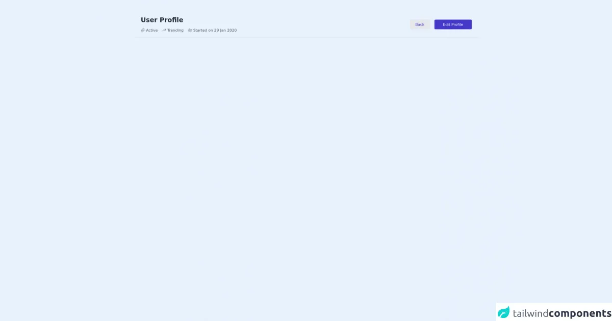
The preview of Free Tailwind CSS Page Heading Component ui component.
To create a Free Tailwind CSS Page Heading Component, we will use a combination of HTML and Tailwind CSS classes. The result will be a beautiful and responsive page heading that looks great on all devices.
Free download of the Free Tailwind CSS Page Heading Component's source code
The source code of Free Tailwind CSS Page Heading Component ui component.
To create a Free Tailwind CSS Page Heading Component, we will use the following HTML and Tailwind CSS classes:
<!-- Code block starts -->
        <div class="my-6 lg:my-12 container px-6 mx-auto flex flex-col md:flex-row items-start md:items-center justify-between pb-4 border-b border-gray-300">
            <div>
<!--- more free and premium Tailwind CSS components at https://tailwinduikit.com/ --->
                <h4 class="text-2xl font-bold leading-tight text-gray-800 dark:text-gray-100">User Profile</h4>
                <ul aria-label="current Status" class="flex flex-col md:flex-row items-start md:items-center text-gray-600 dark:text-gray-400 text-sm mt-3">
                    <li class="flex items-center mr-4">
                        <div class="mr-1">
                            <svg xmlns="http://www.w3.org/2000/svg" class="icon icon-tabler icon-tabler-paperclip" width="16" height="16" viewBox="0 0 24 24" stroke-width="1.5" stroke="currentColor" fill="none" stroke-linecap="round" stroke-linejoin="round">
                                <path stroke="none" d="M0 0h24v24H0z" />
                                <path d="M15 7l-6.5 6.5a1.5 1.5 0 0 0 3 3l6.5 -6.5a3 3 0 0 0 -6 -6l-6.5 6.5a4.5 4.5 0 0 0 9 9 l6.5 -6.5" />
                            </svg>
                        </div>
                        <span>Active</span>
                    </li>
                    <li class="flex items-center mr-4 mt-4 md:mt-0">
                        <div class="mr-1">
                            <svg xmlns="http://www.w3.org/2000/svg" class="icon icon-tabler icon-tabler-trending-up" width="16" height="16" viewBox="0 0 24 24" stroke-width="1.5" stroke="currentColor" fill="none" stroke-linecap="round" stroke-linejoin="round">
                                <path stroke="none" d="M0 0h24v24H0z" />
                                <polyline points="3 17 9 11 13 15 21 7" />
                                <polyline points="14 7 21 7 21 14" />
                            </svg>
                        </div>
                        <span> Trending</span>
                    </li>
                    <li class="flex items-center mt-4 md:mt-0">
                        <div class="mr-1">
                            <svg xmlns="http://www.w3.org/2000/svg" class="icon icon-tabler icon-tabler-plane-departure" width="16" height="16" viewBox="0 0 24 24" stroke-width="1.5" stroke="currentColor" fill="none" stroke-linecap="round" stroke-linejoin="round">
                                <path stroke="none" d="M0 0h24v24H0z" />
                                <path d="M15 12h5a2 2 0 0 1 0 4h-15l-3 -6h3l2 2h3l-2 -7h3z" transform="rotate(-15 12 12) translate(0 -1)" />
                                <line x1="3" y1="21" x2="21" y2="21" />
                            </svg>
                        </div>
                        <span>Started on 29 Jan 2020</span>
                    </li>
                </ul>
            </div>
            <div class="mt-6 md:mt-0">
                <button class="mr-3 bg-gray-200 dark:bg-gray-700 focus:outline-none focus:ring-2 focus:ring-offset-2 focus:ring-indigo-700 transition duration-150 ease-in-out rounded hover:bg-gray-300 text-indigo-700 dark:hover:bg-gray-600 dark:text-indigo-600 px-5 py-2 text-sm">Back</button>
                <button class="transition focus:outline-none focus:ring-2 focus:ring-offset-2 focus:ring-indigo-700 duration-150 ease-in-out hover:bg-indigo-600 bg-indigo-700 rounded text-white px-8 py-2 text-sm">Edit Profile</button>
            </div>
        </div>
        <!-- Code block ends -->
How to create a Free Tailwind CSS Page Heading Component with Tailwind CSS?
Here are six tips to help you create a Free Tailwind CSS Page Heading Component with Tailwind CSS:
- Start with the HTML structure
The first step in creating a Free Tailwind CSS Page Heading Component is to define the HTML structure. The structure should include a title, a subtitle, and an optional image. Here is an example of the HTML structure:
<div class="page-heading">
  <div class="page-heading__title">
    <h1 class="text-3xl font-bold">Page Title</h1>
  </div>
  <div class="page-heading__subtitle">
    <p class="text-gray-500">Page Subtitle</p>
  </div>
  <div class="page-heading__image">
    <img src="image.jpg" alt="Page Image">
  </div>
</div>
- Style the title
Once you have defined the HTML structure, you can start styling the title. Use the text-3xl class to set the font size to 3xl, and the font-bold class to make the text bold. Here is an example of how to style the title:
<div class="page-heading__title">
  <h1 class="text-3xl font-bold">Page Title</h1>
</div>
- Style the subtitle
Next, style the subtitle. Use the text-gray-500 class to set the text color to gray. Here is an example of how to style the subtitle:
<div class="page-heading__subtitle">
  <p class="text-gray-500">Page Subtitle</p>
</div>
- Style the image
If you want to include an image in your Free Tailwind CSS Page Heading Component, style it using the object-cover class to ensure that it fills the available space. Here is an example of how to style the image:
<div class="page-heading__image">
  <img src="image.jpg" alt="Page Image" class="object-cover">
</div>
- Customize the colors
Tailwind CSS provides a set of pre-defined colors that you can use to customize your Free Tailwind CSS Page Heading Component. For example, you can use the bg-blue-500 class to set the background color to blue. Here is an example of how to customize the colors:
<div class="page-heading bg-blue-500">
  <div class="page-heading__title">
    <h1 class="text-3xl font-bold text-white">Page Title</h1>
  </div>
  <div class="page-heading__subtitle">
    <p class="text-gray-100">Page Subtitle</p>
  </div>
  <div class="page-heading__image">
    <img src="image.jpg" alt="Page Image" class="object-cover">
  </div>
</div>
- Make it responsive
Finally, make sure that your Free Tailwind CSS Page Heading Component is responsive. Use the sm, md, lg, and xl classes to define different styles for different screen sizes. Here is an example of how to make your Free Tailwind CSS Page Heading Component responsive:
<div class="page-heading bg-blue-500 sm:bg-red-500 md:bg-green-500 lg:bg-yellow-500 xl:bg-purple-500">
  <div class="page-heading__title">
    <h1 class="text-3xl font-bold text-white sm:text-4xl md:text-5xl lg:text-6xl xl:text-7xl">Page Title</h1>
  </div>
  <div class="page-heading__subtitle">
    <p class="text-gray-100 sm:text-lg md:text-xl lg:text-2xl xl:text-3xl">Page Subtitle</p>
  </div>
  <div class="page-heading__image">
    <img src="image.jpg" alt="Page Image" class="object-cover">
  </div>
</div>
Conclusion
In conclusion, creating a Free Tailwind CSS Page Heading Component is a simple and straightforward process. By following these six tips, you can create a beautiful and responsive page heading that looks great on all devices. With Tailwind CSS, you can create a unique design that fits your brand without writing any custom CSS. So, what are you waiting for? Start creating your Free Tailwind CSS Page Heading Component today!