- Published on
What You Need To Create A Fade-out Buttons With Tailwind CSS
- What is Tailwind CSS?
- The description of Fade-out buttons ui component
- Why use Tailwind CSS to create a Fade-out buttons ui component?
- The preview of Fade-out buttons ui component
- The source code of Fade-out buttons ui component
- How to create a Fade-out buttons with Tailwind CSS?
- Conclusion
What is Tailwind CSS?
Tailwind CSS is a utility-first CSS framework that allows developers to quickly build custom user interfaces. It provides a set of pre-defined classes that can be used to style HTML elements without writing any CSS code. Tailwind CSS is gaining popularity among developers because it allows them to focus on the functionality of their applications rather than spending time on styling.
The description of Fade-out buttons ui component
Fade-out buttons are a popular user interface component that is used to indicate the completion of an action. When a user clicks on a button, the button fades out to indicate that the action has been completed. Fade-out buttons are commonly used in e-commerce websites, social media platforms, and mobile applications.
Why use Tailwind CSS to create a Fade-out buttons ui component?
Tailwind CSS provides a set of pre-defined classes that can be used to create a Fade-out buttons ui component without writing any CSS code. This saves developers time and allows them to focus on the functionality of their applications. Tailwind CSS also provides responsive design classes that can be used to create a responsive Fade-out buttons ui component that looks great on all devices.
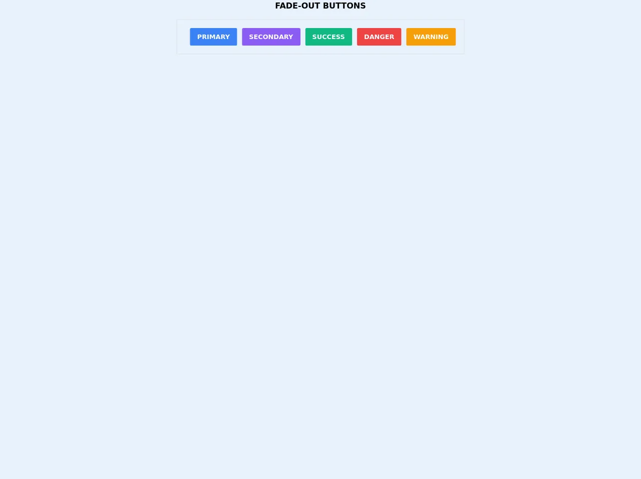
The preview of Fade-out buttons ui component
To create a Fade-out buttons ui component using Tailwind CSS, we will use the transition and opacity classes. The transition class is used to specify the duration and timing function of the transition effect, while the opacity class is used to set the opacity of the button.
Free download of the Fade-out buttons's source code
The source code of Fade-out buttons ui component
To create a Fade-out buttons ui component using Tailwind CSS, we will use the following HTML and CSS code:
<h1 class="text-xl text-center font-bold uppercase mb-5">Fade-out buttons</h1>

<div class="flex justify-center w-max mx-auto p-5 rounded border-2 border-gray-200">
    <button class="border-2 border-transparent bg-blue-500 ml-3 py-2 px-4 font-bold uppercase text-white rounded transition-all hover:border-blue-500 hover:bg-transparent hover:text-blue-500">primary</button>
    <button class="border-2 border-transparent bg-purple-500 ml-3 py-2 px-4 font-bold uppercase text-white rounded transition-all hover:border-purple-500 hover:bg-transparent hover:text-purple-500">secondary</button>
    <button class="border-2 border-transparent bg-green-500 ml-3 py-2 px-4 font-bold uppercase text-white rounded transition-all hover:border-green-500 hover:bg-transparent hover:text-green-500">success</button>
    <button class="border-2 border-transparent bg-red-500 ml-3 py-2 px-4 font-bold uppercase text-white rounded transition-all hover:border-red-500 hover:bg-transparent hover:text-red-500">danger</button>
    <button class="border-2 border-transparent bg-yellow-500 ml-3 py-2 px-4 font-bold uppercase text-white rounded transition-all hover:border-yellow-500 hover:bg-transparent hover:text-yellow-500">warning</button>
</div>
How to create a Fade-out buttons with Tailwind CSS?
To create a Fade-out buttons ui component with Tailwind CSS, follow these steps:
- Create an HTML button element and give it a class of
bg-blue-500 hover:bg-blue-700 text-white font-bold py-2 px-4 rounded.
<button class="bg-blue-500 hover:bg-blue-700 text-white font-bold py-2 px-4 rounded">
  Click me
</button>
- Add the
transitionandopacityclasses to the button element.
<button class="bg-blue-500 hover:bg-blue-700 text-white font-bold py-2 px-4 rounded transition duration-500 ease-in-out opacity-100">
  Click me
</button>
- Add a JavaScript event listener to the button element that changes the opacity of the button to 0 and disables the button when it is clicked.
<button onclick="this.disabled=true; this.style.opacity=0;" class="bg-blue-500 hover:bg-blue-700 text-white font-bold py-2 px-4 rounded transition duration-500 ease-in-out opacity-100">
  Click me
</button>
- Add a CSS class to the button element that changes the opacity of the button to 0 when it is disabled.
<button onclick="this.disabled=true; this.style.opacity=0;" class="bg-blue-500 hover:bg-blue-700 text-white font-bold py-2 px-4 rounded transition duration-500 ease-in-out opacity-100 disabled:opacity-0">
  Click me
</button>
- Add the
cursor-not-allowedclass to the button element to change the cursor to not-allowed when the button is disabled.
<button onclick="this.disabled=true; this.style.opacity=0;" class="bg-blue-500 hover:bg-blue-700 text-white font-bold py-2 px-4 rounded transition duration-500 ease-in-out opacity-100 disabled:opacity-0 cursor-not-allowed">
  Click me
</button>
- Add the
pointer-events-noneclass to the button element to disable pointer events when the button is disabled.
<button onclick="this.disabled=true; this.style.opacity=0;" class="bg-blue-500 hover:bg-blue-700 text-white font-bold py-2 px-4 rounded transition duration-500 ease-in-out opacity-100 disabled:opacity-0 cursor-not-allowed pointer-events-none">
  Click me
</button>
Conclusion
In this article, we have discussed how to create a Fade-out buttons ui component using Tailwind CSS. We have seen that Tailwind CSS provides a set of pre-defined classes that can be used to style HTML elements without writing any CSS code. We have also seen that Tailwind CSS provides responsive design classes that can be used to create a responsive Fade-out buttons ui component that looks great on all devices. By following the steps outlined in this article, you can easily create a Fade-out buttons ui component for your web applications.