- Published on
Practical Guide: Create A Dark Action Panel With Tailwind CSS
- What is Tailwind CSS?
- The Description of Dark Action Panel UI Component
- Why Use Tailwind CSS to Create a Dark Action Panel UI Component?
- The Preview of Dark Action Panel UI Component
- The Source Code of Dark Action Panel UI Component
- How to Create a Dark Action Panel With Tailwind CSS?
- Step 1: Set up the HTML structure
- Step 2: Add the toggle button
- Step 3: Style the panel and toggle button
- Step 4: Add the toggle functionality
- Conclusion
As a FrontEnd technology blogger, it's important to stay up-to-date with the latest trends and tools in the industry. One such tool that has gained popularity in recent years is Tailwind CSS. In this article, we will explore how to use Tailwind CSS to create a Dark Action Panel UI component.
What is Tailwind CSS?
Tailwind CSS is a utility-first CSS framework that helps you quickly build custom user interfaces. It provides a set of pre-defined classes that you can use to style your HTML elements. With Tailwind CSS, you don't need to write custom CSS code for every element on your page. Instead, you can use pre-defined classes to achieve the desired style.
The Description of Dark Action Panel UI Component
A Dark Action Panel is a UI component that is commonly used in web applications to display a set of actions that a user can perform. It usually appears on the side of the screen and can be expanded or collapsed as needed. The Dark Action Panel has a dark background and light-colored icons and text to make it stand out from the rest of the page.
Why Use Tailwind CSS to Create a Dark Action Panel UI Component?
Tailwind CSS provides a set of pre-defined classes that can be used to create a Dark Action Panel UI component quickly. It also allows you to customize the styles of individual elements easily. With Tailwind CSS, you can create a responsive and visually appealing Dark Action Panel UI component without writing custom CSS code.
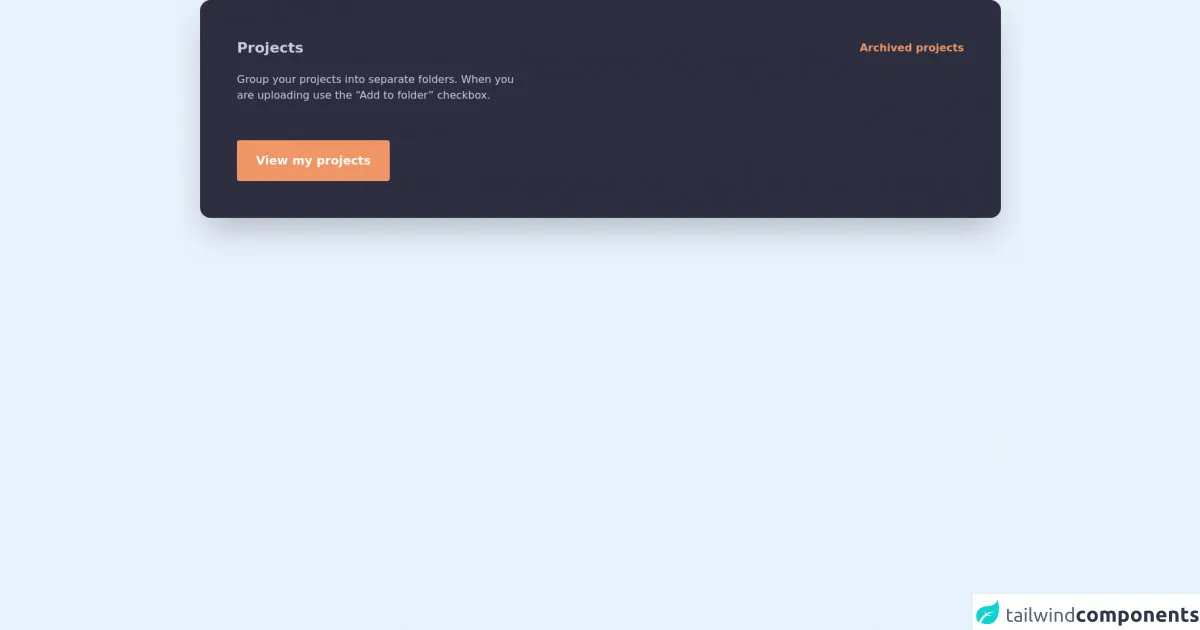
The Preview of Dark Action Panel UI Component
To create a Dark Action Panel UI component, we will use Tailwind CSS classes to style the HTML elements. The final result will look something like this:
Free download of the Dark action panel's source code
The Source Code of Dark Action Panel UI Component
To create the Dark Action Panel UI component, we will use HTML and Tailwind CSS classes. The code will look something like this:
<section class='px-4 sm:px-6 lg:px-8'>
  <div class="p-8 sm:p-14 bg-[#2E2E41] rounded-2xl shadow-2xl font-mulish md:min-w-[692px]">
    <div class="flex justify-between items-center">
      <h3 class="text-[#D0CAE5] text-[22px] font-bold">
        Projects
      </h3>
      <a href="#" class="text-[#F09666] font-bold hover:underline">
        Archived projects
      </a>
    </div>
    <p class="mt-5 text-[#D0CAE5] max-w-md">
      Group your projects into separate folders. When you are uploading use the “Add to folder” checkbox.
    </p>
    <button type="button" class="font-bold text-lg mt-14 bg-[#F09666] rounded text-white py-4 px-7 border border-transparent hover:bg-transparent hover:border-[#F09666] hover:text-[#F09666] focus:outline-none focus:ring-2 focus:ring-[#F09666]">
       View my projects
    </button>
  </div>
</section>
How to Create a Dark Action Panel With Tailwind CSS?
To create a Dark Action Panel UI component with Tailwind CSS, follow these steps:
Step 1: Set up the HTML structure
The first step is to create the HTML structure for the Dark Action Panel. We will use a div element with a class of "dark-action-panel" to contain the panel's content.
<div class="dark-action-panel">
  <!-- Panel content goes here -->
</div>
Step 2: Add the toggle button
Next, we will add a button element to toggle the panel's visibility. We will use a font-awesome icon for the button.
<button class="dark-action-panel-toggle">
  <i class="fas fa-bars"></i>
</button>
Step 3: Style the panel and toggle button
Now, we will use Tailwind CSS classes to style the panel and toggle button. We will set the background color of the panel to black and the text color to white. We will also add padding and margin to the panel to give it some space.
.dark-action-panel {
  background-color: #1a202c;
  color: #fff;
  padding: 1rem;
  margin: 1rem;
}

.dark-action-panel-toggle {
  background-color: #4a5568;
  color: #fff;
  border: none;
  padding: 0.5rem;
  border-radius: 0.25rem;
  position: fixed;
  top: 1rem;
  right: 1rem;
}
Step 4: Add the toggle functionality
Finally, we will add some JavaScript code to toggle the panel's visibility when the button is clicked.
const toggleButton = document.querySelector('.dark-action-panel-toggle');
const panel = document.querySelector('.dark-action-panel');

toggleButton.addEventListener('click', () => {
  panel.classList.toggle('hidden');
});
Conclusion
In this article, we learned how to use Tailwind CSS to create a Dark Action Panel UI component. We saw how Tailwind CSS provides a set of pre-defined classes that can be used to style HTML elements quickly. We also saw how to customize the styles of individual elements easily. With Tailwind CSS, you can create a responsive and visually appealing Dark Action Panel UI component without writing custom CSS code.