- Published on
Practical Guide: Build A Curvy Buttons With Tailwind CSS
- What is Tailwind CSS?
- The description of Curvy buttons UI component
- Why use Tailwind CSS to create a Curvy buttons UI component?
- The preview of Curvy buttons UI component
- The source code of Curvy buttons UI component
- How to create a Curvy buttons with Tailwind CSS?
- Step 1: Create an HTML button
- Step 2: Add the curved edge
- Step 3: Add the shadow effect
- Step 4: Add the hover effect
- Step 5: Add the transition effect
- Conclusion
As a FrontEnd technology blogger, it's important to stay up-to-date with the latest trends and tools in the industry. One of the most popular CSS frameworks today is Tailwind CSS. It's a utility-first CSS framework that makes it easy to create custom designs quickly. In this article, we'll explore how to use Tailwind CSS to build a Curvy Buttons UI component.
What is Tailwind CSS?
Tailwind CSS is a CSS framework that provides a set of pre-defined classes that can be used to create custom designs. It's a utility-first CSS framework, which means that it focuses on providing small, single-purpose classes that can be combined to create complex designs. With Tailwind CSS, you can create custom designs quickly without having to write custom CSS.
The description of Curvy buttons UI component
Curvy buttons are a popular UI component that can be used to add a touch of elegance to your website. They're typically used for call-to-action buttons, but can be used in a variety of other ways as well. Curvy buttons have a unique shape that sets them apart from other buttons. They have a curved edge that gives them a softer, more organic look.
Why use Tailwind CSS to create a Curvy buttons UI component?
Tailwind CSS is a great choice for creating a Curvy buttons UI component because it provides a set of pre-defined classes that can be used to create the curved edges. With Tailwind CSS, you can easily create custom designs without having to write custom CSS. Additionally, Tailwind CSS makes it easy to create responsive designs that look great on any device.
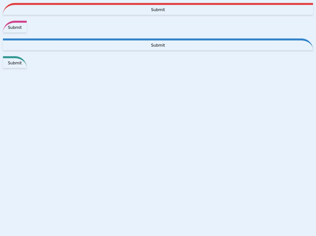
The preview of Curvy buttons UI component
To create a Curvy buttons UI component, we'll use Tailwind CSS to add a curved edge to a button. Here's what the final product will look like:
Free download of the Curvy buttons's source code
The source code of Curvy buttons UI component
To create a Curvy buttons UI component, we'll use a combination of HTML and Tailwind CSS classes. Here's the source code:
<div class="p-3">
	<button
		class="p-2 text-center border-t-8 border-red-600 w-full rounded-tl-full
		rounded-br-lg shadow-md hover:shadow-lg focus:outline-none">
		Submit
	</button>
</div>

<div class="p-3">
	<button
		class="p-2 text-center border-t-8 border-pink-600 w-24 rounded-tl-full
		rounded-br-lg shadow-md hover:shadow-lg focus:outline-none">
		Submit
	</button>
</div>

<div class="p-3">
	<button
		class="p-2 text-center border-t-8 border-blue-600 w-full rounded-tr-full
		rounded-br-lg shadow-md hover:shadow-lg focus:outline-none">
		Submit
	</button>
</div>

<div class="p-3">
	<button
		class="p-2 text-center border-t-8 border-teal-600 w-24 rounded-tr-full
		rounded-br-lg shadow-md hover:shadow-lg focus:outline-none">
		Submit
	</button>
</div>
How to create a Curvy buttons with Tailwind CSS?
To create a Curvy buttons UI component with Tailwind CSS, follow these steps:
Step 1: Create an HTML button
The first step is to create an HTML button. Here's an example:
<button class="bg-blue-500 hover:bg-blue-700 text-white font-bold py-2 px-4 rounded">
  Click me
</button>
This will create a basic button that we'll style with Tailwind CSS.
Step 2: Add the curved edge
To add the curved edge, we'll use the rounded-full class. This will round the corners of the button to create a circular shape. However, we want a more subtle curve, so we'll use the rounded-lg class instead. This will create a button with a slightly curved edge.
<button class="bg-blue-500 hover:bg-blue-700 text-white font-bold py-2 px-4 rounded-lg">
  Click me
</button>
Step 3: Add the shadow effect
To add a shadow effect to the button, we'll use the shadow-lg class. This will create a subtle shadow effect that gives the button some depth.
<button class="bg-blue-500 hover:bg-blue-700 text-white font-bold py-2 px-4 rounded-lg shadow-lg">
  Click me
</button>
Step 4: Add the hover effect
To add a hover effect to the button, we'll use the hover:shadow-xl class. This will create a larger shadow effect when the button is hovered over.
<button class="bg-blue-500 hover:bg-blue-700 text-white font-bold py-2 px-4 rounded-lg shadow-lg hover:shadow-xl">
  Click me
</button>
Step 5: Add the transition effect
To add a transition effect to the button, we'll use the transition duration-500 classes. This will create a smooth transition effect when the button is hovered over.
<button class="bg-blue-500 hover:bg-blue-700 text-white font-bold py-2 px-4 rounded-lg shadow-lg hover:shadow-xl transition duration-500">
  Click me
</button>
And that's it! You've successfully created a Curvy buttons UI component with Tailwind CSS.
Conclusion
In this article, we've explored how to use Tailwind CSS to create a Curvy buttons UI component. We've seen how Tailwind CSS can make it easy to create custom designs quickly without having to write custom CSS. By following the steps outlined in this article, you can create your own Curvy buttons UI component and add a touch of elegance to your website.