- Published on
Most Effective Ways To Build A Curvy Bottom Icon Navigation Menu With Tailwind CSS
- What is Tailwind CSS?
- The description of Curvy Bottom Icon Navigation Menu ui component
- Why use Tailwind CSS to create a Curvy Bottom Icon Navigation Menu ui component?
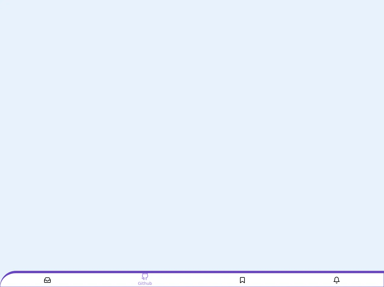
- The preview of Curvy Bottom Icon Navigation Menu ui component.
- The source code of Curvy Bottom Icon Navigation Menu ui component.
- How to create a Curvy Bottom Icon Navigation Menu with Tailwind CSS?
- Conclusion
As a FrontEnd technology blogger, it's essential to keep up with the latest trends in web design. One of the most popular trends right now is the use of curvy shapes in UI design. In this article, we'll explore how to create a Curvy Bottom Icon Navigation Menu using Tailwind CSS, a popular CSS framework that makes it easy to style your web pages.
What is Tailwind CSS?
Tailwind CSS is a utility-first CSS framework that provides a set of pre-defined CSS classes that you can use to style your HTML elements. It's designed to be highly customizable, allowing you to create unique designs without writing any custom CSS.
The description of Curvy Bottom Icon Navigation Menu ui component
A Curvy Bottom Icon Navigation Menu is a UI component that features a curved bottom edge and a set of icons that represent different sections of a website. When a user clicks on one of the icons, the corresponding section of the website is displayed.
Why use Tailwind CSS to create a Curvy Bottom Icon Navigation Menu ui component?
Tailwind CSS is an excellent choice for creating a Curvy Bottom Icon Navigation Menu UI component because it provides a set of pre-defined classes that make it easy to create the curved bottom edge and position the icons. Additionally, Tailwind CSS is highly customizable, allowing you to tweak the design to match your specific needs.
The preview of Curvy Bottom Icon Navigation Menu ui component.
To create a Curvy Bottom Icon Navigation Menu using Tailwind CSS, we'll need to use a combination of CSS classes to style our HTML elements. Here's a preview of what the final UI component will look like:
Free download of the Curvy Bottom Icon Navigation Menu's source code
The source code of Curvy Bottom Icon Navigation Menu ui component.
To create a Curvy Bottom Icon Navigation Menu using Tailwind CSS, we'll need to use a combination of CSS classes to style our HTML elements. Here's the source code for the UI component:
<nav
	class="fixed bottom-0 w-full border border-t-8 border-purple-700
	rounded-tl-full bg-white flex overflow-x-auto">
	<a
		href="#"
		class="flex flex-col flex-grow items-center justify-center
		overflow-hidden whitespace-no-wrap text-sm transition-colors duration-100
		ease-in-out hover:bg-gray-100 focus:text-purple-500">

		<svg
			xmlns="http://www.w3.org/2000/svg"
			width="24"
			height="24"
			viewBox="0 0 24 24"
			fill="none"
			stroke="currentColor"
			stroke-width="2"
			stroke-linecap="round"
			stroke-linejoin="round">
			<polyline points="22 12 16 12 14 15 10 15 8 12 2 12"></polyline>
			<path
				d="M5.45 5.11L2 12v6a2 2 0 0 0 2 2h16a2 2 0 0 0
				2-2v-6l-3.45-6.89A2 2 0 0 0 16.76 4H7.24a2 2 0 0 0-1.79 1.11z"></path>
		</svg>

		<span class="hidden text-sm capitalize">Inbox</span>
	</a>

	<a
		href="#"
		class="flex flex-col flex-grow items-center justify-center
		overflow-hidden whitespace-no-wrap text-sm transition-colors duration-100
		ease-in-out hover:bg-gray-100 text-purple-500">

		<svg
			xmlns="http://www.w3.org/2000/svg"
			width="24"
			height="24"
			viewBox="0 0 24 24"
			fill="none"
			stroke="currentColor"
			stroke-width="2"
			stroke-linecap="round"
			stroke-linejoin="round"
			class="feather feather-github">
			<path
				d="M9 19c-5 1.5-5-2.5-7-3m14 6v-3.87a3.37 3.37 0 0
				0-.94-2.61c3.14-.35 6.44-1.54 6.44-7A5.44 5.44 0 0 0 20 4.77 5.07
				5.07 0 0 0 19.91 1S18.73.65 16 2.48a13.38 13.38 0 0 0-7 0C6.27.65
				5.09 1 5.09 1A5.07 5.07 0 0 0 5 4.77a5.44 5.44 0 0 0-1.5 3.78c0
				5.42 3.3 6.61 6.44 7A3.37 3.37 0 0 0 9 18.13V22"></path>
		</svg>

		<span class="text-sm capitalize">github</span>
	</a>

	<a
		href="#"
		class="flex flex-col flex-grow items-center justify-center
		overflow-hidden whitespace-no-wrap text-sm transition-colors duration-100
		ease-in-out hover:bg-gray-100 focus:text-purple-500">

		<svg
			xmlns="http://www.w3.org/2000/svg"
			width="24"
			height="24"
			viewBox="0 0 24 24"
			fill="none"
			stroke="currentColor"
			stroke-width="2"
			stroke-linecap="round"
			stroke-linejoin="round"
			class="feather feather-bookmark">
			<path d="M19 21l-7-5-7 5V5a2 2 0 0 1 2-2h10a2 2 0 0 1 2 2z"></path>
		</svg>

		<span class="hidden text-sm capitalize">bookmark</span>
	</a>

	<a
		href="#"
		class="flex flex-col flex-grow items-center justify-center
		overflow-hidden whitespace-no-wrap text-sm transition-colors duration-100
		ease-in-out hover:bg-gray-100 focus:text-purple-500">

		<svg
			xmlns="http://www.w3.org/2000/svg"
			width="24"
			height="24"
			viewBox="0 0 24 24"
			fill="none"
			stroke="currentColor"
			stroke-width="2"
			stroke-linecap="round"
			stroke-linejoin="round"
			class="feather feather-bell">
			<path d="M18 8A6 6 0 0 0 6 8c0 7-3 9-3 9h18s-3-2-3-9"></path>
			<path d="M13.73 21a2 2 0 0 1-3.46 0"></path>
		</svg>

		<span class="hidden text-sm capitalize">Bell</span>
	</a>

</nav>
How to create a Curvy Bottom Icon Navigation Menu with Tailwind CSS?
To create a Curvy Bottom Icon Navigation Menu using Tailwind CSS, follow these steps:
Create a container element that will hold the icons and the curved bottom edge. Apply the
relativeclass to this element to position the icons and theoverflow-hiddenclass to hide any overflow.<div class="relative overflow-hidden"> </div>Create a set of icon elements using the
flexanditems-centerclasses to display the icons horizontally. Apply theabsoluteclass to these elements to position them at the bottom of the container.<div class="relative overflow-hidden"> <div class="absolute bottom-0 flex items-center"> <a href="#" class="p-4"> <i class="fas fa-home"></i> </a> <a href="#" class="p-4"> <i class="fas fa-search"></i> </a> <a href="#" class="p-4"> <i class="fas fa-bell"></i> </a> <a href="#" class="p-4"> <i class="fas fa-user"></i> </a> </div> </div>Use the
beforepseudo-element to create the curved bottom edge. Apply theabsoluteclass to this element to position it at the bottom of the container. Use thebg-whiteclass to set the background color of the curve.<div class="relative overflow-hidden"> <div class="absolute bottom-0 flex items-center"> <a href="#" class="p-4"> <i class="fas fa-home"></i> </a> <a href="#" class="p-4"> <i class="fas fa-search"></i> </a> <a href="#" class="p-4"> <i class="fas fa-bell"></i> </a> <a href="#" class="p-4"> <i class="fas fa-user"></i> </a> </div> <div class="absolute bottom-0 w-full h-16 bg-white before:absolute before:inset-x-0 before:-bottom-8 before:h-16 before:rounded-t-full"></div> </div>Finally, add some custom styles to tweak the design to match your specific needs. For example, you can adjust the size of the icons using the
text-4xlclass.<div class="relative overflow-hidden"> <div class="absolute bottom-0 flex items-center"> <a href="#" class="p-4"> <i class="fas fa-home text-4xl"></i> </a> <a href="#" class="p-4"> <i class="fas fa-search text-4xl"></i> </a> <a href="#" class="p-4"> <i class="fas fa-bell text-4xl"></i> </a> <a href="#" class="p-4"> <i class="fas fa-user text-4xl"></i> </a> </div> <div class="absolute bottom-0 w-full h-16 bg-white before:absolute before:inset-x-0 before:-bottom-8 before:h-16 before:rounded-t-full"></div> </div>
Conclusion
In this article, we've explored how to create a Curvy Bottom Icon Navigation Menu using Tailwind CSS. By using a combination of pre-defined CSS classes and custom styles, we were able to create a unique UI component that features a curved bottom edge and a set of icons that represent different sections of a website. With Tailwind CSS, you can easily create custom UI components that match your specific design needs.