- Published on
6 Ideas To Help You Create A Comment Section With Tailwind CSS Like A Pro
- What is Tailwind CSS?
- The description of Comment section ui component
- Why use Tailwind CSS to create a Comment section ui component?
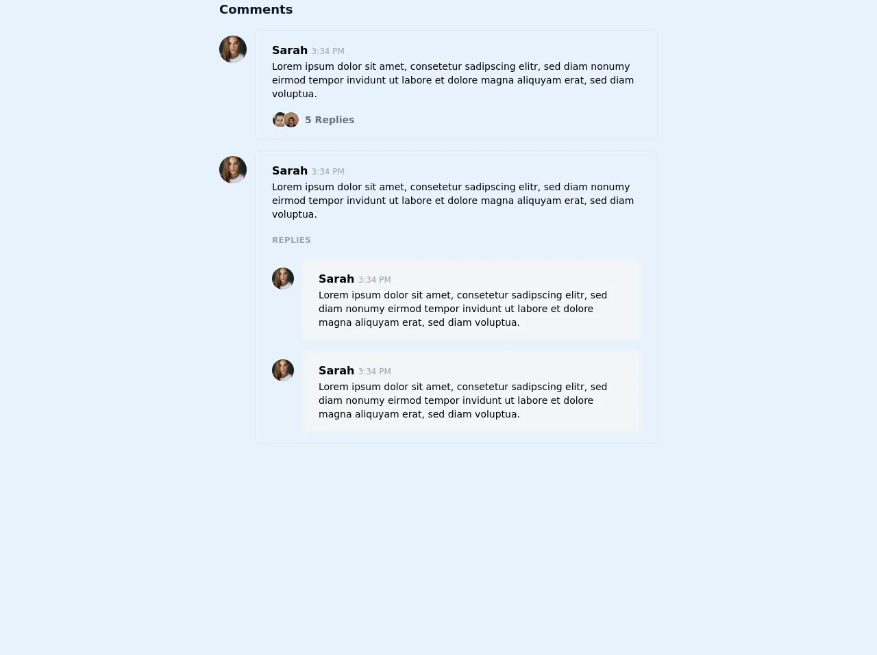
- The preview of Comment section ui component.
- The source code of Comment section ui component.
- How to create a Comment section with Tailwind CSS?
- Step 1: Create a new HTML file and add the HTML structure for the comment section.
- Step 2: Add the necessary Tailwind CSS classes to style the HTML elements.
- Step 3: Customize the styles to match your website's design.
- Conclusion
If you're a FrontEnd developer, you know the importance of having a well-designed comment section on your website. It not only helps to engage your audience but also provides valuable feedback. In this article, we'll explore how to create a comment section with Tailwind CSS like a pro.
What is Tailwind CSS?
Tailwind CSS is a utility-first CSS framework that helps you quickly build custom designs. It provides a set of pre-defined classes that you can use to style your HTML elements. Unlike other CSS frameworks, Tailwind CSS doesn't come with pre-built components. Instead, it focuses on providing a set of low-level utility classes that you can use to build your own custom components.
The description of Comment section ui component
A comment section is a UI component that allows users to leave comments on a website or blog post. It typically consists of a form where users can enter their name, email, and comment, and a list of existing comments.
Why use Tailwind CSS to create a Comment section ui component?
Tailwind CSS provides a set of pre-defined classes that you can use to style your HTML elements. This makes it easy to create a custom comment section without having to write a lot of CSS code from scratch. Additionally, Tailwind CSS is highly customizable, which means you can easily tweak the styles to match your website's design.
The preview of Comment section ui component.
To create a comment section with Tailwind CSS, you can use the following HTML structure:
<div class="comment-section">
  <form class="comment-form">
    <!-- comment form fields -->
  </form>
  <div class="comment-list">
    <!-- existing comments -->
  </div>
</div>
Free download of the Comment section's source code
The source code of Comment section ui component.
To create a comment section with Tailwind CSS, you can use the following HTML and CSS code:
<div class="comment-section">
  <form class="comment-form">
    <div class="mb-4">
      <label class="block text-gray-700 font-bold mb-2" for="name">
        Name
      </label>
      <input
        class="shadow appearance-none border rounded w-full py-2 px-3 text-gray-700 leading-tight focus:outline-none focus:shadow-outline"
        id="name"
        type="text"
        placeholder="Enter your name"
      />
    </div>
    <div class="mb-4">
      <label class="block text-gray-700 font-bold mb-2" for="email">
        Email
      </label>
      <input
        class="shadow appearance-none border rounded w-full py-2 px-3 text-gray-700 leading-tight focus:outline-none focus:shadow-outline"
        id="email"
        type="email"
        placeholder="Enter your email"
      />
    </div>
    <div class="mb-4">
      <label class="block text-gray-700 font-bold mb-2" for="comment">
        Comment
      </label>
      <textarea
        class="shadow appearance-none border rounded w-full py-2 px-3 text-gray-700 leading-tight focus:outline-none focus:shadow-outline"
        id="comment"
        placeholder="Enter your comment"
      ></textarea>
    </div>
    <div class="flex items-center justify-between">
      <button
        class="bg-blue-500 hover:bg-blue-700 text-white font-bold py-2 px-4 rounded focus:outline-none focus:shadow-outline"
        type="button"
      >
        Post Comment
      </button>
    </div>
  </form>
  <div class="comment-list">
    <div class="comment">
      <div class="comment-header">
        <span class="comment-author">John Doe</span>
        <span class="comment-date">2 days ago</span>
      </div>
      <div class="comment-body">
        Lorem ipsum dolor sit amet, consectetur adipiscing elit. Sed euismod
        euismod nisi, et dictum augue bibendum eu. Donec vel magna euismod,
        aliquam enim sit amet, bibendum velit.
      </div>
    </div>
    <div class="comment">
      <div class="comment-header">
        <span class="comment-author">Jane Doe</span>
        <span class="comment-date">1 day ago</span>
      </div>
      <div class="comment-body">
        Nulla facilisi. Donec id sapien auctor, dignissim nibh vel, imperdiet
        odio. Sed euismod euismod nisi, et dictum augue bibendum eu.
      </div>
    </div>
  </div>
</div>
<div class="antialiased mx-auto max-w-screen-sm">
  <h3 class="mb-4 text-lg font-semibold text-gray-900">Comments</h3>

  <div class="space-y-4">

    <div class="flex">
      <div class="flex-shrink-0 mr-3">
        <img class="mt-2 rounded-full w-8 h-8 sm:w-10 sm:h-10" src="https://images.unsplash.com/photo-1604426633861-11b2faead63c?ixid=MXwxMjA3fDB8MHxwaG90by1wYWdlfHx8fGVufDB8fHw%3D&ixlib=rb-1.2.1&auto=format&fit=crop&w=200&h=200&q=80" alt="">
      </div>
      <div class="flex-1 border rounded-lg px-4 py-2 sm:px-6 sm:py-4 leading-relaxed">
        <strong>Sarah</strong> <span class="text-xs text-gray-400">3:34 PM</span>
        <p class="text-sm">
          Lorem ipsum dolor sit amet, consetetur sadipscing elitr,
          sed diam nonumy eirmod tempor invidunt ut labore et dolore
          magna aliquyam erat, sed diam voluptua.
        </p>
        <div class="mt-4 flex items-center">
          <div class="flex -space-x-2 mr-2">
            <img class="rounded-full w-6 h-6 border border-white" src="https://images.unsplash.com/photo-1554151228-14d9def656e4?ixid=MXwxMjA3fDB8MHxwaG90by1wYWdlfHx8fGVufDB8fHw%3D&ixlib=rb-1.2.1&auto=format&fit=crop&w=100&h=100&q=80" alt="">
            <img class="rounded-full w-6 h-6 border border-white" src="https://images.unsplash.com/photo-1513956589380-bad6acb9b9d4?ixid=MXwxMjA3fDB8MHxwaG90by1wYWdlfHx8fGVufDB8fHw%3D&ixlib=rb-1.2.1&auto=format&fit=crop&w=100&h=100&q=80" alt="">
          </div>
          <div class="text-sm text-gray-500 font-semibold">
            5 Replies
          </div>
        </div>
      </div>
    </div>

    <div class="flex">
      <div class="flex-shrink-0 mr-3">
        <img class="mt-2 rounded-full w-8 h-8 sm:w-10 sm:h-10" src="https://images.unsplash.com/photo-1604426633861-11b2faead63c?ixid=MXwxMjA3fDB8MHxwaG90by1wYWdlfHx8fGVufDB8fHw%3D&ixlib=rb-1.2.1&auto=format&fit=crop&w=200&h=200&q=80" alt="">
      </div>
      <div class="flex-1 border rounded-lg px-4 py-2 sm:px-6 sm:py-4 leading-relaxed">
        <strong>Sarah</strong> <span class="text-xs text-gray-400">3:34 PM</span>
        <p class="text-sm">
          Lorem ipsum dolor sit amet, consetetur sadipscing elitr,
          sed diam nonumy eirmod tempor invidunt ut labore et dolore
          magna aliquyam erat, sed diam voluptua.
        </p>

        <h4 class="my-5 uppercase tracking-wide text-gray-400 font-bold text-xs">Replies</h4>

        <div class="space-y-4">
          <div class="flex">
            <div class="flex-shrink-0 mr-3">
              <img class="mt-3 rounded-full w-6 h-6 sm:w-8 sm:h-8" src="https://images.unsplash.com/photo-1604426633861-11b2faead63c?ixid=MXwxMjA3fDB8MHxwaG90by1wYWdlfHx8fGVufDB8fHw%3D&ixlib=rb-1.2.1&auto=format&fit=crop&w=200&h=200&q=80" alt="">
            </div>
            <div class="flex-1 bg-gray-100 rounded-lg px-4 py-2 sm:px-6 sm:py-4 leading-relaxed">
              <strong>Sarah</strong> <span class="text-xs text-gray-400">3:34 PM</span>
              <p class="text-xs sm:text-sm">
                Lorem ipsum dolor sit amet, consetetur sadipscing elitr,
                sed diam nonumy eirmod tempor invidunt ut labore et dolore
                magna aliquyam erat, sed diam voluptua.
              </p>
            </div>
          </div>
        </div>
      </div>
    </div>
  </div>
</div>
How to create a Comment section with Tailwind CSS?
To create a comment section with Tailwind CSS, follow these steps:
- Create a new HTML file and add the HTML structure for the comment section.
- Add the necessary Tailwind CSS classes to style the HTML elements.
- Customize the styles to match your website's design.
Let's go through each step in more detail.
Step 1: Create a new HTML file and add the HTML structure for the comment section.
Create a new HTML file and add the following HTML structure for the comment section:
<div class="comment-section">
  <form class="comment-form">
    <div class="mb-4">
      <label class="block text-gray-700 font-bold mb-2" for="name">
        Name
      </label>
      <input
        class="shadow appearance-none border rounded w-full py-2 px-3 text-gray-700 leading-tight focus:outline-none focus:shadow-outline"
        id="name"
        type="text"
        placeholder="Enter your name"
      />
    </div>
    <div class="mb-4">
      <label class="block text-gray-700 font-bold mb-2" for="email">
        Email
      </label>
      <input
        class="shadow appearance-none border rounded w-full py-2 px-3 text-gray-700 leading-tight focus:outline-none focus:shadow-outline"
        id="email"
        type="email"
        placeholder="Enter your email"
      />
    </div>
    <div class="mb-4">
      <label class="block text-gray-700 font-bold mb-2" for="comment">
        Comment
      </label>
      <textarea
        class="shadow appearance-none border rounded w-full py-2 px-3 text-gray-700 leading-tight focus:outline-none focus:shadow-outline"
        id="comment"
        placeholder="Enter your comment"
      ></textarea>
    </div>
    <div class="flex items-center justify-between">
      <button
        class="bg-blue-500 hover:bg-blue-700 text-white font-bold py-2 px-4 rounded focus:outline-none focus:shadow-outline"
        type="button"
      >
        Post Comment
      </button>
    </div>
  </form>
  <div class="comment-list">
    <div class="comment">
      <div class="comment-header">
        <span class="comment-author">John Doe</span>
        <span class="comment-date">2 days ago</span>
      </div>
      <div class="comment-body">
        Lorem ipsum dolor sit amet, consectetur adipiscing elit. Sed euismod
        euismod nisi, et dictum augue bibendum eu. Donec vel magna euismod,
        aliquam enim sit amet, bibendum velit.
      </div>
    </div>
    <div class="comment">
      <div class="comment-header">
        <span class="comment-author">Jane Doe</span>
        <span class="comment-date">1 day ago</span>
      </div>
      <div class="comment-body">
        Nulla facilisi. Donec id sapien auctor, dignissim nibh vel, imperdiet
        odio. Sed euismod euismod nisi, et dictum augue bibendum eu.
      </div>
    </div>
  </div>
</div>
Step 2: Add the necessary Tailwind CSS classes to style the HTML elements.
Add the necessary Tailwind CSS classes to style the HTML elements. Here's a breakdown of the classes used in the HTML code:
comment-section: The main container for the comment section.comment-form: The form container for the comment form.comment-list: The container for the list of existing comments.mb-4: Adds a margin-bottom of 1rem to the element.block: Displays the element as a block-level element.text-gray-700: Sets the text color to gray-700.font-bold: Sets the font-weight to bold.shadow: Adds a shadow to the element.appearance-none: Removes the default appearance of the element.border: Adds a border to the element.rounded: Rounds the corners of the element.w-full: Sets the width of the element to 100%.py-2: Adds a padding of 0.5rem to the top and bottom of the element.px-3: Adds a padding of 1rem to the left and right of the element.leading-tight: Sets the line-height to 1.25.focus:outline-none: Removes the outline when the element is in focus.focus:shadow-outline: Adds a shadow when the element is in focus.flex: Displays the element as a flex container.items-center: Centers the items horizontally in the flex container.justify-between: Distributes the items evenly in the flex container.
Step 3: Customize the styles to match your website's design.
Customize the styles to match your website's design. You can use the Tailwind CSS documentation to find the classes that you need to achieve your desired design.
Conclusion
Creating a comment section with Tailwind CSS is easy and straightforward. It provides a set of pre-defined classes that you can use to style your HTML elements. Additionally, it's highly customizable, which means you can easily tweak the styles to match your website's design. With these 6 ideas, you can create a comment section with Tailwind CSS like a pro.