- Published on
Practical Guide: Make A Cofee With Tailwind CSS
- What is Tailwind CSS?
- The description of coffee UI component
- Why use Tailwind CSS to create a coffee UI component?
- The preview of coffee UI component
- The source code of coffee UI component
- How to create a coffee with Tailwind CSS?
- Step 1: Create a new HTML file and add the necessary HTML elements
- Step 2: Add the Tailwind CSS stylesheet to the HTML file
- Step 3: Add the necessary Tailwind CSS classes to the HTML elements to style the component
- Step 4: Add JavaScript code to handle the user input and submit the order
- Conclusion
As a FrontEnd technology blogger, I am always looking for ways to make the development process faster and more efficient. One tool that has caught my attention recently is Tailwind CSS. In this article, I will provide a practical guide on how to use Tailwind CSS to create a coffee UI component.
What is Tailwind CSS?
Tailwind CSS is a utility-first CSS framework that provides a set of pre-defined classes that you can use to style your HTML elements. It allows you to create complex layouts and designs without writing custom CSS. Tailwind CSS is highly customizable, and you can configure it to suit your project's needs.
The description of coffee UI component
The coffee UI component is a simple user interface that allows users to select their preferred type of coffee and customize it with different options such as milk, sugar, and flavorings. The component consists of a dropdown menu for selecting the coffee type, checkboxes for selecting the options, and a button to submit the order.
Why use Tailwind CSS to create a coffee UI component?
Tailwind CSS provides a set of pre-defined classes that you can use to style your HTML elements. This makes it easy to create a consistent and visually appealing UI component without writing custom CSS. Tailwind CSS also allows you to customize the styles by editing the configuration file, which makes it easy to maintain a consistent design across your project.
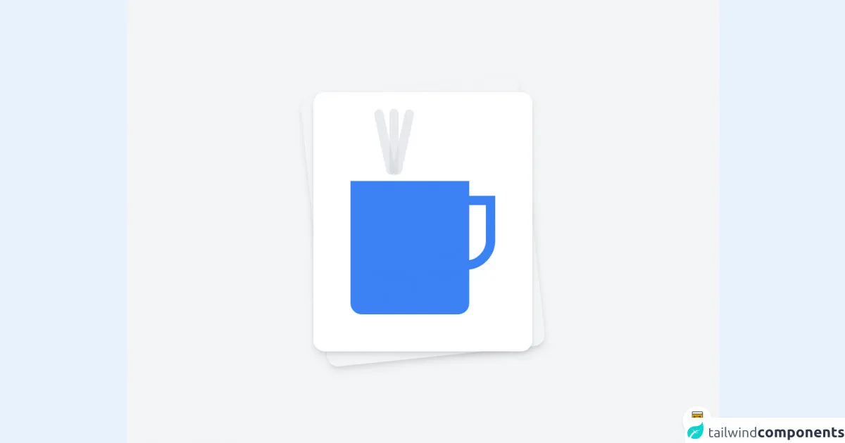
The preview of coffee UI component
To create the coffee UI component, we will use Tailwind CSS classes to style the HTML elements. Here is a preview of what the coffee UI component will look like:
Free download of the cofee's source code
The source code of coffee UI component
Here is the source code for the coffee UI component. We will use HTML and Tailwind CSS classes to create the component:
<div class="min-h-screen bg-gray-100 py-6 flex flex-col justify-center sm:py-12">
  <div class="relative py-3 sm:max-w-xl sm:mx-auto">
    <div class="absolute inset-0 bg-gradient-to-r from-cyan-400 to-light-blue-500 shadow-lg transform -skew-y-6 sm:skew-y-0 sm:-rotate-6 sm:rounded-3xl"></div>
    <div class="relative px-4 py-10  bg-white shadow-lg sm:rounded-3xl sm:p-20">
        <div class="flex absolute top-1 mt-8 gap-10 justify-center left-36">
            <div class="h-36 w-5 bg-gray-300 opacity-10 animate-pulse  transform -rotate-12 rounded-full"></div>
            <div class="h-36 w-5 bg-gray-300 opacity-10 animate-pulse  transform  rounded-full"></div>
            <div class="h-36 w-5 bg-gray-300 opacity-10 animate-pulse  transform rotate-12 rounded-full"></div>
        </div>


        <div class="w-64 h-72 bg-blue-500 rounded-b-3xl mt-28 mr-14"></div>
        <div class="absolute h-40 w-32 top-56 right-20 border-8 border-blue-500 rounded-b-full "></div>
    </div>
  </div>
</div>

<style>
    .border-8{
        border-width: 20px;
    }
</style>

<!-- BUY ME A BEER AND HELP SUPPORT OPEN-SOURCE RESOURCES -->
<div class="flex items-end justify-end fixed bottom-0 right-0 mb-4 mr-4 z-10">
    <div>
        <a title="Buy me a beer" href="https://www.buymeacoffee.com/emichel" target="_blank" class="block w-16 h-16 rounded-full transition-all shadow hover:shadow-lg transform hover:scale-110 hover:rotate-12">
            <img class="object-cover object-center w-full h-full rounded-full" src="https://i.pinimg.com/originals/60/fd/e8/60fde811b6be57094e0abc69d9c2622a.jpg"/>
        </a>
    </div>
</div>
How to create a coffee with Tailwind CSS?
To create a coffee with Tailwind CSS, we will use the coffee UI component that we created earlier. Here are the steps:
- Create a new HTML file and add the necessary HTML elements for the coffee UI component.
- Add the Tailwind CSS stylesheet to the HTML file.
- Add the necessary Tailwind CSS classes to the HTML elements to style the component.
- Add JavaScript code to handle the user input and submit the order.
Let's go through each step in more detail.
Step 1: Create a new HTML file and add the necessary HTML elements
Create a new HTML file and add the necessary HTML elements for the coffee UI component. Here is the HTML code:
<div class="p-4 bg-gray-100">
  <h1 class="text-2xl font-bold mb-4">Coffee Order Form</h1>
  <form class="bg-white rounded-lg shadow-md p-4">
    <div class="mb-4">
      <label class="block text-gray-700 font-bold mb-2" for="coffee-type">
        Coffee Type
      </label>
      <select
        class="form-select block w-full rounded-md border-gray-300 shadow-sm focus:border-indigo-500 focus:ring focus:ring-indigo-200 focus:ring-opacity-50"
        id="coffee-type"
        name="coffee-type"
      >
        <option value="espresso">Espresso</option>
        <option value="latte">Latte</option>
        <option value="cappuccino">Cappuccino</option>
        <option value="americano">Americano</option>
      </select>
    </div>
    <div class="mb-4">
      <p class="text-gray-700 font-bold mb-2">Options</p>
      <div class="flex flex-wrap -mx-2">
        <div class="w-full md:w-1/2 px-2 mb-4">
          <label class="inline-flex items-center">
            <input type="checkbox" class="form-checkbox" name="milk" />
            <span class="ml-2">Milk</span>
          </label>
        </div>
        <div class="w-full md:w-1/2 px-2 mb-4">
          <label class="inline-flex items-center">
            <input type="checkbox" class="form-checkbox" name="sugar" />
            <span class="ml-2">Sugar</span>
          </label>
        </div>
        <div class="w-full md:w-1/2 px-2 mb-4">
          <label class="inline-flex items-center">
            <input type="checkbox" class="form-checkbox" name="flavoring" />
            <span class="ml-2">Flavoring</span>
          </label>
        </div>
      </div>
    </div>
    <div class="flex justify-end">
      <button
        class="bg-indigo-500 hover:bg-indigo-700 text-white font-bold py-2 px-4 rounded focus:outline-none focus:shadow-outline"
        type="submit"
      >
        Order
      </button>
    </div>
  </form>
</div>
Step 2: Add the Tailwind CSS stylesheet to the HTML file
Add the Tailwind CSS stylesheet to the HTML file. You can either download the CSS file from the Tailwind CSS website or use a CDN. Here is an example of how to use the CDN:
<link
  href="https://cdn.jsdelivr.net/npm/[email protected]/dist/tailwind.min.css"
  rel="stylesheet"
/>
Step 3: Add the necessary Tailwind CSS classes to the HTML elements to style the component
Add the necessary Tailwind CSS classes to the HTML elements to style the component. Here is the updated HTML code with the Tailwind CSS classes:
<div class="p-4 bg-gray-100">
  <h1 class="text-2xl font-bold mb-4">Coffee Order Form</h1>
  <form class="bg-white rounded-lg shadow-md p-4">
    <div class="mb-4">
      <label class="block text-gray-700 font-bold mb-2" for="coffee-type">
        Coffee Type
      </label>
      <select
        class="form-select block w-full rounded-md border-gray-300 shadow-sm focus:border-indigo-500 focus:ring focus:ring-indigo-200 focus:ring-opacity-50"
        id="coffee-type"
        name="coffee-type"
      >
        <option value="espresso">Espresso</option>
        <option value="latte">Latte</option>
        <option value="cappuccino">Cappuccino</option>
        <option value="americano">Americano</option>
      </select>
    </div>
    <div class="mb-4">
      <p class="text-gray-700 font-bold mb-2">Options</p>
      <div class="flex flex-wrap -mx-2">
        <div class="w-full md:w-1/2 px-2 mb-4">
          <label class="inline-flex items-center">
            <input type="checkbox" class="form-checkbox" name="milk" />
            <span class="ml-2">Milk</span>
          </label>
        </div>
        <div class="w-full md:w-1/2 px-2 mb-4">
          <label class="inline-flex items-center">
            <input type="checkbox" class="form-checkbox" name="sugar" />
            <span class="ml-2">Sugar</span>
          </label>
        </div>
        <div class="w-full md:w-1/2 px-2 mb-4">
          <label class="inline-flex items-center">
            <input type="checkbox" class="form-checkbox" name="flavoring" />
            <span class="ml-2">Flavoring</span>
          </label>
        </div>
      </div>
    </div>
    <div class="flex justify-end">
      <button
        class="bg-indigo-500 hover:bg-indigo-700 text-white font-bold py-2 px-4 rounded focus:outline-none focus:shadow-outline"
        type="submit"
      >
        Order
      </button>
    </div>
  </form>
</div>
Step 4: Add JavaScript code to handle the user input and submit the order
Add JavaScript code to handle the user input and submit the order. Here is an example of how to do this:
const form = document.querySelector('form');

form.addEventListener('submit', (event) => {
  event.preventDefault();

  const coffeeType = document.getElementById('coffee-type').value;
  const milk = document.getElementsByName('milk')[0].checked;
  const sugar = document.getElementsByName('sugar')[0].checked;
  const flavoring = document.getElementsByName('flavoring')[0].checked;

  const order = {
    coffeeType,
    milk,
    sugar,
    flavoring,
  };

  console.log(order);
});
Conclusion
In this article, we have learned how to use Tailwind CSS to create a coffee UI component and how to use the component to create a coffee order form. Tailwind CSS is a powerful tool that can help you create complex layouts and designs quickly and efficiently. I hope this practical guide has been helpful, and I encourage you to explore Tailwind CSS further to see how it can improve your FrontEnd development workflow.