- Published on
Learn How To Create A Stripe-style Animated Vertical Tabs With Tailwind CSS from the Pros
- What is Tailwind CSS?
- The description of Stripe-style animated vertical tabs ui component
- Why use Tailwind CSS to create a Stripe-style animated vertical tabs UI component?
- The preview of Stripe-style animated vertical tabs UI component
- The source code of Stripe-style animated vertical tabs UI component
- How to create a Stripe-style animated vertical tabs with Tailwind CSS?
- Step 1: Set up the HTML
- Step 2: Style the tabs
- Step 3: Style the active tab
- Step 4: Style the content
- Step 5: Add the animation
- Step 6: Add the JavaScript
- Conclusion
What is Tailwind CSS?
Tailwind CSS is a utility-first CSS framework that provides a set of pre-defined classes to style HTML elements. It is designed to speed up the development process by reducing the amount of custom CSS code needed. With Tailwind CSS, you can easily create complex designs without writing a single line of CSS.
The description of Stripe-style animated vertical tabs ui component
Stripe is a popular payment processing platform that has a sleek and modern user interface. One of the standout features of the Stripe UI is its use of animated vertical tabs. These tabs allow users to easily navigate between different sections of the platform while providing a visually engaging experience.
In this tutorial, we will show you how to create a Stripe-style animated vertical tabs UI component using Tailwind CSS.
Why use Tailwind CSS to create a Stripe-style animated vertical tabs UI component?
Tailwind CSS provides a set of pre-defined classes that can be used to create complex designs quickly and easily. With Tailwind CSS, you can focus on the functionality of your UI component rather than spending time writing custom CSS code.
Additionally, Tailwind CSS makes it easy to create responsive designs that work well on all devices. This is important for a UI component like vertical tabs, which will be used on a variety of screen sizes.
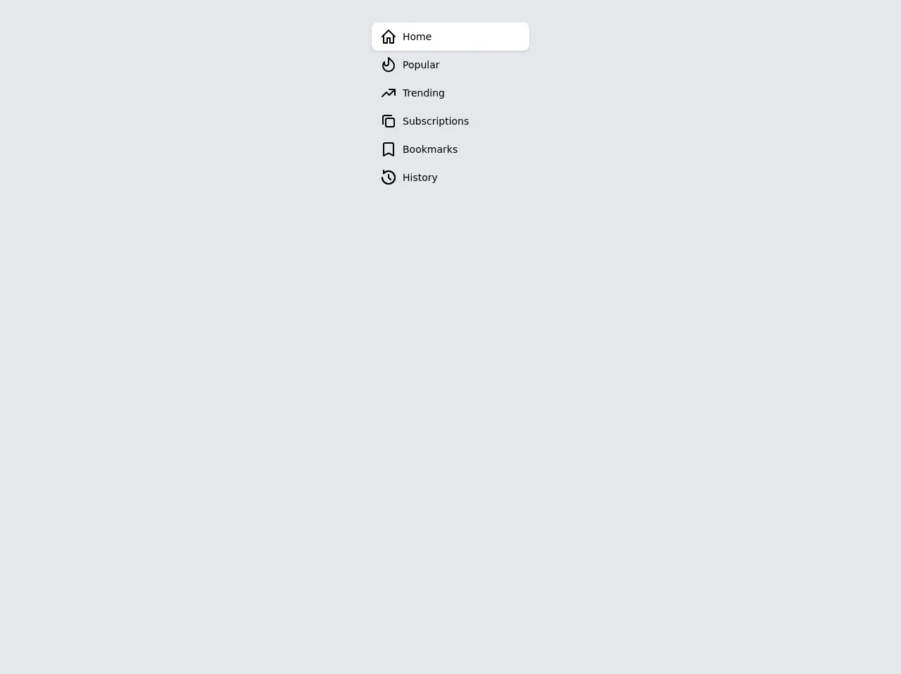
The preview of Stripe-style animated vertical tabs UI component
To create a Stripe-style animated vertical tabs UI component, we will use Tailwind CSS to style a set of HTML elements. The resulting component will feature a set of vertical tabs that can be clicked to reveal their corresponding content.
Free download of the Stripe-style animated vertical tabs's source code
The source code of Stripe-style animated vertical tabs UI component
To create the Stripe-style animated vertical tabs UI component, we will use HTML and Tailwind CSS. The HTML will consist of a set of div elements that will serve as the tabs, and a set of div elements that will serve as the content for each tab.
<!--
    THIS COMPONENT NEEDS JAVASCRIPT TO BE FULLY FUCTIONAL.
    USE ANYTHING YOU LIKE: VueJS, AlpineJS, React, etc.
    Here it goes one example using VueJS:

    new Vue({
        el: "#nav",
        data: {
            selected: 1
        },
        methods: {
            select(i) {
            this.selected = i;
            }
        }
        });

    The link in the description runs smoothly and looks nicer.
-->

<style>
    .ease-in {
  transition-timing-function: cubic-bezier(0.4, 0, 1, 1);
}
.ease-out {
  transition-timing-function: cubic-bezier(0, 0, 0.2, 1);
}
.ease-in-out {
  transition-timing-function: cubic-bezier(0.4, 0, 0.2, 1);
}

.transition-fastest {
  transition-duration: 75ms;
}
.transition-faster {
  transition-duration: 100ms;
}
.transition-fast {
  transition-duration: 150ms;
}
.transition-medium {
  transition-duration: 200ms;
}
.transition-slow {
  transition-duration: 300ms;
}
.transition-slower {
  transition-duration: 500ms;
}
.transition-slowest {
  transition-duration: 700ms;
}

.transition-all {
  transition-property: all;
}
.transition-opacity {
  transition-property: opacity;
}
.transition-transform {
  transition-property: transform;
}

.focus-visible.focus-visible\:underline {
  text-decoration: underline;
}

</style>
<div class="antialiased bg-gray-200 min-h-screen p-8">
  <div class="flex justify-center">
    <nav id="nav" class="w-56 relative">
      <span
        class="absolute h-10 w-full bg-white rounded-lg shadow ease-out transition-transform transition-medium"
        :style="{ transform: `translateY(calc(100% * ${selected}))` }"
      ></span>
      <ul class="relative">
        <li>
          <button
            type="button"
            @click="select(0)"
            :aria-selected="selected === 0"
            class="py-2 px-3 w-full flex items-center focus:outline-none focus-visible:underline"
          >
            <svg
              :class="selected === 0 ? 'text-indigo-400' : 'text-gray-500'"
              class="h-6 w-6 transition-all ease-out transition-medium"
              viewBox="0 0 24 24"
              fill="currentColor"
            >
              <path
                fill-rule="evenodd"
                clip-rule="evenodd"
                d="M12.707 2.293a1 1 0 00-1.414 0l-9 9a1 1 0 101.414 1.414L4 12.414V21a1 1 0 001 1h5a1 1 0 001-1v-6h2v6a1 1 0 001 1h5a1 1 0 001-1v-8.586l.293.293a1 1 0 001.414-1.414l-9-9zM18 10.414l-6-6-6 6V20h3v-6a1 1 0 011-1h4a1 1 0 011 1v6h3v-9.586z"
              />
            </svg>
            <span
              :class="selected === 0 ? 'text-indigo-600' : 'text-gray-700'"
              class="ml-2 text-sm font-medium transition-all ease-out transition-medium"
            >
              Home
            </span>
          </button>
        </li>
        <li>
          <button
            type="button"
            @click="select(1)"
            :aria-selected="selected === 1"
            class="py-2 px-3 w-full flex items-center focus:outline-none focus-visible:underline"
          >
            <svg
              :class="selected === 1 ? 'text-indigo-400' : 'text-gray-500'"
              class="h-6 w-6 transition-all ease-out transition-medium"
              viewBox="0 0 24 24"
              fill="currentColor"
            >
              <path
                fill-rule="evenodd"
                clip-rule="evenodd"
                d="M11.617 1.076a1 1 0 011.09.217l5.657 5.657a9 9 0 11-13.113.41A1 1 0 017 8.022v2.292a2 2 0 104 0V2a1 1 0 01.617-.924zM13 4.414v5.9A4 4 0 015.212 11.6 7 7 0 1016.95 8.364L13 4.414z"
              />
            </svg>
            <span
              :class="selected === 1 ? 'text-indigo-600' : 'text-gray-700'"
              class="ml-2 text-sm font-medium transition-all ease-out transition-medium"
            >
              Popular
            </span>
          </button>
        </li>
        <li>
          <button
            type="button"
            @click="select(2)"
            :aria-selected="selected === 2"
            class="py-2 px-3 w-full flex items-center focus:outline-none focus-visible:underline"
          >
            <svg
              :class="selected === 2 ? 'text-indigo-400' : 'text-gray-500'"
              class="h-6 w-6 transition-all ease-out transition-medium"
              viewBox="0 0 24 24"
              fill="currentColor"
            >
              <path
                fill-rule="evenodd"
                clip-rule="evenodd"
                d="M12 7a1 1 0 011-1h8a1 1 0 011 1v8a1 1 0 11-2 0V8h-7a1 1 0 01-1-1z"
              />
              <path
                fill-rule="evenodd"
                clip-rule="evenodd"
                d="M20.707 7.293a1 1 0 010 1.414l-7 7a1 1 0 01-1.414 0L9 12.414l-5.293 5.293a1 1 0 01-1.414-1.414l6-6a1 1 0 011.414 0L13 13.586l6.293-6.293a1 1 0 011.414 0z"
              />
            </svg>
            <span
              :class="selected === 2 ? 'text-indigo-600' : 'text-gray-700'"
              class="ml-2 text-sm font-medium transition-all ease-out transition-medium"
            >
              Trending
            </span>
          </button>
        </li>
        <li>
          <button
            type="button"
            @click="select(3)"
            :aria-selected="selected === 3"
            class="py-2 px-3 w-full flex items-center focus:outline-none focus-visible:underline"
          >
            <svg
              :class="selected === 3 ? 'text-indigo-400' : 'text-gray-500'"
              class="h-6 w-6 transition-all ease-out transition-medium"
              viewBox="0 0 24 24"
              fill="currentColor"
            >
              <path
                fill-rule="evenodd"
                clip-rule="evenodd"
                d="M7 10a3 3 0 013-3h8a3 3 0 013 3v8a3 3 0 01-3 3h-8a3 3 0 01-3-3v-8zm3-1a1 1 0 00-1 1v8a1 1 0 001 1h8a1 1 0 001-1v-8a1 1 0 00-1-1h-8z"
              />
              <path
                fill-rule="evenodd"
                clip-rule="evenodd"
                d="M3 6a3 3 0 013-3h10a1 1 0 110 2H6a1 1 0 00-1 1v10a1 1 0 11-2 0V6z"
              />
            </svg>
            <span
              :class="selected === 3 ? 'text-indigo-600' : 'text-gray-700'"
              class="ml-2 text-sm font-medium transition-all ease-out transition-medium"
            >
              Subscriptions
            </span>
          </button>
        </li>
        <li>
          <button
            type="button"
            @click="select(4)"
            :aria-selected="selected === 4"
            class="py-2 px-3 w-full flex items-center focus:outline-none focus-visible:underline"
          >
            <svg
              :class="selected === 4 ? 'text-indigo-400' : 'text-gray-500'"
              class="h-6 w-6 transition-all ease-out transition-medium"
              viewBox="0 0 24 24"
              fill="currentColor"
            >
              <path
                fill-rule="evenodd"
                clip-rule="evenodd"
                d="M4 5a3 3 0 013-3h10a3 3 0 013 3v16a1 1 0 01-1.447.894L12 18.618l-6.553 3.276A1 1 0 014 21V5zm3-1a1 1 0 00-1 1v14.382l5.553-2.776a1 1 0 01.894 0L18 19.382V5a1 1 0 00-1-1H7z"
              />
            </svg>
            <span
              :class="selected === 4 ? 'text-indigo-600' : 'text-gray-700'"
              class="ml-2 text-sm font-medium transition-all ease-out transition-medium"
            >
              Bookmarks
            </span>
          </button>
        </li>
        <li>
          <button
            type="button"
            @click="select(5)"
            :aria-selected="selected === 5"
            class="py-2 px-3 w-full flex items-center focus:outline-none focus-visible:underline"
          >
            <svg
              :class="selected === 5 ? 'text-indigo-400' : 'text-gray-500'"
              class="h-6 w-6 transition-all ease-out transition-medium"
              viewBox="0 0 24 24"
              fill="currentColor"
            >
              <path
                fill-rule="evenodd"
                clip-rule="evenodd"
                d="M13 11.586l2.536 2.535a1 1 0 11-1.415 1.415l-2.828-2.829A.997.997 0 0111 12V8a1 1 0 112 0v3.586z"
              />
              <path
                fill-rule="evenodd"
                clip-rule="evenodd"
                d="M5 1a1 1 0 011 1v1.998c3.918-2.945 9.506-2.635 13.071.93 3.905 3.906 3.905 10.238 0 14.143-3.905 3.905-10.237 3.905-14.142 0A9.972 9.972 0 012 12a1 1 0 112 0 8 8 0 101.777-5.029A1 1 0 014 6.341V2a1 1 0 011-1z"
              />
              <path
                fill-rule="evenodd"
                clip-rule="evenodd"
                d="M11.293 12.707A.997.997 0 0111 12V8a1 1 0 112 0v3.586l2.536 2.535a1 1 0 11-1.415 1.415l-2.828-2.829zM5.934 1.643A1 1 0 004 2v4.342a1 1 0 001.777.63A8 8 0 114 12v-.001a1 1 0 10-2 0c0 2.558.977 5.119 2.929 7.071 3.905 3.905 10.237 3.905 14.142 0 3.844-3.844 3.904-10.04.18-13.957A10.004 10.004 0 006 3.999V2a.998.998 0 00-.066-.357zM5 2.25z"
              />
            </svg>
            <span
              :class="selected === 5 ? 'text-indigo-600' : 'text-gray-700'"
              class="ml-2 text-sm font-medium transition-all ease-out transition-medium"
            >
              History
            </span>
          </button>
        </li>
      </ul>
    </nav>
  </div>
</div>
How to create a Stripe-style animated vertical tabs with Tailwind CSS?
Step 1: Set up the HTML
The first step in creating the Stripe-style animated vertical tabs is to set up the HTML. We will create a set of div elements that will serve as the tabs, and a set of div elements that will serve as the content for each tab.
<div class="flex flex-row">
  <div class="w-1/4 bg-gray-100">
    <div class="flex flex-col">
      <div class="bg-white shadow p-4">
        <a href="#" class="text-gray-900 font-medium">Tab 1</a>
      </div>
      <div class="bg-gray-200 shadow p-4">
        <a href="#" class="text-gray-900 font-medium">Tab 2</a>
      </div>
      <div class="bg-gray-200 shadow p-4">
        <a href="#" class="text-gray-900 font-medium">Tab 3</a>
      </div>
    </div>
  </div>
  <div class="w-3/4 bg-white p-4">
    <div class="bg-gray-100 shadow p-4">
      <h2 class="text-gray-900 font-medium">Tab 1 Content</h2>
      <p>Lorem ipsum dolor sit amet, consectetur adipiscing elit. Donec vel felis euismod, efficitur risus vel, semper mauris.</p>
    </div>
    <div class="bg-gray-200 shadow p-4">
      <h2 class="text-gray-900 font-medium">Tab 2 Content</h2>
      <p>Lorem ipsum dolor sit amet, consectetur adipiscing elit. Donec vel felis euismod, efficitur risus vel, semper mauris.</p>
    </div>
    <div class="bg-gray-200 shadow p-4">
      <h2 class="text-gray-900 font-medium">Tab 3 Content</h2>
      <p>Lorem ipsum dolor sit amet, consectetur adipiscing elit. Donec vel felis euismod, efficitur risus vel, semper mauris.</p>
    </div>
  </div>
</div>
Step 2: Style the tabs
Next, we will use Tailwind CSS to style the tabs. We will use the flex and flex-col classes to create a vertical layout for the tabs. We will also use the bg-white, shadow, p-4, text-gray-900, and font-medium classes to style the individual tabs.
.bg-white {
  background-color: #fff;
}

.shadow {
  box-shadow: 0 1px 2px 0 rgba(0, 0, 0, 0.05);
}

.p-4 {
  padding: 1rem;
}

.text-gray-900 {
  color: #1a202c;
}

.font-medium {
  font-weight: 500;
}

.flex {
  display: flex;
}

.flex-col {
  flex-direction: column;
}

.w-1/4 {
  width: 25%;
}
Step 3: Style the active tab
To indicate which tab is currently active, we will use the bg-gray-100 class to style the active tab. We will also use the text-white class to ensure that the text is visible on the dark background.
.bg-gray-100 {
  background-color: #f7fafc;
}

.text-white {
  color: #fff;
}
Step 4: Style the content
Finally, we will use Tailwind CSS to style the content for each tab. We will use the bg-gray-100, bg-gray-200, text-gray-900, and font-medium classes to style the content.
.bg-gray-200 {
  background-color: #edf2f7;
}
Step 5: Add the animation
To create the animation, we will use CSS transitions to animate the height of the content divs. We will use the max-h-0 and overflow-hidden classes to hide the content by default, and the max-h-full class to reveal the content when the tab is clicked.
.max-h-0 {
  max-height: 0;
}

.overflow-hidden {
  overflow: hidden;
}

.max-h-full {
  max-height: 9999px;
  transition: max-height 0.5s ease-in-out;
}
Step 6: Add the JavaScript
Finally, we will use JavaScript to toggle the active class on the tabs and to animate the content divs.
const tabs = document.querySelectorAll('.tab');

tabs.forEach((tab) => {
  tab.addEventListener('click', () => {
    tabs.forEach((tab) => {
      tab.classList.remove('bg-gray-100', 'text-white');
    });
    tab.classList.add('bg-gray-100', 'text-white');

    const target = document.querySelector(tab.dataset.target);
    const content = document.querySelectorAll('.content');

    content.forEach((c) => {
      c.classList.remove('max-h-full');
      c.classList.add('max-h-0', 'overflow-hidden');
    });

    target.classList.remove('max-h-0', 'overflow-hidden');
    target.classList.add('max-h-full');
  });
});
Conclusion
In this tutorial, we have shown you how to create a Stripe-style animated vertical tabs UI component using Tailwind CSS. With Tailwind CSS, it is easy to create complex designs quickly and easily, and the resulting component is responsive and visually engaging. We hope you found this tutorial helpful and that you can use these techniques to create your own UI components.