- Published on
Practical Guide: Make A CardUI Dark With Tailwind CSS
- What is Tailwind CSS?
- The description of CardUI Dark ui component
- Why use Tailwind CSS to create a CardUI Dark ui component?
- The preview of CardUI Dark ui component
- The source code of CardUI Dark ui component
- How to create a CardUI Dark with Tailwind CSS?
- Conclusion
What is Tailwind CSS?
Tailwind CSS is a utility-first CSS framework that allows you to create custom designs by composing pre-defined classes. It provides a set of pre-defined classes for common styles, such as margins, paddings, colors, and typography. With Tailwind CSS, you can focus on creating your design instead of writing custom CSS code.
The description of CardUI Dark ui component
CardUI is a common user interface component used for displaying content in a card format. It is a container that contains text, images, and other elements in a structured way. The CardUI Dark ui component is a variation of the CardUI component that has a dark background color and light text color.
Why use Tailwind CSS to create a CardUI Dark ui component?
Tailwind CSS is a great choice for creating a CardUI Dark ui component because it provides pre-defined classes for creating a dark background color, light text color, and other common styles used in a CardUI component. With Tailwind CSS, you can easily create a CardUI Dark ui component without writing custom CSS code.
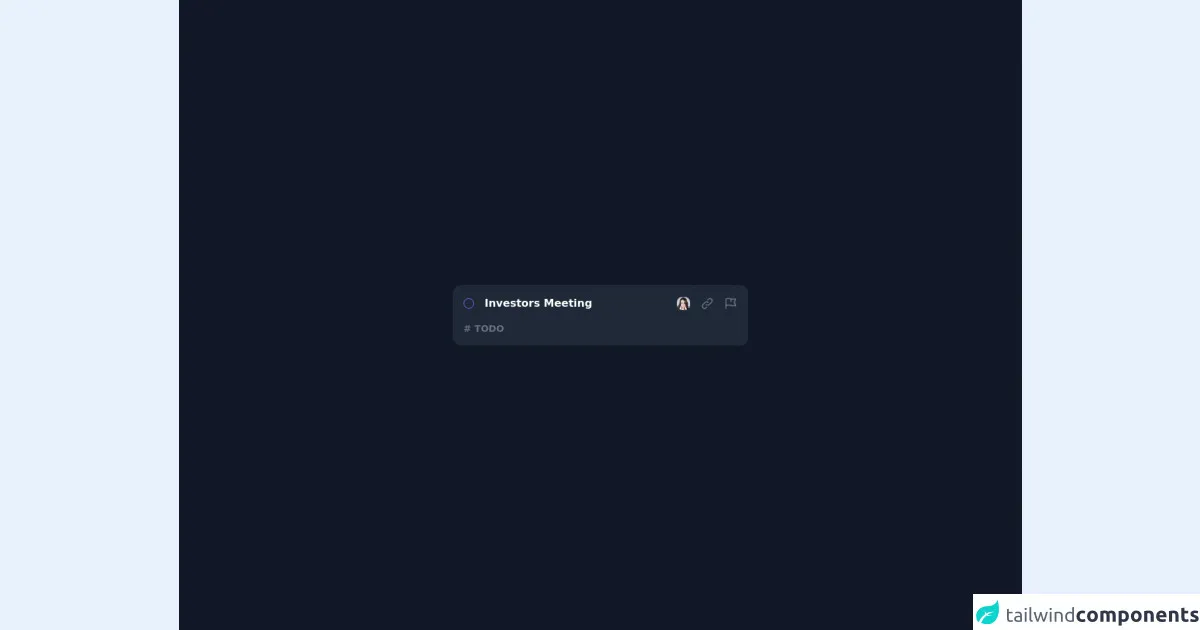
The preview of CardUI Dark ui component
To create a CardUI Dark ui component with Tailwind CSS, you can use the following classes:
<div class="bg-gray-800 text-white rounded-lg p-4">
  <h2 class="text-lg font-bold mb-2">Card Title</h2>
  <p class="text-gray-300">Card description goes here.</p>
</div>
Free download of the CardUI Dark's source code
The source code of CardUI Dark ui component
To create a CardUI Dark ui component with Tailwind CSS, you can use the following classes:
<div class="bg-gray-800 text-white rounded-lg p-4">
  <h2 class="text-lg font-bold mb-2">Card Title</h2>
  <p class="text-gray-300">Card description goes here.</p>
</div>
<div class="bg-gray-900 w-full min-h-screen flex flex-col justify-center items-center p-4">
  <div class="bg-gray-800 text-white w-full max-w-md flex flex-col rounded-xl shadow-lg p-4">
    <div class="flex items-center justify-between">
      <div class="flex items-center space-x-4">
        <div class="rounded-full w-4 h-4 border border-purple-500"></div>
        <div class="text-md font-bold">Investors Meeting</div>
      </div>
      <div class="flex items-center space-x-4">
        <div class="cursor-pointer">
          <img class="w-5 h-5 rounded-lg" src="https://i.pravatar.cc/300" />
        </div>
        <div class="text-gray-500 hover:text-gray-300 cursor-pointer">
          <svg xmlns="http://www.w3.org/2000/svg" class="h-5 w-5" fill="none" viewBox="0 0 24 24" stroke="currentColor">
            <path stroke-linecap="round" stroke-linejoin="round" stroke-width="2" d="M13.828 10.172a4 4 0 00-5.656 0l-4 4a4 4 0 105.656 5.656l1.102-1.101m-.758-4.899a4 4 0 005.656 0l4-4a4 4 0 00-5.656-5.656l-1.1 1.1" />
          </svg>
        </div>
        <div class="text-gray-500 hover:text-gray-300 cursor-pointer">
          <svg xmlns="http://www.w3.org/2000/svg" class="h-5 w-5" fill="none" viewBox="0 0 24 24" stroke="currentColor">
            <path stroke-linecap="round" stroke-linejoin="round" stroke-width="2" d="M3 21v-4m0 0V5a2 2 0 012-2h6.5l1 1H21l-3 6 3 6h-8.5l-1-1H5a2 2 0 00-2 2zm9-13.5V9" />
          </svg>
        </div>
      </div>
    </div>
    <div class="mt-4 text-gray-500 font-bold text-sm">
      # TODO
    </div>
  </div>
</div>
How to create a CardUI Dark with Tailwind CSS?
To create a CardUI Dark ui component with Tailwind CSS, you can follow these steps:
- Create a new HTML file and add the following code:
<!DOCTYPE html>
<html lang="en">
<head>
  <meta charset="UTF-8">
  <title>CardUI Dark with Tailwind CSS</title>
  <link rel="stylesheet" href="https://cdn.jsdelivr.net/npm/[email protected]/dist/tailwind.min.css">
</head>
<body>
  <div class="bg-gray-900 min-h-screen flex items-center justify-center">
    <div class="bg-gray-800 text-white rounded-lg p-4">
      <h2 class="text-lg font-bold mb-2">Card Title</h2>
      <p class="text-gray-300">Card description goes here.</p>
    </div>
  </div>
</body>
</html>
Open the HTML file in your browser to see the CardUI Dark ui component.
Customize the CardUI Dark ui component by modifying the classes. For example, you can change the background color by changing the
bg-gray-800class to another color class, such asbg-blue-800.
Conclusion
In this article, we have learned how to create a CardUI Dark ui component with Tailwind CSS. Tailwind CSS provides pre-defined classes for creating common styles used in a CardUI component, such as a dark background color and light text color. With Tailwind CSS, you can easily create a CardUI Dark ui component without writing custom CSS code.