- Published on
How To Create A CardUI With Tailwind CSS In 5 Easy Steps
- What is Tailwind CSS?
- The description of CardUI ui component
- Why use Tailwind CSS to create a CardUI ui component?
- The preview of CardUI ui component.
- The source code of CardUI ui component.
- How to create a CardUI with Tailwind CSS?
- Step 1: Set up your HTML structure
- Step 2: Add Tailwind CSS classes
- Step 3: Style the image
- Step 4: Style the text content
- Step 5: Style the call-to-action button
- Conclusion
What is Tailwind CSS?
Tailwind CSS is a utility-first CSS framework that allows you to create custom designs without writing any CSS from scratch. It provides a set of pre-defined classes that you can use to style your HTML elements. With Tailwind CSS, you can create responsive and mobile-first designs quickly and easily.
The description of CardUI ui component
CardUI is a popular UI component that is used to display content in a card-like format. It is commonly used in websites and applications to showcase products, services, and other types of content. A CardUI typically consists of an image, title, description, and a call-to-action button.
Why use Tailwind CSS to create a CardUI ui component?
Tailwind CSS provides a set of pre-defined classes that make it easy to create a CardUI without writing any CSS from scratch. It also provides responsive design classes that make it easy to create a CardUI that looks great on all devices.
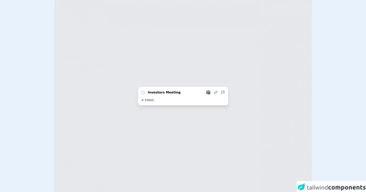
The preview of CardUI ui component.
To create a CardUI with Tailwind CSS, we will use a combination of HTML and CSS classes. The resulting CardUI will look something like this:
Free download of the CardUI's source code
The source code of CardUI ui component.
To create a CardUI with Tailwind CSS, we will use the following HTML and CSS classes:
<div class="bg-gray-200 w-full min-h-screen flex flex-col justify-center items-center p-4">
  <div class="bg-white text-black w-full max-w-md flex flex-col rounded-xl shadow-lg p-4">
    <div class="flex items-center justify-between">
      <div class="flex items-center space-x-4">
        <div class="rounded-full w-4 h-4 border border-purple-500"></div>
        <div class="text-md font-bold">Investors Meeting</div>
      </div>
      <div class="flex items-center space-x-4">
        <div class="cursor-pointer">
          <img class="w-5 h-5 rounded-lg" src="https://i.pravatar.cc/300" />
        </div>
        <div class="text-gray-500 hover:text-gray-300 cursor-pointer">
          <svg xmlns="http://www.w3.org/2000/svg" class="h-5 w-5" fill="none" viewBox="0 0 24 24" stroke="currentColor">
            <path stroke-linecap="round" stroke-linejoin="round" stroke-width="2" d="M13.828 10.172a4 4 0 00-5.656 0l-4 4a4 4 0 105.656 5.656l1.102-1.101m-.758-4.899a4 4 0 005.656 0l4-4a4 4 0 00-5.656-5.656l-1.1 1.1" />
          </svg>
        </div>
        <div class="text-gray-500 hover:text-gray-300 cursor-pointer">
          <svg xmlns="http://www.w3.org/2000/svg" class="h-5 w-5" fill="none" viewBox="0 0 24 24" stroke="currentColor">
            <path stroke-linecap="round" stroke-linejoin="round" stroke-width="2" d="M3 21v-4m0 0V5a2 2 0 012-2h6.5l1 1H21l-3 6 3 6h-8.5l-1-1H5a2 2 0 00-2 2zm9-13.5V9" />
          </svg>
        </div>
      </div>
    </div>
    <div class="mt-4 text-gray-500 font-bold text-sm">
      # TODO
    </div>
  </div>
</div>
How to create a CardUI with Tailwind CSS?
Follow these 5 easy steps to create a CardUI with Tailwind CSS:
Step 1: Set up your HTML structure
To create a CardUI, we first need to set up our HTML structure. We will use a div element to wrap our CardUI content. Inside the div, we will create an img element for the image, a div element for the text content, and a button element for the call-to-action button.
<div class="max-w-sm rounded overflow-hidden shadow-lg">
  <img class="w-full" src="img/card-image.jpg" alt="Card Image">
  <div class="px-6 py-4">
    <div class="font-bold text-xl mb-2">Card Title</div>
    <p class="text-gray-700 text-base">
      Lorem ipsum dolor sit amet, consectetur adipiscing elit. Sed do eiusmod tempor incididunt ut labore et dolore magna aliqua.
    </p>
  </div>
  <div class="px-6 pt-4 pb-2">
    <button class="bg-blue-500 hover:bg-blue-700 text-white font-bold py-2 px-4 rounded">
      Call to Action
    </button>
  </div>
</div>
Step 2: Add Tailwind CSS classes
Now that we have our HTML structure in place, we can start adding Tailwind CSS classes to style our CardUI. We will use the max-w-sm class to set the maximum width of our CardUI, the rounded class to add rounded corners, the overflow-hidden class to hide any content that overflows the CardUI, and the shadow-lg class to add a shadow effect.
<div class="max-w-sm rounded overflow-hidden shadow-lg">
Step 3: Style the image
Next, we will style the image using the w-full class to make it full width and the h-auto class to maintain the aspect ratio of the image.
<img class="w-full h-auto" src="img/card-image.jpg" alt="Card Image">
Step 4: Style the text content
We will use the px-6 class to add horizontal padding to the text content and the py-4 class to add vertical padding. We will also use the font-bold class to make the title bold, the text-xl class to set the font size of the title, the mb-2 class to add bottom margin to the title, and the text-gray-700 class to set the color of the description text.
<div class="px-6 py-4">
  <div class="font-bold text-xl mb-2">Card Title</div>
  <p class="text-gray-700 text-base">
    Lorem ipsum dolor sit amet, consectetur adipiscing elit. Sed do eiusmod tempor incididunt ut labore et dolore magna aliqua.
  </p>
</div>
Step 5: Style the call-to-action button
Finally, we will style the call-to-action button using the px-6 class to add horizontal padding, the pt-4 class to add top padding, the pb-2 class to add bottom padding, the bg-blue-500 class to set the background color, the hover:bg-blue-700 class to set the background color on hover, the text-white class to set the text color, the font-bold class to make the text bold, and the py-2 and px-4 classes to set the padding of the button.
<div class="px-6 pt-4 pb-2">
  <button class="bg-blue-500 hover:bg-blue-700 text-white font-bold py-2 px-4 rounded">
    Call to Action
  </button>
</div>
And that's it! You have successfully created a CardUI with Tailwind CSS.
Conclusion
In this article, we learned how to create a CardUI with Tailwind CSS in 5 easy steps. Tailwind CSS provides a set of pre-defined classes that make it easy to create custom designs without writing any CSS from scratch. By following these steps, you can create a CardUI that looks great on all devices and is easy to maintain.