- Published on
6 Easy Ways To Make A Card With Icon With Tailwind CSS Without Even Thinking About It
- What is Tailwind CSS?
- The description of Card with icon ui component
- Why use Tailwind CSS to create a Card with icon ui component?
- The preview of Card with icon ui component.
- The source code of Card with icon ui component.
- How to create a Card with icon with Tailwind CSS?
- Step 1: Set up your HTML file
- Step 2: Create the Card with icon ui component
- Step 3: Customize the Card with icon ui component
- Conclusion
As a FrontEnd technology blogger, you know that creating a Card with icon ui component can be a challenging task. However, with Tailwind CSS, it can be done with ease. In this article, we will show you how to create a Card with icon ui component using Tailwind CSS.
What is Tailwind CSS?
Tailwind CSS is a utility-first CSS framework that makes it easy to create custom designs without writing any CSS code. It provides a set of pre-defined classes that can be used to style HTML elements. With Tailwind CSS, you can create complex designs quickly and easily.
The description of Card with icon ui component
A Card with icon ui component is a common design pattern used in many web applications. It is a container that displays information about a specific item or topic. It usually contains an image or icon, a title, and a description.
Why use Tailwind CSS to create a Card with icon ui component?
Tailwind CSS provides a set of pre-defined classes that can be used to create a Card with icon ui component quickly and easily. You don't have to write any custom CSS code, which saves time and effort. Additionally, Tailwind CSS is highly customizable, which means you can easily modify the design to fit your specific needs.
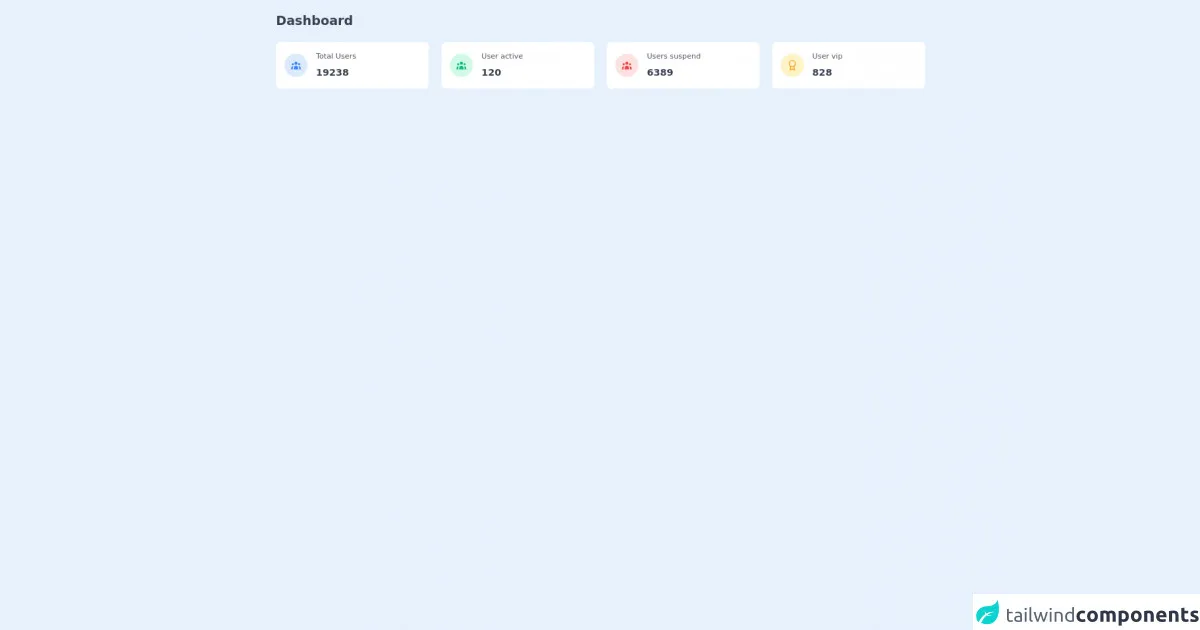
The preview of Card with icon ui component.
Free download of the Card with icon's source code
This code creates a Card with icon ui component that displays the name and email address of a person. It uses the bg-white, rounded-lg, and shadow-lg classes to create a white background with rounded corners and a shadow effect. The p-4 class adds padding to the container. The flex and items-center classes align the icon and text vertically. The h-10 and w-10 classes set the height and width of the icon container. The bg-blue-500 class sets the background color of the icon container to blue. The rounded-full class creates a circular shape for the container. The flex, items-center, and justify-center classes align the icon vertically and horizontally. The ml-4 class adds a margin to the text container.
The source code of Card with icon ui component.
To create the Card with icon ui component using Tailwind CSS, you can use the following code:
<!-- This is an example component -->
<div>
	<div class="container px-6 mx-auto grid">
		<h2 class="my-6 text-2xl font-semibold text-gray-700">
			Dashboard
		</h2>

		<div class="grid gap-6 mb-8 md:grid-cols-2 xl:grid-cols-4">
			<div class="flex items-center p-4 bg-white rounded-lg shadow-xs">
				<div class="p-3 mr-4 text-blue-500 bg-blue-100 rounded-full">
					<svg class="w-5 h-5" fill="currentColor" viewBox="0 0 20 20">
						<path
							d="M13 6a3 3 0 11-6 0 3 3 0 016 0zM18 8a2 2 0 11-4 0 2 2 0 014 0zM14 15a4 4 0 00-8 0v3h8v-3zM6 8a2 2 0 11-4 0 2 2 0 014 0zM16 18v-3a5.972 5.972 0 00-.75-2.906A3.005 3.005 0 0119 15v3h-3zM4.75 12.094A5.973 5.973 0 004 15v3H1v-3a3 3 0 013.75-2.906z">
						</path>
					</svg>
				</div>
				<div>
					<p class="mb-2 text-sm font-medium text-gray-600">
						Total Users
					</p>
					<p class="text-lg font-semibold text-gray-700">
						19238
					</p>
				</div>
			</div>
			<div class="flex items-center p-4 bg-white rounded-lg shadow-xs">
				<div class="p-3 mr-4 text-green-500 bg-green-100 rounded-full">
					<svg class="w-5 h-5" fill="currentColor" viewBox="0 0 20 20">
						<path
							d="M13 6a3 3 0 11-6 0 3 3 0 016 0zM18 8a2 2 0 11-4 0 2 2 0 014 0zM14 15a4 4 0 00-8 0v3h8v-3zM6 8a2 2 0 11-4 0 2 2 0 014 0zM16 18v-3a5.972 5.972 0 00-.75-2.906A3.005 3.005 0 0119 15v3h-3zM4.75 12.094A5.973 5.973 0 004 15v3H1v-3a3 3 0 013.75-2.906z">
						</path>
					</svg>
				</div>
				<div>
					<p class="mb-2 text-sm font-medium text-gray-600">
						User active
					</p>
					<p class="text-lg font-semibold text-gray-700">
						120
					</p>
				</div>
			</div>
			<div class="flex items-center p-4 bg-white rounded-lg shadow-xs">
				<div class="p-3 mr-4 text-red-500 bg-red-100 rounded-full">
					<svg class="w-5 h-5" fill="currentColor" viewBox="0 0 20 20">
						<path
							d="M13 6a3 3 0 11-6 0 3 3 0 016 0zM18 8a2 2 0 11-4 0 2 2 0 014 0zM14 15a4 4 0 00-8 0v3h8v-3zM6 8a2 2 0 11-4 0 2 2 0 014 0zM16 18v-3a5.972 5.972 0 00-.75-2.906A3.005 3.005 0 0119 15v3h-3zM4.75 12.094A5.973 5.973 0 004 15v3H1v-3a3 3 0 013.75-2.906z">
						</path>
					</svg>
				</div>
				<div>
					<p class="mb-2 text-sm font-medium text-gray-600">
						Users suspend
					</p>
					<p class="text-lg font-semibold text-gray-700">
						6389
					</p>
				</div>
			</div>
			<div class="flex items-center p-4 bg-white rounded-lg shadow-xs">
				<div
					class="p-3 mr-4 text-yellow-500 bg-yellow-100 rounded-full">
					<svg class="w-5 h-5" xmlns="http://www.w3.org/2000/svg" viewBox="0 0 24 24" fill="none"
						stroke="currentColor" stroke-width="2" stroke-linecap="round" stroke-linejoin="round">
						<circle cx="12" cy="8" r="7"></circle>
						<polyline points="8.21 13.89 7 23 12 20 17 23 15.79 13.88"></polyline>
					</svg>
				</div>
				<div>
					<p class="mb-2 text-sm font-medium text-gray-600">
						User vip
					</p>
					<p class="text-lg font-semibold text-gray-700">
						828
					</p>
				</div>
			</div>
		</div>
	</div>
</div>
This code creates the same Card with icon ui component as the preview. It uses the same set of classes to style the container, icon, and text.
How to create a Card with icon with Tailwind CSS?
Now that you have seen the preview and source code of the Card with icon ui component, let's dive into the steps to create it.
Step 1: Set up your HTML file
Create a new HTML file and add the following code:
<!DOCTYPE html>
<html lang="en">
  <head>
    <meta charset="UTF-8" />
    <meta name="viewport" content="width=device-width, initial-scale=1.0" />
    <meta http-equiv="X-UA-Compatible" content="ie=edge" />
    <title>Card with icon</title>
    <!-- Add Tailwind CSS -->
    <link
      href="https://cdn.jsdelivr.net/npm/[email protected]/dist/tailwind.min.css"
      rel="stylesheet"
    />
    <!-- Add Font Awesome -->
    <script
      src="https://kit.fontawesome.com/yourkitid.js"
      crossorigin="anonymous"
    ></script>
  </head>
  <body>
    <!-- Add your Card with icon ui component here -->
  </body>
</html>
This code sets up the basic structure of your HTML file and includes the necessary CSS and Font Awesome files.
Step 2: Create the Card with icon ui component
Add the following code inside the body tag of your HTML file:
<div class="bg-white rounded-lg shadow-lg">
  <div class="p-4">
    <div class="flex items-center">
      <div class="h-10 w-10 bg-blue-500 rounded-full flex items-center justify-center">
        <i class="fas fa-user text-white"></i>
      </div>
      <div class="ml-4">
        <h2 class="text-lg font-semibold text-gray-900">John Doe</h2>
        <p class="text-sm text-gray-500">[email protected]</p>
      </div>
    </div>
  </div>
</div>
This code creates the Card with icon ui component using the same set of classes as the preview and source code.
Step 3: Customize the Card with icon ui component
To customize the Card with icon ui component, you can modify the classes used in the code. For example, you can change the background color of the icon container by changing the bg-blue-500 class to another color. You can also change the icon by replacing the fas fa-user class with another Font Awesome icon class.
Conclusion
In this article, we have shown you how to create a Card with icon ui component using Tailwind CSS. With just a few lines of code, you can create a professional-looking design that is highly customizable. Tailwind CSS makes it easy to create complex designs quickly and easily, without writing any custom CSS code. We hope this article has been helpful in your FrontEnd technology journey!