- Published on
Most Effective Ways To Make A Card Login With Tailwind CSS
- What is Tailwind CSS?
- The description of Card Login UI component
- Why use Tailwind CSS to create a Card Login UI component?
- The preview of Card Login UI component
- The source code of Card Login UI component
- How to create a Card Login with Tailwind CSS?
- Step 1: Set up the HTML structure
- Step 2: Style the form with Tailwind CSS
- Step 3: Add interactivity with JavaScript
- Conclusion
In the world of web development, creating a user interface that is both visually appealing and easy to use is crucial. One of the most common UI components is the login form. In this article, we will explore the most effective ways to create a card login UI component using Tailwind CSS.
What is Tailwind CSS?
Tailwind CSS is a utility-first CSS framework that allows developers to easily create custom designs without having to write custom CSS. It provides a wide range of pre-built classes that can be used to style HTML elements.
The description of Card Login UI component
A card login UI component is a login form that is presented in a card-like format. It typically includes fields for the user to input their username and password, as well as a button to submit the form.
Why use Tailwind CSS to create a Card Login UI component?
Tailwind CSS provides a number of benefits when it comes to creating a card login UI component. Firstly, it allows for easy customization of the design, as it provides a wide range of pre-built classes that can be used to style the form. Secondly, it is lightweight and fast, which is important for ensuring that the form loads quickly for users. Finally, it is easy to learn and use, even for those who are new to web development.
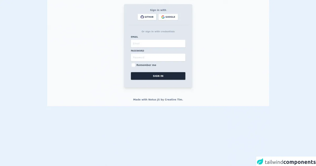
The preview of Card Login UI component
To create a card login UI component with Tailwind CSS, we will use a combination of HTML and CSS. The resulting component will look something like this:
Free download of the Card Login's source code
The source code of Card Login UI component
To create the card login UI component, we will use the following HTML and CSS code:
<link rel="stylesheet" href="https://demos.creative-tim.com/notus-js/assets/styles/tailwind.css">
<link rel="stylesheet" href="https://demos.creative-tim.com/notus-js/assets/vendor/@fortawesome/fontawesome-free/css/all.min.css">


<section class="bg-blueGray-50">
  <div class="w-full lg:w-4/12 px-4 mx-auto pt-6">
    <div class="relative flex flex-col min-w-0 break-words w-full mb-6 shadow-lg rounded-lg bg-blueGray-200 border-0">
      <div class="rounded-t mb-0 px-6 py-6">
        <div class="text-center mb-3">
          <h6 class="text-blueGray-500 text-sm font-bold">
            Sign in with
          </h6>
        </div>
        <div class="btn-wrapper text-center">
          <button class="bg-white active:bg-blueGray-50 text-blueGray-700 font-normal px-4 py-2 rounded outline-none focus:outline-none mr-2 mb-1 uppercase shadow hover:shadow-md inline-flex items-center font-bold text-xs ease-linear transition-all duration-150" type="button">
            <img alt="..." class="w-5 mr-1" src="https://demos.creative-tim.com/notus-js/assets/img/github.svg">Github</button>
          <button class="bg-white active:bg-blueGray-50 text-blueGray-700 font-normal px-4 py-2 rounded outline-none focus:outline-none mr-1 mb-1 uppercase shadow hover:shadow-md inline-flex items-center font-bold text-xs ease-linear transition-all duration-150" type="button">
            <img alt="..." class="w-5 mr-1" src="https://demos.creative-tim.com/notus-js/assets/img/google.svg">Google </button>

        </div>
        <hr class="mt-6 border-b-1 border-blueGray-300">
      </div>
      <div class="flex-auto px-4 lg:px-10 py-10 pt-0">
        <div class="text-blueGray-400 text-center mb-3 font-bold">
          <small>Or sign in with credentials</small>
        </div>
        <form>
          <div class="relative w-full mb-3">
            <label class="block uppercase text-blueGray-600 text-xs font-bold mb-2" for="grid-password">Email</label><input type="email" class="border-0 px-3 py-3 placeholder-blueGray-300 text-blueGray-600 bg-white rounded text-sm shadow focus:outline-none focus:ring w-full ease-linear transition-all duration-150" placeholder="Email">
          </div>
          <div class="relative w-full mb-3">
            <label class="block uppercase text-blueGray-600 text-xs font-bold mb-2" for="grid-password">Password</label><input type="password" class="border-0 px-3 py-3 placeholder-blueGray-300 text-blueGray-600 bg-white rounded text-sm shadow focus:outline-none focus:ring w-full ease-linear transition-all duration-150" placeholder="Password">
          </div>
          <div>
            <label class="inline-flex items-center cursor-pointer"><input id="customCheckLogin" type="checkbox" class="form-checkbox border-0 rounded text-blueGray-700 ml-1 w-5 h-5 ease-linear transition-all duration-150"><span class="ml-2 text-sm font-semibold text-blueGray-600">Remember me</span></label>
          </div>
          <div class="text-center mt-6">
            <button class="bg-blueGray-800 text-white active:bg-blueGray-600 text-sm font-bold uppercase px-6 py-3 rounded shadow hover:shadow-lg outline-none focus:outline-none mr-1 mb-1 w-full ease-linear transition-all duration-150" type="button"> Sign In </button>
          </div>
        </form>
      </div>
    </div>
  </div>
  <footer class="relative pt-8 pb-6 mt-2">
    <div class="container mx-auto px-2">
      <div class="flex flex-wrap items-center md:justify-between justify-center">
        <div class="w-full md:w-6/12 px-4 mx-auto text-center">
          <div class="text-sm text-blueGray-500 font-semibold py-1">
            Made with <a href="https://www.creative-tim.com/product/notus-js" class="text-blueGray-500 hover:text-gray-800" target="_blank">Notus JS</a> by <a href="https://www.creative-tim.com" class="text-blueGray-500 hover:text-blueGray-800" target="_blank"> Creative Tim</a>.
          </div>
        </div>
      </div>
    </div>
  </footer>
</section>
How to create a Card Login with Tailwind CSS?
Now that we have an understanding of why Tailwind CSS is a great choice for creating a card login UI component, let's dive into the steps required to create one.
Step 1: Set up the HTML structure
The first step is to create the HTML structure for the card login form. This will include a container div, a form element, and input fields for the username and password.
<div class="bg-white rounded-lg shadow-md p-6 w-80">
  <form>
    <div class="mb-4">
      <label class="block text-gray-700 font-bold mb-2" for="username">
        Username
      </label>
      <input
        class="shadow appearance-none border rounded w-full py-2 px-3 text-gray-700 leading-tight focus:outline-none focus:shadow-outline"
        id="username"
        type="text"
        placeholder="Username"
      />
    </div>
    <div class="mb-6">
      <label class="block text-gray-700 font-bold mb-2" for="password">
        Password
      </label>
      <input
        class="shadow appearance-none border rounded w-full py-2 px-3 text-gray-700 leading-tight focus:outline-none focus:shadow-outline"
        id="password"
        type="password"
        placeholder="Password"
      />
    </div>
    <div class="flex items-center justify-between">
      <button
        class="bg-blue-500 hover:bg-blue-700 text-white font-bold py-2 px-4 rounded focus:outline-none focus:shadow-outline"
        type="button"
      >
        Sign In
      </button>
    </div>
  </form>
</div>
Step 2: Style the form with Tailwind CSS
Next, we will use Tailwind CSS to style the form. This will involve adding classes to the HTML elements to change their appearance.
<div class="bg-white rounded-lg shadow-md p-6 w-80">
  <form>
    <div class="mb-4">
      <label class="block text-gray-700 font-bold mb-2" for="username">
        Username
      </label>
      <input
        class="shadow appearance-none border rounded w-full py-2 px-3 text-gray-700 leading-tight focus:outline-none focus:shadow-outline"
        id="username"
        type="text"
        placeholder="Username"
      />
    </div>
    <div class="mb-6">
      <label class="block text-gray-700 font-bold mb-2" for="password">
        Password
      </label>
      <input
        class="shadow appearance-none border rounded w-full py-2 px-3 text-gray-700 leading-tight focus:outline-none focus:shadow-outline"
        id="password"
        type="password"
        placeholder="Password"
      />
    </div>
    <div class="flex items-center justify-between">
      <button
        class="bg-blue-500 hover:bg-blue-700 text-white font-bold py-2 px-4 rounded focus:outline-none focus:shadow-outline"
        type="button"
      >
        Sign In
      </button>
    </div>
  </form>
</div>
Step 3: Add interactivity with JavaScript
Finally, we can add interactivity to the form using JavaScript. This will involve adding event listeners to the form elements to handle user input and submission.
<div class="bg-white rounded-lg shadow-md p-6 w-80">
  <form>
    <div class="mb-4">
      <label class="block text-gray-700 font-bold mb-2" for="username">
        Username
      </label>
      <input
        class="shadow appearance-none border rounded w-full py-2 px-3 text-gray-700 leading-tight focus:outline-none focus:shadow-outline"
        id="username"
        type="text"
        placeholder="Username"
      />
    </div>
    <div class="mb-6">
      <label class="block text-gray-700 font-bold mb-2" for="password">
        Password
      </label>
      <input
        class="shadow appearance-none border rounded w-full py-2 px-3 text-gray-700 leading-tight focus:outline-none focus:shadow-outline"
        id="password"
        type="password"
        placeholder="Password"
      />
    </div>
    <div class="flex items-center justify-between">
      <button
        class="bg-blue-500 hover:bg-blue-700 text-white font-bold py-2 px-4 rounded focus:outline-none focus:shadow-outline"
        type="button"
        onclick="submitForm()"
      >
        Sign In
      </button>
    </div>
  </form>
</div>

<script>
  function submitForm() {
    const username = document.getElementById("username").value;
    const password = document.getElementById("password").value;
    // Submit form data to server
  }
</script>
Conclusion
In conclusion, creating a card login UI component with Tailwind CSS is a simple and effective way to create a visually appealing and easy-to-use login form. By following the steps outlined in this article, you can create a custom login form that is both functional and stylish.