- Published on
Practical Guide: Build A Card Paragaph With Tailwind CSS
- What is Tailwind CSS?
- The description of Card Paragaph ui component
- Why use Tailwind CSS to create a Card Paragaph ui component?
- The preview of Card Paragaph ui component
- The source code of Card Paragaph ui component
- How to create a Card Paragaph with Tailwind CSS?
- Step 1: Set up the HTML structure
- Step 2: Style the Card Paragaph with Tailwind CSS classes
- Step 3: Customize the Card Paragaph with Tailwind CSS
- Step 4: Add responsiveness to the Card Paragaph with Tailwind CSS
- Conclusion
What is Tailwind CSS?
Tailwind CSS is a utility-first CSS framework that allows developers to easily create custom designs without writing any CSS code. It provides a set of pre-defined classes that can be used to style HTML elements. Tailwind CSS is gaining popularity among developers because of its flexibility and ease of use.
The description of Card Paragaph ui component
A Card Paragaph is a UI component that is commonly used to display content in a card-like format. It typically contains an image, a title, a description, and a call-to-action button. The Card Paragaph component is widely used in web development because it provides a clean and organized way to present content.
Why use Tailwind CSS to create a Card Paragaph ui component?
Tailwind CSS provides a set of pre-defined classes that can be used to create a Card Paragaph UI component quickly and easily. It eliminates the need to write custom CSS code, which saves time and effort. Additionally, Tailwind CSS allows developers to create responsive designs without writing media queries.
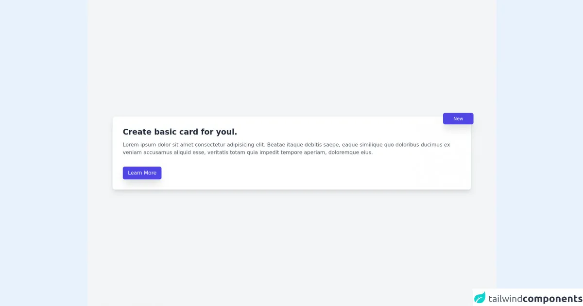
The preview of Card Paragaph ui component
To create a Card Paragaph UI component with Tailwind CSS, we will use a combination of classes to style the HTML elements. Here is a preview of what the final Card Paragaph UI component will look like:
Free download of the Card Paragaph's source code
The source code of Card Paragaph ui component
To create a Card Paragaph UI component with Tailwind CSS, we will use a combination of classes to style the HTML elements. Here is the source code for the Card Paragaph UI component:
<div class="min-h-screen bg-gray-100 flex items-center justify-center">
  <div class="containter mx-auto px-20">
    <div class="bg-white p-8 rounded-lg shadow-lg relative hover:shadow-2xl transition duration-500">
      <h1 class="text-2xl text-gray-800 font-semibold mb-3">Create basic card for youl.</h1>
      <p class="text-gray-600 leading-6 tracking-normal">Lorem ipsum dolor sit amet consectetur adipisicing elit. Beatae itaque debitis saepe, eaque similique quo doloribus ducimus ex veniam accusamus aliquid esse, veritatis totam quia impedit tempore aperiam, doloremque eius.</p>
  <button class="py-2 px-4 mt-8 bg-indigo-600 text-white rounded-md shadow-xl">Learn  More</button>
      <div>
        <span class="absolute py-2 px-8 text-sm text-white top-0 right-0 bg-indigo-600 rounded-md transform translate-x-2 -translate-y-3 shadow-xl">New</span>
      </div>
    </div>
  </div>
</div>
How to create a Card Paragaph with Tailwind CSS?
To create a Card Paragaph UI component with Tailwind CSS, follow these steps:
Step 1: Set up the HTML structure
First, we need to set up the HTML structure for the Card Paragaph UI component. Here is an example:
<div class="bg-white rounded-lg shadow-lg overflow-hidden">
  <img class="w-full h-48 object-cover" src="https://via.placeholder.com/640x360.png" alt="Card image">
  <div class="p-6">
    <h2 class="text-xl font-bold mb-2">Card title</h2>
    <p class="text-gray-700 leading-relaxed">Lorem ipsum dolor sit amet, consectetur adipiscing elit. Sed do eiusmod tempor incididunt ut labore et dolore magna aliqua.</p>
    <a href="#" class="inline-block bg-blue-500 hover:bg-blue-700 text-white font-bold py-2 px-4 rounded">Read more</a>
  </div>
</div>
In this example, we have a div element with a set of classes that define the background color, border radius, and shadow. Inside the div element, we have an img element that displays the card image. We also have a div element that contains the card title, description, and call-to-action button.
Step 2: Style the Card Paragaph with Tailwind CSS classes
Next, we need to style the Card Paragaph UI component using Tailwind CSS classes. Here is an example:
<div class="bg-white rounded-lg shadow-lg overflow-hidden">
  <img class="w-full h-48 object-cover" src="https://via.placeholder.com/640x360.png" alt="Card image">
  <div class="p-6">
    <h2 class="text-xl font-bold mb-2">Card title</h2>
    <p class="text-gray-700 leading-relaxed">Lorem ipsum dolor sit amet, consectetur adipiscing elit. Sed do eiusmod tempor incididunt ut labore et dolore magna aliqua.</p>
    <a href="#" class="inline-block bg-blue-500 hover:bg-blue-700 text-white font-bold py-2 px-4 rounded">Read more</a>
  </div>
</div>
In this example, we have used the following Tailwind CSS classes to style the Card Paragaph UI component:
bg-white: Sets the background color to white.rounded-lg: Sets the border radius to a large value.shadow-lg: Adds a shadow effect.w-full: Sets the width of the image to 100%.h-48: Sets the height of the image to 48 pixels.object-cover: Sets the image to cover the entire container.p-6: Adds padding to the content container.text-xl: Sets the font size to extra large.font-bold: Sets the font weight to bold.mb-2: Adds margin to the bottom of the title.text-gray-700: Sets the text color to gray.leading-relaxed: Sets the line height to a relaxed value.inline-block: Sets the display property to inline-block.bg-blue-500: Sets the background color of the button to blue.hover:bg-blue-700: Sets the background color of the button to a darker shade of blue on hover.text-white: Sets the text color of the button to white.py-2: Adds padding to the top and bottom of the button.px-4: Adds padding to the left and right of the button.rounded: Sets the border radius of the button.
Step 3: Customize the Card Paragaph with Tailwind CSS
Tailwind CSS allows developers to customize the pre-defined classes by adding their own values. For example, we can change the background color of the card by adding a custom color class:
<div class="bg-custom-color rounded-lg shadow-lg overflow-hidden">
  <img class="w-full h-48 object-cover" src="https://via.placeholder.com/640x360.png" alt="Card image">
  <div class="p-6">
    <h2 class="text-xl font-bold mb-2">Card title</h2>
    <p class="text-gray-700 leading-relaxed">Lorem ipsum dolor sit amet, consectetur adipiscing elit. Sed do eiusmod tempor incididunt ut labore et dolore magna aliqua.</p>
    <a href="#" class="inline-block bg-blue-500 hover:bg-blue-700 text-white font-bold py-2 px-4 rounded">Read more</a>
  </div>
</div>
In this example, we have added a custom class bg-custom-color to set the background color of the card to a custom color.
Step 4: Add responsiveness to the Card Paragaph with Tailwind CSS
Tailwind CSS provides a set of pre-defined classes that can be used to create responsive designs without writing media queries. For example, we can use the sm: prefix to apply styles only on small screens:
<div class="bg-white rounded-lg shadow-lg overflow-hidden">
  <img class="w-full h-48 object-cover" src="https://via.placeholder.com/640x360.png" alt="Card image">
  <div class="p-6">
    <h2 class="text-xl font-bold mb-2">Card title</h2>
    <p class="text-gray-700 leading-relaxed">Lorem ipsum dolor sit amet, consectetur adipiscing elit. Sed do eiusmod tempor incididunt ut labore et dolore magna aliqua.</p>
    <a href="#" class="inline-block bg-blue-500 hover:bg-blue-700 text-white font-bold py-2 px-4 rounded">Read more</a>
  </div>
</div>
In this example, we have not added any responsive classes. However, we can use the sm: prefix to apply styles only on small screens:
<div class="bg-white rounded-lg shadow-lg overflow-hidden">
  <img class="w-full h-48 object-cover" src="https://via.placeholder.com/640x360.png" alt="Card image">
  <div class="p-6">
    <h2 class="text-xl font-bold mb-2 sm:mb-4">Card title</h2>
    <p class="text-gray-700 leading-relaxed">Lorem ipsum dolor sit amet, consectetur adipiscing elit. Sed do eiusmod tempor incididunt ut labore et dolore magna aliqua.</p>
    <a href="#" class="inline-block bg-blue-500 hover:bg-blue-700 text-white font-bold py-2 px-4 rounded">Read more</a>
  </div>
</div>
In this example, we have added the sm:mb-4 class to add extra margin to the bottom of the title on small screens.
Conclusion
In this article, we have learned how to create a Card Paragaph UI component with Tailwind CSS. We have seen how Tailwind CSS provides a set of pre-defined classes that can be used to create custom designs without writing any CSS code. We have also seen how to customize the pre-defined classes and add responsiveness to the Card Paragaph UI component. With Tailwind CSS, developers can create beautiful and responsive UI components quickly and easily.