- Published on
Ultimate Guide: Make A Card Glass Effect With Tailwind CSS
- What is Tailwind CSS?
- The description of Card Glass Effect ui component
- Why use Tailwind CSS to create a Card Glass Effect ui component?
- The preview of Card Glass Effect ui component
- The source code of Card Glass Effect ui component
- How to create a Card Glass Effect with Tailwind CSS?
- Conclusion
As a FrontEnd technology blogger, it's important to stay up-to-date with the latest trends and techniques in web development. One such trend is the Card Glass Effect, which has become increasingly popular in recent years. In this article, we'll show you how to create a Card Glass Effect using Tailwind CSS.
What is Tailwind CSS?
Tailwind CSS is a utility-first CSS framework that makes it easy to create custom designs without having to write a lot of CSS code. It provides a set of pre-defined classes that you can use to style your HTML elements, and it's highly customizable, so you can create your own classes to suit your needs.
The description of Card Glass Effect ui component
The Card Glass Effect is a UI component that gives the appearance of a card floating above the background, with a frosted glass effect. It's a popular design trend that's used in a variety of applications, from mobile apps to web interfaces.
Why use Tailwind CSS to create a Card Glass Effect ui component?
Tailwind CSS is an excellent choice for creating a Card Glass Effect UI component because it provides a set of pre-defined classes that make it easy to create the effect without having to write a lot of custom CSS code. Additionally, Tailwind CSS is highly customizable, so you can tweak the design to suit your needs.
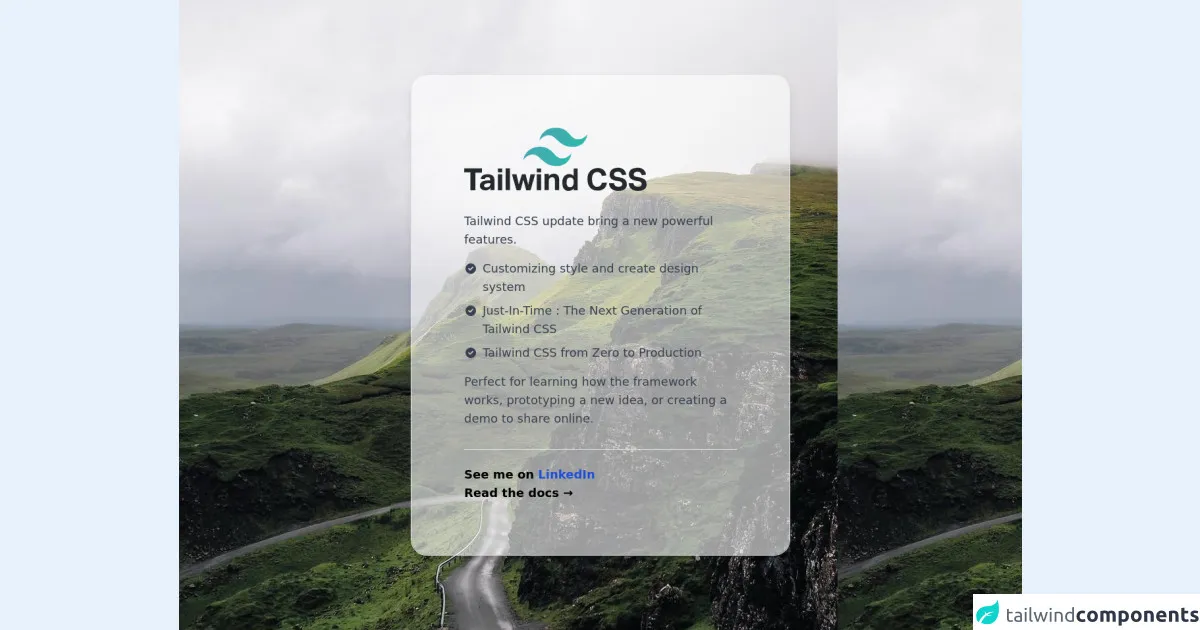
The preview of Card Glass Effect ui component
To create a Card Glass Effect UI component with Tailwind CSS, you'll need to use a combination of CSS properties and classes. Here's a preview of what the end result will look like:
Free download of the Card Glass Effect's source code
The source code of Card Glass Effect ui component
To create the Card Glass Effect UI component, you'll need to use a combination of CSS properties and Tailwind CSS classes. Here's the source code:
<div class="min-h-screen bg-gray-100 py-6 flex flex-col justify-center sm:py-12" style="background-image: url('https://picsum.photos/id/1018/1000')">
<div class="relative py-3 sm:max-w-xl sm:mx-auto">
<div class="relative px-4 py-10 bg-white shadow-lg sm:rounded-3xl sm:p-20 bg-clip-padding bg-opacity-60 border border-gray-200" style="backdrop-filter: blur(20px);">
<div class="max-w-md mx-auto">
<div>
<img src="https://cdn.worldvectorlogo.com/logos/tailwind-css-1.svg" class="h-16 sm:h-24" />
</div>
<div class="divide-y divide-gray-200">
<div class="py-8 text-base leading-6 space-y-4 text-gray-700 sm:text-lg sm:leading-7">
<p>Tailwind CSS update bring a new powerful features.</p>
<ul class="list-disc space-y-2">
<li class="flex items-start">
<span class="h-6 flex items-center sm:h-7">
<svg class="flex-shrink-0 h-5 w-5 text-cyan-500" viewBox="0 0 20 20" fill="currentColor">
<path fill-rule="evenodd" d="M10 18a8 8 0 100-16 8 8 0 000 16zm3.707-9.293a1 1 0 00-1.414-1.414L9 10.586 7.707 9.293a1 1 0 00-1.414 1.414l2 2a1 1 0 001.414 0l4-4z" clip-rule="evenodd" />
</svg>
</span>
<p class="ml-2">
Customizing style and create design system
</p>
</li>
<li class="flex items-start">
<span class="h-6 flex items-center sm:h-7">
<svg class="flex-shrink-0 h-5 w-5 text-cyan-500" viewBox="0 0 20 20" fill="currentColor">
<path fill-rule="evenodd" d="M10 18a8 8 0 100-16 8 8 0 000 16zm3.707-9.293a1 1 0 00-1.414-1.414L9 10.586 7.707 9.293a1 1 0 00-1.414 1.414l2 2a1 1 0 001.414 0l4-4z" clip-rule="evenodd" />
</svg>
</span>
<p class="ml-2">
Just-In-Time : The Next Generation of Tailwind CSS
</p>
</li>
<li class="flex items-start">
<span class="h-6 flex items-center sm:h-7">
<svg class="flex-shrink-0 h-5 w-5 text-cyan-500" viewBox="0 0 20 20" fill="currentColor">
<path fill-rule="evenodd" d="M10 18a8 8 0 100-16 8 8 0 000 16zm3.707-9.293a1 1 0 00-1.414-1.414L9 10.586 7.707 9.293a1 1 0 00-1.414 1.414l2 2a1 1 0 001.414 0l4-4z" clip-rule="evenodd" />
</svg>
</span>
<p class="ml-2">Tailwind CSS from Zero to Production</p>
</li>
</ul>
<p>Perfect for learning how the framework works, prototyping a new idea, or creating a demo to share online.</p>
</div>
<div class="pt-6 text-base leading-6 font-bold sm:text-lg sm:leading-7">
<p>See me on <a class="font-bold text-blue-700" href="https://www.linkedin.com/in/ferdianar/"> LinkedIn </a></p>
<p>
<a href="https://tailwindcss.com/docs" class="text-cyan-600 hover:text-cyan-700"> Read the docs → </a>
</p>
</div>
</div>
</div>
</div>
</div>
</div>
How to create a Card Glass Effect with Tailwind CSS?
To create a Card Glass Effect with Tailwind CSS, you'll need to follow these steps:
- Create a container element for the card.
- Apply the
bg-whiteandshadow-lgclasses to the container element to give it a white background and a shadow effect. - Apply the
rounded-lgclass to the container element to give it rounded corners. - Apply the
relativeclass to the container element to make it a positioned element. - Create a child element for the card content.
- Apply the
absoluteclass to the child element to make it absolutely positioned within the container element. - Apply the
inset-0class to the child element to make it fill the entire container element. - Apply the
bg-whiteandopacity-25classes to the child element to give it a frosted glass effect. - Apply the
p-4class to the child element to add padding to the content.
Here's the complete code:
<div class="bg-white shadow-lg rounded-lg relative">
  <div class="absolute inset-0 bg-white opacity-25"></div>
  <div class="p-4 absolute inset-0">
    <!-- Card content here -->
  </div>
</div>
You can customize the Card Glass Effect by tweaking the CSS properties or creating your own Tailwind CSS classes.
Conclusion
The Card Glass Effect is a popular design trend that can add a touch of elegance to your UI components. With Tailwind CSS, it's easy to create the effect without having to write a lot of custom CSS code. By following the steps outlined in this article, you'll be able to create your own Card Glass Effect UI component in no time.