- Published on
6 Easy Ways To Create A Card With Tailwind CSS Without Even Thinking About It
- What is Tailwind CSS?
- The description of Card UI component
- Why use Tailwind CSS to create a Card UI component?
- The preview of Card UI component
- The source code of Card UI component
- How to create a Card with Tailwind CSS?
- Step 1: Set up your HTML
- Step 2: Add Tailwind CSS classes
- Step 3: Customize the design
- Conclusion
If you are a front-end developer, you may have heard of Tailwind CSS. It is a utility-first CSS framework that helps you quickly create custom designs without writing any CSS. In this article, we will show you how to create a card UI component using Tailwind CSS.
What is Tailwind CSS?
Tailwind CSS is a utility-first CSS framework that provides a set of pre-designed CSS classes that you can use to create custom designs. It is different from other CSS frameworks like Bootstrap or Foundation, which provide pre-designed components that you can use in your projects. With Tailwind CSS, you have complete control over the design of your website or application, and you can create custom designs without writing any CSS.
The description of Card UI component
A card is a UI component that is commonly used in web and mobile applications. It is a container that holds information, such as an image, title, and description. Cards are used to display content in a visually appealing way and are often used in e-commerce websites, social media platforms, and news websites.
Why use Tailwind CSS to create a Card UI component?
Tailwind CSS provides a set of pre-designed CSS classes that you can use to create a card UI component quickly. You don't need to write any CSS, and you can customize the design of your card easily by adding or removing classes. Tailwind CSS also provides responsive design classes that allow you to create cards that look great on any device.
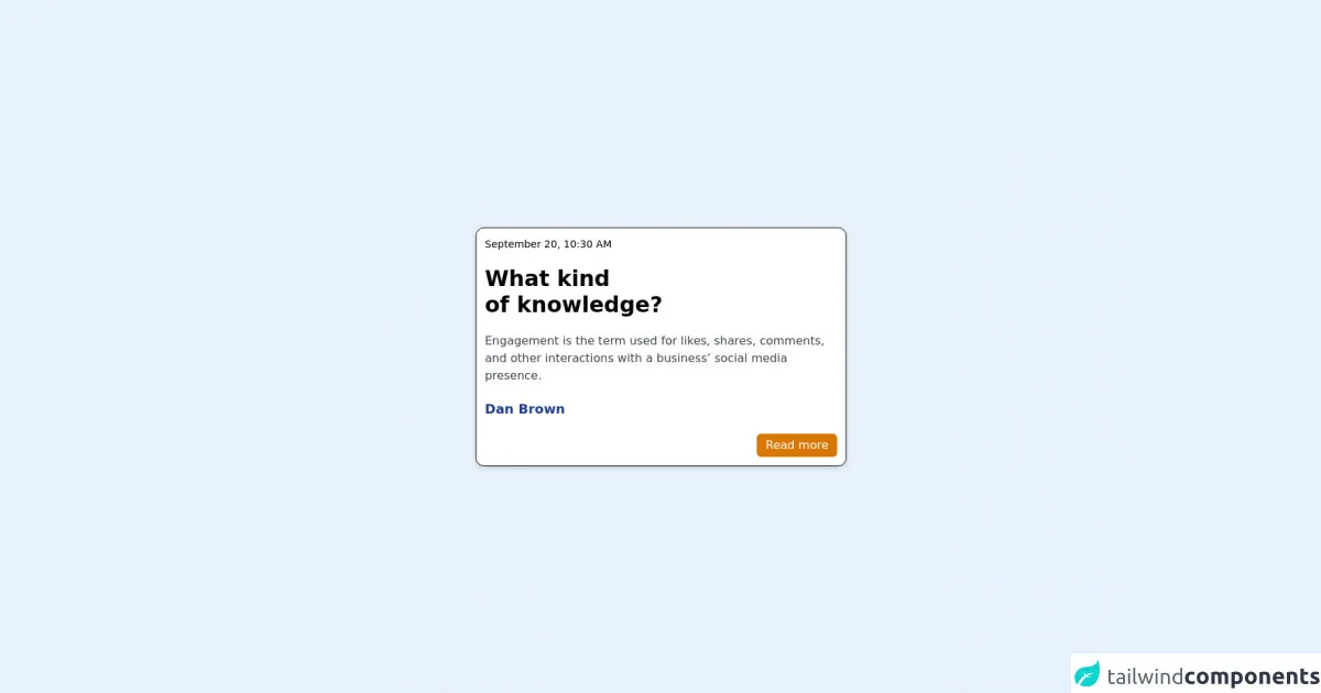
The preview of Card UI component
Creating a card UI component with Tailwind CSS is easy. Here's a preview of what our card will look like:
Free download of the Card's source code
The source code of Card UI component
To create a card UI component with Tailwind CSS, you need to use a combination of HTML and CSS classes. Here's the source code for our card:
<main class="w-full flex justify-center">
    <div class="flex flex-col md:w-2/5 p-3 space-y-5 rounded-xl border border-black bg-white shadow-md">
        <section class="text-sm font-thin text-orange-400">
            September 20, 10:30 AM
        </section>
        <section class="text-3xl font-bold">
            What kind <br/>of knowledge?
        </section>
        <section class="font-normal text-md text-gray-700">
            Engagement is the term used for likes, shares, comments, and other interactions with a business’ social media presence.
        </section>
        <section class="font-bold text-lg text-blue-900">
            Dan Brown
        </section>
        <section class="flex justify-end">
            <button type="button" class="bg-yellow-600 text-white px-3 py-1 rounded-md">Read more</button>
        </section>
    </div>
</main>
How to create a Card with Tailwind CSS?
Now that we've seen what our card will look like and what the source code looks like, let's dive into how to create a card UI component with Tailwind CSS.
Step 1: Set up your HTML
The first step is to set up your HTML. Here's the HTML code for our card:
<div class="max-w-sm rounded overflow-hidden shadow-lg">
  <img class="w-full" src="/img/card-image.jpg" alt="Sunset in the mountains">
  <div class="px-6 py-4">
    <div class="font-bold text-xl mb-2">The Coldest Sunset</div>
    <p class="text-gray-700 text-base">
      Lorem ipsum dolor sit amet, consectetur adipisicing elit. Voluptatibus quia, nulla! Maiores et perferendis eaque, exercitationem praesentium nihil.
    </p>
  </div>
  <div class="px-6 py-4">
    <span class="inline-block bg-gray-200 rounded-full px-3 py-1 text-sm font-semibold text-gray-700 mr-2">#photography</span>
    <span class="inline-block bg-gray-200 rounded-full px-3 py-1 text-sm font-semibold text-gray-700 mr-2">#travel</span>
    <span class="inline-block bg-gray-200 rounded-full px-3 py-1 text-sm font-semibold text-gray-700">#winter</span>
  </div>
</div>
In this code, we have a div element that has a set of CSS classes that define the size, shape, and shadow of the card. Inside this div, we have an img element that displays the image for the card. We also have two div elements that contain the title, description, and tags for the card.
Step 2: Add Tailwind CSS classes
The next step is to add Tailwind CSS classes to our HTML. Here's the updated HTML code with Tailwind CSS classes:
<div class="max-w-sm rounded overflow-hidden shadow-lg">
  <img class="w-full" src="/img/card-image.jpg" alt="Sunset in the mountains">
  <div class="px-6 py-4">
    <div class="font-bold text-xl mb-2">The Coldest Sunset</div>
    <p class="text-gray-700 text-base">
      Lorem ipsum dolor sit amet, consectetur adipisicing elit. Voluptatibus quia, nulla! Maiores et perferendis eaque, exercitationem praesentium nihil.
    </p>
  </div>
  <div class="px-6 py-4">
    <span class="inline-block bg-gray-200 rounded-full px-3 py-1 text-sm font-semibold text-gray-700 mr-2">#photography</span>
    <span class="inline-block bg-gray-200 rounded-full px-3 py-1 text-sm font-semibold text-gray-700 mr-2">#travel</span>
    <span class="inline-block bg-gray-200 rounded-full px-3 py-1 text-sm font-semibold text-gray-700">#winter</span>
  </div>
</div>
In this code, we have added Tailwind CSS classes to our HTML elements. For example, we have added the max-w-sm class to the outer div element, which sets the maximum width of the card to sm (small) size. We have also added classes like rounded, overflow-hidden, and shadow-lg to give the card a rounded shape, hide any overflow, and add a shadow effect.
Step 3: Customize the design
The final step is to customize the design of our card by adding or removing Tailwind CSS classes. For example, we can change the color of the tags by adding the bg-blue-500 class to each span element:
<div class="max-w-sm rounded overflow-hidden shadow-lg">
  <img class="w-full" src="/img/card-image.jpg" alt="Sunset in the mountains">
  <div class="px-6 py-4">
    <div class="font-bold text-xl mb-2">The Coldest Sunset</div>
    <p class="text-gray-700 text-base">
      Lorem ipsum dolor sit amet, consectetur adipisicing elit. Voluptatibus quia, nulla! Maiores et perferendis eaque, exercitationem praesentium nihil.
    </p>
  </div>
  <div class="px-6 py-4">
    <span class="inline-block bg-blue-500 rounded-full px-3 py-1 text-sm font-semibold text-white mr-2">#photography</span>
    <span class="inline-block bg-blue-500 rounded-full px-3 py-1 text-sm font-semibold text-white mr-2">#travel</span>
    <span class="inline-block bg-blue-500 rounded-full px-3 py-1 text-sm font-semibold text-white">#winter</span>
  </div>
</div>
In this code, we have added the bg-blue-500 class to each span element, which changes the background color to blue with a shade of 500. We have also changed the text color to white by adding the text-white class.
Conclusion
Creating a card UI component with Tailwind CSS is easy and requires no CSS knowledge. With Tailwind CSS, you can quickly create custom designs and customize them easily by adding or removing classes. We hope this article has helped you create a card UI component with Tailwind CSS.