- Published on
Best Ways To Make A Card With Tailwind CSS
- What is Tailwind CSS?
- The description of Card ui component
- Why use Tailwind CSS to create a Card ui component?
- The preview of Card ui component
- The source code of Card ui component
- How to create a Card with Tailwind CSS?
- Step 1: Create a container
- Step 2: Add content to the card
- Step 3: Customize the card
- Conclusion
What is Tailwind CSS?
Tailwind CSS is a utility-first CSS framework that offers a set of pre-defined classes to style your HTML elements. It is a highly customizable framework that allows you to create unique designs without writing any custom CSS code. With Tailwind CSS, you can easily create responsive and mobile-friendly layouts, typography, and UI components.
The description of Card ui component
A card is a UI component that is widely used in web development to display information in a structured and organized way. It is a container that holds a piece of content, such as an image, text, or a combination of both. Cards are commonly used in e-commerce websites, social media platforms, and news websites to showcase products, posts, and articles.
Why use Tailwind CSS to create a Card ui component?
Tailwind CSS offers a set of pre-defined classes that can be used to create a card UI component quickly and efficiently. With Tailwind CSS, you don't need to write any custom CSS code to style your card component. You can use pre-defined classes to style your card's background color, border, padding, margin, and other properties.
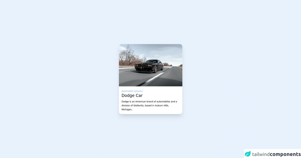
The preview of Card ui component
To create a card UI component with Tailwind CSS, you can use the following classes:
<div class="bg-white rounded-lg shadow-md p-6">
  <!-- Card content goes here -->
</div>
Free download of the Card's source code
The source code of Card ui component
To create a card UI component with Tailwind CSS, you can use the following classes:
<div class="bg-white rounded-lg shadow-md p-6">
  <!-- Card content goes here -->
</div>
<!-- background -->
<div class="relative flex min-h-screen flex-col justify-center bg-gradient-to-r from-rose-100 to-teal-100">
  <!-- card -->
  <div class="mx-auto flex w-96 flex-col justify-center bg-white rounded-2xl shadow-xl shadow-slate-300/60">
    <!-- img -->
    <img class="aspect-video w-96 rounded-t-2xl object-cover object-center" src="https://images.pexels.com/photos/3311574/pexels-photo-3311574.jpeg?auto=compress&cs=tinysrgb&w=1260&h=750&dpr=1" />
    <!-- text information -->
    <div class="p-4">
      <small class="text-blue-400 text-xs">Automobile company</small>
      <h1 class="text-2xl font-medium text-slate-600 pb-2">Dodge Car</h1>
      <p class="text-sm tracking-tight font-light text-slate-400 leading-6">Dodge is an American brand of automobiles and a division of Stellantis, based in Auburn Hills, Michigan..</p>
    </div>
  </div>
</div>
How to create a Card with Tailwind CSS?
To create a card UI component with Tailwind CSS, you can follow these steps:
Step 1: Create a container
The first step is to create a container for your card. You can use a div element to create a container for your card.
<div class="bg-white rounded-lg shadow-md p-6">
  <!-- Card content goes here -->
</div>
In the above code, we have used the bg-white class to set the background color of the card to white. We have also used the rounded-lg class to add rounded corners to the card. The shadow-md class adds a shadow effect to the card, making it look like it's floating.
Step 2: Add content to the card
The next step is to add content to the card. You can add any HTML element inside the card container to display your content.
<div class="bg-white rounded-lg shadow-md p-6">
  <img src="https://via.placeholder.com/150" alt="Placeholder image" class="w-full mb-4">
  <h2 class="text-xl font-bold mb-2">Card Title</h2>
  <p class="text-gray-700">Lorem ipsum dolor sit amet, consectetur adipiscing elit. Sed euismod, urna eu efficitur interdum, odio lorem sodales nisl, ac pharetra sapien magna vel ex.</p>
  <a href="#" class="text-blue-500 hover:text-blue-700">Read more</a>
</div>
In the above code, we have added an image, a title, a description, and a link to the card. We have used the w-full class to set the width of the image to 100%. The mb-4 class adds a margin-bottom of 1rem to the image. The text-xl and font-bold classes are used to style the title. The text-gray-700 class sets the color of the description text to gray. The text-blue-500 and hover:text-blue-700 classes are used to style the link.
Step 3: Customize the card
You can customize the card by adding or removing classes from the container or the content elements. For example, you can change the background color of the card by using a different color class, such as bg-blue-500. You can also change the size of the card by adjusting the padding or margin classes.
<div class="bg-blue-500 rounded-lg shadow-md p-6">
  <img src="https://via.placeholder.com/150" alt="Placeholder image" class="w-full mb-4">
  <h2 class="text-xl font-bold mb-2 text-white">Card Title</h2>
  <p class="text-gray-100">Lorem ipsum dolor sit amet, consectetur adipiscing elit. Sed euismod, urna eu efficitur interdum, odio lorem sodales nisl, ac pharetra sapien magna vel ex.</p>
  <a href="#" class="text-white hover:text-blue-100">Read more</a>
</div>
In the above code, we have changed the background color of the card to blue by using the bg-blue-500 class. We have also changed the color of the title to white by using the text-white class. The text-gray-100 class sets the color of the description text to light gray. The hover:text-blue-100 class changes the color of the link when it's hovered over.
Conclusion
In conclusion, Tailwind CSS is a powerful CSS framework that allows you to create beautiful and responsive UI components quickly and efficiently. Creating a card UI component with Tailwind CSS is easy and requires minimal CSS code. By using pre-defined classes, you can style your card component and customize it to fit your design needs.