- Published on
6 Incredibly Easy Ways To Create A Cards With Tailwind CSS Better While Spending Less
- What is Tailwind CSS?
- The description of Cards UI component
- Why use Tailwind CSS to create a Cards UI component?
- The preview of Cards UI component
- The source code of Cards UI component
- How to create a Cards with Tailwind CSS?
- 1. Use the grid system
- 2. Use pre-defined classes
- 3. Use hover effects
- 4. Use flexbox
- 5. Use custom CSS
- 6. Use responsive design
- Conclusion
What is Tailwind CSS?
Tailwind CSS is a utility-first CSS framework that allows developers to create responsive and customizable web designs with ease. It provides a set of pre-defined classes that can be used to style HTML elements without writing any CSS code. Tailwind CSS is gaining popularity among developers due to its simplicity, flexibility, and ease of use.
The description of Cards UI component
Cards are a popular UI component used in web design to display information in a visually appealing way. Cards are usually rectangular in shape and contain a combination of text, images, and buttons. They are used to display information such as product details, news articles, and user profiles.
Why use Tailwind CSS to create a Cards UI component?
Tailwind CSS provides a set of pre-defined classes that can be used to create Cards UI components quickly and easily. The pre-defined classes can be used to style the Cards UI component without writing any custom CSS code. This saves time and effort and allows developers to focus on the functionality of the Cards UI component.
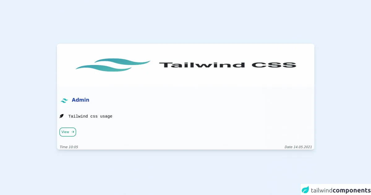
The preview of Cards UI component
Cards UI components are visually appealing and can be used to display a variety of information. They are usually rectangular in shape and contain a combination of text, images, and buttons. Here is a preview of what a Cards UI component can look like:
Free download of the Cards's source code
The source code of Cards UI component
To create a Cards UI component with Tailwind CSS, you need to use a combination of HTML and Tailwind CSS classes. Here is an example of the source code for a Cards UI component:
<head>
<meta charset="utf-8">
<title></title>
<meta name="viewport" content="width=device-width, initial-scale=1.0">
<script src="https://unpkg.com/@popperjs/core@2/dist/umd/popper.min.js"></script>
<script src="https://unpkg.com/tippy.js@6/dist/tippy-bundle.umd.js"></script>
<link rel="stylesheet" href="tailwind.css">
<link rel="stylesheet" href="https://pro.fontawesome.com/releases/v5.10.0/css/all.css" integrity="sha384-AYmEC3Yw5cVb3ZcuHtOA93w35dYTsvhLPVnYs9eStHfGJvOvKxVfELGroGkvsg+p" crossorigin="anonymous"/>
</head>
<body>
<style>
body
{
background-image:url("http://wallpaperstock.net/topiary-garden_wallpapers_51910_1280x1024.jpg");
}
</style>
<div class="md:flex p-2 md:items-center md:justify-center w-screen h-screen">
<div class="bg-white bg-opacity-75 duration-500 rounded-xl mb-2 h-4/5 md:h-auto mb-2 shadow-lg lg:transform hover:scale-105 ">
<div class="">
<img src="https://res.cloudinary.com/practicaldev/image/fetch/s--JXlFx1ne--/c_imagga_scale,f_auto,fl_progressive,h_900,q_auto,w_1600/https://dev-to-uploads.s3.amazonaws.com/i/f30hrij5h3j7gt2klbcu.jpg" class="w-full h-52 rounded-t-xl">
</div>
<div class="p-3 space-y-10">
<img src="https://encrypted-tbn0.gstatic.com/images?q=tbn:ANd9GcQegOQH2mkVKDWO2lsLTCUFeFjG5gtX0st22johXR66_gqxwonI9j-K0LFz5dX4qIDZlGg&usqp=CAU" class="w-12 h-12 rounded-full inline-block transform ">
<h1 class="font-bold text-2xl text-blue-800 inline-block m-2">Admin</h1><br>
<div class="space-y-10">
<p class="font-mono text-xl "><i class="fas fa-feather-alt"></i>  Tailwind css usage</p>
</div>
<div class="space-x-5">
<button class="bg-white- border-2 border-green-600 text-green-600 inline-block hover:bg-green-600 hover:text-white rounded-2xl p-2">View <i class="fad fa-long-arrow-right"></i></button>
</div>
<div>
<p class="text-gray-600 inline-block italic float-left font-medium">Time 10:05</p>
<p class="text-gray-600 inline-block italic font-medium float-right">Date 14.05.2021</p>
</div>
</div>
</div>
</body>
</html>
How to create a Cards with Tailwind CSS?
Creating a Cards UI component with Tailwind CSS is easy and straightforward. Here are six incredibly easy ways to create a Cards UI component with Tailwind CSS:
1. Use the grid system
The grid system in Tailwind CSS allows you to create a responsive layout for your Cards UI component. You can use the grid system to divide your Cards UI component into columns and rows and position your content accordingly.
2. Use pre-defined classes
Tailwind CSS provides a set of pre-defined classes that can be used to style your Cards UI component. You can use classes such as bg-white, rounded-lg, and shadow-md to create a visually appealing Cards UI component.
3. Use hover effects
Tailwind CSS provides a set of hover classes that can be used to add hover effects to your Cards UI component. You can use classes such as hover:bg-gray-100 and hover:shadow-lg to add hover effects to your Cards UI component.
4. Use flexbox
Flexbox is a powerful layout tool that can be used to create a flexible and responsive Cards UI component. You can use the flexbox classes in Tailwind CSS to position your content and create a visually appealing Cards UI component.
5. Use custom CSS
Tailwind CSS allows you to write custom CSS code to style your Cards UI component. You can use custom CSS to add unique styles and effects to your Cards UI component.
6. Use responsive design
Tailwind CSS provides a set of responsive classes that can be used to create a responsive Cards UI component. You can use classes such as sm:w-1/2 and md:w-1/3 to create a Cards UI component that is responsive across different screen sizes.
Conclusion
Creating a Cards UI component with Tailwind CSS is easy and straightforward. By using the pre-defined classes, grid system, hover effects, flexbox, custom CSS, and responsive design, you can create a visually appealing Cards UI component that is both functional and responsive. Tailwind CSS is a powerful tool that can help you create beautiful and responsive web designs with ease.