- Published on
6 Easy Ways To Make A Calendar UI With TailwindCSS And AlpineJS With Tailwind CSS
- What is Tailwind CSS?
- The description of Calendar UI with TailwindCSS and AlpineJS ui component
- Why use Tailwind CSS to create a Calendar UI with TailwindCSS and AlpineJS ui component?
- The preview of Calendar UI with TailwindCSS and AlpineJS ui component.
- The source code of Calendar UI with TailwindCSS and AlpineJS ui component.
- How to create a Calendar UI with TailwindCSS and AlpineJS with Tailwind CSS?
- Step 1: Set up the HTML structure
- Step 2: Add Tailwind CSS classes
- Step 3: Add AlpineJS directives
- Step 4: Add JavaScript functions
- Step 5: Add event handling
- Step 6: Add styling
- Conclusion
What is Tailwind CSS?
Tailwind CSS is a utility-first CSS framework that provides a set of pre-defined classes to create a responsive and modern UI design. It is a popular choice among developers because it allows them to create custom designs quickly without writing custom CSS code.
The description of Calendar UI with TailwindCSS and AlpineJS ui component
A Calendar UI is a common component in many web applications. It allows users to view dates and schedule events. In this article, we will explore how to create a Calendar UI with TailwindCSS and AlpineJS.
Why use Tailwind CSS to create a Calendar UI with TailwindCSS and AlpineJS ui component?
Tailwind CSS provides a set of pre-defined classes that can be used to create a responsive and modern UI design. This makes it easy to create a Calendar UI without writing custom CSS code. Additionally, AlpineJS is a lightweight JavaScript framework that allows us to add interactivity to our UI components. It is a great choice for creating a Calendar UI because it allows us to handle user interactions such as selecting dates and scheduling events.
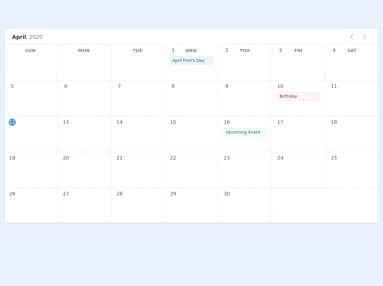
The preview of Calendar UI with TailwindCSS and AlpineJS ui component.
To create a Calendar UI with TailwindCSS and AlpineJS, we will use a combination of HTML, CSS, and JavaScript. We will create a simple UI that allows users to view dates and schedule events.
Free download of the Calendar UI with TailwindCSS and AlpineJS's source code
The source code of Calendar UI with TailwindCSS and AlpineJS ui component.
To create a Calendar UI with TailwindCSS and AlpineJS, we will use a combination of HTML, CSS, and JavaScript. We will create a simple UI that allows users to view dates and schedule events.
<!-- This is an example component -->
<div>

	<link rel="dns-prefetch" href="//unpkg.com" />
	<link rel="dns-prefetch" href="//cdn.jsdelivr.net" />
	<link rel="stylesheet" href="https://unpkg.com/tailwindcss@^1.0/dist/tailwind.min.css">
	<script src="https://cdn.jsdelivr.net/gh/alpinejs/[email protected]/dist/alpine.js" defer></script>

	<style>
		[x-cloak] {
			display: none;
		}
	</style>

<div class="antialiased sans-serif bg-gray-100 h-screen">
	<div x-data="app()" x-init="[initDate(), getNoOfDays()]" x-cloak>
		<div class="container mx-auto px-4 py-2 md:py-24">

			<!-- <div class="font-bold text-gray-800 text-xl mb-4">
				Schedule Tasks
			</div> -->

			<div class="bg-white rounded-lg shadow overflow-hidden">

				<div class="flex items-center justify-between py-2 px-6">
					<div>
						<span x-text="MONTH_NAMES[month]" class="text-lg font-bold text-gray-800"></span>
						<span x-text="year" class="ml-1 text-lg text-gray-600 font-normal"></span>
					</div>
					<div class="border rounded-lg px-1" style="padding-top: 2px;">
						<button
							type="button"
							class="leading-none rounded-lg transition ease-in-out duration-100 inline-flex cursor-pointer hover:bg-gray-200 p-1 items-center"
							:class="{'cursor-not-allowed opacity-25': month == 0 }"
							:disabled="month == 0 ? true : false"
							@click="month--; getNoOfDays()">
							<svg class="h-6 w-6 text-gray-500 inline-flex leading-none"  fill="none" viewBox="0 0 24 24" stroke="currentColor">
								<path stroke-linecap="round" stroke-linejoin="round" stroke-width="2" d="M15 19l-7-7 7-7"/>
							</svg>
						</button>
						<div class="border-r inline-flex h-6"></div>
						<button
							type="button"
							class="leading-none rounded-lg transition ease-in-out duration-100 inline-flex items-center cursor-pointer hover:bg-gray-200 p-1"
							:class="{'cursor-not-allowed opacity-25': month == 11 }"
							:disabled="month == 11 ? true : false"
							@click="month++; getNoOfDays()">
							<svg class="h-6 w-6 text-gray-500 inline-flex leading-none"  fill="none" viewBox="0 0 24 24" stroke="currentColor">
								<path stroke-linecap="round" stroke-linejoin="round" stroke-width="2" d="M9 5l7 7-7 7"/>
							</svg>
						</button>
					</div>
				</div>

				<div class="-mx-1 -mb-1">
					<div class="flex flex-wrap" style="margin-bottom: -40px;">
						<template x-for="(day, index) in DAYS" :key="index">
							<div style="width: 14.26%" class="px-2 py-2">
								<div
									x-text="day"
									class="text-gray-600 text-sm uppercase tracking-wide font-bold text-center"></div>
							</div>
						</template>
					</div>

					<div class="flex flex-wrap border-t border-l">
						<template x-for="blankday in blankdays">
							<div
								style="width: 14.28%; height: 120px"
								class="text-center border-r border-b px-4 pt-2"
							></div>
						</template>
						<template x-for="(date, dateIndex) in no_of_days" :key="dateIndex">
							<div style="width: 14.28%; height: 120px" class="px-4 pt-2 border-r border-b relative">
								<div
									@click="showEventModal(date)"
									x-text="date"
									class="inline-flex w-6 h-6 items-center justify-center cursor-pointer text-center leading-none rounded-full transition ease-in-out duration-100"
									:class="{'bg-blue-500 text-white': isToday(date) == true, 'text-gray-700 hover:bg-blue-200': isToday(date) == false }"
								></div>
								<div style="height: 80px;" class="overflow-y-auto mt-1">
									<!-- <div
										class="absolute top-0 right-0 mt-2 mr-2 inline-flex items-center justify-center rounded-full text-sm w-6 h-6 bg-gray-700 text-white leading-none"
										x-show="events.filter(e => e.event_date === new Date(year, month, date).toDateString()).length"
										x-text="events.filter(e => e.event_date === new Date(year, month, date).toDateString()).length"></div> -->

									<template x-for="event in events.filter(e => new Date(e.event_date).toDateString() ===  new Date(year, month, date).toDateString() )">
										<div
											class="px-2 py-1 rounded-lg mt-1 overflow-hidden border"
											:class="{
												'border-blue-200 text-blue-800 bg-blue-100': event.event_theme === 'blue',
												'border-red-200 text-red-800 bg-red-100': event.event_theme === 'red',
												'border-yellow-200 text-yellow-800 bg-yellow-100': event.event_theme === 'yellow',
												'border-green-200 text-green-800 bg-green-100': event.event_theme === 'green',
												'border-purple-200 text-purple-800 bg-purple-100': event.event_theme === 'purple'
											}"
										>
											<p x-text="event.event_title" class="text-sm truncate leading-tight"></p>
										</div>
									</template>
								</div>
							</div>
						</template>
					</div>
				</div>
			</div>
		</div>

		<!-- Modal -->
		<div style=" background-color: rgba(0, 0, 0, 0.8)" class="fixed z-40 top-0 right-0 left-0 bottom-0 h-full w-full" x-show.transition.opacity="openEventModal">
			<div class="p-4 max-w-xl mx-auto relative absolute left-0 right-0 overflow-hidden mt-24">
				<div class="shadow absolute right-0 top-0 w-10 h-10 rounded-full bg-white text-gray-500 hover:text-gray-800 inline-flex items-center justify-center cursor-pointer"
					x-on:click="openEventModal = !openEventModal">
					<svg class="fill-current w-6 h-6" xmlns="http://www.w3.org/2000/svg" viewBox="0 0 24 24">
						<path
							d="M16.192 6.344L11.949 10.586 7.707 6.344 6.293 7.758 10.535 12 6.293 16.242 7.707 17.656 11.949 13.414 16.192 17.656 17.606 16.242 13.364 12 17.606 7.758z" />
					</svg>
				</div>

				<div class="shadow w-full rounded-lg bg-white overflow-hidden w-full block p-8">

					<h2 class="font-bold text-2xl mb-6 text-gray-800 border-b pb-2">Add Event Details</h2>

					<div class="mb-4">
						<label class="text-gray-800 block mb-1 font-bold text-sm tracking-wide">Event title</label>
						<input class="bg-gray-200 appearance-none border-2 border-gray-200 rounded-lg w-full py-2 px-4 text-gray-700 leading-tight focus:outline-none focus:bg-white focus:border-blue-500" type="text" x-model="event_title">
					</div>

					<div class="mb-4">
						<label class="text-gray-800 block mb-1 font-bold text-sm tracking-wide">Event date</label>
						<input class="bg-gray-200 appearance-none border-2 border-gray-200 rounded-lg w-full py-2 px-4 text-gray-700 leading-tight focus:outline-none focus:bg-white focus:border-blue-500" type="text" x-model="event_date" readonly>
					</div>

					<div class="inline-block w-64 mb-4">
						<label class="text-gray-800 block mb-1 font-bold text-sm tracking-wide">Select a theme</label>
						<div class="relative">
							<select @change="event_theme = $event.target.value;" x-model="event_theme" class="block appearance-none w-full bg-gray-200 border-2 border-gray-200 hover:border-gray-500 px-4 py-2 pr-8 rounded-lg leading-tight focus:outline-none focus:bg-white focus:border-blue-500 text-gray-700">
									<template x-for="(theme, index) in themes">
										<option :value="theme.value" x-text="theme.label"></option>
									</template>

							</select>
							<div class="pointer-events-none absolute inset-y-0 right-0 flex items-center px-2 text-gray-700">
							<svg class="fill-current h-4 w-4" xmlns="http://www.w3.org/2000/svg" viewBox="0 0 20 20"><path d="M9.293 12.95l.707.707L15.657 8l-1.414-1.414L10 10.828 5.757 6.586 4.343 8z"/></svg>
							</div>
						</div>
					</div>

					<div class="mt-8 text-right">
						<button type="button" class="bg-white hover:bg-gray-100 text-gray-700 font-semibold py-2 px-4 border border-gray-300 rounded-lg shadow-sm mr-2" @click="openEventModal = !openEventModal">
							Cancel
						</button>
						<button type="button" class="bg-gray-800 hover:bg-gray-700 text-white font-semibold py-2 px-4 border border-gray-700 rounded-lg shadow-sm" @click="addEvent()">
							Save Event
						</button>
					</div>
				</div>
			</div>
		</div>
		<!-- /Modal -->
	</div>

	<script>
		const MONTH_NAMES = ['January', 'February', 'March', 'April', 'May', 'June', 'July', 'August', 'September', 'October', 'November', 'December'];
		const DAYS = ['Sun', 'Mon', 'Tue', 'Wed', 'Thu', 'Fri', 'Sat'];

		function app() {
			return {
				month: '',
				year: '',
				no_of_days: [],
				blankdays: [],
				days: ['Sun', 'Mon', 'Tue', 'Wed', 'Thu', 'Fri', 'Sat'],

				events: [
					{
						event_date: new Date(2020, 3, 1),
						event_title: "April Fool's Day",
						event_theme: 'blue'
					},

					{
						event_date: new Date(2020, 3, 10),
						event_title: "Birthday",
						event_theme: 'red'
					},

					{
						event_date: new Date(2020, 3, 16),
						event_title: "Upcoming Event",
						event_theme: 'green'
					}
				],
				event_title: '',
				event_date: '',
				event_theme: 'blue',

				themes: [
					{
						value: "blue",
						label: "Blue Theme"
					},
					{
						value: "red",
						label: "Red Theme"
					},
					{
						value: "yellow",
						label: "Yellow Theme"
					},
					{
						value: "green",
						label: "Green Theme"
					},
					{
						value: "purple",
						label: "Purple Theme"
					}
				],

				openEventModal: false,

				initDate() {
					let today = new Date();
					this.month = today.getMonth();
					this.year = today.getFullYear();
					this.datepickerValue = new Date(this.year, this.month, today.getDate()).toDateString();
				},

				isToday(date) {
					const today = new Date();
					const d = new Date(this.year, this.month, date);

					return today.toDateString() === d.toDateString() ? true : false;
				},

				showEventModal(date) {
					// open the modal
					this.openEventModal = true;
					this.event_date = new Date(this.year, this.month, date).toDateString();
				},

				addEvent() {
					if (this.event_title == '') {
						return;
					}

					this.events.push({
						event_date: this.event_date,
						event_title: this.event_title,
						event_theme: this.event_theme
					});

					console.log(this.events);

					// clear the form data
					this.event_title = '';
					this.event_date = '';
					this.event_theme = 'blue';

					//close the modal
					this.openEventModal = false;
				},

				getNoOfDays() {
					let daysInMonth = new Date(this.year, this.month + 1, 0).getDate();

					// find where to start calendar day of week
					let dayOfWeek = new Date(this.year, this.month).getDay();
					let blankdaysArray = [];
					for ( var i=1; i <= dayOfWeek; i++) {
						blankdaysArray.push(i);
					}

					let daysArray = [];
					for ( var i=1; i <= daysInMonth; i++) {
						daysArray.push(i);
					}

					this.blankdays = blankdaysArray;
					this.no_of_days = daysArray;
				}
			}
		}
	</script>
  </div>
How to create a Calendar UI with TailwindCSS and AlpineJS with Tailwind CSS?
Step 1: Set up the HTML structure
We will start by creating the HTML structure for our Calendar UI. We will use a table to display the dates and events. Each cell in the table will represent a day in the month.
<div class="calendar">
  <table>
    <thead>
      <tr>
        <th>Sun</th>
        <th>Mon</th>
        <th>Tue</th>
        <th>Wed</th>
        <th>Thu</th>
        <th>Fri</th>
        <th>Sat</th>
      </tr>
    </thead>
    <tbody>
      <tr>
        <td></td>
        <td></td>
        <td></td>
        <td></td>
        <td></td>
        <td></td>
        <td></td>
      </tr>
      <!-- Repeat for all weeks in the month -->
    </tbody>
  </table>
</div>
Step 2: Add Tailwind CSS classes
We will now add Tailwind CSS classes to our HTML structure to style our Calendar UI. We will use the table and table-cell classes to create a table layout. We will also use the bg-gray-100 class to add a background color to the cells.
<div class="calendar">
  <table class="table-fixed w-full">
    <thead>
      <tr>
        <th class="w-1/7">Sun</th>
        <th class="w-1/7">Mon</th>
        <th class="w-1/7">Tue</th>
        <th class="w-1/7">Wed</th>
        <th class="w-1/7">Thu</th>
        <th class="w-1/7">Fri</th>
        <th class="w-1/7">Sat</th>
      </tr>
    </thead>
    <tbody>
      <tr>
        <td class="table-cell bg-gray-100"></td>
        <td class="table-cell bg-gray-100"></td>
        <td class="table-cell bg-gray-100"></td>
        <td class="table-cell bg-gray-100"></td>
        <td class="table-cell bg-gray-100"></td>
        <td class="table-cell bg-gray-100"></td>
        <td class="table-cell bg-gray-100"></td>
      </tr>
      <!-- Repeat for all weeks in the month -->
    </tbody>
  </table>
</div>
Step 3: Add AlpineJS directives
We will now add AlpineJS directives to our HTML structure to handle user interactions. We will use the x-data directive to create a JavaScript object that will store the state of our Calendar UI. We will also use the x-for directive to loop through the days in the month and display them in the table.
<div class="calendar" x-data="calendar()">
  <table class="table-fixed w-full">
    <thead>
      <tr>
        <th class="w-1/7">Sun</th>
        <th class="w-1/7">Mon</th>
        <th class="w-1/7">Tue</th>
        <th class="w-1/7">Wed</th>
        <th class="w-1/7">Thu</th>
        <th class="w-1/7">Fri</th>
        <th class="w-1/7">Sat</th>
      </tr>
    </thead>
    <tbody>
      <template x-for="(week, weekIndex) in weeks" :key="weekIndex">
        <tr>
          <template x-for="(day, dayIndex) in week" :key="dayIndex">
            <td class="table-cell bg-gray-100" x-text="day"></td>
          </template>
        </tr>
      </template>
    </tbody>
  </table>
</div>
We have used the calendar() function to create a JavaScript object that will store the state of our Calendar UI. We have also used the weeks array to store the days in the month.
Step 4: Add JavaScript functions
We will now add JavaScript functions to our HTML structure to handle user interactions. We will use the getDaysInMonth() function to get the number of days in the month. We will also use the getMonthData() function to get the days in the month and display them in the table.
<script>
  function calendar() {
    return {
      weeks: [],
      init() {
        this.getMonthData();
      },
      getDaysInMonth(year, month) {
        return new Date(year, month + 1, 0).getDate();
      },
      getMonthData() {
        const now = new Date();
        const year = now.getFullYear();
        const month = now.getMonth();
        const daysInMonth = this.getDaysInMonth(year, month);
        const firstDay = new Date(year, month, 1).getDay();
        const lastDay = new Date(year, month, daysInMonth).getDay();
        const weeks = [[]];
        let weekIndex = 0;
        for (let i = 0; i < firstDay; i++) {
          weeks[weekIndex].push("");
        }
        for (let i = 1; i <= daysInMonth; i++) {
          if (weeks[weekIndex].length === 7) {
            weeks.push([]);
            weekIndex++;
          }
          weeks[weekIndex].push(i);
        }
        for (let i = lastDay; i < 6; i++) {
          weeks[weekIndex].push("");
        }
        this.weeks = weeks;
      },
    };
  }
</script>
We have used the init() function to initialize the state of our Calendar UI. We have also used the getDaysInMonth() function to get the number of days in the month and the getMonthData() function to get the days in the month and display them in the table.
Step 5: Add event handling
We will now add event handling to our HTML structure to handle user interactions. We will use the x-on directive to listen for click events on the cells in the table. We will also use the x-show directive to show a form when the user clicks on a cell.
<div class="calendar" x-data="calendar()" x-init="init()">
  <table class="table-fixed w-full">
    <thead>
      <tr>
        <th class="w-1/7">Sun</th>
        <th class="w-1/7">Mon</th>
        <th class="w-1/7">Tue</th>
        <th class="w-1/7">Wed</th>
        <th class="w-1/7">Thu</th>
        <th class="w-1/7">Fri</th>
        <th class="w-1/7">Sat</th>
      </tr>
    </thead>
    <tbody>
      <template x-for="(week, weekIndex) in weeks" :key="weekIndex">
        <tr>
          <template x-for="(day, dayIndex) in week" :key="dayIndex">
            <td class="table-cell bg-gray-100" x-text="day" x-on:click="showForm(day)"></td>
          </template>
        </tr>
      </template>
    </tbody>
  </table>
  <div class="fixed inset-0 bg-gray-900 bg-opacity-50 flex items-center justify-center" x-show="show">
    <div class="bg-white p-6 rounded-lg shadow-lg">
      <h2 class="text-lg font-medium mb-4">Schedule Event</h2>
      <form>
        <div class="mb-4">
          <label class="block text-gray-700 font-bold mb-2" for="event-title">Title</label>
          <input class="border rounded-lg py-2 px-3 w-full" type="text" id="event-title" name="event-title" required>
        </div>
        <div class="mb-4">
          <label class="block text-gray-700 font-bold mb-2" for="event-date">Date</label>
          <input class="border rounded-lg py-2 px-3 w-full" type="date" id="event-date" name="event-date" required>
        </div>
        <div class="mb-4">
          <label class="block text-gray-700 font-bold mb-2" for="event-time">Time</label>
          <input class="border rounded-lg py-2 px-3 w-full" type="time" id="event-time" name="event-time" required>
        </div>
        <div class="flex justify-end">
          <button class="bg-blue-500 hover:bg-blue-700 text-white font-bold py-2 px-4 rounded" type="submit">Save</button>
        </div>
      </form>
    </div>
  </div>
</div>
We have used the showForm() function to show a form when the user clicks on a cell. We have also used the show variable to control the visibility of the form.
Step 6: Add styling
We will now add styling to our HTML structure to make our Calendar UI look more visually appealing. We will use the bg-white, p-6, rounded-lg, and shadow-lg classes to style the form.
<style>
  .calendar {
    height: 600px;
  }
</style>
We have used the .calendar class to set the height of our Calendar UI.
Conclusion
In this article, we have explored how to create a Calendar UI with TailwindCSS and AlpineJS. We have used a combination of HTML, CSS, and JavaScript to create a simple UI that allows users to view dates and schedule events. We have also used Tailwind CSS to style our UI and AlpineJS to handle user interactions. With these tools, we can create custom UI components quickly and easily.