- Published on
How to Create A Buttons With SVG Icons With Tailwind CSS?
- What is Tailwind CSS?
- The description of Buttons with SVG Icons ui component
- Why use Tailwind CSS to create a Buttons with SVG Icons ui component?
- The preview of Buttons with SVG Icons ui component
- The source code of Buttons with SVG Icons ui component
- How to create a Buttons with SVG Icons with Tailwind CSS?
- Conclusion
In this article, we will discuss how to create a Buttons with SVG Icons ui component using Tailwind CSS. We will cover the basics of Tailwind CSS, the benefits of using it to create this ui component, and provide a preview and source code of the final product.
What is Tailwind CSS?
Tailwind CSS is a utility-first CSS framework that allows developers to rapidly build custom user interfaces. It provides a set of pre-defined classes that can be used to style HTML elements, making it easy to create responsive and visually appealing designs. Tailwind CSS is highly customizable, making it a popular choice for front-end developers.
The description of Buttons with SVG Icons ui component
Buttons with SVG Icons is a common ui component used in web applications. It consists of a button with an SVG icon embedded in it. This ui component is commonly used for actions such as submitting a form, navigating to a new page, or deleting an item.
Why use Tailwind CSS to create a Buttons with SVG Icons ui component?
Tailwind CSS provides a set of pre-defined classes that can be used to style HTML elements, making it easy to create responsive and visually appealing designs. Using Tailwind CSS to create a Buttons with SVG Icons ui component allows developers to quickly create a consistent and visually appealing design. Additionally, Tailwind CSS is highly customizable, allowing developers to easily modify the design to fit their specific needs.
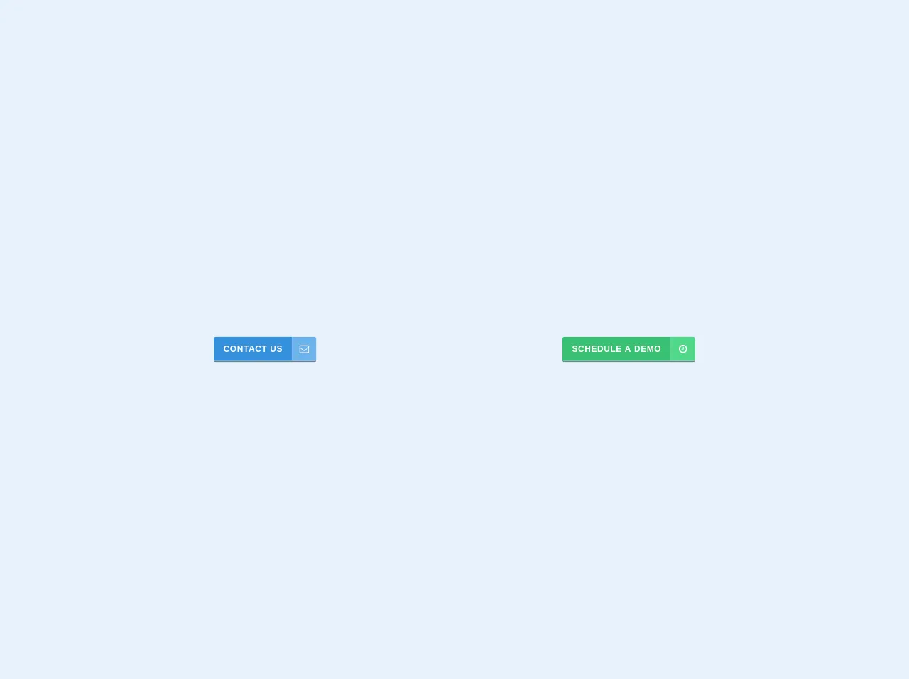
The preview of Buttons with SVG Icons ui component
Free download of the Buttons with SVG Icons's source code
The source code of Buttons with SVG Icons ui component
To create a Buttons with SVG Icons ui component using Tailwind CSS, we will use the following HTML and CSS code:
<section class="mt-8 container mx-auto flex items-center justify-around">
	<div>
		<div class="flex rounded border-b-2 border-grey-dark overflow-hidden">
			<button class="block text-white text-sm shadow-border bg-blue hover:bg-blue-dark text-sm py-3 px-4 font-sans tracking-wide uppercase font-bold">
				contact us
			</button>
			<div class="bg-blue-light shadow-border p-3">
				<div class="w-4 h-4">
					<svg class="fill-current text-white" viewBox="0 0 1792 1792" xmlns="http://www.w3.org/2000/svg"><path d="M1664 1504v-768q-32 36-69 66-268 206-426 338-51 43-83 67t-86.5 48.5-102.5 24.5h-2q-48 0-102.5-24.5t-86.5-48.5-83-67q-158-132-426-338-37-30-69-66v768q0 13 9.5 22.5t22.5 9.5h1472q13 0 22.5-9.5t9.5-22.5zm0-1051v-24.5l-.5-13-3-12.5-5.5-9-9-7.5-14-2.5h-1472q-13 0-22.5 9.5t-9.5 22.5q0 168 147 284 193 152 401 317 6 5 35 29.5t46 37.5 44.5 31.5 50.5 27.5 43 9h2q20 0 43-9t50.5-27.5 44.5-31.5 46-37.5 35-29.5q208-165 401-317 54-43 100.5-115.5t46.5-131.5zm128-37v1088q0 66-47 113t-113 47h-1472q-66 0-113-47t-47-113v-1088q0-66 47-113t113-47h1472q66 0 113 47t47 113z"/></svg>
				</div>
			</div>
		</div>
	</div>
	<div>
		<div class="flex rounded border-b-2 border-grey-dark overflow-hidden">
			<button class="block text-white text-sm shadow-border bg-green hover:bg-green-dark text-sm py-3 px-4 font-sans tracking-wide uppercase font-bold">
				schedule a demo
			</button>
			<div class="bg-green-light shadow-border p-3">
				<div class="w-4 h-4">
					<svg class="fill-current text-white" viewBox="0 0 1792 1792" xmlns="http://www.w3.org/2000/svg"><path d="M1024 544v448q0 14-9 23t-23 9h-320q-14 0-23-9t-9-23v-64q0-14 9-23t23-9h224v-352q0-14 9-23t23-9h64q14 0 23 9t9 23zm416 352q0-148-73-273t-198-198-273-73-273 73-198 198-73 273 73 273 198 198 273 73 273-73 198-198 73-273zm224 0q0 209-103 385.5t-279.5 279.5-385.5 103-385.5-103-279.5-279.5-103-385.5 103-385.5 279.5-279.5 385.5-103 385.5 103 279.5 279.5 103 385.5z"/></svg>
				</div>
			</div>
		</div>
	</div>
</section>
How to create a Buttons with SVG Icons with Tailwind CSS?
To create a Buttons with SVG Icons ui component using Tailwind CSS, follow these steps:
- Create a new HTML file and add the following code:
<button class="bg-blue-500 hover:bg-blue-700 text-white font-bold py-2 px-4 rounded">
  <svg class="h-6 w-6 inline-block" xmlns="http://www.w3.org/2000/svg" viewBox="0 0 20 20" fill="currentColor">
    <path d="M10 12a2 2 0 100-4 2 2 0 000 4z" />
    <path fill-rule="evenodd" d="M10 18a8 8 0 100-16 8 8 0 000 16zm0-2a6 6 0 100-12 6 6 0 000 12z" clip-rule="evenodd" />
  </svg>
  placeholder1
</button>
Replace the
placeholder1with the text that you want to appear on the button.Save the HTML file and open it in a web browser. You should see a button with an SVG icon and the text that you added.
To customize the design of the button, you can modify the classes used in the HTML code. For example, to change the background color of the button, you can change the
bg-blue-500class to a different color.To add additional SVG icons to the button, you can copy and paste the SVG code and modify the
dattribute to create a different shape.
Conclusion
In this article, we discussed how to create a Buttons with SVG Icons ui component using Tailwind CSS. We covered the basics of Tailwind CSS, the benefits of using it to create this ui component, and provided a preview and source code of the final product. By following these steps, you can easily create a visually appealing and responsive Buttons with SVG Icons ui component for your web application.