- Published on
How To Create A Buttons With Tailwind CSS In 5 Easy Steps
- What is Tailwind CSS?
- The description of Buttons ui component
- Why use Tailwind CSS to create a Buttons ui component?
- The preview of Buttons ui component.
- The source code of Buttons ui component.
- How to create a Buttons with Tailwind CSS?
- Step 1: Set up your HTML file
- Step 2: Define the button's size
- Step 3: Define the button's color
- Step 4: Define the button's hover state
- Step 5: Define the button's active state
- Conclusion
What is Tailwind CSS?
Tailwind CSS is a utility-first CSS framework that allows developers to quickly and easily create custom user interfaces. It provides a set of pre-defined classes that can be used to style HTML elements without writing any CSS code.
The description of Buttons ui component
Buttons are one of the most commonly used user interface elements in web development. They are used to trigger actions, navigate between pages, and perform other tasks. A well-designed button can make a big difference in the user experience.
Why use Tailwind CSS to create a Buttons ui component?
Tailwind CSS provides a simple and efficient way to create buttons with minimal coding. With its pre-defined classes, developers can easily customize the look and feel of buttons without having to write any CSS code.
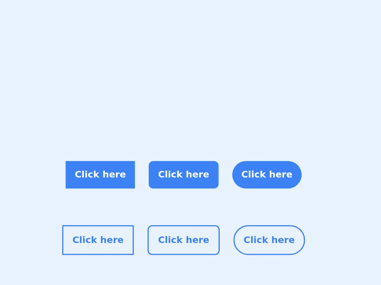
The preview of Buttons ui component.
Buttons can come in different shapes, sizes, and colors. They can be flat or raised, with or without borders, and can have different hover and active states. With Tailwind CSS, you can easily create buttons that match your design requirements.
Free download of the Buttons's source code
The source code of Buttons ui component.
To create a button with Tailwind CSS, you only need to add a few classes to your HTML element. The classes define the button's size, color, and other properties.
<!-- Classic Button -->
<div class="flex flex-col">
<div class="flex justify-center">
<a href="" class="bg-blue-500 font-bold text-white px-4 py-3 transition duration-300 ease-in-out hover:bg-blue-600 mr-6">
    Click here
</a>
<a href="" class="bg-blue-500 rounded-lg font-bold text-white text-center px-4 py-3 transition duration-300 ease-in-out hover:bg-blue-600 mr-6">
    Click here
</a>
<a href="" class="bg-blue-500 rounded-full font-bold text-white px-4 py-3 transition duration-300 ease-in-out hover:bg-blue-600 mr-6">
    Click here
</a>
</div>
<div class="mt-16 flex justify-center">
<a href="" class="border-2 border-blue-500 font-bold text-blue-500 px-4 py-3 transition duration-300 ease-in-out hover:bg-blue-500 hover:text-white mr-6">
    Click here
</a>
<a href="" class="border-2 border-blue-500 rounded-lg font-bold text-blue-500 px-4 py-3 transition duration-300 ease-in-out hover:bg-blue-500 hover:text-white mr-6">
    Click here
</a>
<a href="" class="border-2 border-blue-500 rounded-full font-bold text-blue-500 px-4 py-3 transition duration-300 ease-in-out hover:bg-blue-500 hover:text-white mr-6">
    Click here
</a>
</div>
<div class="mt-16 flex justify-center">
<a href="" class="flex bg-blue-500 font-bold text-white px-4 py-3 transition duration-300 ease-in-out hover:bg-blue-600 mr-6">
    Click here
    <svg xmlns="http://www.w3.org/2000/svg" class="inline ml-2 w-6 stroke-current text-white stroke-2" viewBox="0 0 24 24" fill="none" stroke-linecap="round" stroke-linejoin="round"><line x1="5" y1="12" x2="19" y2="12"/><polyline points="12 5 19 12 12 19"/></svg>
</a>
<a href="" class="flex bg-blue-500 rounded-lg font-bold text-white text-center px-4 py-3 transition duration-300 ease-in-out hover:bg-blue-600 mr-6">
    Click here
    <svg xmlns="http://www.w3.org/2000/svg" class="inline ml-2 w-6 stroke-current text-white stroke-2" viewBox="0 0 24 24" fill="none" stroke-linecap="round" stroke-linejoin="round"><line x1="5" y1="12" x2="19" y2="12"/><polyline points="12 5 19 12 12 19"/></svg>
</a>
<a href="" class="flex bg-blue-500 rounded-full font-bold text-white px-4 py-3 transition duration-300 ease-in-out hover:bg-blue-600 mr-6">
    Click here
    <svg xmlns="http://www.w3.org/2000/svg" class="inline ml-2 w-6 stroke-current text-white stroke-2" viewBox="0 0 24 24" fill="none" stroke-linecap="round" stroke-linejoin="round"><line x1="5" y1="12" x2="19" y2="12"/><polyline points="12 5 19 12 12 19"/></svg>
</a>
</div>
<div class="mt-16 flex justify-center">
<a href="" class="flex bg-blue-500 font-bold text-white px-4 py-4 transition duration-300 ease-in-out hover:bg-blue-600 mr-6">
    <svg xmlns="http://www.w3.org/2000/svg" class="inline w-6 stroke-current text-white stroke-2" viewBox="0 0 24 24" fill="none" stroke-linecap="round" stroke-linejoin="round"><line x1="5" y1="12" x2="19" y2="12"/><polyline points="12 5 19 12 12 19"/></svg>
</a>
<a href="" class="flex bg-blue-500 rounded-lg font-bold text-white text-center px-4 py-3 transition duration-300 ease-in-out hover:bg-blue-600 mr-6">
    <svg xmlns="http://www.w3.org/2000/svg" class="inline w-6 stroke-current text-white stroke-2" viewBox="0 0 24 24" fill="none" stroke-linecap="round" stroke-linejoin="round"><line x1="5" y1="12" x2="19" y2="12"/><polyline points="12 5 19 12 12 19"/></svg>
</a>
<a href="" class="flex bg-blue-500 rounded-full font-bold text-white px-4 py-4 transition duration-300 ease-in-out hover:bg-blue-600 mr-6">
    <svg xmlns="http://www.w3.org/2000/svg" class="inline w-6 stroke-current text-white stroke-2" viewBox="0 0 24 24" fill="none" stroke-linecap="round" stroke-linejoin="round"><line x1="5" y1="12" x2="19" y2="12"/><polyline points="12 5 19 12 12 19"/></svg>
</a>
</div>
</div>
How to create a Buttons with Tailwind CSS?
Here are the 5 easy steps to create a button with Tailwind CSS:
Step 1: Set up your HTML file
Create a new HTML file and add the following code:
<!DOCTYPE html>
<html>
<head>
	<title>Button Example</title>
	<link rel="stylesheet" href="https://cdn.jsdelivr.net/npm/[email protected]/dist/tailwind.min.css">
</head>
<body>
	<button class="bg-blue-500 hover:bg-blue-700 text-white font-bold py-2 px-4 rounded">
		Button
	</button>
</body>
</html>
This code includes the Tailwind CSS stylesheet and a button element with some pre-defined classes.
Step 2: Define the button's size
To define the button's size, you can use the py and px classes. py stands for "padding-y" and px stands for "padding-x". These classes define the amount of padding on the top and bottom (py) and left and right (px) of the button.
<button class="bg-blue-500 hover:bg-blue-700 text-white font-bold py-2 px-4 rounded">
	Button
</button>
Step 3: Define the button's color
To define the button's color, you can use the bg class. This class defines the background color of the button.
<button class="bg-blue-500 hover:bg-blue-700 text-white font-bold py-2 px-4 rounded">
	Button
</button>
Step 4: Define the button's hover state
To define the button's hover state, you can use the hover class. This class defines the styles that should be applied when the user hovers over the button.
<button class="bg-blue-500 hover:bg-blue-700 text-white font-bold py-2 px-4 rounded">
	Button
</button>
Step 5: Define the button's active state
To define the button's active state, you can use the active class. This class defines the styles that should be applied when the user clicks on the button.
<button class="bg-blue-500 hover:bg-blue-700 active:bg-blue-800 text-white font-bold py-2 px-4 rounded">
	Button
</button>
Conclusion
Creating buttons with Tailwind CSS is easy and efficient. With its pre-defined classes, you can quickly customize the look and feel of buttons without having to write any CSS code. By following the 5 easy steps outlined in this article, you can create buttons that match your design requirements in no time.