- Published on
6 Steps To Make A Button With Tailwind CSS Like A Pro In Under An Hour
- What is Tailwind CSS?
- The description of Button ui component
- Why use Tailwind CSS to create a Button ui component?
- The preview of Button ui component.
- The source code of Button ui component.
- How to create a Button with Tailwind CSS?
- Step 1: Install Tailwind CSS
- Step 2: Create a configuration file
- Step 3: Add Tailwind CSS to your project
- Step 4: Create a button
- Step 5: Customize the button
- Step 6: Add the button to your project
- Conclusion
As a FrontEnd technology blogger, you must have heard of Tailwind CSS. It is a utility-first CSS framework that helps you quickly build custom designs without writing any CSS. In this article, we will discuss how to create a button with Tailwind CSS in six easy steps.
What is Tailwind CSS?
Tailwind CSS is a CSS framework that provides a set of utility classes to create custom designs. It is different from other CSS frameworks like Bootstrap and Foundation, which provide pre-designed components. Tailwind CSS allows you to create your own custom designs by using its utility classes.
The description of Button ui component
A button is a common UI component that is used to trigger an action. It is an essential element of any website or application. A button can be designed in many ways, such as flat, raised, outlined, or with an icon. In this article, we will create a flat button with a primary color.
Why use Tailwind CSS to create a Button ui component?
Tailwind CSS provides a set of utility classes that can be used to create a button quickly. It eliminates the need for writing custom CSS, which saves time and effort. Moreover, Tailwind CSS is highly customizable, which means you can create a button that matches your design requirements.
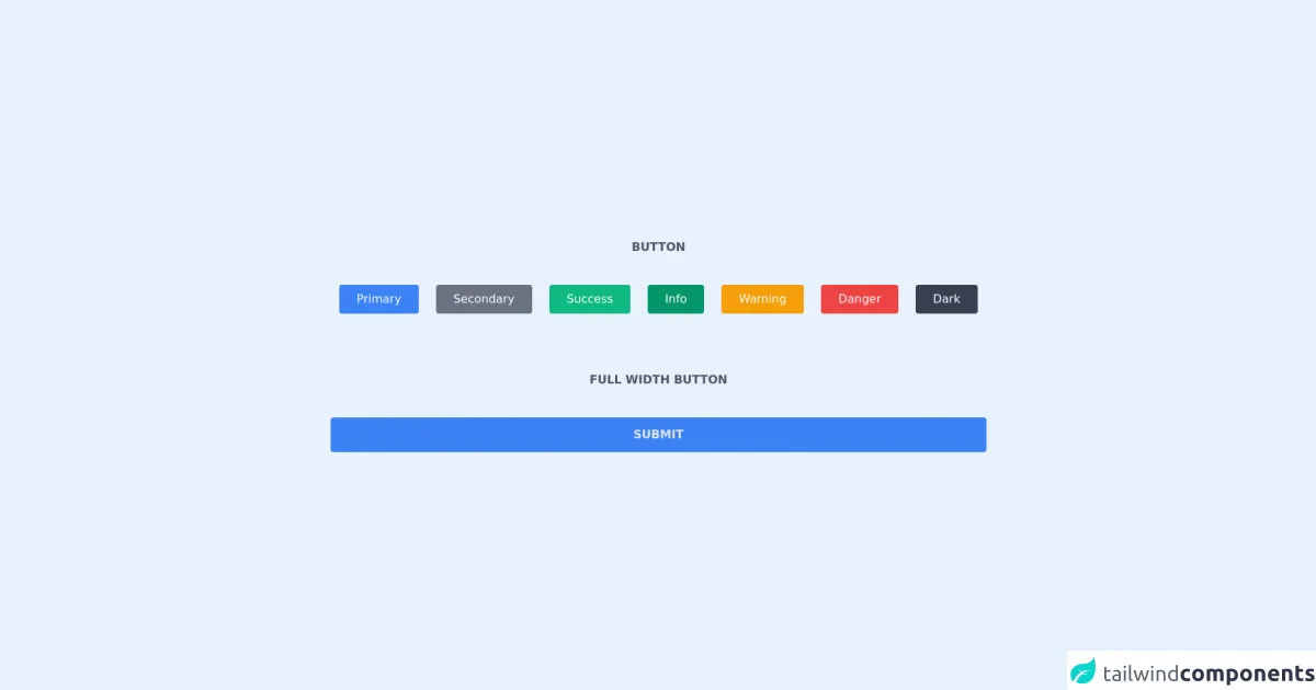
The preview of Button ui component.
To create a button with Tailwind CSS, we will use the following classes:
bg-blue-500 hover:bg-blue-700 text-white font-bold py-2 px-4 rounded
Free download of the Button's source code
The source code of Button ui component.
To create a button with Tailwind CSS, we will use the following HTML code:
<button class="bg-blue-500 hover:bg-blue-700 text-white font-bold py-2 px-4 rounded">
  Click me
</button>
<div class="h-screen flex justify-center items-center">
    <div>
        <h1 class="text-center pb-10 uppercase font-semibold text-gray-600">Button<h1/>
        <div class="flex justify-center items-center">
            <div class="flex">
                <button type="button" class="bg-blue-500 text-white px-6 py-2 rounded font-medium mx-3 hover:bg-blue-600 transition duration-200 each-in-out">Primary</button>
                <button type="button" class="bg-gray-500 text-white px-6 py-2 rounded font-medium mx-3 hover:bg-gray-600 transition duration-200 each-in-out">Secondary</button>
                <button type="button" class="bg-green-500 text-white px-6 py-2 rounded font-medium mx-3 hover:bg-green-600 transition duration-200 each-in-out">Success</button>
                <button type="button" class="bg-green-600 text-white px-6 py-2 rounded font-medium mx-3 hover:bg-green-700 transition duration-200 each-in-out">Info</button>
                <button type="button" class="bg-yellow-500 text-white px-6 py-2 rounded font-medium mx-3 hover:bg-yellow-600 transition duration-200 each-in-out">Warning</button>
                <button type="button" class="bg-red-500 text-white px-6 py-2 rounded font-medium mx-3 hover:bg-red-600 transition duration-200 each-in-out">Danger</button>
                <button type="button" class="bg-gray-700 text-white px-6 py-2 rounded font-medium mx-3 hover:bg-gray-800 transition duration-200 each-in-out">Dark</button>
            </div>
        </div>
        <div class="text-center mt-20">
            <h1 class="text-center pb-10 uppercase font-semibold text-gray-600">full width button</h1>
            <div>
                <button type="button" class="w-full bg-blue-500 px-4 py-3 rounded text-gray-200 font-semibold hover:bg-blue-600 transition duration-200 each-in-out">SUBMIT</button>
            </div>
        </div>
    </div>
</div>
How to create a Button with Tailwind CSS?
Now that we have an idea of what Tailwind CSS is and why it is useful, let's dive into the steps to create a button with Tailwind CSS.
Step 1: Install Tailwind CSS
The first step is to install Tailwind CSS. You can install it using npm or yarn. Here is the command to install Tailwind CSS using npm:
npm install tailwindcss
Step 2: Create a configuration file
The next step is to create a configuration file for Tailwind CSS. You can create a configuration file using the following command:
npx tailwindcss init
This command will create a tailwind.config.js file in your project directory.
Step 3: Add Tailwind CSS to your project
The next step is to add Tailwind CSS to your project. You can add it to your project by importing it in your CSS file:
@import 'tailwindcss/base';
@import 'tailwindcss/components';
@import 'tailwindcss/utilities';
Step 4: Create a button
Now that we have set up Tailwind CSS, we can create a button. We will use the following classes to create a flat button with a primary color:
<button class="bg-blue-500 hover:bg-blue-700 text-white font-bold py-2 px-4 rounded">
  Click me
</button>
Step 5: Customize the button
Tailwind CSS provides a set of utility classes that can be used to customize the button. For example, you can change the button's color, size, font, and padding. Here is an example of how to change the button's color to red:
<button class="bg-red-500 hover:bg-red-700 text-white font-bold py-2 px-4 rounded">
  Click me
</button>
Step 6: Add the button to your project
Finally, you can add the button to your project by copying the HTML code and pasting it into your project's HTML file.
Conclusion
In this article, we discussed how to create a button with Tailwind CSS in six easy steps. We also discussed why Tailwind CSS is useful for creating custom designs quickly. With Tailwind CSS, you can create a button that matches your design requirements without writing any custom CSS.